Using Transfer Learning, Natural Language Processing and Network Analysis to Identify Influential Rap Albums
In this post, we will analyze data from two different sources: Pitchfork music reviews of rap albums, and the lyrics from these same rap albums. We will use transfer learning to convert the text of the album lyrics to document vectors (vectors of real valued numbers where each point captures a dimension of a document’s meaning and where semantically similar documents have similar vectors). We will use these document vectors to calculate the linguistic similarity among rap albums in our database, which will serve as an index of the “influence” of albums across time. Finally, we will use these similarity calculations to make a network visualization of the patterns of influence of rap albums within the time period contained in the Pitchfork data set (e.g. albums released or re-issued between 1999 and 2017).
You can find the data and code used for this analysis on Github here.
Part 1: From Word Vectors to Document Vectors
We will use the spaCy library in Python for the natural language processing component of this analysis. spaCy comes with pre-trained word vectors, which can be downloaded for use with any NLP project. According to the documentation, the word embeddings are 300-dimensional GloVe vectors that cover over 1 million terms in the English language.
We will make use of these word vectors to compute the location of each album’s lyrics on each of the 300 latent dimensions in spaCy’s pre-trained word embeddings. We do this by averaging the word vectors for all the words in each album; the resulting scores are referred to as “document vectors,” because they summarize the latent dimensions at the level of the document. Each album in our corpus will have one document vector with 300 variables in the columns, representing the album average on each dimension.
We first need to load our raw data, which contains the Pitchfork reviews, as well as the full text of all of the lyrics for each album:
Step 1: Load the Raw Data
# import the libraries we will need for this step
import pandas as pd
import numpy as np
%matplotlib inline
import seaborn as sns
from matplotlib import pyplot as plt
sns.set_palette("dark")

# identify the directory where the data are stored
in_dir = 'D:\\Directory\\'

# load the raw data
raw_data = pd.read_csv(in_dir + 'master_pitchfork_lyrics.csv')
# make the lyrics column unicode
raw_data.clean_text = raw_data.clean_text.astype('unicode')
Our raw data has 1083 rows (one row per album), and 43 columns. The data come from two sources: the Pitchfork data from Kaggle that I’ve written about about in previous posts on this blog, and data of the rap album lyrics that I scraped from the internet. I was not able to gather complete lyrics data for all of the albums in the Pitchfork data set. Some of the albums did not have complete lyrics available online; others were instrumental “beat” albums that contained no or few words. In total, I was able to get complete lyrics for around 70% of all of the rap albums in the original Pitchfork data set.
The head of our raw data set looks like this:
| reviewid | title | artist | url | score | best_new_music | author | author_type | pub_date | pub_weekday | ... | artist4 | artist5 | artist6 | artist7 | artist_clean | title_clean | raw_text | clean_text | song_count | total_words | |
|---|---|---|---|---|---|---|---|---|---|---|---|---|---|---|---|---|---|---|---|---|---|
| 0 | 22704 | stillness in wonderland | little simz | http://pitchfork.com/reviews/albums/22704-litt... | 7.1 | 0 | katherine st. asaph | contributor | 2017-01-05 | 3 | ... | NaN | NaN | NaN | NaN | little-simz | stillness-in-wonderland | b"\n\n[Refrain: Little Simz]\nMentally enslave... | mentally enslaved mentally deranged mental cha... | 15 | 1749 |
| 1 | 22724 | filthy america its beautiful | the lox | http://pitchfork.com/reviews/albums/22724-filt... | 5.3 | 0 | ian cohen | contributor | 2017-01-04 | 2 | ... | NaN | NaN | NaN | NaN | the-lox | filthy-america-its-beautiful | b"\n\n[Intro]\nThe omen\n\n[Verse 1: Sheek Lou... | omen ride nigga die kids soul fly project lobb... | 12 | 2471 |
| 2 | 22745 | run the jewels 3 | run the jewels | http://pitchfork.com/reviews/albums/22745-run-... | 8.6 | 1 | sheldon pearce | associate staff writer | 2017-01-03 | 1 | ... | NaN | NaN | NaN | NaN | run-the-jewels | run-the-jewels-3 | b'\n\n[Verse 1: Killer Mike]\nI hope (I hope)\... | hope hope hope highest hopes trap days dealing... | 14 | 3384 |
| 3 | 22699 | don't smoke rock | smoke dza, pete rock | http://pitchfork.com/reviews/albums/22699-dont... | 7.4 | 0 | dean van nguyen | contributor | 2017-01-02 | 0 | ... | NaN | NaN | NaN | NaN | smoke-dza-pete-rock | don-t-smoke-rock | b"\n\nMmhmm\nIts a vibe\nIts a painting\nIts a... | mmhmm vibe painting moment mother fucker capsu... | 13 | 2597 |
| 4 | 22719 | merry christmas lil mama | chance the rapper, jeremih | http://pitchfork.com/reviews/albums/22719-merr... | 8.1 | 0 | sheldon pearce | associate staff writer | 2016-12-30 | 4 | ... | NaN | NaN | NaN | NaN | chance-the-rapper-jeremih | merry-christmas-lil-mama | b"\n\n[Intro]\nNo! No! I want an Official Red... | official red ryder carbine action shot range m... | 9 | 1730 |
5 rows × 43 columns
The cleaned text is contained in the column clean_text. This field contains the lyrics with numbers, symbols, stopwords, and words with fewer than 3 characters removed. The code used to clean the text is essentially the same as that shown in a previous post post on this blog.
Step 2: Use the Word Vectors to Generate Document Vectors per Album With spaCy
We are now ready to process the text with spaCy, in order to generate the document vectors for each album. We first need to load the pre-trained spaCy model, which contains the word vectors we’ll use. There are 3 different pre-trained models available with spaCy (small, medium, and large). I’m using the “large” model here, which contains vectors for over 1 million words!
(Note: you need to download the models separately. For instructions see here. And for a great free short tutorial on how to use spaCy, I very much recommend the spaCy 101 course on the spaCy website.)
import spaCy
# load the pre-trained word vectors
# we use the large one here
# for more info see:
# https://spacy.io/models/en
nlp = spacy.load('en_core_web_lg')
We can now calculate the document vectors for each album. We loop through each document, and spaCy calculates the document vectors automatically for us! The routine simply takes the average of all of the word vectors for each of the words in each album (that are also in the GloVe vocabulary). The document vectors therefore represent the “average” vector space of the individual words in each document.
Below, we initialize an empty list and append each document vector to that list as we loop through the album texts.
# create an empty list to store the document vectors
# for each album
doc_vector_list = []
# calculate the average vector per album
# we just want the vector averages, so we
# disable the tagger, parser, and
# named entity recognition
# (other features available in spaCy)
with nlp.disable_pipes('tagger', 'parser', 'ner'):
    for doc in nlp.pipe(raw_data.clean_text):
        doc_vector = doc.vector
        doc_vector_list.append(doc_vector)
print(len(doc_vector_list))
Our list contains 1,083 elements, which is identical to the length of our input data frame. Looking good so far!
Quick Check: How Many of the Words in the Rap Album Lyrics are in the Word Vector Vocabulary?
Let’s see how many words in our rap lyrics corpus are contained in the word vector vocabulary. I was initially concerned that, given the type of language one finds in rap lyrics, the vector vocabulary might not contain many of the words we find in the texts.
Below, I first create two empty lists. One will store the words that are present in the word vector vocabulary, and one will store the words that are not in the vector vocabulary. We can use these lists to determine whether or not we get good coverage of the rap lyrics’ vocabulary with the spaCy pre-trained word vectors.
# what words in the albums have / do not have vectors?
# create empty lists to store the
# words in the vocabulary
# and those that are out of vocabulary
vocab_list = []
oov_list = []
# loop through the words and store those
# with and without vectors
with nlp.disable_pipes('tagger', 'parser', 'ner'):
    for doc in nlp.pipe(raw_data.clean_text):
        for token in doc:
            if token.is_oov:
                oov_list.append(token.text)
            else:
                vocab_list.append(token.text)
We can now examine how many words are in each list to get an idea of the coverage of the rap lyrics’ vocabulary with our word vector vocabulary:
# how many tokens are out of vocabulary?
# how many tokens have vectors?
# (e.g. are in the vocabulary)
print(len(oov_list))
print(len(vocab_list))
It looks like 38,533 of the tokens in our rap lyrics corpus are not contained in the GloVe vocabulary, while 2,887,177 of the tokens are. In other words, only 1.3% (38533/(38533+2887177)) of the tokens in our rap lyrics corpus are not found in the spaCy pre-trained word vectors. I was very impressed with this result!
What are the words in our corpus that are not contained in in the GloVe vocabulary? We can take a look at the first 5 such words with the following code:
# what are the first five out-of-vocabulary words?
list(set(oov_list))[0:5]
Which returns:
['wristses', 'eauh', 'ccause', 'penitentiares', 'darva']These are either misspellings or uncommon spellings of rare slang words. The rap lyrics texts were transcribed by fans and posted to the internet, and it’s normal that such errors occur. It’s also unsurprising that some hip-hop albums contain very specific slang that’s not included in our pre-trained word vectors.
Note that the above method of counting includes every word used in the cleaned lyrics texts. However, we can also approach this question in a different way. Of the unique words in the corpus, how many do we find in the GloVe vocabulary?
# when considering the unique words in the corpus
# how many are in vs. out of vocabulary?
print(len(set(oov_list)))
print(len(set(vocab_list)))
It looks like 18,465 of the unique tokens in our corpus are not in the GloVe vocabulary, while 60,239 of them are. Viewed this way, 23% (18465/(18465 + 60239)) of the unique words are not in the vector vocabulary, which suggests less good coverage. However, as the above analysis shows, the 18,465 “missing” words represent only 1.3% of the total number of words, so on the whole we’re not doing too bad with our pre-trained word vectors.
Small Detour: Vector Space Models vs. Document-Feature Matrices
One important point to make here is that, by using a vector space model, we are able to have a much more efficient representation of the information contained in the rap lyrics texts. In text analysis, one of the key challenges is reducing the dimensionality of the data. In previous examples of text analysis on this blog, we have usually used a document-feature matrix, which stores single and multiple-word combinations as individual columns in a matrix. However, these matrices tend to be very wide, because there are usually many unique words in any corpus, but also very sparse, because most words occur relatively infrequently. In these previous approaches, we used data-specific selection strategies to reduce the width of the matrix, for example by removing terms that occur infrequently in the corpus. And even still, it’s not uncommon to end up with hundreds of features in many text analytics problems.
In contrast, by using the word vectors, we are able to summarize the information contained in all of the texts in our corpus with only 300 features. These 300 features capture 60,239 unique words in our texts, and 2.9 million total words in the corpus. Viewed from this perspective, the vector space approach is much more efficient in representing the text data in a smaller dimensional space. The “portability” of the approach is also nice - these vectors were trained with a data, time and CPU-intensive process (on someone else’s dime!), but we can re-use them for any number of problems (this is the “transfer” in “transfer learning”). This greatly simplifies the processing and subsequent use of text data in “downsteam” applications like we will do here.
Part 2: Calculating Album Similarity & Making the Edge List
We now have the document vectors for our 1,083 albums. Our next task will be to calculate the pairwise similarity between each album, and to use this information to create an edge list, which is a specific data structure used in network analysis. Concretely, the edge list is used to represent a graph (our network visualization) as a list of its edges (the existence or strength of a connection between pairs of albums in this case).
We want to make a visualization showing the influence of a given album’s lyrics on subsequent albums’ lyrics. We are therefore interested in creating a directed graph, where the relationships between the edges have a specific direction associated with them. This “direction” is the graph representation of “influence” of an album’s influence on a subsequent one, as measured by the linguistic similarity between album lyrics.
Step 1: Turn the List of Document Vectors into a Single Data Frame
In order to calculate the linguistic similarity between albums, we first need to make a data frame containing the document vectors we created above. We can do this with the following code:
# make a dataframe containing the
# document vectors for each album
vector_df = pd.DataFrame(doc_vector_list)
vector_df.shape
Our resulting data frame has 1,083 rows (one per document) and 300 columns (one per latent dimension) - everything matches up with our input data!
The head of the document vector data frame looks like this:
| 0 | 1 | 2 | 3 | 4 | 5 | 6 | 7 | 8 | 9 | ... | 290 | 291 | 292 | 293 | 294 | 295 | 296 | 297 | 298 | 299 | |
|---|---|---|---|---|---|---|---|---|---|---|---|---|---|---|---|---|---|---|---|---|---|
| 0 | -0.069489 | 0.044536 | -0.112510 | -0.128843 | 0.040417 | -0.010109 | -0.002730 | -0.072304 | 0.024287 | 1.795148 | ... | -0.105341 | -0.058560 | -0.099978 | -0.108917 | 0.078929 | 0.070669 | -0.054547 | 0.044849 | 0.017493 | 0.056178 |
| 1 | -0.092255 | -0.027883 | -0.065304 | -0.099179 | 0.102714 | 0.006615 | -0.026145 | -0.105251 | 0.002976 | 1.504460 | ... | -0.061829 | -0.104873 | -0.081623 | -0.095009 | 0.038976 | 0.022231 | -0.067038 | -0.003667 | 0.004293 | 0.065177 |
| 2 | -0.127192 | -0.009156 | -0.048750 | -0.065003 | 0.029119 | -0.058352 | -0.015318 | -0.059759 | -0.019876 | 1.571402 | ... | -0.078488 | -0.075226 | -0.074312 | -0.084667 | 0.037030 | 0.088605 | -0.033691 | 0.035165 | -0.008805 | 0.016284 |
| 3 | -0.069357 | -0.019785 | -0.049316 | -0.107467 | 0.101743 | 0.016004 | -0.020142 | -0.080948 | 0.002970 | 1.408484 | ... | -0.045023 | -0.091161 | -0.066385 | -0.092101 | 0.037450 | 0.069421 | -0.057250 | 0.017662 | -0.010029 | 0.035073 |
| 4 | -0.057396 | 0.015530 | -0.091174 | -0.128860 | 0.115945 | -0.034689 | 0.104010 | -0.096396 | 0.030812 | 1.292859 | ... | -0.022795 | -0.002179 | -0.022153 | -0.003781 | 0.148555 | -0.009957 | -0.032731 | 0.078632 | -0.042702 | 0.113089 |
5 rows × 300 columns
Step 2: Calculate Album Similarity
We now need to calculate the similarity among all of the albums in our corpus. spaCy has a handy feature to do this for individual documents using cosine similarities, but because we are interested in pairwise comparisons of all the albums, let’s make this calculation ourselves using sklearn’s cosine similarity function:
# import the cosine similarity library from sklearn
from sklearn.metrics.pairwise import cosine_similarity
# calculate the cosine similarities from our vector dataframe
cos_sim = cosine_similarity(vector_df)
cos_sim.shape
We now have a numpy matrix with 1,083 rows and 1,083 columns, with each value in the matrix representing the pairwise similarity between two albums in our corpus.
Step 3: Create the Edge List for the Network Visualization
We will use this numpy matrix, along with our original lyrics data frame, to create the edge list for our network visualization. The code below is somewhat complicated, but in essence we use the indices from the cosine similarity matrix to make selections of albums from our lyrics data frame. For each album in our data (the “source” albums), we identify the 5 most similar albums (the “target” albums), based on the cosine similarities computed from the 300 latent dimensions of our document vectors. We pull out other pieces of information about the source and target albums that will be helpful for making the network visualization, and include them in our edge list data structure.
# loop to generate the edges
# https://stackoverflow.com/questions/28056171/how-to-build-and-fill-pandas-dataframe-from-for-loop

# outer loop:
# we iterate throughout the rows of our reviews dataframe
# for each row, we pull out the appropriate cosine similarities
# for documents for that row from our cosine matrix
# we then sort the cosine similarities we've extracted
# this gives us indices for similar documents
# which we will later use to pull out album info from our reviews dataset
# the rest of the outer loop is used to access our source album
# for the source album, we pull out the source reviewid, album, artist,
# review score, and release year

# inner loop:
# the inner loop is used to find the 5 most similar albums.
# we use the sorted cosine similarities (and their indices)
# to pull out the target album, artist, reviewid, and cosine_similarities
# for the 5 most-closely related albums (the targets)
# we make a dictionary with the source and 5 target albums,
# which we append to a list at the end of each iteration
# of the loop.
# after we pick up 5 target albums for each source,
# we start the loop over with the next source album

d = []
for i in np.arange(0,len(cos_sim)):
    cos_sim_df = pd.DataFrame(cos_sim)[i]
    sort_cos_sim_df = cos_sim_df.sort_values(ascending=False)
    source_id = raw_data['reviewid'][i]
    source_album = raw_data['title'][i]
    source_artist = raw_data['artist'][i]
    source_score = raw_data['score'][i]
    source_year1 = raw_data['year1'][i]
    source_year2 = raw_data['year2'][i]
    for i in np.arange(1,6):
        target_id = raw_data.reviewid[sort_cos_sim_df.index[i]]
        target_album = raw_data.title[sort_cos_sim_df.index[i]]
        target_artist = raw_data.artist[sort_cos_sim_df.index[i]]
        target_score = raw_data.score[sort_cos_sim_df.index[i]]
        target_year1 = raw_data.year1[sort_cos_sim_df.index[i]]
        target_year2 = raw_data.year2[sort_cos_sim_df.index[i]]
        target_rank = i
        cosine_sim = sort_cos_sim_df[sort_cos_sim_df.index[i]]

        d.append({'source_id': source_id,
		'source_album': source_album, 'source_artist': source_artist,
		'source_score': source_score, 'source_year1': source_year1,
		'source_year2': source_year2, 'target_id': target_id,
		'target_album': target_album, 'target_artist': target_artist,
		'target_score':target_score, 'target_year1': target_year1,
		'target_year2': target_year2, 'target_rank': target_rank,
		'cosine_sim': cosine_sim})

# turn our list into a dataframe
edge_df = pd.DataFrame(d)

# and show the top 10 lines
edge_df.head(10)
The first 10 lines of our edge list dataframe look like this:
| source_id | source_album | source_artist | source_score | source_year1 | source_year2 | target_id | target_album | target_artist | target_score | target_year1 | target_year2 | target_rank | cosine_sim | |
|---|---|---|---|---|---|---|---|---|---|---|---|---|---|---|
| 0 | 22704 | stillness in wonderland | little simz | 7.1 | 2016.0 | NaN | 15641 | i'm gay (i'm happy) | lil b | 8.1 | 2011.0 | NaN | 1 | 0.992661 |
| 1 | 22704 | stillness in wonderland | little simz | 7.1 | 2016.0 | NaN | 4179 | all of the above | j-live | 8.5 | 2002.0 | NaN | 2 | 0.991908 |
| 2 | 22704 | stillness in wonderland | little simz | 7.1 | 2016.0 | NaN | 3538 | attack of the attacking things | jean grae | 6.9 | 2002.0 | NaN | 3 | 0.991567 |
| 3 | 22704 | stillness in wonderland | little simz | 7.1 | 2016.0 | NaN | 21107 | a curious tale of trials + persons | little simz | 7.8 | 2015.0 | NaN | 4 | 0.990933 |
| 4 | 22704 | stillness in wonderland | little simz | 7.1 | 2016.0 | NaN | 21740 | genesis | domo genesis | 7.2 | 2016.0 | NaN | 5 | 0.990863 |
| 5 | 22724 | filthy america its beautiful | the lox | 5.3 | 2016.0 | NaN | 21344 | black market | rick ross | 7.0 | 2015.0 | NaN | 1 | 0.993113 |
| 6 | 22724 | filthy america its beautiful | the lox | 5.3 | 2016.0 | NaN | 18562 | b.o.a.t.s ii: me time | 2 chainz | 6.2 | 2013.0 | NaN | 2 | 0.992874 |
| 7 | 22724 | filthy america its beautiful | the lox | 5.3 | 2016.0 | NaN | 20045 | what happened to the world | the jacka | 8.0 | 2014.0 | NaN | 3 | 0.992863 |
| 8 | 22724 | filthy america its beautiful | the lox | 5.3 | 2016.0 | NaN | 17525 | trouble man: heavy is the head | t.i. | 5.0 | 2012.0 | NaN | 4 | 0.992646 |
| 9 | 22724 | filthy america its beautiful | the lox | 5.3 | 2016.0 | NaN | 11171 | ode to the ghetto | guilty simpson | 4.5 | 2008.0 | NaN | 5 | 0.992446 |
The first row of our data frame indicates that the album that is most similar to Little Simz’ 2016 album “Stillness in Wonderland” is the 2011 album “I’m Gay (I’m Happy)” by Lil’ B.
Let’s dig in to these data a bit more. We can see that, in the head of the dataframe above, the cosine similarity scores are very high. Is this the case in general, or are these selections atypical?
We can plot the distribution of the cosine similarity scores using Seaborn:
plt.figure(figsize=(12, 8))
ax = sns.distplot(edge_df.cosine_sim)
ax.set(xlabel = 'Cosine Similarity')
ax.set_title('Distribution of Cosine Similarity',fontsize = 20)
Which yields the following plot:
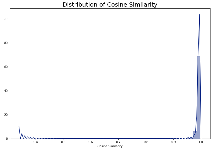
Indeed, it seems like the vast majority of the cosine similarity values are very high, with some smaller values in the left hand tail of the distribution. It’s hard to say exactly why this is the case. It could have something to do with the fact that the word vectors were undoubtedly built on data which are quite different than our rap lyrics corpus. One thing we might be seeing, therefore, is that the texts in our corpus are all quite similar to one another, because they are all rap album lyrics.
Do these cosine similarity values nevertheless differentiate between the albums in a meaningful way? We’ll see shortly in the network visualization (spoiler: yes!).
Step 4: Clean the Edge List Data Frame
We’re almost ready to make our network visualization, but our data still need some final touches before they are ready.
Let’s first clean up the year variable. As we saw in the blog post about cleaning the Pitchfork data, some albums have multiple years. This happens, for example, when an album is re-released. In such cases, we have both the year of the original release, and the year of the re-release. I harmonize these data with the code below, taking the minimum year for both the source and target albums.
We will also clean up one album title - Joey Badass’ album “B4.Da.$$”, whose creative spelling caused issues when plotting the network.
# get the minimum of the two year columns
edge_df['source_year_master'] = edge_df[['source_year1', 'source_year2']].min(axis = 1)
edge_df['target_year_master'] = edge_df[['target_year1', 'target_year2']].min(axis = 1)
# regex cleanup of Joey Badass' album "B4.Da.$$" which caused a problem when plotting
edge_df['source_album'] = edge_df['source_album'].str.replace(r'b4\.da\.\$\$', 'BADASS')
edge_df['target_album'] = edge_df['target_album'].str.replace(r'b4\.da\.\$\$', 'BADASS')
Next, we’ll categorize each album in our edge list according to the original Pitchfork review. We’ll use this information in our network visualization below.
Below, I use the Pandas’ qcut function to bin the source and target scores into 3 more-or-less equally-sized bins.
The following code tests out the binning, and shows that when we bin the source and target review scores, we end up with basically the same cut points.
# bin the source scores into 3 equal-sized groups
# using pandas qcut
pd.qcut(edge_df.source_score, 3).value_counts()
(6.6, 7.6]      1920
(0.799, 6.6]    1830
(7.6, 10.0]     1665
Name: source_score, dtype: int64
# bin the target scores into 3 equal-sized groups
pd.qcut(edge_df.target_score, 3).value_counts()
(0.999, 6.5]    1822
(6.5, 7.6]      1809
(7.6, 10.0]     1784
Name: target_score, dtype: int64
# assign quality labels to each album using
# the above binning method
edge_df['source_score_cut'] = pd.qcut(edge_df.source_score, 3, labels=['Bad', 'Good', 'Great'])
edge_df['target_score_cut'] = pd.qcut(edge_df.target_score, 3, labels=['Bad', 'Good', 'Great'])
There are two final issues that we need to address before making the network visualization:
- We have too many links to display. Our edge list data frame currently has 5,415 rows, and if we use this for the plot, it will look really messy. There’s simply too much information to present in a clean and simple way.
- The current data selection does not represent our analytical goal: to look at the influence of a rap album’s lyrics on lyrics used on subsequent albums. As we can see in the head of the data frame above, some source albums have release dates after the release dates of the target albums. This timing sequence is impossible, if we use the directed graph approach and posit a direct influence from the source to the target albums.
We can solve both of these problems by
- only keeping the top 2 source-target relationships for each source album and
- only keeping rows where the source year is less than the target year:
# limit the selection to the top 2 similar target albums for each
# source album and
# select rows where the target year is greater than the source year
# (definition of influence means later album can't influence earlier one)
edge_df_trim = edge_df[(edge_df.target_rank<3) & (edge_df.source_year_master< edge_df.target_year_master)]
edge_df_trim.shape
This leaves us with a final edge list with 831 rows. The head of our final edge list looks like this:
| source_id | source_album | source_artist | source_score | source_year1 | source_year2 | target_id | target_album | target_artist | target_score | target_year1 | target_year2 | target_rank | cosine_sim | source_year_master | target_year_master | source_score_cut | target_score_cut | |
|---|---|---|---|---|---|---|---|---|---|---|---|---|---|---|---|---|---|---|
| 100 | 22561 | death certificate | ice cube | 9.5 | 1991.0 | NaN | 20048 | ferg forever | a$ap ferg | 6.4 | 2014.0 | NaN | 1 | 0.994675 | 1991.0 | 2014.0 | Great | Bad |
| 101 | 22561 | death certificate | ice cube | 9.5 | 1991.0 | NaN | 18930 | piata | madlib, freddie gibbs | 8.0 | 2014.0 | NaN | 2 | 0.994550 | 1991.0 | 2014.0 | Great | Great |
| 135 | 22566 | blunted on reality | fugees | 7.6 | 1994.0 | 2016.0 | 5711 | street's disciple | nas | 7.2 | 2004.0 | NaN | 1 | 0.989205 | 1994.0 | 2004.0 | Good | Good |
| 136 | 22566 | blunted on reality | fugees | 7.6 | 1994.0 | 2016.0 | 13373 | slaughterhouse | slaughterhouse | 5.5 | 2009.0 | NaN | 2 | 0.987979 | 1994.0 | 2009.0 | Good | Bad |
| 275 | 22132 | things fall apart | the roots | 9.4 | 1999.0 | NaN | 4331 | power in numbers | jurassic 5 | 7.1 | 2002.0 | NaN | 1 | 0.992334 | 1999.0 | 2002.0 | Great | Good |
Part 3: Making the Network Graph and Visualization
Making the Network Graph Object with Networkx
We are now (finally) ready to make our network visualization! We will use the networkx package to create the network graph object, and pyvis to create an interactive visualization of the graph object.
The following code creates a directed network graph object with networkx. We specify the source (the source album), the target (the target album), and an edge attribute (the cosine similarity between the source and target albums’ document vectors, an index of the strength of “influence” from the source to the target albums):
import networkx as nx
g = nx.from_pandas_edgelist(edge_df_trim,
	'source_album',
	'target_album',
	edge_attr='cosine_sim')
len(g.nodes())
Our graph object has 815 nodes - quite a lot, but with an interactive visualization we can get away with this (it’s also possible to make static plots with the networkx library, but all of the nodes are very small and the text is mostly illegible).
Before we can go to pyvis, we need to add some meta-data about the rap albums to our networkx graph object, which we can then display in our visualization. Specifically, we want to indicate, for each node, the quality of the album as indexed by the Pitchfork review categories we defined above (Great, Good, and Bad). We also want to add the name of the artist and the album release year for each node in our network.
In order to add these meta-data to the networkx graph object, we need to define dictionaries with the name of the node (which is the album name in our case) as the key, and the meta-data as the values. Below, I create a dictionary with the name of the album as the key and the Pitchfork score category as the value. I then modify the Pitchfork score category to the color I want to display in the plot: green for “Great”, dark goldenrod for “Good” and red for “Bad”.
# make dictionaries for source and target albums
source_album_dict = pd.Series(edge_df_trim.source_score_cut.values,
					index=edge_df_trim.source_album).to_dict()
target_album_dict = pd.Series(edge_df_trim.target_score_cut.values,
					index=edge_df_trim.target_album).to_dict()

# concatenate the dictionaries
# https://stackoverflow.com/questions/38987/how-do-i-merge-two-dictionaries-in-a-single-expression
master_album_dict = {**source_album_dict, **target_album_dict}

# change the master album dict to have
# album: color attribute
mad2 = master_album_dict.copy()
for album, quality in mad2.items():
    if quality == "Great":
        mad2[album] = "green"
    elif quality == "Good":
        mad2[album] = "darkgoldenrod"
    elif quality == "Bad":
        mad2[album] = "red"

# display the first element of the dictionary
list(mad2.items())[0]
The first key-value pair in our dictionary is:
('death certificate', 'green')This refers to Ice Cube’s 1991 album “Death Certificate”, which Pitchfork thought was “Great”, and so this node will be colored in green.
We add this attribute to our networkx graph and give it the name “color”.
# set the node attribute color
# using the above dictionary mapping
nx.set_node_attributes(g, mad2, 'color')
We can then look and see the attributes for this node in our graph object:
g.nodes['death certificate']
Which returns:
{'color': 'green'}We have successfully added the color attribute, indicating the Pitchfork review score category for each album, to our network graph object.
Let’s add another attribute to our graph. In the pyvis example documentation, it states that we can add a “title” attribute, which will display data when one hovers over a node.
Below, I create a “title” attribute which links the album title with the artist name and the year of release (in a single character string):
# make dictionaries for source and target artists
source_artist_dict = pd.Series((edge_df_trim.source_artist + " (" +
		edge_df_trim.source_year_master.astype(int).astype(str) + ")").values,
		index=edge_df_trim.source_album).to_dict()
target_artist_dict = pd.Series((edge_df_trim.target_artist + " (" +
		edge_df_trim.target_year_master.astype(int).astype(str) + ")").values,
		index=edge_df_trim.target_album).to_dict()

# concatenate the dictionaries
master_artist_dict = {**source_artist_dict, **target_artist_dict}

# set the node title attribute
# using the above dictionary mapping
nx.set_node_attributes(g, master_artist_dict, 'title')
We can once again examine the attributes for Ice Cube’s “Death Certificate” album in our graph object:
g.nodes['death certificate']
Which returns:
{'color': 'green', 'title': 'ice cube (1991)'}We have successfully added our meta-data to the networkx graph object, and we are now ready to make our network visualization with pyvis.
Making the Interactive Network Visualization with Pyvis
Pyvis is a Python package to make interactive network visualizations. Pyvis can accept a networkx graph object, but there are some tweaks to be made in this process. I found this function on Github that makes it really easy to feed a networkx graph object to pyvis to make an interactive network visualization. We’ll use it below to make our plot:
# https://gist.github.com/maciejkos/e3bc958aac9e7a245dddff8d86058e17
def draw_graph3(networkx_graph,notebook=True,output_filename='graph.html',show_buttons=True,only_physics_buttons=False,
                height=None,width=None,bgcolor=None,font_color=None,pyvis_options=None):
    """
    This function accepts a networkx graph object,
    converts it to a pyvis network object preserving its node and edge attributes,
    and both returns and saves a dynamic network visualization.
    Valid node attributes include:
        "size", "value", "title", "x", "y", "label", "color".
        (For more info: https://pyvis.readthedocs.io/en/latest/documentation.html#pyvis.network.Network.add_node)
    Valid edge attributes include:
        "arrowStrikethrough", "hidden", "physics", "title", "value", "width"
        (For more info: https://pyvis.readthedocs.io/en/latest/documentation.html#pyvis.network.Network.add_edge)
    Args:
        networkx_graph: The graph to convert and display
        notebook: Display in Jupyter?
        output_filename: Where to save the converted network
        show_buttons: Show buttons in saved version of network?
        only_physics_buttons: Show only buttons controlling physics of network?
        height: height in px or %, e.g, "750px" or "100%
        width: width in px or %, e.g, "750px" or "100%
        bgcolor: background color, e.g., "black" or "#222222"
        font_color: font color,  e.g., "black" or "#222222"
        pyvis_options: provide pyvis-specific options (https://pyvis.readthedocs.io/en/latest/documentation.html#pyvis.options.Options.set)
    """

    # import
    from pyvis import network as net

    # make a pyvis network
    network_class_parameters = {"notebook": notebook, "height": height, "width": width, "bgcolor": bgcolor, "font_color": font_color}
    pyvis_graph = net.Network(**{parameter_name: parameter_value for parameter_name, parameter_value in network_class_parameters.items() if parameter_value})

    # for each node and its attributes in the networkx graph
    for node,node_attrs in networkx_graph.nodes(data=True):
        pyvis_graph.add_node(node,**node_attrs)

    # for each edge and its attributes in the networkx graph
    for source,target,edge_attrs in networkx_graph.edges(data=True):
        # if value/width not specified directly, and weight is specified, set 'value' to 'weight'
        if not 'value' in edge_attrs and not 'width' in edge_attrs and 'weight' in edge_attrs:
            # place at key 'value' the weight of the edge
            edge_attrs['value']=edge_attrs['weight']
        # add the edge
        pyvis_graph.add_edge(source,target,**edge_attrs)

    # turn buttons on
    if show_buttons:
        if only_physics_buttons:
            pyvis_graph.show_buttons(filter_=['physics'])
        else:
            pyvis_graph.show_buttons()

    # pyvis-specific options
    if pyvis_options:
        pyvis_graph.set_options(pyvis_options)

    # return and also save
    return pyvis_graph.show(output_filename)
We use this function to pass our networkx graph object to pyvis, saving the plot out to an html file and displaying it in the Jupyter notebook:
draw_graph3(g, height = '1000px', width = '1000px',
            show_buttons=False,
            output_filename='graph_output_lg.html', notebook=True)
Which reveals our network visualization of influential rap albums. The visualization is zoomable and clickable - hover over the nodes to reveal the artist and album release year.
Part 4: Some Observations About the Network Graph
The visualization is very rich, and contains lots of interesting patterns to explore. Below are some of my observations; please feel free to leave yours in the comments! (Note: I have manually added the artist and album release year to the pictures below. This information is shown on the interactive graph when you hover over the nodes. Also, the graph is initialized randomly each time it loads. The layout of the nodes below might not match exactly with the layout you see, though the links will be the same.)
- Albums by the same artist tend to cluster together. However, time period also plays a role, such that a given artist can have multiple clusters of their own albums, which seem to be organized by time periods. Let’s first take a look at single clusters of albums by a couple of artists.
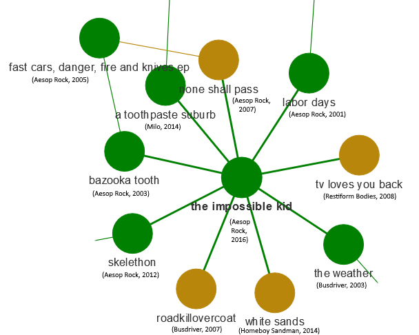
- Aesop Rock: In another interesting text analysis of rap lyrics, Aesop Rock was found to have the largest vocabulary among rappers over the past 40 years. The current analysis shows that Aesop Rock’s albums are similar to one another linguistically. We see his albums the Impossible Kid, None Shall Pass, Labor Days, Bazooka Tooth, and Skelethon all in the same cluster. It’s interesting to see which other artists are linked to this cluster: namely, Homeboy Sandman and Busdriver (a close second to Aesop Rock in the analysis of rappers’ vocabularies). This makes sense to me - compared to many mainstream rap artists, Aesop Rock, Homeboy Sandman and Busdriver tend to tackle different subjects and have a different way of using language (Aesop Rock and Homeboy Sandman have even collaborated in the past).
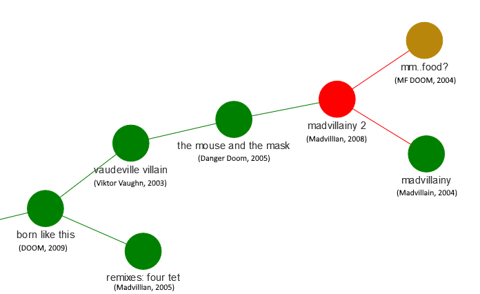
- MF DOOM: MF DOOM is a personal favorite of mine, and we’ve examined his lyrics in a previous post. In the picture below, we can see a cluster of DOOM albums (some under pseudonyms or with collaborators) that were released between 2003 and 2009: Born Like This, Vaudeville Villain, Mouse and the Mask, Madvillainy and Madvilliany 2, and mm.. Food?. This is an incredible streak of great albums by MF DOOM, and they all seem to group together linguistically, indicating similar themes running through these albums.
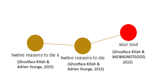
- Ghostface Killah: Ghostface is a rapper with a long discography, and his albums are grouped together in a number of different clusters in our network visualization. Below we can see a grouping of 3 albums released within a 2-year window. These are collaborations with Adrien Younge (Twelve Reasons to Die) and BADBADNOTGOOD (Sour Soul), and represent a shift stylistically and linguistically from Ghostface’s albums from the previous decade.
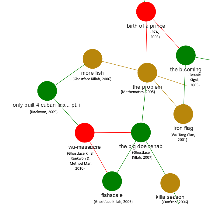
- Albums from the same time period cluster together. This could indicate that there are certain linguistic themes that come and go, making albums from the same time period more similar linguistically than those across different time periods. Let’s return to our example of Ghostface Killah: his mid-2000’s output appears together in another cluster (Fishscale, More Fish, The Big Doe Rehab), along with other albums from the same period. Among these neighboring albums, we find ones on which Ghostface is featured prominently (Only Built 4 Cuban Linx… Pt. II and Wu-Massacre), along with 2000’s releases from the full Wu-Tang Clan (Iron Flag) and RZA (Birth of a Prince). The analysis is clearly picking up on linguistic themes common to Ghostface and Wu-Tang Clan members at a specific time period.
- There are some artists (also anchored to time periods) that linguistically very distinctive. These artists’ albums are related to one another, but not other albums in the database. In other words, these albums are very “original,” in that they are linguistically distinct from other mainstream rap albums.
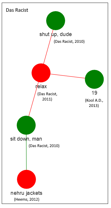
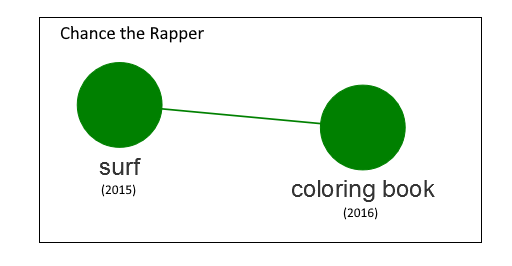
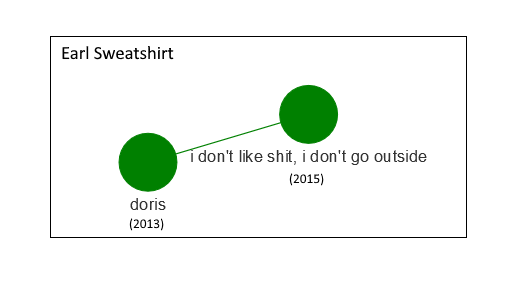
- Some original artists with their own separate clusters are Earl Sweatshirt (2013-2015), Chance the Rapper (2015-2016) and Das Racist (along with solo albums from two members of the group: Heems’ Nehru Jackets and Kool A.D.’s 19; 2010-2013). I would totally agree that these albums are a bit off in left-field, lyrically speaking, when compared to much mainstream rap:
- Albums in centers of networks are frequently colored in red, meaning that Pitchfork thought they were relatively bad. Perhaps it’s the case that such albums, which are influenced by multiple previous albums, can be derivative and unorginal. Let’s examine a single case, that of Bun B’s 2010 album “Trill O.G.”
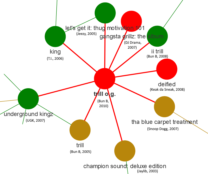
Our data analysis shows that this album’s lyrics are influenced by a number of Bun B’s previous albums (Trill and II Trill), as well as a number of other albums (all from the 2000’s, most from after 2005). We also know that Pitchfork didn’t think very highly of the album. What does the Pitchfork review say?
"But on Trill O.G., that eternal baritone-rumble feels tired and beaten-down. He's no longer packing his verses with tricky internal rhymes, and everything he says feels like something he's said better before...

Besides that, there's a weird outdated feel to the album; too many of the songs feel like attempts to cross over to a rap mainstream that barely exists anymore...

Bun is content to plug away at the same model, with diminishing returns. It's a shame."
Very interesting - the pattern suggested by the data analysis (the album’s lyrics are similar to many previous albums, including Bun B’s own work) seems to mirror what the Pitchfork reviewer is saying (the artist is repeating himself and the work immitates an “older” style that is no longer in vogue).
Summary and Conclusion
In this post, we analyzed data from two sources: Pitchfork music reviews of rap albums, and the lyrics from these same rap albums. We used pre-trained word vectors from spaCy to create document vectors for each album’s lyrics, and computed the linguistic similarity between albums, based on the document vectors. We used these similarity scores to make a network visualization of how rap albums influence one another across time.
The network visualization indicated a number of interesting relationships. In particular, albums seem to cluster together by artist and time period. This is perhaps because there are certain linguistic themes that are characteristic of artists within specific time periods. These themes come and go, and this is evident in the lyrics and picked up by our document vector analysis. The interactive network visualization provides an overview of the patterns of linguistic influence of rap albums within the time period contained in the Pitchfork data set (e.g. albums released or re-issued between 1999 and 2017).
This post was written during the Coronavirus lockdown in April 2020. It is also (therefore?) very long. There’s a lot of detail here- I wanted to make a fully reproducible guide for a crazy data analysis. Also, data scientists don’t often describe the details of the work that goes into doing data analysis. Hopefully some parts of this will be useful to someone out there. It was also a fun project for me to do, and it kept my mind occupied during a very hectic time.
Coming Up Next
In our next post, we will return to the network graph we created above. We will use community detection to extract groupings of albums within our network, and create a visualization which displays album community membership in our network structure.
Stay tuned!