Sentiment Use Across the Course of Pitchfork Music Reviews: A Tidy Text Analysis with R
In this post, we’ll return to the Kaggle data containing information on Pitchfork music reviews. In a previous post, I used this dataset to cluster music genres. In the current post, I will use R and the tidytext package (and philosophy) to examine the text of the music reviews. Specifically, the goal of the analysis described in this post will be to track the course of positive and negative sentiment use across the length of the review texts.
The Data
The data are available on the Kaggle website. I did an extensive data munging exercise to clean and prepare the data for analysis. As noted in the previous post using these data, some of the music reviews are assigned multiple genres. As we will later be interested in examining sentiment use in the different genres, I excluded reviews with more than 1 genre from the scope of this analysis, leaving us with 12,147 review texts. In this post we will focus on 3 columns in our dataset: one column containing a unique review identifier, one column with the review text, and one column that contains the genre of the album being reviewed (with the following options: electronic, experimental, folk/country, global, jazz, metal, pop/rnb, rap and rock).
The tidytext Approach
In order to prepare our data for analysis, we must turn it into a tidy dataset. The basic idea behind the tidytext framework is that we represent our data with 1 line per token (a sub-division of a longer text, typically but not always a single word), keeping track of important meta-data (e.g. the id number of the review the word appears in) in additional columns.
I was first introduced to this way of thinking about text analysis at Julia Silge’s excellent talk at the useR conference in Brussels last June. I have done lots of text analysis (with R and Python), and I have always used the “bag of words” framework, in which each text is kept in a single line of the dataset. This traditional approach is very handy when doing, for example, predictive analysis with text. However, the tidytext philosophy lets us think about and analyze our data in a slightly different way. Check out the excellent tidytext book, available freely online, for a thorough overview of the approach and its implementation in R.
One of the advantages of the tidytext approach is that it retains information about word order that is lost when using the bag of words approach. A nice illustration of using word order in quantitative text analysis is described in the tidytext book and vignette. This analysis examines the balance of emotion words across the course of each of Jane Austen’s novels. I was inspired by this approach, and the current post is an adaptation of this idea, applied to Pitchfork music reviews.
Data Preparation
The head of our raw dataset (called text_df), which serves as the input for our analysis, looks like this:
| line | text | genre | |
|---|---|---|---|
| 1 | 1 | “Trip-hop” eventually became a ’90s punchline, a music-press shorthand for “overhyped hotel lounge music.”... | electronic |
| 2 | 2 | Eight years, five albums, and two EPs in, the New York-based outfit Krallice have long since shut up purists about their “hipster black metal.” ... | metal |
| 3 | 3 | Minneapolis’ Uranium Club seem to revel in being aggressively obtuse... | rock |
| 4 | 4 | Kleenex began with a crash. It transpired one night not long after they’d formed, in Zurich of 1978... | rock |
| 5 | 5 | It is impossible to consider a given release by a footwork artist without confronting the long shadow cast by DJ Rashad’s catalog... | electronic |
| 6 | 6 | Rapper Simbi Ajikawo, who records as Little Simz, is by all measures on an upward trajectory... | rap |
The column “line” serves as an indicator of the review id. The column “text” contains the text of the review and the “genre” column indicates the genre.
We will first turn our raw data into a tidy text dataframe (as explained in the tidytext vignette):
# load the packages we'll be using
library(plyr); library(dplyr)
library(tidytext)
library(tidyr)
library(ggplot2)
# unnest to one line
# https://cran.r-project.org/web/packages/tidytext/vignettes/tidytext.html
tidy_reviews <- text_df %>% unnest_tokens(word, text)
Our data have now been transformed into a tidy format (only first 10 rows shown):
| line | genre | word | |
|---|---|---|---|
| 1 | 1 | electronic | trip |
| 2 | 1 | electronic | hop |
| 3 | 1 | electronic | eventually |
| 4 | 1 | electronic | became |
| 5 | 1 | electronic | a |
| 6 | 1 | electronic | 90s |
| 7 | 1 | electronic | punchline |
| 8 | 1 | electronic | a |
| 9 | 1 | electronic | music |
| 10 | 1 | electronic | press |
As shown above, our data now contains one word per line, and our meta-data (review id and genre) are contained in two additional columns. Note that, by default, the unnest_tokens function removes punctuation and converts all letters to lower case.
Unnesting our text data gives us a narrow but extremely long dataframe. Specifically, our dataframe contains as many rows as there are words in the 12,147 reviews: 8,182,882 to be precise!
As we are interested in understanding the course of emotional valence throughout the texts, we will add a column indicating the order of the words within each review, which I will call “position_in_review_0.”
# add position within review text
tidy_reviews <- tidy_reviews %>% group_by(line) %>%
	mutate(position_in_review_0 = 1:n())
Our dataset, called tidy_reviews, now looks like this (only first 10 rows shown):
| line | genre | word | position_in_review_0 | |
|---|---|---|---|---|
| 1 | 1 | electronic | trip | 1 |
| 2 | 1 | electronic | hop | 2 |
| 3 | 1 | electronic | eventually | 3 |
| 4 | 1 | electronic | became | 4 |
| 5 | 1 | electronic | a | 5 |
| 6 | 1 | electronic | 90s | 6 |
| 7 | 1 | electronic | punchline | 7 |
| 8 | 1 | electronic | a | 8 |
| 9 | 1 | electronic | music | 9 |
| 10 | 1 | electronic | press | 10 |
We can see that the data contain stopwords (words which occur frequently but contain no meaningful content such as “the”, “a” etc.). Before we continue, let’s remove these stopwords. In the tidytext approach, this is done with an anti-join of our tidy text dataframe against a tidy dataframe containing a list of stopwords. We then order the dataset by the review id (called line) and by the word order position (position_in_review_0) in the raw data. We create a new word order variable, called position_in_review, which gives the position of each word in the cleaned data (without stopwords), while removing the position_in_review_0 variable created above.
# remove stop words
# order the dataset by review id
# and the order of the remaining words
# in the original dataset
cleaned_reviews <- tidy_reviews %>%
	anti_join(stop_words) %>% arrange(line, position_in_review_0)

# add position of word within cleaned review
# we also remove the first word order column
# (position_in_review_0) created above
cleaned_reviews <- cleaned_reviews %>% group_by(line) %>%
	mutate(position_in_review = 1:n()) %>% select(-position_in_review_0)
The data (called cleaned_reviews) now look like this (only first 10 rows shown):
| line | genre | word | position_in_review | |
|---|---|---|---|---|
| 1 | 1 | electronic | trip | 1 |
| 2 | 1 | electronic | hop | 2 |
| 3 | 1 | electronic | eventually | 3 |
| 4 | 1 | electronic | 90s | 4 |
| 5 | 1 | electronic | punchline | 5 |
| 6 | 1 | electronic | music | 6 |
| 7 | 1 | electronic | press | 7 |
| 8 | 1 | electronic | shorthand | 8 |
| 9 | 1 | electronic | overhyped | 9 |
| 10 | 1 | electronic | hotel | 10 |
Our goal was to preserve the word order so that we can track the use of emotion words across the course of the review texts. The steps necessary to achieve this were somewhat involved, but we have reached our goal. We have retained the important words in the texts and, for each word, we have created a record of its position in the review.
As the reviews have differing numbers of words, we cannot simply compare the evolution of sentiment use across word number. Therefore, we will count the number of words in each review, and for each word, calculate its position in terms of its percentage in the words of the text. This will result in 101 different levels representing word position for each text (because we go from 0 to 1 in increments of .01). We will eventually aggregate the data to this level, making it possible to visualize the use of emotion words across the different percentages of the review texts.
# count the number of remaining words for each review
# and calculate the percentage within each review
# that each word falls in
cleaned_reviews <- cleaned_reviews %>% group_by(line) %>%
	mutate(wordcount_review = n(),
	percentage_in_review = round(position_in_review/wordcount_review,2))
Our data now look like this (only first 10 rows shown):
| line | genre | word | position_in_review | wordcount_review | percentage_in_review | |
|---|---|---|---|---|---|---|
| 1 | 1 | electronic | trip | 1 | 746 | 0 |
| 2 | 1 | electronic | hop | 2 | 746 | 0 |
| 3 | 1 | electronic | eventually | 3 | 746 | 0 |
| 4 | 1 | electronic | 90s | 4 | 746 | 0.01 |
| 5 | 1 | electronic | punchline | 5 | 746 | 0.01 |
| 6 | 1 | electronic | music | 6 | 746 | 0.01 |
| 7 | 1 | electronic | press | 7 | 746 | 0.01 |
| 8 | 1 | electronic | shorthand | 8 | 746 | 0.01 |
| 9 | 1 | electronic | overhyped | 9 | 746 | 0.01 |
| 10 | 1 | electronic | hotel | 10 | 746 | 0.01 |
Intermezzo: Coding Sentiment With Dictionaries
There are a number of different ways of analyzing sentiment in text. One common approach is to use dictionaries, which contain pre-defined lists of words which are categorized as belonging to a particular type of higher-level characteristic we wish to understand (e.g. in the case of sentiment - positive, negative, or more fine-grained such as excitement, anxiety, etc.).
In this post, we will use a dictionary set included in the tidytext package and which is described in the tidytext book and vignette. Specifically, we will use the positive and negative sentiment words contained in the “bing” dictionaries. For more information about the bing dictionaries, you can check out these excellent blog posts, consult the tidytext book or vignette, or type ?sentiments in the R console (with the tidytext package loaded). One thing to keep in mind is that the bing dictionaries contain many more negative words than positive words:
# count of positive/negative sentiment
# in bing dictionaries
get_sentiments("bing") %>% count(sentiment)
Which returns:
| sentiment | n | |
|---|---|---|
| 1 | negative | 4782 |
| 2 | positive | 2006 |
Indeed, there are more than twice as many negative than positive words in the bing dictionaries.
Let’s look at the most frequent positive and negative words from the bing dictionaries in our review data. We can make a word cloud with code directly adapted from the tidytext vignette to do this:
# plot most frequent positive/negative words
# with wordcloud
library(reshape2)
library(wordcloud)

cleaned_reviews %>%
	inner_join(get_sentiments("bing"), by = "word") %>%
	count(word, sentiment, sort = TRUE) %>%
	acast(word ~ sentiment, value.var = "n", fill = 0, fun.aggregate = length) %>%
	comparison.cloud(colors = c("#F8766D", "#00BFC4"),
	max.words = 150, title.size = 1, scale=c(3.5,1))
Which gives us the following plot:
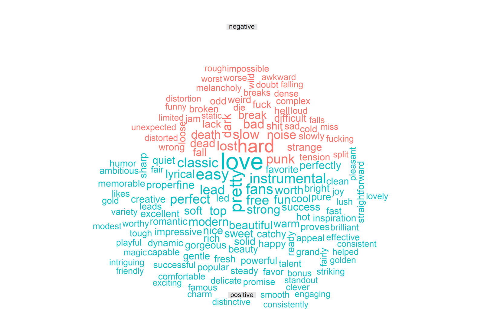
The vast majority of the words make sense to me, and seem to capture positive and negative things one could say about music in the context of an album review. It is amusing to see that “punk” is classified as negative, which makes sense in many contexts but is a bit off here. This is the downside of using general-purpose text classification dictionaries; overall they can perform quite well but they are by design not adapted for the specifics of every corpus. Despite these small imperfections, the above visualization makes clear that the bing dictionaries are picking up on meaningful indicators of sentiment in the Pitchfork reviews.
Note that, in the analysis below, I will treat positive and negative sentiment separately. The analysis presented in the tidytext vignette analyzes an overall sentiment score (e.g. sentiment = positive - negative). However, this seems strange to me for 2 reasons. First, as we saw above, there are twice as many negative (vs. positive) words in the bing corpus. Second, there is a large literature in psychology that suggests that positive and negative affect are orthogonal (independent); this logic underpins the measurement of affect in the widely used PANAS questionnaire, for example.
Let’s then apply these dictionaries to our data, in order to extract both positive and negative sentiment at each percentage of our review texts.
Finishing the Munging
We will conduct all of the necessary steps in a single dplyr chain. First, we merge in the sentiment dictionaries, retaining only the words classified as positive or negative. We then count the number of positive and negative words at each percentage in the reviews; this counting is done separately for each percentage of each review. We then aggregate the data by genre and percentage of the review text. Specifically, for each genre, we calculate the average number of positive and negative words that occur at each percentage in the review text.
pitchfork_sentiment <- cleaned_reviews %>%
	# code the words according to the positive/negative bing sentiment dictionaries
	inner_join(get_sentiments("bing"), by = "word") %>%
	# count the number of pos/neg words at each percentage of each review
	count(genre, index = percentage_in_review, sentiment) %>%
	# put the pos/neg counts into their own columns
	spread(sentiment, n, fill = 0) %>%
	# for each genre, compute the average number of pos/neg words
	# used at each percentage of the review texts
	group_by(genre, index) %>%
	summarize(mean_negative = round(mean(negative, na.rm = TRUE),2),
		mean_positive = round(mean(positive, na.rm = TRUE),2))
The resulting dataset, called pitchfork_sentiment, looks like this (only first 10 rows shown):
| genre | index | mean_negative | mean_positive | |
|---|---|---|---|---|
| 1 | electronic | 0 | 0.67 | 0.35 |
| 2 | electronic | 0.01 | 0.61 | 0.54 |
| 3 | electronic | 0.02 | 0.61 | 0.59 |
| 4 | electronic | 0.03 | 0.62 | 0.54 |
| 5 | electronic | 0.04 | 0.64 | 0.53 |
| 6 | electronic | 0.05 | 0.56 | 0.59 |
| 7 | electronic | 0.06 | 0.62 | 0.55 |
| 8 | electronic | 0.07 | 0.64 | 0.56 |
| 9 | electronic | 0.08 | 0.63 | 0.56 |
| 10 | electronic | 0.09 | 0.58 | 0.58 |
Our data contains 9 genres, with 101 rows per genre (because we go from 0 to 1 in increments of .01), resulting in 909 total rows.
Visualizing Emotional Valence Across the Album Reviews
We will produce our plots using the excellent ggplot2 package, which also is built according to the tidy data philosophy. From the tidy perspective, our data are problematic in that the values we want to visualize (mean_positive and mean_negative) are contained in two different columns. Therefore, in order to plot using ggplot2, we must transform our data from a wide to a long format, putting our observations in a single column, with an additional column containing the sentiment type (positive or negative).
We can achieve this using code taken directly from the gather help page from the tidyr package (check out this webpage or type ?gather with the tidyr package loaded):
# make the wide to long data
# (from the "gather" help page in tidyr)
long_sentiment_by_genre <- gather(pitchfork_sentiment, key,
	value, -genre, -index)
Which gives us (only first 10 rows shown):
| genre | index | key | value | |
|---|---|---|---|---|
| 1 | electronic | 0 | mean_negative | 0.67 |
| 2 | electronic | 0.01 | mean_negative | 0.61 |
| 3 | electronic | 0.02 | mean_negative | 0.61 |
| 4 | electronic | 0.03 | mean_negative | 0.62 |
| 5 | electronic | 0.04 | mean_negative | 0.64 |
| 6 | electronic | 0.05 | mean_negative | 0.56 |
| 7 | electronic | 0.06 | mean_negative | 0.62 |
| 8 | electronic | 0.07 | mean_negative | 0.64 |
| 9 | electronic | 0.08 | mean_negative | 0.63 |
| 10 | electronic | 0.09 | mean_negative | 0.58 |
Our numeric data on both positive and negative sentiment are now contained in a single column (called value) while the sentiment type (called key) is contained in a separate column.
Our input dataframe (pitchfork_sentiment) had 909 rows, and because each row had a value for both positive and negative sentiment, our long dataframe (called long_sentiment_by_genre) has 1,818 rows.
Overall Trends
We are now ready to plot the average number of positive and negative sentiment words across the course of the reviews. We’ll first produce a plot of the overall data (not split by genre), using loess regression to visualize the overall trends per sentiment type. Note that I set the limits of the y axis to focus on the loess regression lines:
# plot the positive vs. negative sentiment across review percentage
ggplot(long_sentiment_by_genre, aes(index * 100, value, color = key)) +
	geom_point() +
	geom_smooth(method="loess") +
	coord_cartesian(ylim = c(.5, .7)) +
	labs(x = "Percentage of Review Text",
	y = "Mean Number of Positive & Negative Words" ) +
	scale_color_manual(name="Sentiment",
	breaks=c("mean_negative", "mean_positive"),
	labels=c("Negative", "Positive"),
	values = c("#F8766D", "#00BFC4"))
Which produces the following plot:
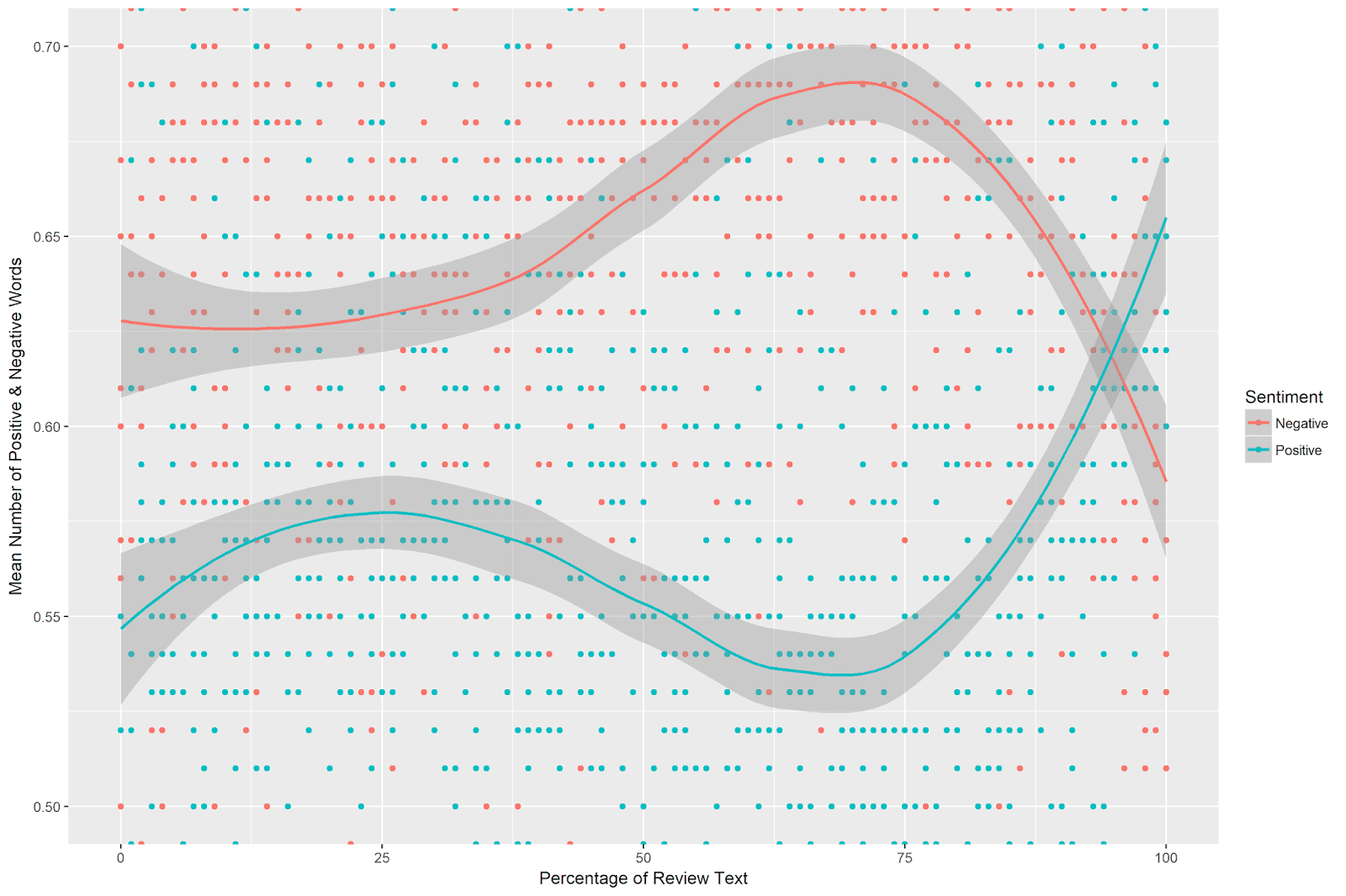
This is quite interesting. There is a clear pattern of positive and negative sentiment use across the album reviews. Negative sentiment use is flat for around the first 45 percent of the review text, after which it increases, peaking just shy of the 75th percentile of the reviews. After peaking, the use of negative sentiment plummets sharply, ending lower than its starting point.
Positive sentiment, meanwhile, increases slightly at around 1/4 of the review text. It then decreases, reaching a low point at around 70%. From around the 75th percentile of the review texts, positive sentiment use increases sharply and ends far above its starting point.
When comparing the trends of positive and negative sentiment, there is a clear divergence just short of the 75th percentile of the album review texts. At this point, negative sentiment increases, while positive sentiment decreases. After the 75th percentile, these trends reverse, and the review texts end with more positive than negative sentiment.
Trends by Genre
We can also examine the course of positive and negative sentiment across the reviews for the different genres. This requires just a slight modification of the above code to use genre as a facet (note I again specify the range of the y-axis in the plot to highlight the trends):
# separate plots per genre
ggplot(long_sentiment_by_genre, aes(index, value, color = key)) +
	geom_point() +
	geom_smooth(method="loess") +
	coord_cartesian(ylim = c(.45, .8)) +
	labs(x = "Percentage of Review Text",
		y = "Mean Count Positive & Negative Sentiment" ) +
	scale_color_manual(name="Emotional\nValence",
	breaks=c("mean_negative", "mean_positive"),
	labels=c("Negative", "Positive"),
	values = c("#F8766D", "#00BFC4")) +
	facet_wrap(~genre, ncol = 3, scales = "free_x")
Which yields the following plot:
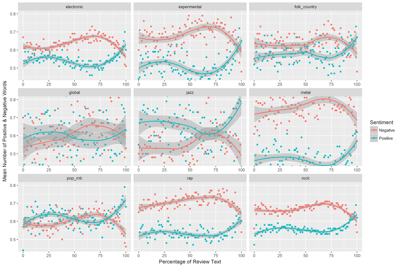
The increase in negative sentiment and the decrease in positive sentiment just shy of 75% (and subsequent reversal of this trend) is evident across genres. The relative levels of positive and negative sentiment, however, differ across genres. Interestingly, jazz is the only genre for which positive sentiment use is consistently higher than negative sentiment use.
Caveats and Limitations
Dictionary Considerations
One striking pattern in the data was that negative sentiment use was consistently higher than positive sentiment use. Do the Pitchfork reviews really contain more negative than positive sentiment? I think that it’s important to keep in mind that the bing sentiment dictionaries contain twice as many negative as positive words. One alternative interpretation of the difference in mean levels of positive vs. negative sentiment, therefore, is that we have an easier time detecting negative sentiment (because we have many more negative words in our dictionary) than positive sentiment (which has half as many words). In sum, it’s hard to say from these data whether the Pitchfork music reviews are really more negative than positive overall.
Effect Size
We saw in the above figures that positive and negative sentiment dipped and peaked across the review texts. How large are these decreases and increases in sentiment use? This question relates to the effect size of the observed trends in emotion use across the review texts.
One way to interpret observed effect sizes is by using domain knowledge, e.g. expertise accumulated through previous work in the domain. Unfortunately, we’re using a very specific metric here (mean number of words across percentages of a text), and I don’t know of any existing studies using this type of coding. This is the first time I myself have used this approach!
For classical statistical models, there are statistical definitions of effect size, but these do not apply to the type of local regression (loess) models we are using here.
One principal that I’ve heard mentioned a number of times is that an effect worth considering should be visible with the naked eye. The trends are quite striking in the above plots, but I’ve set the axes in such a way that the differences are highlighted. What happens if we plot the data, but allow the y-axis to be defined by the minimum and maximum observed values of mean positive and negative sentiment? (Note that this approach parallels the underlying logic of most measures of effect size, which compare observed differences scaled to some measure of variation in the data.)
The plot (obtained by using the above code with the coord_cartesian command removed) looks like this:
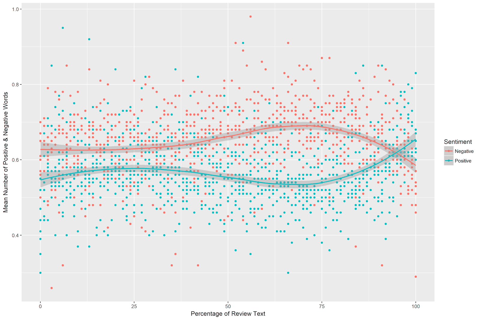
The patterns still looks clear to me. Even when shown across the observed values of mean sentiment, the divergence and subsequent reversal in sentiment use is easily observable.
Conclusion
In summary, in this post we examined the use of positive and negative sentiment words across the course of Pitchfork album reviews. We first turned our raw data (with one review per line) into a tidy text dataframe (with one word per line). We then removed stopwords and calculated the position of each word in terms of its percentage in the review text. Next, we calculated the mean positive and negative sentiment words at each percentage of the review texts for each genre separately. Finally, we visualized the overall trends of positive and negative sentiment across the review texts, and also examined these trends separately across genres.
There were clear patterns for positive and negative sentiment use. Positive sentiment reached its lowest point just short of the 75th percentile of the review texts, after which it sharply increased. Negative sentiment peaked just shy of the 75th percentile, after which it sharply decreased. In sum, it appears that Pitchfork music reviews increase in negativity and decrease in positivity around 75the percentile of the review texts, after which they become much less negative and much more positive (in essence ending on a positive note).
Coming Up Next
In the next post, I will continue exploring the Pitchfork music reviews with the tidyext package. Specifically, we will examine how word usage differs according to the genre of the album being reviewed.
Stay tuned!