Analyzing Wine Data in Python: Part 3 (Text mining & Classification)
In the previous two posts, I described some analyses of a dataset containing characteristics of 2000 different wines. We used easily-analyzable data such as year of production and appellation region to predict wine price (a regression problem) and to classify wines as red vs. white (a classification problem).
[Edit: the data used in this blog post are now available on Github.]
In this blog post, we will again use the wine dataset and the random forest algorithm to classify wines as red vs. white. However, in contrast to the previous two blog posts in which we used features of the type traditionally used in statistical and data analysis (e.g. quantitative information such as year of production or categorical variables with a limited number of levels), in this post we will use words describing the wine (the “Winemaker’s Notes”) as input for our classification model. We will again use Python for our analysis.
As described in the previous posts, the dataset contains information on 2000 different wines. Half of these wines are red wines, and the other half are white. The dataset also contains “Winemaker’s Notes” for each wine. These texts are provided by the vintner and aim to describe the wine in an appealing way. I see them as being partly descriptive of the characteristics of the wine, and partly a marketing text use to stimulate wine purchase.
Here is an example of the Winemaker’s Notes for one of the wines in the dataset:
"Bright violet-red color extends to primary aromatics revealing chocolate covered cherries and suggestions of smoke and cedar. A purposefully elegant tannin profile puts this Merlot in an entirely new category, providing an ultra-smooth character that will appeal to all palates. Naughty and nice, a true Velvet Devil. Blend: 91% Merlot, 9% Cabernet Sauvignon."Data Pre-Processing
One of the challenges of text analysis involves extracting information from the texts in such a way that they can be used in a data analytic (and, in our case, a predictive modeling) setting. The approach described in this blog post can broadly be described as making use of the bag-of-words model. First, we will process the text in order to make all letters lowercase, remove numbers, and stem the words. We will then extract individual words (unigrams) to create a document-term-matrix (dtm) which will constitute the feature matrix for our classification model. This dtm will have 2000 rows, one for each wine. The terms (e.g. words in the texts) will be contained in the columns of the matrix, with each word represented by one column.
Let’s first import the main libraries we’ll need:
import pandas as pd
from nltk.corpus import stopwords
import numpy as np
import seaborn as sns
from nltk.stem.porter import *
stemmer = PorterStemmer()
The nltk library has a number of interesting functions for text analysis. We will use a mix of the nltk library and functions available in the sklearn library to conduct the analysis. (If you’re interested in understanding computer science approaches to language analysis, I can recommend the freely-available book Natural Language Processing with Python, written by the authors of the nltk library).
In order to process the text, we’ll define a function to do so. This code is adapted from this wonderful tutorial. In sum, we keep only the text, turn all the letters to lowercase, remove stop words (e.g. words that occur frequently but have no substantive content such as “the”), and stem the words (e.g. remove the ending of words to retain only the root form).
# Function to convert a raw text to a string of words
# The input is a single string (a raw text), and
# the output is a single string (a preprocessed text)

def text_to_words(raw_text):
	# 1. Remove non-letters
	letters_only = re.sub("[^a-zA-Z]", " ", raw_text)
	# 2. Convert to lower case, split into individual words
	words = letters_only.lower().split()
	# 3. Remove Stopwords. In Python, searching a set is much faster than
	# searching a list, so convert the stop words to a set
	stops = set(stopwords.words("english"))
	# 4. Remove stop words
	meaningful_words = [w for w in words if not w in stops]
	# 5. Stem words. Need to define porter stemmer above
	singles = [stemmer.stem(word) for word in meaningful_words]
	# 6. Join the words back into one string separated by space,
	# and return the result.
	return( " ".join( singles ))
In order to get a sense of what the function does, let’s take the 5th Winemaker’s Notes in the dataset, and examine the original vs. processed text. The original text was already shown above, but let’s look at it again to compare it with the processed version.
# what does the function do?

# fifth text, unprocessed
print(wine_data.Winemakers_Notes[5])
# fifth text, processed
print(text_to_words(wine_data.Winemakers_Notes[5]))
Raw Text:
Bright violet-red color extends to primary aromatics revealing chocolate covered cherries and suggestions of smoke and cedar. A purposefully elegant tannin profile puts this Merlot in an entirely new category, providing an ultra-smooth character that will appeal to all palates. Naughty and nice, a true Velvet Devil. Blend: 91% Merlot, 9% Cabernet Sauvignon Processed Text:
bright violet red color extend primari aromat reveal chocol cover cherri suggest smoke cedar purpos eleg tannin profil put merlot entir new categori provid ultra smooth charact appeal palat naughti nice true velvet devil blend merlot cabernet sauvignonWe can see the effects of putting letters to lowercase, removing the stop words and also the stemming. The text is much less readable, but the goal here is to reduce the information in the text to the most essential elements in order to use it for analysis. Now that we have seen what the pre-processing function does, let’s apply this method to all of the Winemaker’s Notes in our dataset:
# apply the function to the winemaker's notes text column
# using list comprehension
processed_texts = [text_to_words(text) for text in wine_data.Winemakers_Notes]
Now that text is processed, we need to prepare the data for modeling. We will use the sklearn function CountVectorizer to create the document-term matrix, which as noted above will contain documents in the rows and words in the columns. We will extract single words here, though other types of text features such as bi-grams (two word combinations such as “Nappa Valley”) or tri-grams (three word combinations) can be extracted and used as input for the model.
In this blog post, we will create binary indicators for each word. If a word is present in a given document, it will be represented as a “1” in the document-term matrix, regardless of how many times the word appeared in that document. If a word is not present in a given document, it will be represented as a “0” in the dtm. Other possibilities for word representation include: the count of each word in the document, “normalized” counts (e.g. the term count divided by the total word count in the document), and the term-frequency inverse-document frequency (tf-idf) value for each word. All can be useful and are relatively easy to implement in Python, but for this example we’ll stick with binary indicators for their ease of implementation and their straightforward interpretation.
Finally, we will make a selection of words to include as predictors. Document-term matrices can often be very wide (e.g. with a great many terms in the columns, depending on the corpus or body of texts analyzed) and very sparse (as there are typically many terms which occur infrequently, and therefore provide little information). Dealing with these wide, sparse matrices is a key challenge in text analysis.
There are a number of ways to reduce the feature space by selecting only the most interesting or important words. We can set thresholds for any one of a number of different metrics which assess how “important” a given word is in a collection of documents. Word frequency, the number of documents a word appears in, and tf-idf scores can all be used to make this selection. In this example, we will simply set a minimum threshold for the number of documents a word must appear in before it is included in our dtm. Below, I set this value to 50: a word is included in our extracted document-term matrix if it appears in at least 50 of our 2000 different Winemaker’s Notes texts:
# For predictive modeling, we would like to encode the top words as
# features. We select words that occur in at least 50 documents.
# We use the "binary = True" option to create dichotomous indicators.
# If a given text contained a word, the variable is set to 1, otherwise 0
# The ngram_range specifies that we want to extract single words
# other possibilities include bigrams, trigrams, etc.

# define the count vectorizer
from sklearn.feature_extraction.text import CountVectorizer
vectorizer_count = CountVectorizer(ngram_range=(1, 1),
	min_df = 50, binary = True)

# and apply it to the processed texts
pred_feat_unigrams = vectorizer_count.fit_transform(processed_texts)
We can print the shape of the processed text vector with this call: print(pred_feat_unigrams.shape). In this case, with a minimum document frequency requirement of 50, we extract 307 words from these data.
Let’s see what the most common words are. We are extracting binary indicators here, so our code will return the number of documents (out of the 2000 available in the dataset) that contain the most-frequent words. We’ll first create a sorted dataframe with this information:
# turn the dtm matrix to a numpy array to sum the columns
pred_feat_array = pred_feat_unigrams.toarray()
# Sum up the counts of each word
dist = np.sum(pred_feat_array, axis=0)
# extract the names of the features
vocab = vectorizer_count.get_feature_names()
# make it a dataframe
topwords = pd.DataFrame(dist, vocab, columns = ["Word_in_Num_Documents"])
# add 'word' as a column
topwords = topwords.reset_index()
# sort the words by document frequency
topwords = topwords.sort_values(by = 'Word_in_Num_Documents',
	ascending=False)
Now let’s make a plot of the top 15 words which occur most frequently in the 2000 Winemaker’s Notes. (I’ve tried to define a color-scheme that is somewhat wine-colored!)
# plot the top 15 words

# set the palette for 15 colors
current_palette = sns.cubehelix_palette(15, start = .3, reverse=True)
sns.set_palette(current_palette, n_colors = 15)

# plot the top words and set the axis labels
topwords_plot = sns.barplot(x = 'index', y="Word_in_Num_Documents",
	data=topwords[0:15])
topwords_plot.set(xlabel='Word')
topwords_plot.set(ylabel='Number of Documents') 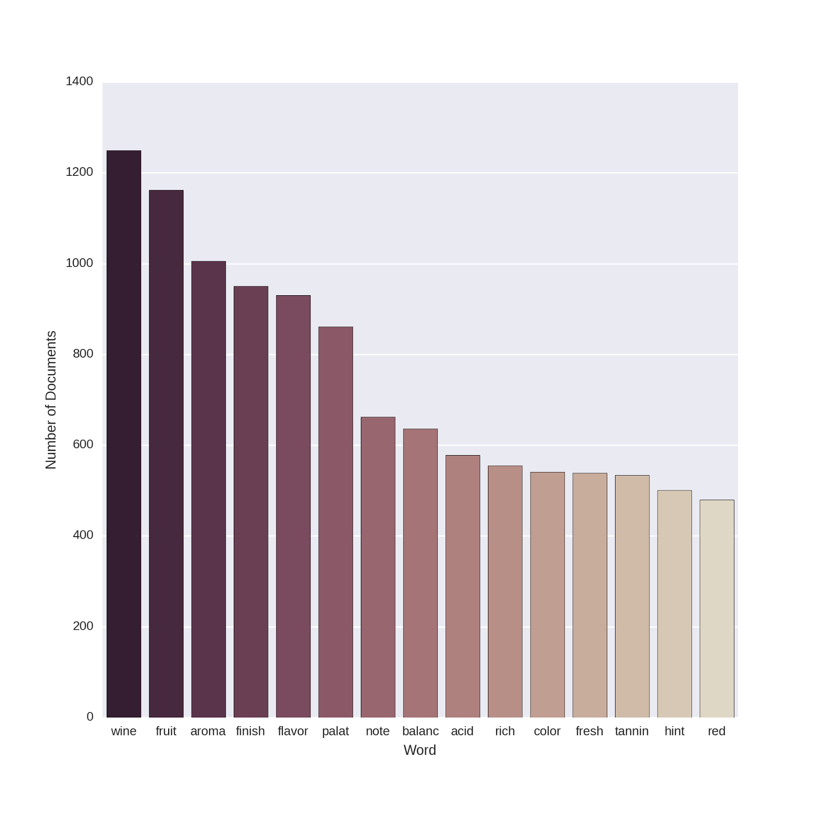
I’m no œnologue, but these all make sense to me. Smell, taste and color all turn up in lots of the texts, and seem like important qualities to describe if you’re trying to create an appealing portrait of your wine!
The document-term matrix we extracted above will serve as our predictor matrix. We are now ready to split our data into training and test sets for modeling. In order to compare our results here (using text features) with the results described in the previous post (using non-text features), we will use the same seed (called random_state in sklearn) when splitting our data. This ensures that the training and test sets here contain the same observations as those used to create and evaluate the models in the previous post. The predictive performance of all models on the test sets are therefore directly comparable.
# train test split. using the same random state as before ensures
# the same observations are placed into train and test set as in the
# previous posts

from sklearn.cross_validation import train_test_split
X_train, X_test, y_train, y_test = train_test_split(pred_feat_unigrams,
	wine_data["Varietal_WineType_Name"],
	test_size=0.30, random_state=42)
Predicting Wine Class
Let’s create a random forest model to predict wine type (red vs. white) using most of the default hyper-parameters in sklearn. The one exception, as before, is that we will increase the number of trees to 500. These settings are the same as described in the “default” model in the previous blog post. The code below creates the model object, runs the model, and computes the confusion matrix on the test data:
# Prepare and run Random Forest
# Import the random forest package
from sklearn.ensemble import RandomForestClassifier
# Create the random forest object
rforest = RandomForestClassifier(n_estimators = 500, n_jobs=-1)
# Fit the training data
rforest_model = rforest.fit(X_train,y_train)
### Do prediction (class) on test data
preds_class_rf = rforest_model.predict(X_test)
# confusion matrix: how well do our predictions match the actual data?
pd.crosstab(pd.get_dummies(y_test)['Red Wines'],preds_class_rf)
The resulting confusion matrix:
| Predicted Class: | Red Wines | White Wines |
|---|---|---|
| Actual Class: | ||
| White Wines | 2 | 296 |
| Red Wines | 292 | 10 |
We can see that this appears to give a much better classification than the previous set of models, which used the non-text features (alcohol by volume, appellation region, year of production, etc.). The signal is much stronger in the Winemaker’s Notes, and so the text-based features are better able to distinguish between red and white wines.
Let’s extract the feature importances for our model and plot them for the 25 most-important predictor words:
# plot the top features

# set the palette for 25 colors
# the _r gives a reverse ordering
# to keep the darker colors on top
sns.set_palette("Blues_r", n_colors = 25)

# extract the top features
feature_names = np.array(vectorizer_count.get_feature_names())
df_featimport = pd.DataFrame([i for i in zip(feature_names,
 rforest_model.feature_importances_)],
 columns=["features","importance"])

# plot the top 25 features
top_features = sns.barplot(x="importance", y="features",
 data=df_featimport.sort('importance', ascending=False)[0:25])
top_features.set(xlabel='Feature Importance')
top_features.set(ylabel='Feature') 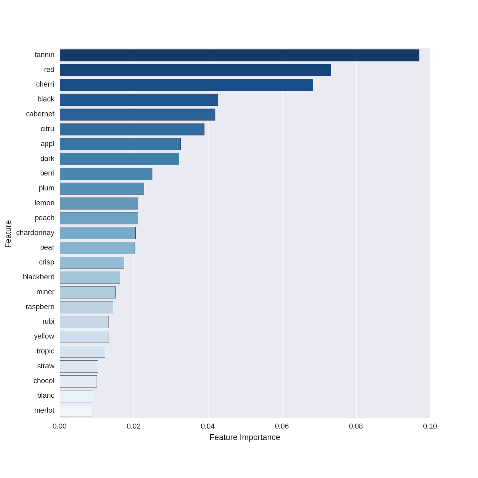
These all appear logical. Even for non-wine-lovers, it’s clear that *cabernet *identifies red wines and *chardonnay *identifies white wines. I found it interesting that there are a number of features related to fruit in the Winemaker’s Notes (e.g. cherry, citrus, apple, berries, plum, etc.) that appear to distinguish red from white wines.
One of the top features of the model is “red,” which obviously is a terrific feature for predicting red vs. white wines. I wondered to myself if including this feature is “cheating” in some sense - of course such a word will be highly predictive, but how well does our model do without a feature that directly names the to-be-predicted outcome?1
In order to examine this question, I decided to remove “red” from the feature set and re-run the random forest model without it. To what extent would this harm predictive performance?
First, let’s redefine the predictor matrix without the word “red”:
# redefine the predictor matrix without the word "red"
# using pred_feat_array created above, turn into dataframe
pred_feat_nored = pd.DataFrame(pred_feat_array,
	columns = vectorizer_count.get_feature_names())
# and drop the column with the indicator for the word "red"
pred_feat_nored = pred_feat_nored.drop('red', axis = 1)
Now let’s create training and test sets (using the same observations in the test and training sets as above and as in the previous post), run the random forest model, and look at the confusion matrix.
# split the data into training and test sets
# we pass the predictive features with no "red"
# as the predictor data
from sklearn.cross_validation import train_test_split
X_train_nr, X_test_nr, y_train_nr, y_test_nr = train_test_split(pred_feat_nored,
	wine_data["Varietal_WineType_Name"],
	test_size=0.30, random_state=42)

# define the model. same hyper-parameters as above
rforest_nr = RandomForestClassifier(n_estimators = 500, n_jobs=-1)
# Fit the training data
rforest_model_nr = rforest_nr.fit(X_train_nr,y_train_nr)
### Do prediction (class) on test data
preds_class_rf_nr = rforest_model_nr.predict(X_test_nr)
# confusion matrix: how well do our predictions match the actual data?
pd.crosstab(pd.get_dummies(y_test_nr)['Red Wines'],preds_class_rf_nr)
The confusion matrix:
| Predicted Class: | Red Wines | White Wines |
|---|---|---|
| Actual Class: | ||
| White Wines | 2 | 296 |
| Red Wines | 294 | 8 |
Our predictions are still very accurate! Without the word “red,” what terms did the model choose as most important in distinguishing between wine types? Let’s extract the features and plot them:
# plot the top 25 features
# for the model without "red" as a predictor
feature_names = np.array(pred_feat_nored.columns)
df_featimport = pd.DataFrame([i for i in zip(feature_names,
	rforest_model_nr.feature_importances_)],
	columns=["features","importance"])

# plot the top 25 features
top_features = sns.barplot(x="importance", y="features",
	data=df_featimport.sort('importance', ascending=False)[0:25])
top_features.set(xlabel='Feature Importance')
top_features.set(ylabel='Feature')
Which yields the following plot:
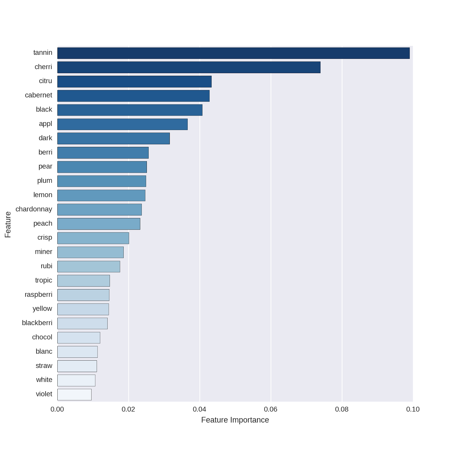
The predictors displayed are basically the same as those in our original model!
Model Comparison
AUC and ROC Curves
The confusion matrix above suggests that the model without the word “red” performs just about as well as the model with the word “red.” In order to make a more direct comparison, let’s use the same approach as in the previous post, and compare the AUC values and ROC curves of the two models. The code is essentially the same as we used in the previous post:
# compute the probability predictions from both models
# model with all unigrams
preds_rf = rforest_model.predict_proba(X_test)
# model with "red" removed from predictor matrix
preds_rf_nr = rforest_model_nr.predict_proba(X_test_nr)

# make the ROC curve plots from both models
from sklearn import metrics
import pandas as pd
import matplotlib.pyplot as plt

plt.figure(figsize=(10,10))
fpr, tpr, _ = metrics.roc_curve(pd.get_dummies(y_test)['Red Wines'],
	preds_rf[:,0])
auc1 = metrics.auc(fpr,tpr)

plt.plot(fpr, tpr,label='AUC Predictors All Unigrams: %0.3f' % auc1,
	color='red', linewidth=2)

fpr, tpr, _ = metrics.roc_curve(pd.get_dummies(y_test_nr)['Red Wines'],
	preds_rf_nr[:,0])
auc1 = metrics.auc(fpr,tpr)

plt.plot(fpr, tpr,label="AUC Predictors Without 'Red': %0.3f" % auc1,
	color='blue', linewidth=2)

plt.plot([0, 1], [0, 1], 'k--', lw=1)
plt.xlim([0.0, 1.0])
plt.ylim([0.0, 1.05])

plt.xlabel('False Positive Rate')
plt.ylabel('True Positive Rate')
plt.title('ROC')
plt.grid(True)
plt.legend(loc="lower right")
And produces the following ROC plot:
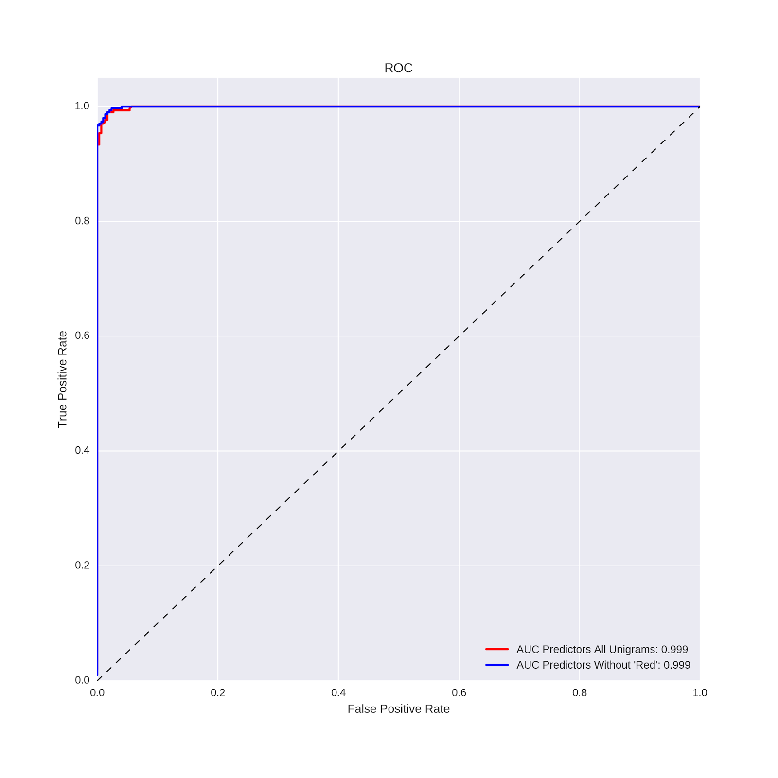
To three decimal places, the AUC values are identical. Removing the word “red” did not hurt the predictive power of the model!
Brier Scores
In this post, we will examine one additional metric for evaluating the performance of classification models: the Brier score. The Brier score is simply the mean squared difference between A) the actual value of the outcome (coded 0/1) for each case in the test set and B) the predicted probability from the model for that case, making it essentially a mean squared error (MSE) for classification models. Smaller (larger) Brier Score values indicate better (worse) model performance, and can be useful for comparing modeling approaches on a given dataset.
We compute the Brier scores for our two models on the test dataset with the following code:
# compare the Brier scores for the two models
from sklearn.metrics import brier_score_loss

# Brier score for the model with all words as predictors
print(brier_score_loss(pd.get_dummies(y_test)['Red Wines'], preds_rf[:,0]))
# Brier score for the model with "red" removed
print(brier_score_loss(pd.get_dummies(y_test_nr)['Red Wines'], preds_rf_nr[:,0]))
The Brier scores are also identical to 3 decimal places, both having values of .019, which are certainly low when considering that they are mean squared errors!
The confusion matrices, AUC values/ROC curves and Brier scores all converge on the same conclusion: the models using features derived from text analysis are very accurate at classifying red vs. white wines. In particular, these models are much more accurate than the models described in the previous post which used the traditional types of features one might use for predictive modeling: abv, price, year of production, appellation region, etc.
Insight into a Top Predictor
As we have done in previous posts, let’s explore the meaning behind an important predictor. In both of the models described in this post, the top predictor was “tannin.” Let’s examine the percentage of texts with the word tannin, separately for red and white wines, and produce a plot showing this difference:
# insight into top predictor: plot presence of
# 'tannin' in red vs. white wine texts

# merge wine type and feature information
winetype_features = pd.concat([wine_data["Varietal_WineType_Name"],
	pd.DataFrame(pred_feat_unigrams.toarray(),
	columns = vectorizer_count.get_feature_names())], axis = 1)

# define the colors to use in the plot
flatui = ['darkred','orange' ]
sns.set_palette(sns.color_palette(flatui))

# plot the percentage of texts with the word 'tannin' in them
# for red and white wines, respectively
tannin_plot = sns.barplot(x = "Varietal_WineType_Name", y= "tannin",
	data=winetype_features, capsize=.2);
	tannin_plot.set(xlabel='Wine Type',
	ylabel = "Percentage of Texts With the Word 'Tannin'")
Which yields the following plot:
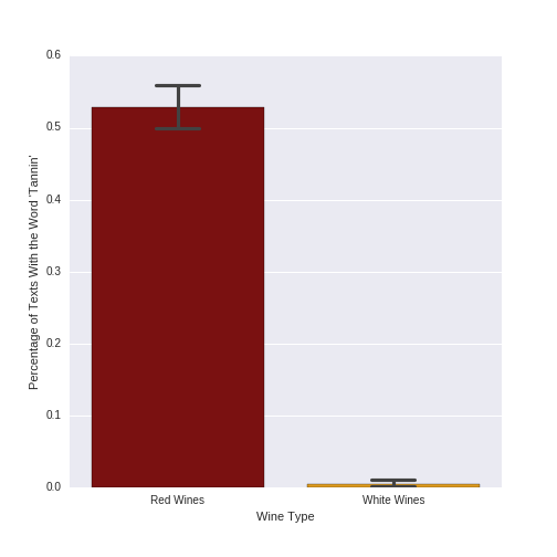
The term “tannin” is clearly much more frequent for red than white wines. Indeed, 52.9% (529) of the 1000 red wine texts mention the word “tannin,” while only .5% (5) of the 1000 white wines do. As red wines have much higher levels of tannins than do white wines, it makes sense that this feature is an important predictor in classifying red vs. white wines.
Conclusion
In this post, we returned to our classification problem of distinguishing red vs. white wines. We used text analysis, extracting unigrams (one-word features) which we fed as predictors to our random forest algorithm. We computed two different models: one including all words which were present in more than 50 documents, and one which included those same words with the exclusion of “red.” Both models were highly accurate, and gave identical predictive performance for the AUC and Brier score metrics.
There are three interesting points to be taken from what we’ve done here.
-
Signal strength across multiple features. Even though “red” was the second-most-important predictor in our first model, removing it in the second model did not harm classification accuracy. Essentially, because there was a strong enough signal in the other features, the random algorithm was able to find other combinations of predictors that resulted in an accurate classification of our outcome.
-
Hyper-parameter tuning vs. feature choice. In the previous post using numeric and categorical features to predict wine type, we went through an awful lot of trouble to search for optimal hyper-parameters, and found that this only increased model performance a slight amount. In this post, we used the same data but changed our feature set to the text of the Winemaker’s Notes. Using a basic set of model hyper-parameters, we were able to much more accurately predict wine type. This points to an insight that many others have made, and which I’ve seen put most succinctly in this Kaggle blog post about best practices in predictive modelling: “What gives you most ‘bang for the buck’ is rarely the statistical method you apply, but rather the features you apply it to.” By providing richer and more discriminating data to our model, a simpler analytical approach resulted in a better classification accuracy.
-
Text as a rich but unstructured data source. Finally, let’s note that the rich feature set we developed in this post was the fruit of text analytic methods. Using basic text cleaning techniques and a simple bag-of-words approach, we were able to derive predictors that very accurately distinguished red from white wines. This required more effort than using the more-easily-usable numeric and categorical variables in our dataset, but the results leave no doubt as to the potential power of text analysis in applied predictive problems.
Coming Up Next
In next post, we’ll switch languages (back to R!), analytical methods (from predictive modelling to exploratory data analysis) and data (we’ll be looking at a rich dataset concerning consumer perceptions of beverages). We’ll first focus on an often-neglected side of data science practice: data munging. We’ll then use traditional statistical techniques to create a map of consumer perceptions of drinks within the beverage category.
Stay tuned!
-
In an applied setting, I’d be happy to have such a feature and would probably leave it at that. If we were to “productionalize” a system where we needed to predict wine type given Winemaker’s Notes texts, any word in those texts would be available at scoring and therefore “fair game” for an applied predictive model. ↩