Analyzing Wine Data in Python: Part 1 (Lasso Regression)
In the next series of posts, I’ll describe some analyses I’ve been doing of a dataset that contains information about wines. The data analysis is done using Python instead of R, and we’ll be switching from a classical statistical data analytic perspective to one that leans more towards the statistical and machine learning side of data analysis. All the code I share below is for Python 3, which I’ve run via an IPython console in Spyder on a Linux operating system.
Description of the Data
[Edit: the data used in this blog post are now available on Github.]
The wine data consist of 2000 records, 1000 describing red wines and 1000 describing white wines. These data come from a much larger database of wine descriptions from a large online wine retailer.
For each wine, there are columns describing the name, year, abv (alcohol by volume), the retail price in US dollars, the appellation region, the varietal name, the wine type (red vs. white), and the winemaker’s notes (short text describing the wine, provided by the vintner). We will use a selection of these variables to predict wine price.
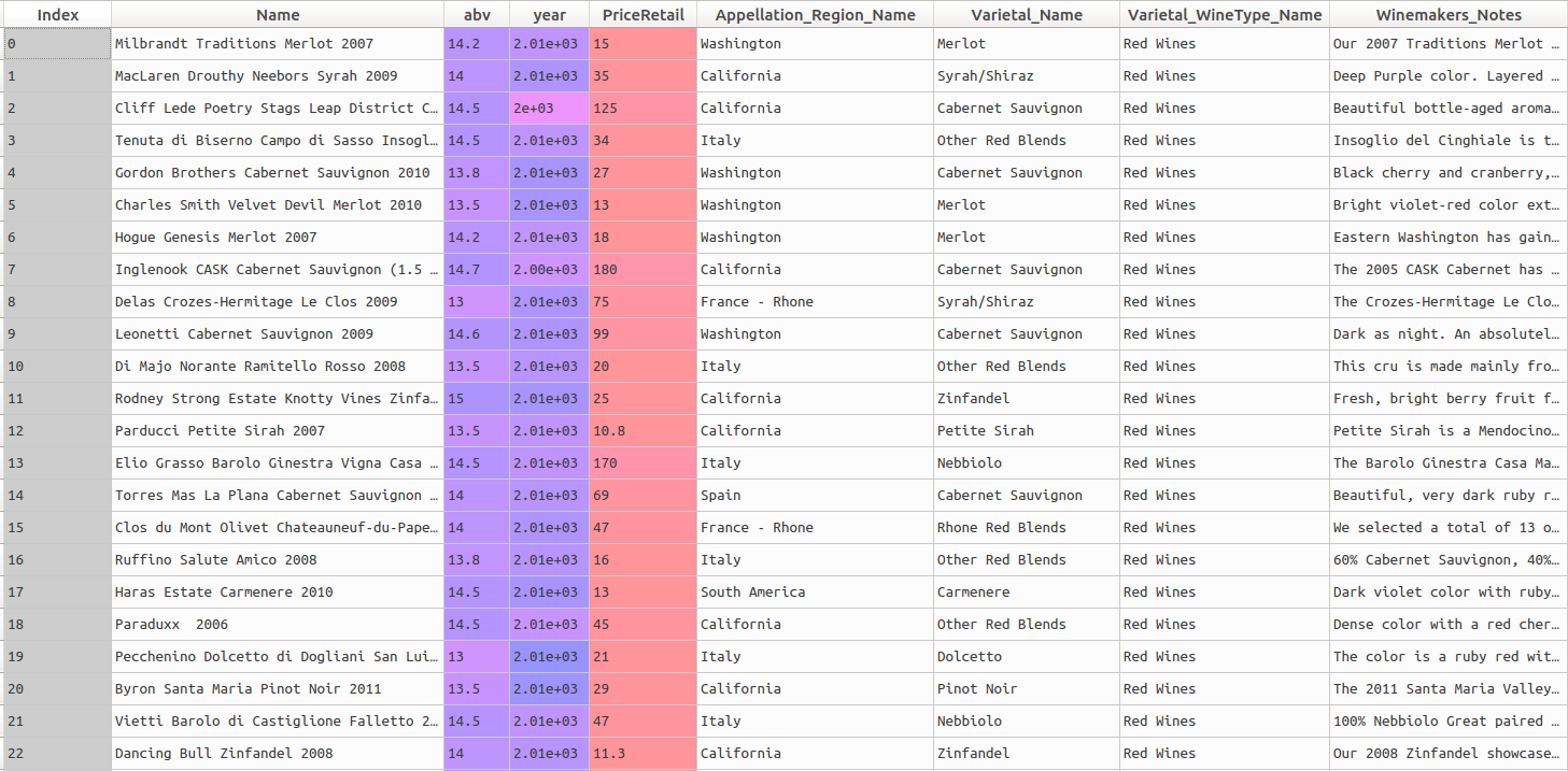
A screenshot of the first records can be found below:
Let’s begin by reading in the data and looking at the head of the dataframe. The pandas library is absolutely great for data munging and manipulation, while the numpy library is very handy for mathematical calculations and transformations. These two libraries work together very well; I often make heavy use of both when working in Python.
# import libraries
import pandas as pd
import numpy as np

# read in the raw data
wine_data = pd.read_csv("/home/directory/wine_data.csv", encoding='latin-1')

# print the head
print(wine_data.head())
We can see the head of the dataframe in the screenshot above.
Let’s do a descriptive visualization of the key quantitative variables we will use in our analysis. The seaborn package is wonderful for making beautiful graphs out-of-the box. The distribution plot (distplot) shows the density of the distribution of a given variable on the y-axis, along the range of the variable (displayed on the x-axis). Note that there are some missing values for year- some additional wrangling is needed to plot this variable.
import seaborn as sns
sns.distplot(wine_data.year[wine_data.year.notnull()])
sns.distplot(wine_data.PriceRetail) 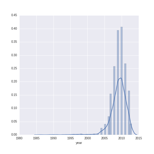
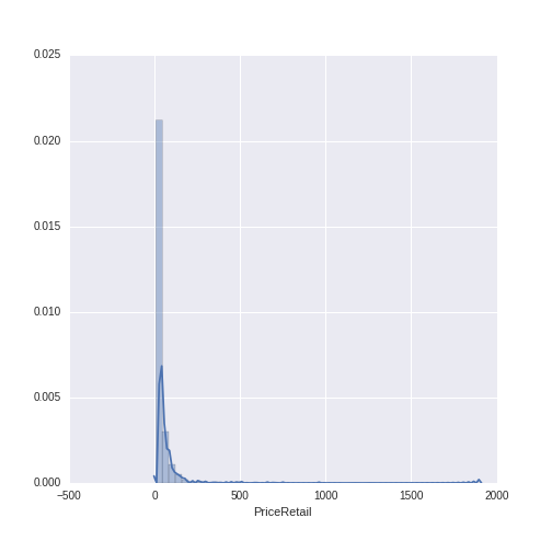
The year variable ranges between 1986 to 2013 with a mean of 2009.13 and a standard deviation of 2.38. The wine price variable ranges from $7.99 to $1899, with a mean of $38.44 and a standard deviation of $71.02. We can see that, while the distribution of year is relatively normal, the distribution of wine price has a heavy right-skew (as is often the case with price or sales data).
For modeling purposes, when using monetary data as the dependent variable (also called the outcome or target), it is often good to work with a log-transformed version of the variable. Let’s see what the distribution of price looks like when log-transformed (using the numpy library to do the log transformation):
log_price_retail = sns.distplot(np.log(wine_data.PriceRetail))
log_price_retail.set(xlabel='Log (PriceRetail)') 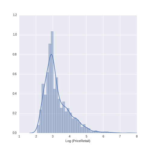
This distribution looks much more normal, and will be a good choice to use in subsequent modeling.
One final variable remains to be described, and that is the Appellation Region Name, which contains the region from which each wine originates. The *countplot *in seaborn makes a very nice representation of the counts of the appellation regions.
Appellation_Reg = sns.countplot(y="Appellation_Region_Name",
	data=wine_data, palette="PuBuGn_d");
Appellation_Reg.set(ylabel='Appellation Region Name') 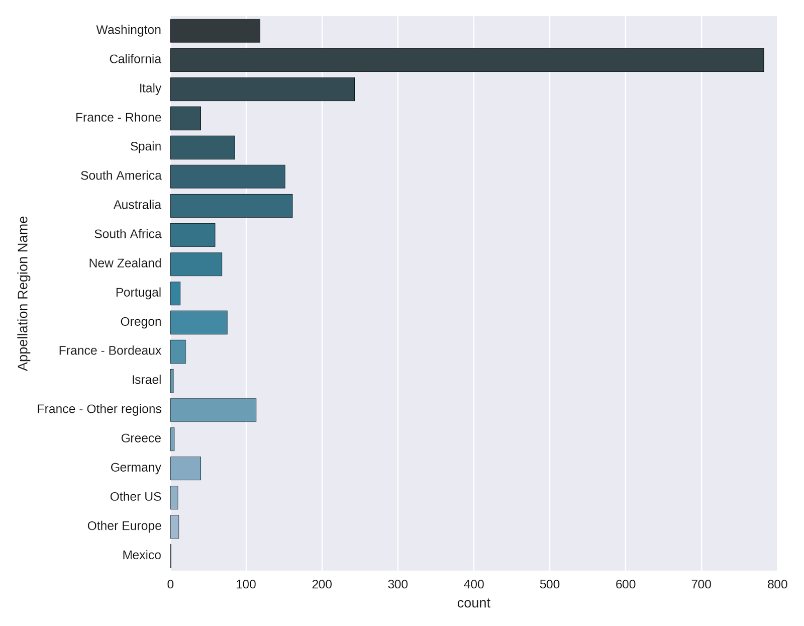
The vast majority of the wines come from California, with Italy, South America and Australia also well-represented. The French wines are also quite frequent, though they are split up according to region. I was surprised to see that Washington also has a fair amount of wines in the list.
Data Pre-Processing
In this post, I’ll be taking a look at predicting the price of the wines from the variables we’ve examined so far, namely: wine year, varietal wine type (e.g. red vs. white), and appellation region. We’ll be using sklearn, a great Python library for predictive modeling and machine learning.
We first need to set up a matrix of predictive variables; unlike R, sklearn requires you to do more extensive pre-processing of data before feeding them to a modeling algorithm. This comes into play for this analysis in the form of representing the categorical predictor variables (wine type and appellation region name) in numeric form via dummy coding. (Recall that in the models built in R that I’ve described in previous posts, categorical variables represented as text were automatically converted and passed directly to a model).
In classical statistical techniques, such as those we saw in the previous posts analyzing Accupedo data, a dummy predictor variable with G levels needs to be represented in the model matrix with G-1 dummy variables (which typically take the form of 0/1 to represent presence or absence of a category). Standard linear models will simply not run due to multicollinearity issues if A) an intercept is included and B) all levels of a categorical variable are represented with their own dummy: this is referred to as the “dummy variable trap.”
However, statistical and machine learning techniques are able to handle datasets with high (and even perfect) multicollinearity among predictors, and so we will take advantage of this when composing our predictor matrix.
The pandas function “get dummies” generates G dummy variables for a predictor with G levels; the dummy variables are represented as 0/1 to indicate the absence or presence of a category.
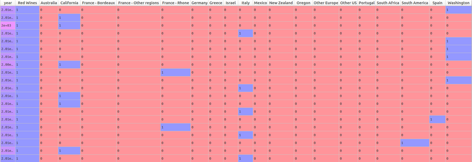
Below, I create a matrix of predictor variables. The Appellation Region Name has 19 levels, as we saw in the chart above. The pandas “get dummies” function therefore generates 19 different dummy variables to represent this information in the predictor matrix. The wine type variable only has two levels: red and white. Rather than including a dummy variable for each, I simply kept the dummy variable for red wines. Because there are only 2 levels needed to represent this variable, an effect for red wines automatically implies a difference between red and white. (Note that this is not the case for the Appellation Region Name, which has 19 different levels.)
# create a model matrix of predictors
# the pandas get dummy function is used to
# generate dummy variables for the categorical predictors
# Appellation Region name is represented with 19 dummies
# Wine type (red vs. white) is represented with 1 dummy
# representing red wines

predictors = pd.concat([wine_data.year,
	pd.get_dummies(wine_data.Varietal_WineType_Name).ix[:,0],
	pd.get_dummies(wine_data.Appellation_Region_Name)] , axis = 1)
The head of the predictor matrix looks like this:
Before beginning the modeling, let’s check for missing values in the predictors. Sklearn will not run a model if any of the the predictors have missing variables.
# check for missing values in the predictors matrix
predictors.isnull().sum()
The results:
| Variable | Number of Missing Values |
|---|---|
| year | 6 |
| Red Wines | 0 |
| Australia | 0 |
| California | 0 |
| France - Bordeaux | 0 |
| France - Other regions | 0 |
| France - Rhone | 0 |
| Germany | 0 |
| Greece | 0 |
| Israel | 0 |
| Italy | 0 |
| Mexico | 0 |
| New Zealand | 0 |
| Oregon | 0 |
| Other Europe | 0 |
| Other US | 0 |
| Portugal | 0 |
| South Africa | 0 |
| South America | 0 |
| Spain | 0 |
| Washington | 0 |
We have 6 missing values for the “year” variable. These wines were simply missing this information. There are many solutions to dealing with missing data, such as: A) replacing missing values with the mean, mode, or median, B) creating dummy variables which indicate observations with missing values or C) using more sophisticated multiple imputation techniques, which borrow information across a data matrix to replace missing data with statistically plausible values. In the context of this example, I’ve decided to simply replace the missing year values with the median year for the entire dataset. This can be done with the sklearn preprocessing imputation function:
# use the imputer function to replace missing values in our matrix
# with the median value for the column
from sklearn.preprocessing import Imputer
imp = Imputer(missing_values='NaN', strategy='median', axis=0)
predictors_imputed = imp.fit_transform(predictors)
Note that the preprocessing function here returns a numpy ndarray, not a Pandas dataframe. This is not an issue for modeling, but the numpy ndarray does not have column names, which means that if we’re interested in understanding which variables are most important in a predictive model, we’ll have to find a way to map the columns in the numpy ndarray to the column names in our original predictor dataframe.
Predicting Wine Price
Now that we have done some basic visualization and pre-processing of the data, we are ready to begin with the predictive modeling.
The goal of this exercise is to predict wine price using the columns describing the year, appellation region and wine type (red vs. white) of each wine. This is a regression type problem, as we are interested in predicting a numeric value (as opposed to a class label). There are many methods available for such problems; here I’ll be using a Lasso regression model to predict wine price.
The Lasso regression model is a type of penalized regression model, which “shrinks” the size of the regression coefficients by a given factor (called a lambda parameter in the statistical world and an alpha parameter in the machine learning world). The goal of shrinking the size of the regression coefficients is to prevent over-fitting the model to the training data. By shrinking the size of the regression coefficients, we get a model that more poorly predicts our outcome (e.g. has increased bias), but which we hope will be more stable when applied to unseen data (e.g. has decreased variance). One of the nice things about the Lasso is that, given the way the penalties are applied to the regression coefficients, the size of certain regression coefficients can be shrunk all the way to zero, which effectively results in model-based feature selection. For problems that benefit from insight into the relationships between predictors and outcomes, Lasso regression is very handy because it identifies the important predictive variables *and *provides an estimation of the size and direction of the partial bi-variate relationships between the predictors and the outcome.
We will first split up our dataset into a training and test set. Sklearn has a very handy function to do this, called “train test split.” We’ll hold out 30% of the data as a test set, and train our model on the remaining 70% (called the training set). By specifying the random state (or seed), we ensure that we will always select the same observations for the training and test sets, if we want to re-run the model at a later point. Note that I am explicitly defining the outcome to be the log-transformed version of the price variable. As we saw above, the raw price values are heavily right-skewed, which can be problematic in regression modeling.
# split the data into training and test sets
# we use the log-transformed price variable as the outcome
# we specify the random state to ensure reproducibility
# of selection of observations into training/testing samples
# if we want to re-run the model at a later point
from sklearn.cross_validation import train_test_split
X_train, X_test, y_train, y_test = train_test_split(predictors_imputed,
	np.log(wine_data["PriceRetail"]),
	test_size=0.30, random_state=42)
Now let’s compute a Lasso regression model. We import the function from sklearn, and use 10-fold cross-validation to choose the appropriate shrinkage parameter (the lambda or alpha value described above). The lassocv function in sklearn makes it possible to specify everything in one command. One final thing to note- because the penalized regression models apply a shrinkage factor to the size of the coefficients, we need to ensure that all of the variables are on similar scales. This is done via the normalization option in the lassocv function. The normalization ensures that the regression coefficients for each variable will also be on similar scales, and that the penalty factor has the chance to be applied “equally” to each variable.
# import the lassocv function
# specify the Lasso regression model
# n_jobs = -1 will parallelize the computations on a multi-core processor
# normalize = True normalizes the predictor variables

from sklearn.linear_model import LassoCV
model_lasso_cv = LassoCV(cv=10, precompute = False, normalize=True,
	n_jobs = -1).fit(X_train, y_train)
Model Results
Let’s first examine the estimates of the penalized regression coefficients. The code below extracts the coefficients, removes those that are shrunk to zero, and plots them. Note that we extract the column names from our predictors matrix, not the predictors_imputed matrix that we used in the model itself (which as we noted above contains no column names).
# make a dataframe of the non-zero regression coefficients
# sort the coefficients in descending order, and plot them
# note that we take the names of the coefficients from the predictors matrix
# as the predictors_imputed object has no column names
# this works because the columns are in the same order in both matrices
lasso_coef = pd.DataFrame(np.round_(model_lasso_cv.coef_, decimals=3),
	predictors.columns, columns = ["penalized_regression_coefficients"])
# remove the non-zero coefficients
lasso_coef = lasso_coef[lasso_coef['penalized_regression_coefficients'] != 0]
# sort the values from high to low
lasso_coef = lasso_coef.sort_values(by = 'penalized_regression_coefficients',
	ascending = False)
# plot the sorted dataframe
ax = sns.barplot(x = 'penalized_regression_coefficients', y= lasso_coef.index ,
data=lasso_coef)
ax.set(xlabel='Penalized Regression Coefficients') 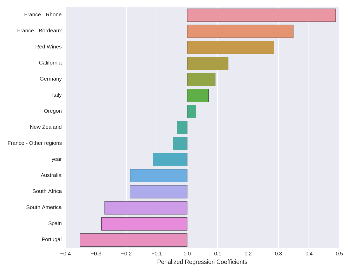
The directional interpretation is relatively straightforward. French wines from the Rhone and Bordeaux regions have large positive coefficients, meaning that they have a higher price. The dummy variable for red wines has a (comparatively smaller) positive coefficient, meaning that red wines tend to be more expensive than white wines. Year has a negative coefficient, indicating that more recent vintages are less expensive. The other coefficients can be interpreted in a similar manner.
The size of the coefficients, however, are somewhat more difficult to interpret. Because the outcome is log-transformed, we can interpret a given coefficient as indicating percent changes in price (holding all the other variables in the regression constant), given a 1-unit increase in the predictor. However, we have to keep in mind the fact that A) the variables have been normalized (mean centered and divided by the l2-norm), so a 1-unit increase in a given predictor corresponds to an l2-norm increase in that predictor, and B) the coefficients are penalized, so the estimates are smaller than unpenalized OLS estimates would be on the same data.
One additional way to get some insight into the relationships identified by the Lasso model is to plot predictor variables against the outcome variable. Below, I plot the relationship between the dummy variable representing French-Rhone wines (0 indicates non-French-Rhone wines, while 1 indicates French-Rhone wines) and wine price, on both the log and original scale:
# plot price (log transformed and original scale) for 'France - Rhone' dummy
import matplotlib.pyplot as plt
# set up the canvas- 1 row with 2 columns for the plots
figure, axes = plt.subplots(nrows=1, ncols=2,figsize=(9, 9), sharex=True)
# set up the plot for the log-transformed price variable
ax = sns.stripplot(x=pd.get_dummies(wine_data.Appellation_Region_Name)['France - Rhone'],
	y=np.log(wine_data.PriceRetail), ax=axes[0], jitter = True)
ax.set(ylabel='Log (PriceRetail)')
# set up the plot for the original scale price variable
sns.stripplot(x=pd.get_dummies(wine_data.Appellation_Region_Name)['France - Rhone'],
y=wine_data.PriceRetail, ax=axes[1], jitter = True) 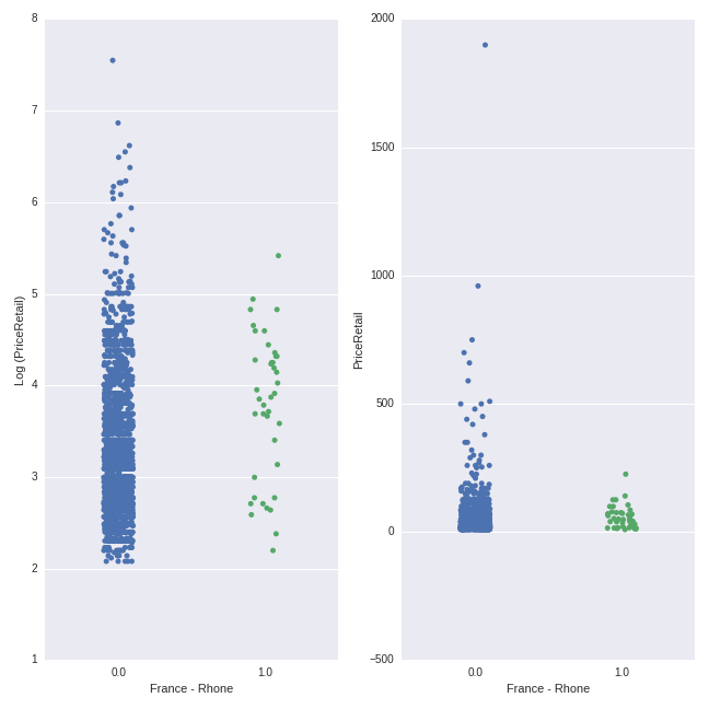
There is quite a bit of overlap between the price ranges. However, the average price of the French-Rhone wines (mean of $58.25) is higher than the mean of the non-French-Rhone wines (mean of $38.03). In both plots, the density of the points for the non-French-Rhone wines sits lower on the y-axis than the density of the points for the French-Rhone wines.
We can make the same plot for the Red Wines variable:
# plot price (log transformed and original scale) for 'Red Wines' dummy
import matplotlib.pyplot as plt
# set up the canvas- 1 row with 2 columns for the plots
figure, axes = plt.subplots(nrows=1, ncols=2,figsize=(9, 9), sharex=True)
# set up the plot for the log-transformed price variable
ax = sns.stripplot(x=pd.get_dummies(wine_data.Varietal_WineType_Name)['Red Wines'],
	y=np.log(wine_data.PriceRetail), ax=axes[0], jitter = True)
ax.set(ylabel='Log (PriceRetail)')
# set up the plot for the original scale price variable
sns.stripplot(x=pd.get_dummies(wine_data.Varietal_WineType_Name)['Red Wines'],
y=wine_data.PriceRetail, ax=axes[1], jitter = True) 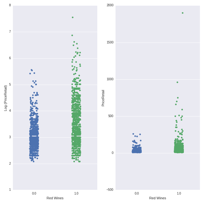
The pattern here is more clearly visible here than for the French-Rhone wines above. Red wines have a higher average price (mean = $52.74) than white wines ($24.13), though there is considerable overlap in the price ranges.
In these plots, we can easily see the effect of the log transformation of the price variable. Whereas the non-logged transformed price values are very “bunched together” with some extreme points (as we also saw in the heavy right-skew evident in the histogram above), the logged price variables are more “spread out” evenly across a smaller range. This conforms more closely to the type of distribution we seek in our target variable when modeling within a linear regression-type framework (the Lasso is a more exotic flavor of this overall family).
Let’s do a similar exercise for the quantitative predictor of year. Here we will make a scatterplot of the year of production versus the price, both on the logged and non-logged scales.
# plot price (log and non-log) by year
figure, axes = plt.subplots(nrows=2, ncols=1,figsize=(9, 9))
ax = sns.regplot(wine_data.year,np.log(wine_data.PriceRetail), ax=axes[0],
	color = 'purple')
ax.set(ylabel='Log (PriceRetail)')
sns.regplot(wine_data.year,wine_data.PriceRetail, ax=axes[1],
color = 'darkorange') 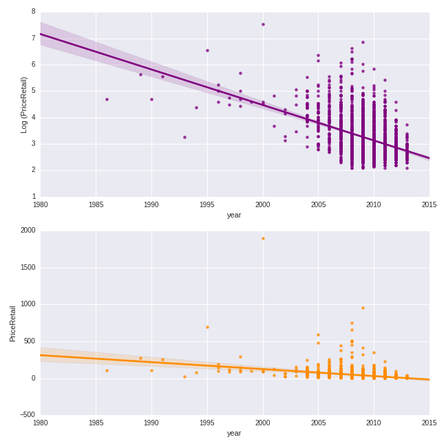
The trend is clearly negative: more recent vintages are less expensive.
Model Predictive Performance
Finally, let’s examine the predictive performance of the model with the optimal lambda/alpha as determined by cross-validation model performance. The optimal model is returned by the LassoCV object by default. We here examine the root mean squared error (RMSE), or the average (square root of the squared) deviation between the model prediction and the actual value for each observation. We will examine the RMSE of the model in both the training and the test datasets.
# RMSE from training and test data
from sklearn.metrics import mean_squared_error
train_RMSE = np.sqrt(mean_squared_error(y_train, model_lasso_cv.predict(X_train)))
test_RMSE = np.sqrt(mean_squared_error(y_test, model_lasso_cv.predict(X_test)))
print('training data RMSE')
print(train_RMSE)
print('test data RMSE')
print(test_RMSE)
The model yields a RMSE of .61 on the training and .67 on the test data, suggesting that the model slightly overfit to the training set. The RMSE values themselves are expressed in log units, as this is the scaling of the outcome in our modeling data.
One additional way of gaining insight into model performance is to plot the predicted price values from our model against the actual price values, both on the log and non-log scales. (The numpy function exp allows us to take the anti-log of both the predicted and actual logged price data, putting both variables on their original scale of US dollars.)
## predicted versus actual on log and non-log scale
figure, axes = plt.subplots(nrows=2, ncols=1,figsize=(9, 9))
# both test data and predictions on log scale
ax = sns.regplot(x = y_test, y = model_lasso_cv.predict(X_test), ax=axes[0],
	color = 'olivedrab')
ax.set(xlabel='Actual Log (PriceRetail): Test Set',
ylabel = 'Predicted Log (PriceRetail): Test Set')
# both test data and predictions on actual (anti-logged) scale
ax = sns.regplot(x = np.exp(y_test), y = np.exp(model_lasso_cv.predict(X_test)), ax=axes[1],
color = 'brown')
ax = ax.set(xlabel='Actual PriceRetail: Test Set',
ylabel = 'Predicted PriceRetail: Test Set') 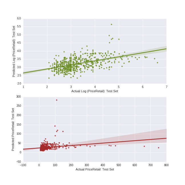
We can see that the model has a hard time predicting values at the higher end of the price range; these values are always predicted far lower than the actual values. In our handful of predictor variables, there is clearly nothing which differentiates these higher-priced wines from the other more moderately-priced ones in our main effects Lasso model.
Going Further
There are many techniques for improving predictive performance. If we decide to stick with a relatively interpretable model, we could add additional predictors to the Lasso regression. We could alternatively create interaction or higher-order polynomial terms from any predictors we include in the Lasso. Or, if we are willing to give up some degree of model interpretability, we can use any number of “black-box” techniques (which often offer better predictive performance but whose predictive mechanisms are less opaque) from the machine learning family.
My next post will return to this dataset, using an ensemble machine learning method to perform a classification task. Stay tuned!