Bayesian Regression Analysis with Rstanarm
In this post, we will work through a simple example of Bayesian regression analysis with the rstanarm package in R. I’ve been reading Gelman, Hill and Vehtari’s recent book “Regression and Other Stories”, and this blog post is my attempt to apply some of the things I’ve learned. I’ve been absorbing bits and pieces about the Bayesian approach for the past couple of years, and think it’s a really interesting way of thinking about and performing data analysis. I’ve really enjoyed working my way through the new book by Gelman and colleagues and by experimenting with these techniques, and am glad to share some of what I’ve learned here.
You can find the data and all the code from this blog post on Github here.
The Data
The data we will examine in this post consist of the daily total step counts from various fitness trackers I’ve had over the past 6 years. The first observation was recorded on 2015-03-04 and the last on 2021-03-15. During this period, the dataset contains the daily total step counts for 2,181 days.
In addition to the daily total step counts, the dataset contains information on the day of the week (e.g. Monday, Tuesday, etc.), the device used to record the step counts (over the years, I’ve had 3 - Accupedo, Fitbit and Mi-Band), and the weather for each date (the average daily temperature in degrees Celsius and the total daily precipitation in millimetres, obtained via the GSODR package in R).
The head of the dataset (named steps_weather) looks like this:
| date | daily_total | dow | week_weekend | device | temp | prcp |
|---|---|---|---|---|---|---|
| 2015-03-04 | 14136 | Wed | Weekday | Accupedo | 4.3 | 1.3 |
| 2015-03-05 | 11248 | Thu | Weekday | Accupedo | 4.7 | 0.0 |
| 2015-03-06 | 12803 | Fri | Weekday | Accupedo | 5.4 | 0.0 |
| 2015-03-07 | 15011 | Sat | Weekend | Accupedo | 7.9 | 0.0 |
| 2015-03-08 | 9222 | Sun | Weekend | Accupedo | 10.2 | 0.0 |
| 2015-03-09 | 21452 | Mon | Weekday | Accupedo | 8.8 | 0.0 |
Regression Analysis
The goal of this blog post is to explore Bayesian regression modelling using the rstanarm package. Therefore, we will use the data to make a very simple model and focus on understanding the model fit and various regression diagnostics. (In a subsequent post we will explore these data with a more complicated modelling approach.)
Our model here is a linear regression model which uses the average temperature in degrees Celsius to predict the total daily step count. We use the stan_glm command to run the regression analysis. We can run the model and see a summary of the results like so:
# load the packages we'll need
library(rstanarm)
library(bayesplot)
library(ggplot2)
# simple model
fit_1 <- stan_glm(daily_total ~ temp, data = steps_weather)
# request the summary of the model
summary(fit_1)
Which returns the following table (along with some more output I won’t discuss here)1:
Model Info:
 function:     stan_glm
 family:       gaussian [identity]
 formula:      daily_total ~ temp
 algorithm:    sampling
 sample:       4000 (posterior sample size)
 priors:       see help('prior_summary')
 observations: 2181
 predictors:   2

Estimates:
              mean    sd      10%     50%     90%
(Intercept) 16211.7   271.7 15867.0 16211.8 16552.2
temp           26.8    20.7     0.2    26.7    53.2
sigma        6195.1    94.6  6072.5  6193.9  6319.1

Fit Diagnostics:
           mean    sd      10%     50%     90%
mean_PPD 16511.8   184.6 16272.3 16511.6 16748.5

The mean_ppd is the sample average posterior predictive distribution of the outcome variable (for details see help('summary.stanreg')).
This table contains the following variables:
- Intercept: This figure represents the expected daily step count when the average daily temperature is 0. In other words, the model predicts that, when the average daily temperature is 0 degrees Celsius, I will walk 16211.7 steps on that day.
- temp: This is the estimated increase in daily step count per 1-unit increase in average daily temperature in degrees Celsius. In other words, the model predicts that, for every 1 degree increase in average daily temperature, I will walk 26.8 additional steps that day.
- sigma: This is the estimated standard deviation of the residuals from the regression model. (The residual is the difference between the model prediction and the observed value for daily total step count.) The distribution of residual values has a standard deviation of 6195.1.
- mean_PPD: The mean_ppd is the sample average posterior predictive distribution of the outcome variable implied by the model (we’ll discuss this further in the section on posterior predictive checks below).
The output shown in the summary table above looks fairly similar to the output from a standard ordinary least squares regression. In the Bayesian regression modeling approach, however, we do not simply get point estimates of coefficients, but rather entire distributions of simulations that represent possible values of the coefficients given the model. In other words, the numbers shown in the above table are simply summaries of distributions of coefficients which describe the relationship between the predictors and the outcome variable.
By default, the rstanarm regression models return 4,000 simulations from the posterior distribution for each model parameter. We can extract the simulations from the model object and look at them like so:
# extract the simulations from the model object
sims <- as.matrix(fit_1)
# what does it look like?
head(sims)
Which returns:
| (Intercept) | temp | sigma |
|---|---|---|
| 16235.27 | 22.35 | 6252.42 |
| 16155.41 | 51.06 | 6180.08 |
| 16139.13 | 53.62 | 6271.30 |
| 15957.03 | 42.68 | 6298.87 |
| 15961.30 | 32.33 | 6147.65 |
| 15607.04 | 64.97 | 6251.23 |
The mean values from these distributions of simulations are displayed in the regression summary output table shown above.
Visualizing the Posterior Distributions using bayesplot
The excellent bayesplot package provides a number of handy functions for visualizing the posterior distributions of our coefficients. Let’s use the mcmc_areas function to show the 90% credible intervals for the model coefficients.2
# area plots
# all of the parameters
# scale of parameters is so varied
# that it's hard to see the details
plot_title <- ggtitle("Posterior distributions",
                      "with medians and 95% intervals")
mcmc_areas(sims, prob = 0.9) + plot_title
Which returns the following plot:
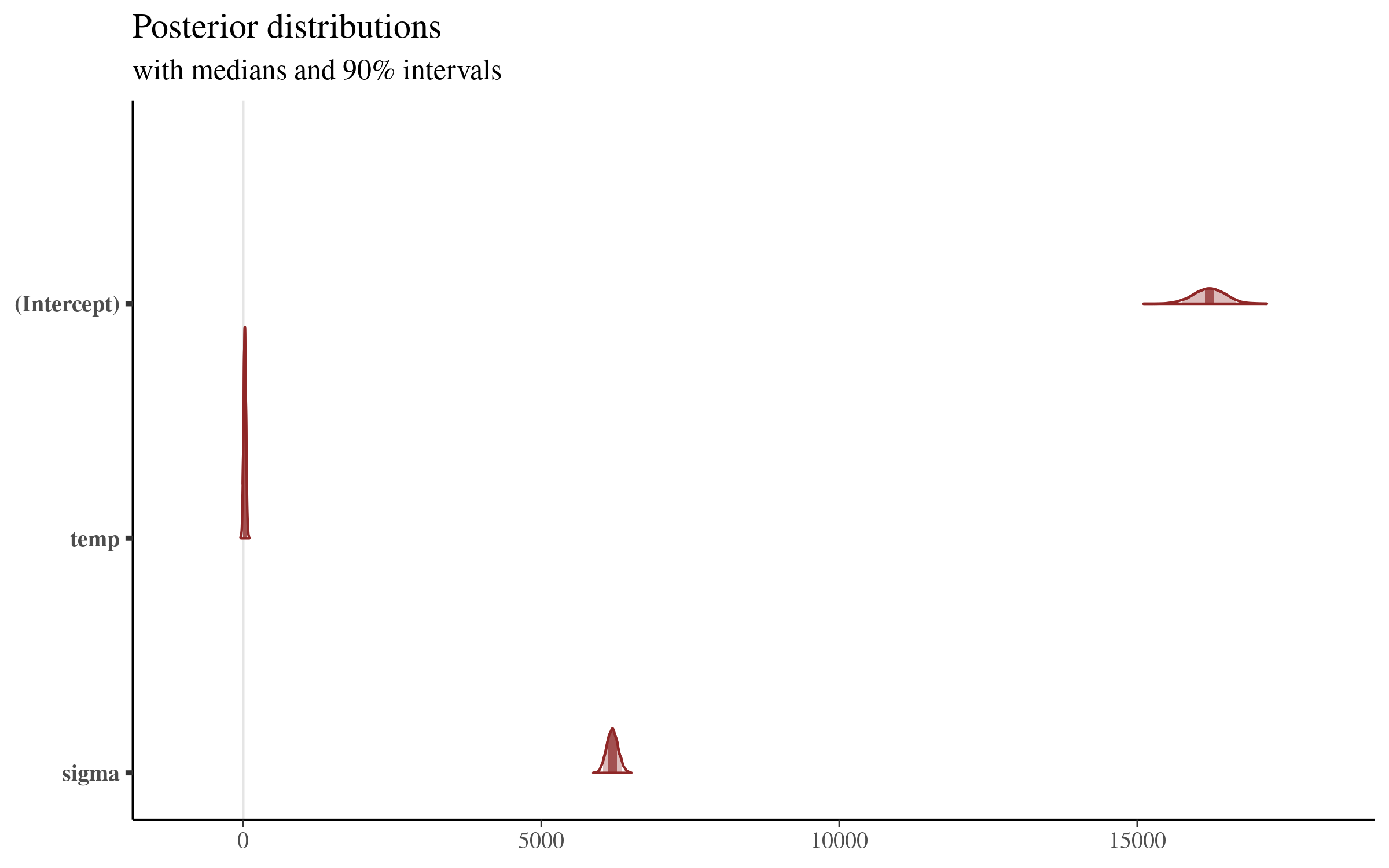
This plot is very interesting, and shows us the posterior distribution of the simulations from the model that we showed above. The plot gives us a sense of the variation of all of the parameters, but the coefficients sit on such different scales that the details are lost by visualizing them all together.
Let’s focus on the temperature coefficient, making an area plot with only this parameter:
# area plot for temperature parameter
mcmc_areas(sims,
          pars = c("temp"),
          prob = 0.9) + plot_title
Which returns the following plot:
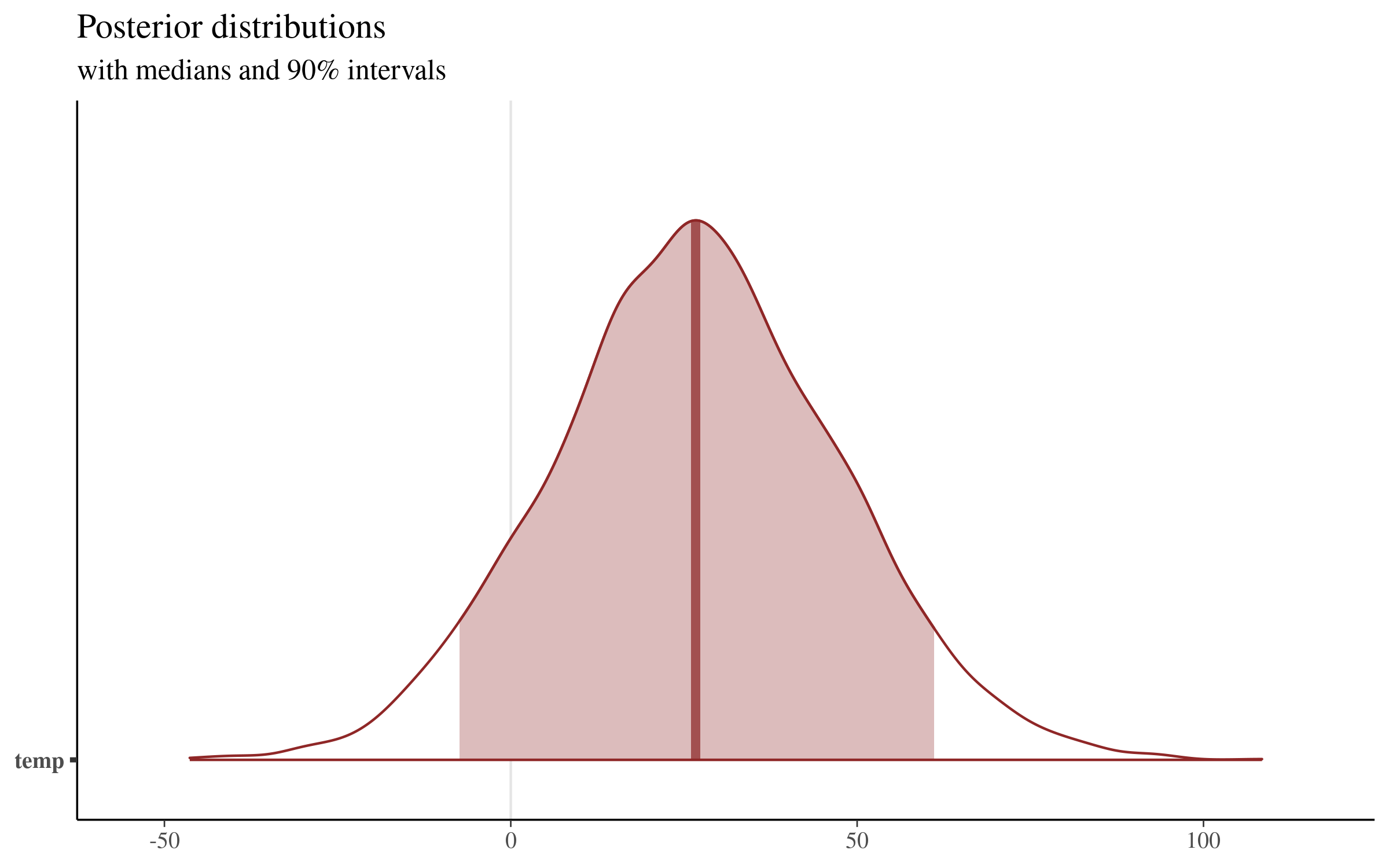
This plot displays the median value of the distribution (26.69, which sits very close to our mean of 26.83). We can extract the boundaries of the shaded region shown above with the posterior_interval function, or directly from the simulations themselves:
# 90% credible intervals
# big-ups to:
# https://rstudio-pubs-static.s3.amazonaws.com/454692_62b73642b49840f9b52f46ceac7696aa.html
# using rstanarm function and model object
posterior_interval(fit_1, pars = "temp", prob=.9)
# calculated directly from simulations from posterior distribution
quantile(sims[,2], probs = c(.025,.975))
Both methods return the same result:
            5%      95%
temp -7.382588 61.09558
This visualization makes clear that there is quite a bit of uncertainty surrounding the size of the coefficient of average temperature on daily total step count. Our point estimate is around 26, but values as low as -7 and as high as 61 are contained in our 90% uncertainty interval, and are therefore consistent with the model and our data!
Visualizing Samples of Slopes from the Posterior Distribution
Another interesting way of visualizing the different coefficients from the posterior distribution is by plotting the regression lines from many draws from the posterior distribution simultaneously against the raw data. This visualization technique is used heavily in both Richard McElreath’s Statistical Rethinking and Regression and Other Stories. Both books produce these types of drawings using plotting functions in base R. I was very happy to find this blog post with an example of how to make these plots using ggplot2! I’ve slightly adapted the code to produce the figure below.
The first step is to extract the basic information to draw each regression line. We do so with the following code, essentially passing our model object to a dataframe, and then only keeping the intercept and temperature slopes for each of our 4,000 simulations from the posterior distribution.
# Coercing a model to a data-frame returns a
# data-frame of posterior samples
# One row per sample.
fits <- fit_1 %>%
  as_tibble() %>%
  rename(intercept = `(Intercept)`) %>%
  select(-sigma)
head(fits)
which returns the following dataframe:
| intercept | temp |
|---|---|
| 15568.80 | 71.60 |
| 15664.79 | 51.80 |
| 16749.21 | -6.09 |
| 16579.78 | 4.43 |
| 16320.15 | 24.32 |
| 16560.62 | -7.86 |
This dataframe has 4,000 rows, one for each simulation from the posterior distribution in our original sims matrix.
We then set up some “aesthetic controllers,” specifying how many lines from the posterior distribution we want to plot, their transparency (the alpha parameter), and the colors for the individual posterior lines and the overall average of the posterior estimates. The ggplot2 code then sets up the axes using the original data frame (steps_weather), plots a sample of regression lines from the posterior distribution in light grey, and then plots the average slope of all the posterior simulations in blue.
# aesthetic controllers
n_draws <- 500
alpha_level <- .15
color_draw <- "grey60"
color_mean <-  "#3366FF"

# make the plot
ggplot(steps_weather) +
  # first - set up the chart axes from original data
  aes(x = temp, y = daily_total ) +
  # restrict the y axis to focus on the differing slopes in the
  # center of the data
  coord_cartesian(ylim = c(15000, 18000)) +
  # Plot a random sample of rows from the simulation df
  # as gray semi-transparent lines
  geom_abline(
    aes(intercept = intercept, slope = temp),
    data = sample_n(fits, n_draws),
    color = color_draw,
    alpha = alpha_level
  ) +
  # Plot the mean values of our parameters in blue
  # this corresponds to the coefficients returned by our
  # model summary
  geom_abline(
    intercept = mean(fits$intercept),
    slope = mean(fits$temp),
    size = 1,
    color = color_mean
  ) +
  geom_point() +
  # set the axis labels and plot title
  labs(x = 'Average Daily Temperature (Degrees Celsius)',
       y = 'Daily Total Steps' ,
       title = 'Visualization of Regression Lines From the Posterior Distribution')
Which returns the following plot:
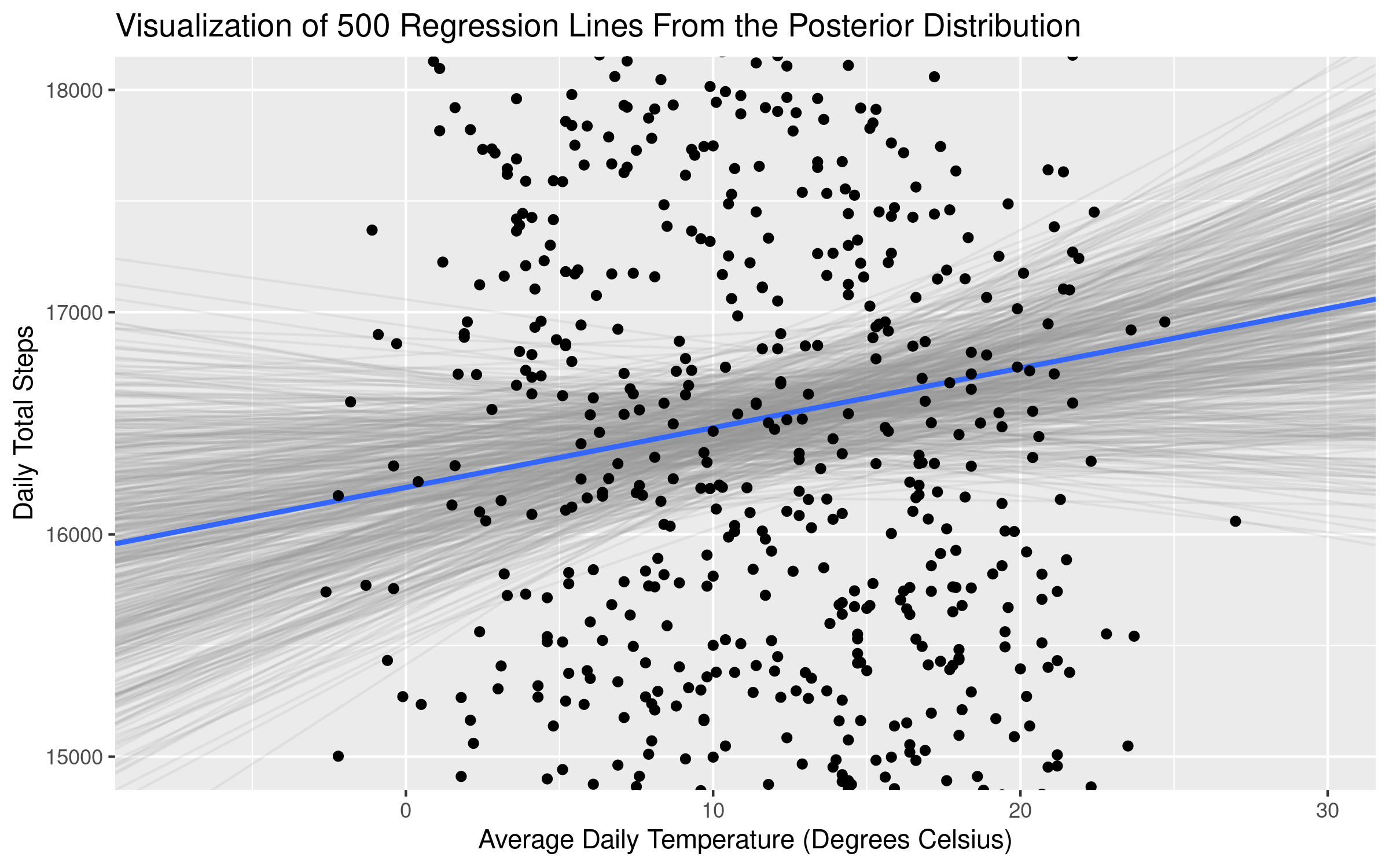
The average slope (displayed in the plot and also returned in the model summary above) of temperature is 26.8. But plotting samples from the posterior distribution makes clear that there is quite a bit of uncertainty about the size of this relationship! Some of the slopes from the distribution are negative - as we saw in our calcualtion of the uncertainty intervals above. In essence, there is an “average” coefficient estimate, but what the Bayesian framework does quite well (via the posterior distributions) is provide additional information about the uncertainty of our estimates.
Posterior Predictive Checks
One final way of using graphs to understand our model is by using posterior predictive checks. I love this intuitive way of explaining the logic behind this set of techniques: “The idea behind posterior predictive checking is simple: if a model is a good fit then we should be able to use it to generate data that looks a lot like the data we observed.” The generated data is called the posterior predictive distribution, which is the distribution of the outcome variable (daily total step count in our case) implied by a model (the regression model defined above). The mean of this distribution is displayed in the regression summary output above, with the name mean_PPD.
There are many types of visualizations one can make to do posterior predictive checks. We will conduct one such analysis (for more information on this topic, check out these links), which displays the mean of our outcome variable (daily total step count) in our original dataset, and the posterior predictive distribution implied by our regression model.
The code is very straightforward:
# posterior predictive check - for more info see:
# https://mc-stan.org/bayesplot/reference/pp_check.html
# http://mc-stan.org/rstanarm/reference/pp_check.stanreg.html
pp_check(fit_1, "stat")
And returns the following plot:
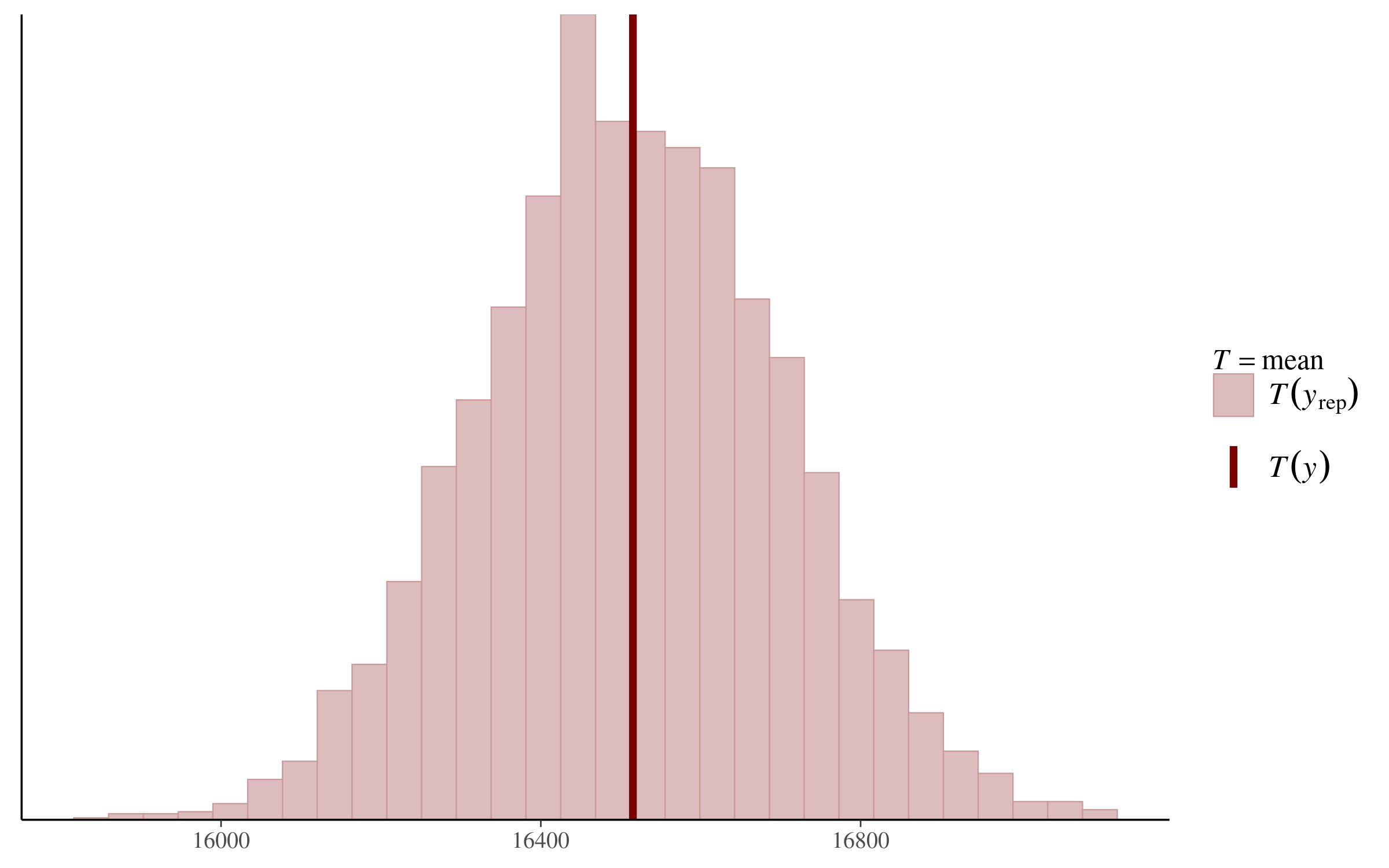
We can see that the mean of our daily steps variable in the original dataset falls basically in the middle of the posterior predictive distribution. According to this analysis, at least, our regression model is “generating data that looks a lot like the data we observed!”
Using the Model to Make Predictions with New Data
Finally, we’ll use the model to make predictions of daily step count based on a specific value of average daily temperature. In Regression and Other Stories in Chapter 9, the authors talk about how a Bayesian regression model can be used to make predictions in a number of different ways, each incorporating different levels of uncertainty into the predictions. We will apply each of these methods in turn.
For each of the methods below, we will predict the average daily step count when the temperature is 10 degrees Celsius. We can set up a new dataframe which we will use to obtain the model predictions:
# define new data from which we will make predictions
# we make predictions for when the average daily temperature
# is 10 degrees Celsius
new <- data.frame(temp = 10)
Point Predictions Using the Single Value Coefficient Summaries of the Posterior Distributions
The first approach mirrors the one we would use with a classical regression analysis. We simply use the point estimates from the model summary, plug in the new temperature we would like a prediction for, and produce our prediction in the form of a single number. We can do this either with the predict function in R, or by multiplying the coefficients from our model summary. Both methods yield the same prediction:
# simply using the single point summary of the posterior distributions
# for the model coefficients (those displayed in the model summary above)
y_point_est <- predict(fit_1, newdata = new)
# same prediction "by hand"
# we use the means from our simulation matrix because
# extracting coefficients from the model object gives us the
# coefficient medians (and the predict function above uses the means)
y_point_est_2 <- mean(sims[,1]) + mean(sims[,2])*new
Our model produces a point prediction of 16479.97.
Linear Predictions With Uncertainty (in the Intercept + Temperature Coefficients)
We can be more nuanced, however, in our prediction of daily total step counts. The regression model calculated above returns 4,000 simulations for three parameters - the intercept, the temperature coefficient, and sigma (the standard deviation of the residuals).
The next method is implemented in rstanarm with the posterior_linpred function, and we can use this to compute the predictions directly. We can also calculate the same result “by hand” using the matrix of simulations from the posterior distribution of our coefficient estimates. This approach simply plugs in the temperature for which we would like predictions (10 degrees Celsius) and, for each of the simulations, adds the intercept to the temperature coefficient times 10. Both methods yield the same vector of 4,000 predictions:
y_linpred <- posterior_linpred(fit_1, newdata = new)
# compute it "by hand"
# we use the sims matrix we defined above
# sims <- as.matrix(fit_1)
y_linpred_2 <- sims[,1] + (sims[,2]*10)
Posterior Predictive Distributions Using the Uncertainty in the Coefficient Estimates and in Sigma
The final predictive method adds yet another layer of uncertainty to our predictions, by including the posterior distributions for sigma in the calculations. This method is available via the posterior_predict function, and we once again use our matrix of 4,000 simulations to calculate a vector of 4,000 predictions. The posterior predict method takes the approach of the posterior_linpred function above, but adds an additional error term based on our estimations of sigma, the standard deviation of the residuals. The calculation as shown in the “by hand” part of the code below makes it clear where the randomness comes in, and because of this randomness, the results from the posterior_predict function and the “by hand” calculation will not agree unless we set the same seed before running each calculation. Both methods yield a vector of 4,000 predictions.
# predictive distribution for a new observation using posterior_predict
set.seed(1)
y_post_pred <- posterior_predict(fit_1, newdata = new)

# calculate it "by hand"
n_sims <- nrow(sims)
sigma <- sims[,3]
set.seed(1)
y_post_pred_2 <- as.numeric(sims[,1] + sims[,2]*10) + rnorm(n_sims, 0, sigma)
Visualizing the Three Types of Predictions
Let’s make a visualization that displays the results of the predictions we made above. We can use a single circle to plot the point prediction from the regression coefficients displayed in the model summary output, and histograms to display the posterior distributions produced by the linear prediction with uncertainty (posterior_linpred ) and posterior predictive distribution (posterior_predict) methods described above.
We first put the vectors of posterior distributions we created above into a dataframe. We also create a dataframe containing the single point prediction from our linear prediction. We then set up our color palette (taken from the NineteenEightyR package) and then make the plot:
# create a dataframe containing the values from the posterior distributions
# of the predictions of daily total step count at 10 degrees Celcius
post_dists <- as.data.frame(rbind(y_linpred, y_post_pred)) %>%
      setNames(c('prediction'))
post_dists$pred_type <- c(rep('posterior_linpred', 4000),
                          rep('posterior_predict', 4000))
y_point_est_df = as.data.frame(y_point_est)

# 70's colors - from NineteenEightyR package
# https://github.com/m-clark/NineteenEightyR
pal <- c('#FEDF37', '#FCA811', '#D25117', '#8A4C19', '#573420')

ggplot(data = post_dists, aes(x = prediction, fill = pred_type)) +
  geom_histogram(alpha = .75, position="identity") +
  geom_point(data = y_point_est_df,
             aes(x = y_point_est,
                 y = 100,
                 fill = 'Linear Point Estimate'),
             color =  pal[2],
             size = 4,
             # alpha = .75,
             show.legend = F) +
  scale_fill_manual(name = "Prediction Method",
        values = c(pal[c(2,3,5)]),
        labels = c(bquote(paste("Linear Point Estimate ", italic("(predict)"))),
            bquote(paste("Linear Prediction With Uncertainty " , italic("(posterior_linpred)"))),
            bquote(paste("Posterior Predictive Distribution ",  italic("(posterior_predict)"))))) +
  # set the plot labels and title
  labs(color='Wrist Location: New Mi Band',
       x = "Predicted Daily Total Step Count",
       y = "Count",
       title = 'Uncertainty in Posterior Prediction Methods')   +
  theme_bw()
Which returns the following plot:
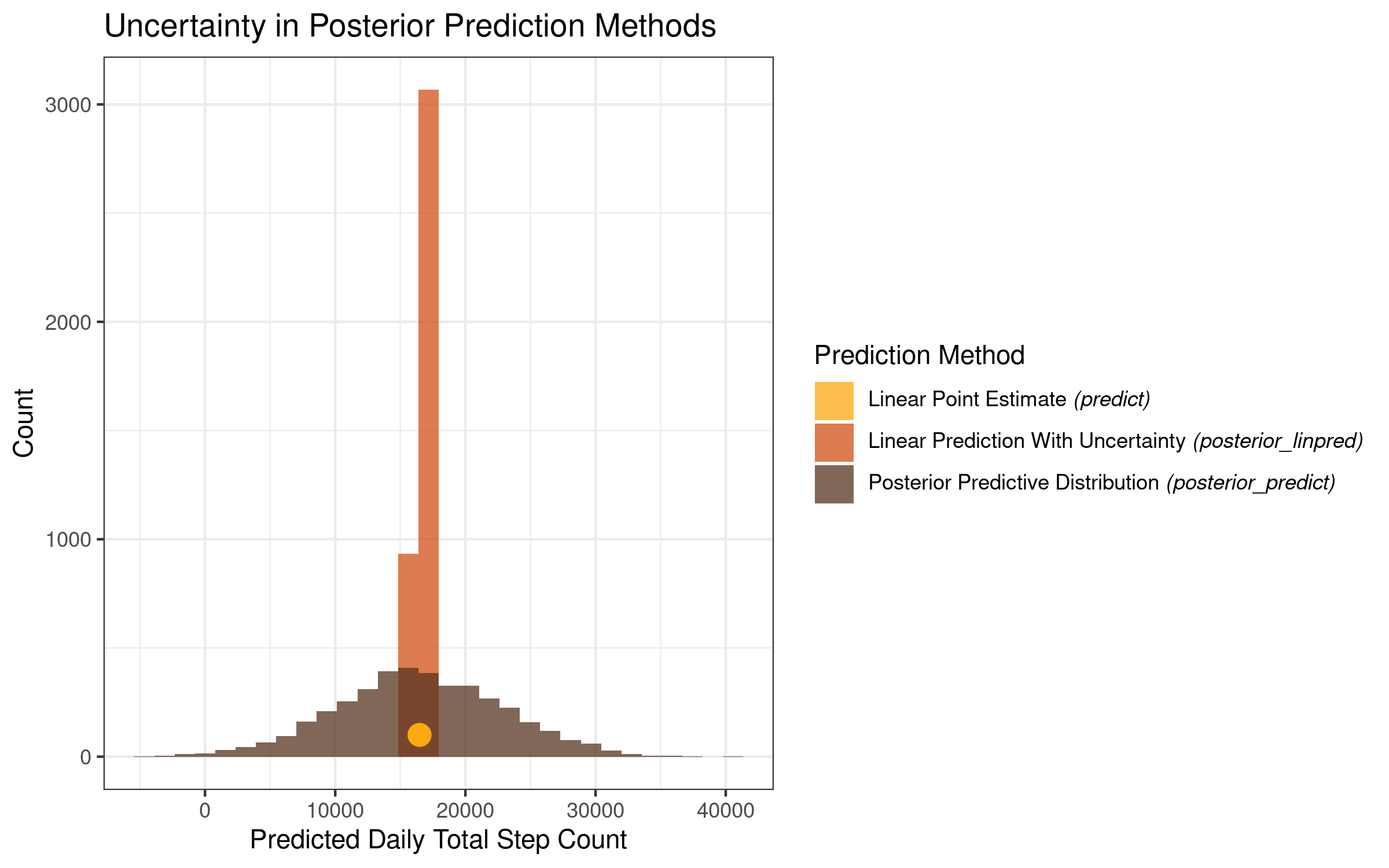
This plot is very informative and makes clear the level of uncertainty that we get for each of our prediction methods. While all 3 prediction methods are centered in the same place on the x-axis, they differ greatly with regards to the uncertainty surrounding the prediction estimates.
The point prediction is a single value, and as such it conveys no uncertainty in and of itself. The linear prediction with uncertainty, which takes into account the posterior distributions of our intercept and temperature coefficients, has a very sharp peak, with the model estimates varying within a relatively narrow range. The posterior predictive distribution varies much more, with the low range of the distribution sitting below zero, and the high range of the distribution sitting above 40,000!
Summary and Conclusion
In this post, we made a simple model using the rstanarm package in R in order to learn about Bayesian regression analysis. We used a dataset consisting of my history of daily total steps, and built a regression model to predict daily step count from the daily average temperature in degrees Celsius. In contrast to the ordinary least squares approach which yields point estimates of model coefficients, the Bayesian regression returns posterior distributions of the coefficient estimtes. We made a number of different summaries and visualizations of these posterior distributions to understand the coefficients and the Bayesian approach more broadly - A) using the bayesplot package to visualize the posterior distributions of our coefficients B) plotting 500 slopes from the posterior distribution, and C) conducting a check of the posterior predictive distribution.
We then used the model to predict my daily total step count at an average daily temperature of 10 degrees Celsius. We used three methods: using the point estimate summaries of the regression coefficients to return a single value prediction, using the linear prediction with uncertainty to calculate a distribution of predictions incorporating the uncertainty in the coefficient estimates, and using the posterior predictive distribution to calculate a distribution of predictions incorporating uncertainty in the coefficients and uncertainty in sigma (the standard deviations of the residuals). While all of these predictions were centered in more-or-less the same place, the methods varied substantially in the uncertainty of their predictions.
The thing that I found the most interesting and thought-provoking about this exercise is that it made me stop and think about the way in which I typically use models to make predictions. In the classical statistical and machine learning perspectives, we use models to produce predictions which we then use for other purposes (e.g. deciding whether to give someone a loan, contact for a marketing campaign, etc.). There is a great deal of time and energy and thought expended to make the best possible model, but once the analyst is satisfied with the model, he or she produces the predictions which are typically taken “as is” and used in a downstream commercial process.
In the Bayesian perspective, in contrast, there is not simply a single prediction from a model for a given observation, but rather distributions of predictions. It’s a challenge to use the entire distribution of predictions for applied problems (if anyone out there does this as part of their work, please give your perspective in the comments!), but my takeaway from the above analysis is that they can provide a sobering perspective on the (un)certainty contained and confidence that we should have in the output of our models.3
Coming Up Next
In the next post, we will return to a topic we’ve tackled before: that of visualizing text data for management presentations. I’ll outline a technique I often use to analyze survey data, linking responses to survey questions and open-ended responses in order to create informative and appealing data visualizations.
Stay tuned!
-
Note that if you’re doing this analysis yourself, you probably won’t get the exact same figures shown below. There is some randomness to the optimization procedure used to compute the model. Every time I’ve run this analysis, the results have been very similar, but not exactly the same. ↩
-
The authors of the rstanarm package recommend computing 90% credible / uncertainty intervals, as explained here. ↩
-
Note we did not even try to make a “great” model here. The point was to use a simple model as a test case to understand the Bayesian regression modeling approach with rstanarm. The better the model (e.g. with more accurate predictions and thus a smaller sigma value), the narrower the posterior prediction uncertainty intervals. Nevertheless, the point remains that this is a sobering exercise in the level of certainty that we should have about our model predictions, and that there can be a wide range of predictions that are “consistent” with a given statistical model. ↩