Analyzing Accupedo step count data in R: Part 2 - Adding weather data
In my last set of posts, I wrote about analyzing data from the Accupedo step counter app I have on my phone. In this post, I’ll talk about some additional analysis I’ve done by merging the step counter data with weather data from another source.
The website www.wunderground.com has freely available weather data available for most parts of the world. According to their website, their data are recorded by a crowd-sourced team of weather enthusiasts who report the weather conditions from personal stations at their homes. Pretty cool project, and it was really easy to search for my city and download the data in a .csv format. In this post, we will focus on the Mean Temperature (for the day) value, recorded in degrees Celsius.
Data Preparation
The step count data here are aggregated to the daily level, as I didn’t have more granular weather information. In all honesty, it probably makes more sense to analyze the data at the day level (as I’ve done); it would likely be hard to see hourly evolution in the weather matching hourly evolution in my step counts. My movements are pretty constrained during certain hours of the day (e.g. when I’m at work), and so examining that granular of a relationship is unlikely to be very illuminating.
I was able to match all of the dates that I had step counts for with the daily weather information from www.wunderground.com, and merged the weather data into the main step count dataset described in the previous post. I then created the analysis dataset, a day-level version of the walking data aggregated across the two variables I had created previously - day and day of week (essentially this aggregates to the day-level, while keeping a column describing the day of the week - e.g. Monday, Tuesday, etc.).
# load the required packages
library(plyr); library(dplyr)
library(lubridate)
library(ggplot2)

# make the variables to aggregate across
# the master data set with steps and temperature is called walking_weather
walking_weather$oneday <- cut(walking_weather$date_time, breaks = "1 day")
walking_weather$dow <- wday(walking_weather$date_time, label = TRUE)

# aggregate by day, day of week
# max of step count; mean of temperature
ww_per_day <- walking_weather %>% group_by(oneday, dow) %>%
	summarise(steps = max(steps), temp = mean(Mean_TemperatureC))
As before, when aggregating I kept the maximum step count per day (as these counts are cumulative), and computed the average temperature in degrees Celsius per day (because there are multiple observations per day in the non-aggregated data, taking the average across days simply returns the daily average temperature from the daily weather data).
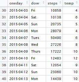
The resulting dataset looks like this:
Data Visualization and Analysis
As a first step, let’s make histograms of the temperature and step count variables:
# histograms of temperature and step count at a daily level
# using the base plotting system
hist(ww_per_day$temp, col ='darkblue',
xlab = 'Daily Average Temperature (Celsius)',
main = 'Histogram of Temperature')

hist(ww_per_day$steps, col ='darkgreen',
xlab = 'Daily Total Step Count',
main = 'Histogram of Step Count') 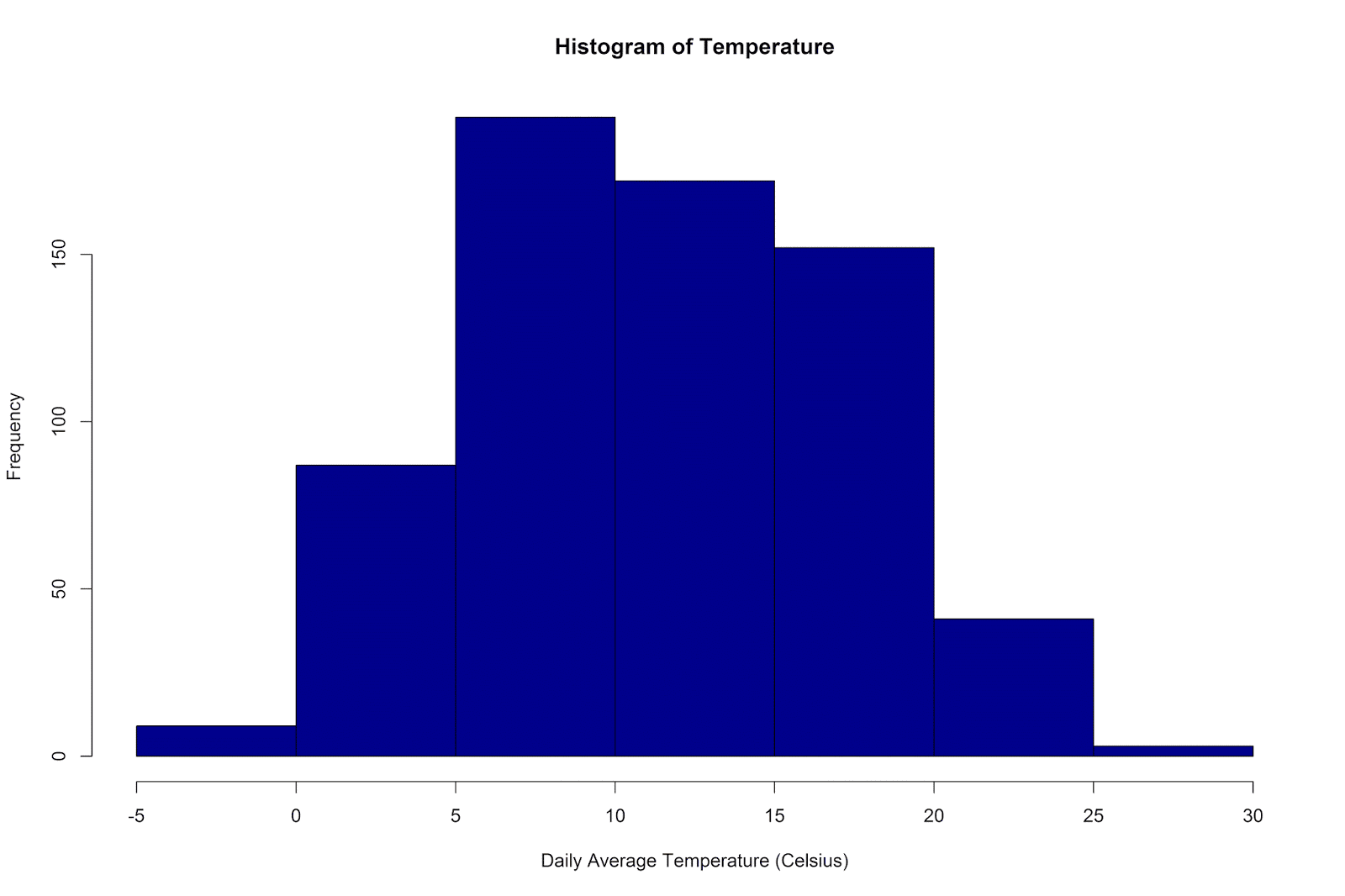
The temperatures have ranged from -4 degrees to 27 degrees Celsius, with a mean of 11.66 (SD = 5.83).
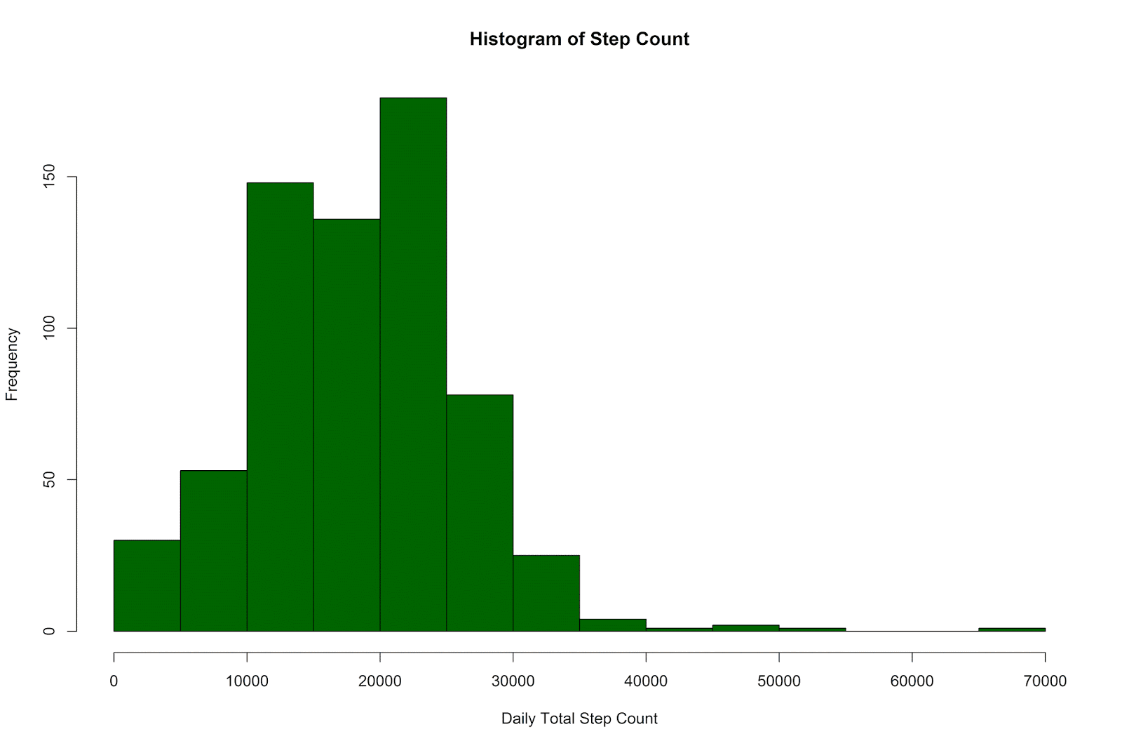
The daily step counts have ranged from 6 to 65,337, with a mean of 18,294.04 (SD = 7,808.36).
In order to visualize the relationship between my daily step count and the daily average temperature, I made a simple scatterplot, with a linear model line superimposed on the graph (95% confidence intervals shown in light grey):
# plot of steps by temperature
p = ggplot(data = ww_per_day, aes(x = temp, y = steps)) +
	geom_point() +
	coord_cartesian(ylim = c(0, 25000)) +
	geom_smooth(method="lm") +
	theme(legend.title=element_blank()) +
	labs(x = "Temperature (Celsius)", y = "Steps" )
p 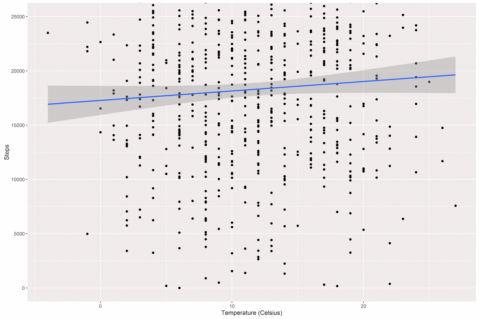
There is a slight positive relationship between temperature and step count, such that on warmer days I tend to walk more. A simple linear regression will estimate the size of this relationship:
summary(lm(steps~temp , data = ww_per_day )) The estimates given:
| Estimate | Std. Error | t value | Pr(>|t|) | Starz! | |
|---|---|---|---|---|---|
| (Intercept) | 17277.29 | 681.76 | 25.342 | < 2e-16 | *** |
| temp | 87.21 | 52.31 | 1.667 | 0.096 | . |
---
Signif. codes:  0 ‘***’ 0.001 ‘**’ 0.01 ‘*’ 0.05 ‘.’ 0.1 ‘ ’ 1

Residual standard error: 7798 on 653 degrees of freedom
Multiple R-squared:  0.004238, Adjusted R-squared:  0.002713
F-statistic: 2.779 on 1 and 653 DF,  p-value: 0.09597
The model estimates that I walk an additional 87.21 steps for each degree increase in the daily average temperature. However, the p-value associated with this estimate shows only a nonsignificant trend toward significance.
In a previous post we saw that my walking patterns tend to be different during the weekdays and the weekend. I was therefore curious to examine the relationship between temperature and step count across these two different types of days.
I generated the week/weekend variable (as in the previous post) and the plot with the following code:
# generate the weekday vs. weekend variable
ww_per_day$week_weekend[ww_per_day$dow == 'Sun'] <- 'Weekend'
ww_per_day$week_weekend[ww_per_day$dow == 'Sat'] <- 'Weekend'
ww_per_day$week_weekend[ww_per_day$dow == 'Mon'] <- 'Weekday'
ww_per_day$week_weekend[ww_per_day$dow == 'Tues'] <- 'Weekday'
ww_per_day$week_weekend[ww_per_day$dow == 'Wed'] <- 'Weekday'
ww_per_day$week_weekend[ww_per_day$dow == 'Thurs'] <- 'Weekday'
ww_per_day$week_weekend[ww_per_day$dow == 'Fri'] <- 'Weekday'

# plot the relationship between temperature and step count
# with separate colors and lines for weekday vs. weekend
p = ggplot(data = ww_per_day, aes(x = temp, y = steps, color=week_weekend)) +
	geom_point() +
	coord_cartesian(ylim = c(0, 25000)) +
	geom_smooth(method="lm") +
	theme(legend.title=element_blank()) +
	labs(x = "Temperature (Celsius)", y = "Steps" )
p
The relationship between temperature and step count does indeed appear to be different on weekdays vs. the weekend:
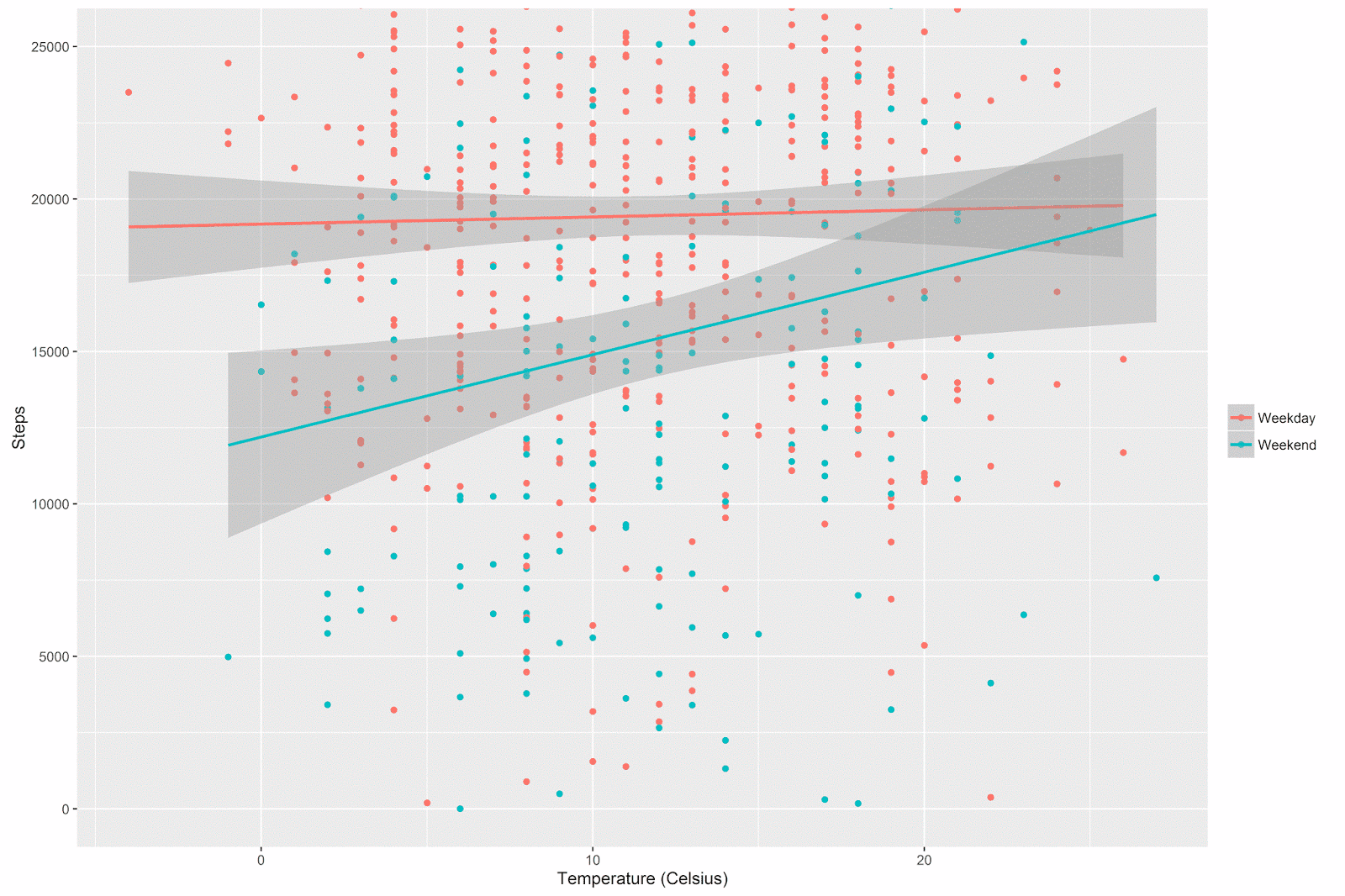
The general pattern is that there’s not much of a relationship between temperature and step count during the week (after all, I have to walk to work whether it’s warm or cold), but on the weekends I walk quite a bit more when it’s warmer out.
Notice how the confidence intervals get wider at the extremes of the x-axis. These are regions where there are simply less data (by definition, extreme temperatures are rare). This pattern is especially noticeable for the weekend days (there are far fewer weekend days than there are week days, and so we have even less data here at the margins).
Although I’m in general not particularly interested in null-hypothesis significance testing of regression coefficients in this type of analysis, I went through the formality of testing the time period (weekday vs. weekend) by temperature interaction.
summary(lm(steps~temp + as.factor(week_weekend)+ temp:as.factor(week_weekend),
data = ww_per_day )) | Estimate | Std. Error | t value | Pr(>|t|) | Starz! | |
|---|---|---|---|---|---|
| (Intercept) | 19178.76 | 774.45 | 24.76 | < 2e-16 | *** |
| temp | 23.46 | 59.52 | 0.39 | 0.69 | |
| as.factor(week_weekend)Weekend | -6982.66 | 1486.25 | -4.70 | 0.00 | *** |
| temp:as.factor(week_weekend)Weekend | 246.76 | 113.76 | 2.17 | 0.03 | * |
---
Signif. codes:  0 ‘***’ 0.001 ‘**’ 0.01 ‘*’ 0.05 ‘.’ 0.1 ‘ ’ 1

Residual standard error: 7560 on 651 degrees of freedom
Multiple R-squared:  0.06682, Adjusted R-squared:  0.06252
F-statistic: 15.54 on 3 and 651 DF,  p-value: 9.005e-10
The results show that the interaction term is statistically significant; we already understood the shape and meaning of the interaction with the above plot.
More interesting for our purposes is the model summary. The adjusted multiple R squared is about 6%, much greater than the .3% from the model above (where we only include temperature as a predictor), but not very high overall. The take-home message is that time period (weekday vs. weekend) and temperature have clear relationships with step count, but together and in combination they don’t explain a huge amount of variance in the amount of steps I walk each day.
I wondered about the importance of the interaction term, actually. Interactions are widely sought after in certain academic contexts, but I enjoy the simplicity and ease-of-interpretation of main effects models for applied problems which require interpretable solutions (e.g. “white box” models). Bluntly put: how important is the interaction term in this context? One might argue that, although the p-value for the interaction term passes the threshold for statistical significance, knowing that the interaction term is (statistically) significantly different from zero doesn’t bring us much further in our understanding of the problem at hand, after accounting for the main effects of time period and temperature.
Model Comparison
[Edit: as an anonymous commenter correctly pointed out, in the current case in which we compare a model with two main effects and a model with these same effects plus their interaction, the model comparison is mathematically equivalent to the significance test of the interaction reported above! (This is not necessarily the case when multiple predictors differ across the to-be-compared regression models.)]
Another approach to examining the importance of the time period by temperature interaction term is to conduct a formal model comparison. In order to do so, I computed the model predicting step count with just the main effects of time period and temperature (lm_1 below), and also the model with the main effects and their interaction term (lm_2 below). I then performed a model comparison to see if adding the interaction term results in a statistically significant reduction in the residual sum of squares. In other words, is the difference between the predictive performance of the first and second model greater than zero?
# main effects model
lm_1 <- lm(steps~temp + as.factor(week_weekend), data = ww_per_day )
summary(lm_1)

# main effects + interaction model
lm_2 <- lm(steps~temp + as.factor(week_weekend)+ temp:as.factor(week_weekend),
data = ww_per_day )
summary(lm_2)

# model comparison
anova(lm_1,lm_2)
Which gives the following result:
| Model | Res.Df | RSS | Df | Sum of Sq | F | Pr(>F) |
|---|---|---|---|---|---|---|
| 1 | 652 | 3.75E+10 | ||||
| 2 | 651 | 3.72E+10 | 1 | 268916758 | 4.70 | 0.03 * |
---
Signif. codes:  0 ‘***’ 0.001 ‘**’ 0.01 ‘*’ 0.05 ‘.’ 0.1 ‘ ’ 1
As noted by a commenter below, the significance test of the interaction term reported above and this model comparison are statistically equivalent. The general conclusion is that adding the interaction term results in a statistically significant decrease in the residual sum of squares. In other words, we can better predict my step count if we include the interaction term.
Conclusion
To sum up, in this post we took the daily total step counts from my Accupedo step counter app and added data about the average temperature on each day that steps were recorded. We used scatterplots to explore and understand the relationship between these two variables, both overall and according to the time period (e.g. weekday vs. weekend).
We also used linear regression to investigate the relationship between daily temperature and daily step count. When predicting step count from temperature, we saw that there was a non-statistically significant trend such that I walk more on warmer days. When adding time period as a categorical predictor in an interactive regression model, we saw a statistically significant interaction between temperature and time period, such that the relationship between temperature and step count was stronger on weekends vs. weekdays. In other words, I walk more when it’s warmer out, but only during the weekend.
Caveat: Null Hypothesis Significance Testing (NHST) in Exploratory Data Analysis
We used NHST and p-values to interpret regression coefficients and to compare the predictive performance of the main effects vs. interaction regression models. I’m somewhat ambivalent about the use of p-values in this context, honestly. I’ve been very influenced by Andrew Gelman’s work, particularly his wonderful blog, and am very conscious of the limitations of p-values in exploratory contexts like this one. It’s not that there’s no value in conducting this type of analysis, it’s just that the NHST aspect of the modeling is not the most valuable part.
The statistical approach we’ve seen in this post conforms very much to the way I was trained in the social sciences. In this tradition, a strong focus is put on NHST (via p-values), and less frequently on interpreting model R square and performing formal model comparisons. In the work I do now as an applied data analyst (or “data scientist”), I often take an approach that borrows heavily from machine learning (though these ideas are also present in traditional statistical thinking): evaluating models via predictive accuracy on a test dataset that was not used in data modeling.
Coming Up Next
In the next set of posts, we will analyze a different dataset using an approach that leans more heavily towards this machine-learning perspective. We’ll also change analytical software, using Python/Pandas and the scikit-learn library to analyze the data. Stay tuned!
