How Do You Order Songs on an Album? Album Sequencing & Song Tempo Across Musical Genres
In this post, we will return to a dataset we examined previously: information describing over 10,000 songs in my personal music collection. We’ll examine the tempo (e.g. the speed) at which songs are played, and analyze the tempo of songs across the length of an album - overall and separately for different musical genres. The goal is to bring a data analytic view on what’s ultimately an artistic choice - how to arrange the songs on an album so that they form a cohesive musical package.
The Data
The data for this blog post come from the digital music (.mp3) files on my computer. I have most of the music I’ve listened to over the past 10 years in a digital format, and I extracted the artist, album, and musical genre information from ID3 tags included in the files (using code adapted from a previous blog post).1
I then used the artist and album information to get the tempo for each album track from the Spotify API, which has catalogued this information for a huge number of albums. I queried the Spotify API using Python and the excellent Spotipy package. In total, I was able to retrieve the tempo information for about 80% of the albums in my digital collection (obscure or niche recordings are not always available on Spotify).
In total, the dataset contains information on 10,054 songs and 694 albums.
You can find the data and all the code from this blog post on Github here.
Tempo
In this post, the primary variable we are interested in is tempo, e.g. the speed or pace at which the songs are played. Tempo is typically measured in beats per minute (bpm), meaning that a song played at 60 bpm has one beat per second, while a song played at 120 bpm has two beats per second. If you’re curious, you can play around with this free online metronome to get an intuitive sense of the speeds associated with different bpm’s.
The head of the dataset (named raw_data) looks like this:
| album_id | album_name | artist_name | track_name | track_number | num_tracks | genre | tempo |
|---|---|---|---|---|---|---|---|
| ce72791169cf13c785d577dcdde03547 | ÷ (Deluxe) | Ed Sheeran | Eraser | 1 | 16 | Pop | 86.01 |
| ce72791169cf13c785d577dcdde03547 | ÷ (Deluxe) | Ed Sheeran | Castle on the Hill | 2 | 16 | Pop | 135.01 |
| ce72791169cf13c785d577dcdde03547 | ÷ (Deluxe) | Ed Sheeran | Dive | 3 | 16 | Pop | 134.94 |
| ce72791169cf13c785d577dcdde03547 | ÷ (Deluxe) | Ed Sheeran | Shape of You | 4 | 16 | Pop | 95.98 |
| ce72791169cf13c785d577dcdde03547 | ÷ (Deluxe) | Ed Sheeran | Perfect | 5 | 16 | Pop | 95.05 |
| ce72791169cf13c785d577dcdde03547 | ÷ (Deluxe) | Ed Sheeran | Galway Girl | 6 | 16 | Pop | 99.94 |
| ce72791169cf13c785d577dcdde03547 | ÷ (Deluxe) | Ed Sheeran | Happier | 7 | 16 | Pop | 89.79 |
| ce72791169cf13c785d577dcdde03547 | ÷ (Deluxe) | Ed Sheeran | New Man | 8 | 16 | Pop | 94.03 |
| ce72791169cf13c785d577dcdde03547 | ÷ (Deluxe) | Ed Sheeran | Hearts Don't Break Around Here | 9 | 16 | Pop | 105.18 |
| ce72791169cf13c785d577dcdde03547 | ÷ (Deluxe) | Ed Sheeran | What Do I Know? | 10 | 16 | Pop | 115.09 |
Histograms of Song Tempo
Overall
Let’s first look at the overall distribution of song tempos across all 10,054 songs, which we can do with the following code. I first set up the color scheme using the Economist palette in the ggthemes package.
# load the libraries we'll use
library(plyr); library(dplyr)
library(ggplot2)

# load ggthemes in order to use
# economist palette
library(ggthemes)
pal <- economist_pal()(7)
single_color <- economist_pal()(9)[8]

# make the overall histogram
raw_data %>%
  # pass the data to ggplot2
  ggplot(., aes(x=tempo)) +
  # specify that we want a histogram
  geom_histogram(position="identity",
                 alpha=0.5,
                 binwidth=1,
                 color="black",
                 fill = single_color) + # 'maroon'
  # use the classic theme
  theme_classic() +
  # specify the labels
  labs(x = "Tempo (beats per minute)",
       y = "Count",
       title = 'Histogram of Song Tempos (N = 10054 songs)' )
Which returns the following plot:
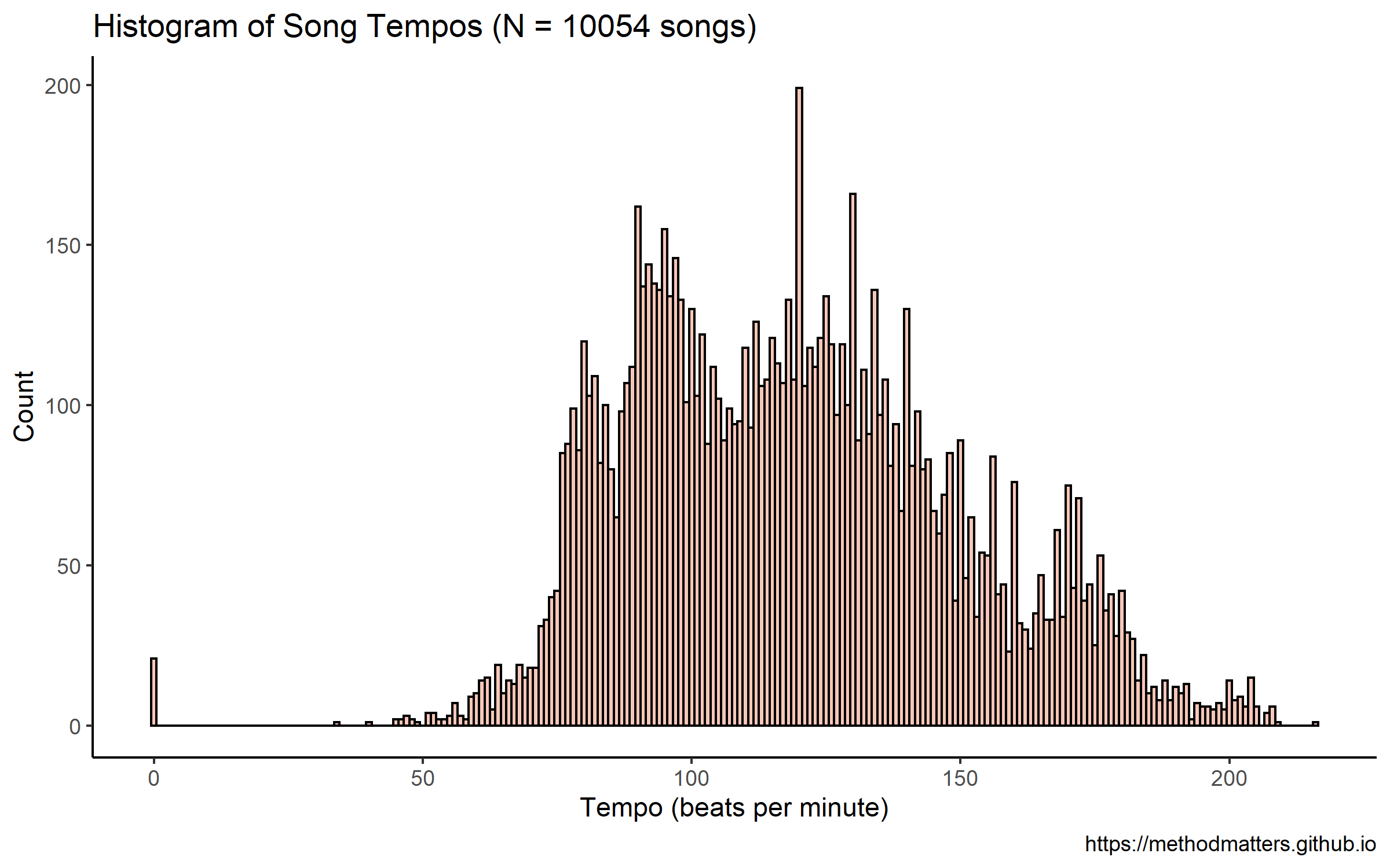
This distribution does not look entirely normal. There look to be perhaps 3 separate peaks - one at just under 100, one around 130, and one around 170. However, these data contain information from songs from different musical genres, which might not have the same underlying distributions.
By Genre
Below I split the data and produce one histogram per genre using a facet plot, only including genres with more than 200 songs.
# panel histogram by genre
raw_data %>%
  # group the data by genre
  group_by(genre) %>%
  # calculate the number of songs / genre
  mutate(num_per_genre = n()) %>%
  # remove genres with fewer than 200 songs
  filter(num_per_genre > 200) %>%
  # ungroup the data
  ungroup(genre) %>%
  # make a new genre column that specifies
  # how many songs there are for each genre
  mutate(genre = paste(genre, "  \n(", num_per_genre, " songs)", sep = '')) %>%
  # pass the data to ggplot2
  ggplot(., aes(x=tempo, color=genre,
          fill=genre, alpha=0.1, position="identity")) +
  # specify that we want a histogram
  geom_histogram() +
  # specify that we want the colors from the
  # economist palette (defined above)
  scale_fill_manual(values=pal) +
  scale_color_manual(values=pal) +
  # use the classic theme
  theme_classic() +
  # turn off the legend
  theme(legend.position="none") +
  # specify the labels
  labs(x = "Tempo (beats per minute)",
       y = "Count",
       title = 'Histogram of Song Tempos by Genre') +
  # make a separate panel for each genre
  facet_wrap(~ genre)
Which returns the following plot:
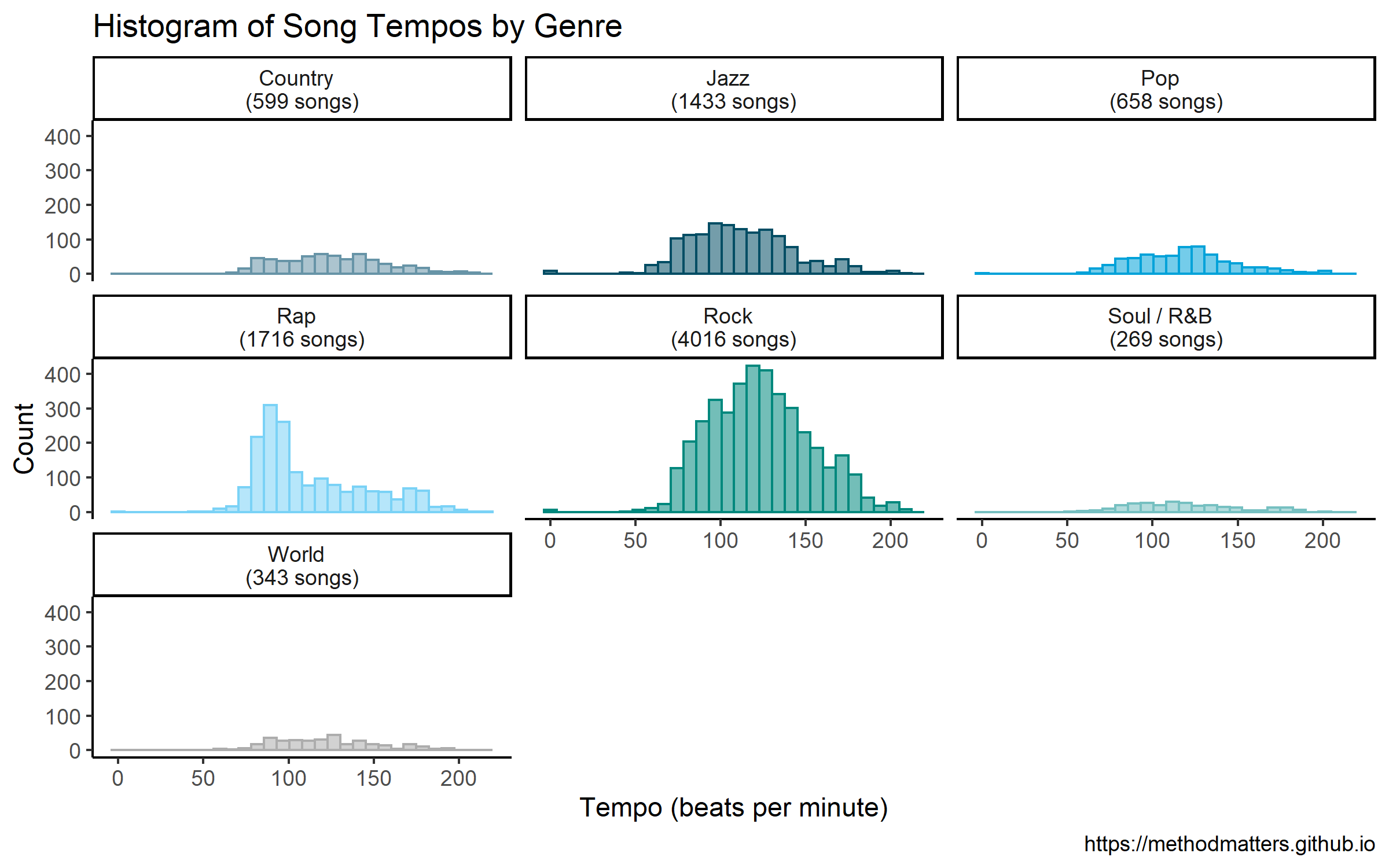
The distributions per genre are mostly more normal-looking than the overall histogram. Furthermore, we can see where some of the peaks in the overall graph come from. For example, the peak just below 100 in the overall histogram appears to come from the rap genre, which has a large peak at this value, followed by a long right-hand tail.
Sequence of Song Tempos Across Album Length
In order to examine trends across album length, we need to divide each album’s tracks into groups based on the order of appearance on the album (e.g. the track number). One challenge is that the albums in the data set have differing numbers of songs, and we need to standardize these lengths across albums. I chose to divide each album up into 10 different parts, which I think strikes a balance between the granularity of measurement across each album (10 different data points), and the actual distribution of album lengths across our data set. In order to ensure we have 10 groups for each album, I exclude albums with fewer than 10 tracks in the analyses below (there are 81 of them).
The dplyr chain shown below takes our raw data as input, and computes a number of selections and transformations, ultimately producing a plot at the end. I won’t go into all of the details of the code in this blog post. Let’s go into a little bit of detail, however, about the division of each album into groups representing track sequence, and our treatment of the tempo variable.
Dividing the Album Into Sequence Groups
In order to divide up each album into 10 parts, I use the ntile function in R. The ntile function sorts observations of a given variable, and then divides the observations into groups of approximately equal size (I specify I want 10 groups in the code below). By grouping the data by album, and then calculating the decile of the track number, we assign each track a value from 1-10, based on its appearance in the album sequence. We aggregate our tempo data by album decile in order to describe the differences across the album sequence in the plots shown below.
Comparing Tempo Across Tracks and Albums
As we can see in the panel histogram above, the genres have different tempo profiles. The same is true of different albums within each genre. How, then, can we meaningfully compare the tempos of tracks across albums and across genres?
The approach that I take below uses the grouping variable of the album in order to transform and compare track tempo information. Specifically, I group the data by album, and calculate the average tempo and tempo standard deviation for each one. Then, for each track, I subtract the album average tempo from the individual track tempo, and divide by the album standard deviation. This transformed tempo value, called std_tempo_track in the code below, expresses, for each track, its difference from the album average in standard deviations. Finally, I take the mean std_tempo_track per album decile, and plot these values in the graph below.
In sum, this approach looks at deviations of tempo within an album, allowing us to put the track tempo data on a common scale that allows comparisons between albums.
Tempo Across Album Tracks: All Genres
The code below performs the selections and transformations I describe above, creating a single plot summarizing the average tempo sequence across 613 albums:
# overall bar chart
raw_data %>%
  # only keep albums with at least 10 tracks
  # (needed to divide album in 10 parts)
  filter(num_tracks > 9) %>%
  # for each album, we calculate the decile for each track
  # along with the mean and std dev of the tempo per album
  # and finally the standardized value of the tempo per track
  group_by(album_id) %>% mutate(album_decile = ntile(track_number, 10),
                         mean_tempo_album = mean(tempo),
                         sd_tempo_album = sd(tempo),
                         std_tempo_track = (tempo -mean_tempo_album) /sd_tempo_album) %>%
  # we then group by album decile and calculate the average difference in std dev
  # from the album average
  group_by(album_decile) %>% summarize(mean_tempo_decile = mean(std_tempo_track)) %>%
  # pass the data to ggplot2
  ggplot(., aes(x = album_decile, y = mean_tempo_decile)) +
  # specify that we want a bar chart
  geom_bar(stat = 'identity',color="black", fill=single_color,alpha=0.9)  +
  # the x axis should go from 1 to 10 by 1
  # to indicate the album decile
  scale_x_continuous(breaks = seq(from = 1, to = 10, by = 1)) +
  # add the value labels above the bars
  # https://stackoverflow.com/questions/46300666/put-labels-over-negative-and-positive-geom-bar
  geom_text(aes(y = mean_tempo_decile + .005 * sign(mean_tempo_decile),
                label = round(mean_tempo_decile,2)),
                position = position_dodge(width = 0.9),
                size = 4, color = 'black') +
  # use the classic theme
  theme_classic() +
  # turn off axis elements for a cleaner graph
  theme(axis.text.y = element_blank(),
        axis.line = element_blank(),
        axis.ticks = element_blank()) +
  # specify the labels
  labs(x = "Album Decile",
       y = "Difference From Album Average (in Standard Deviations)",
       title = 'Tempo Across Album Decile (613 albums)')
Which returns the following plot:
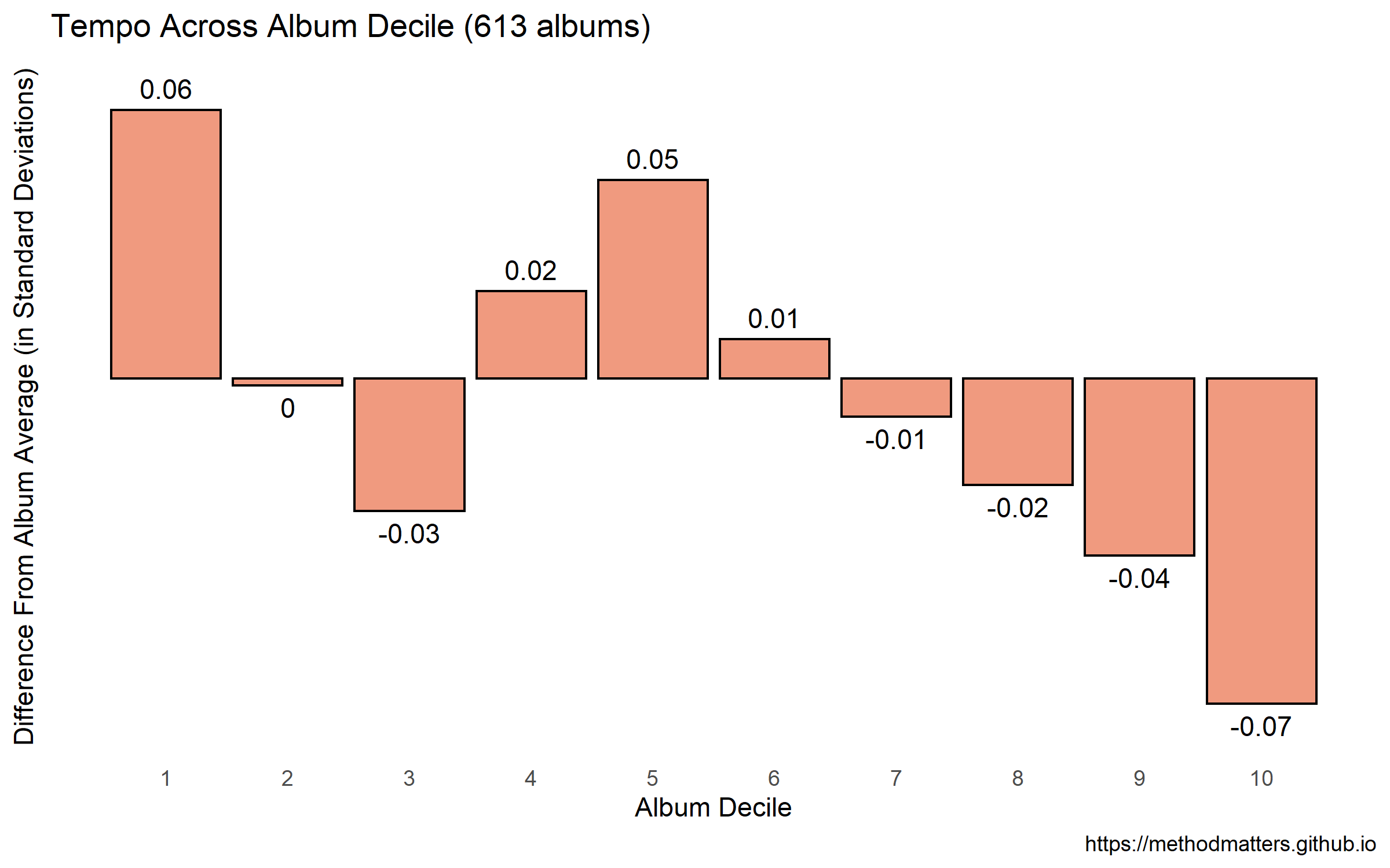
It looks like, on average, albums start off with a slightly faster-than-average song, and end with slightly slower-than-average songs. There’s a small tempo dip at the third decile, and upticks in tempo at the 4th and 6th deciles. However, the size of these differences is quite small. The largest differences from the album average are .06 and -.07 of a standard deviation, which seems to be a small effect size (more on this below).
Tempo Across Album Tracks by Genre
Let’s make separate plots per genre, as we did with the histograms above. The code to do so is mostly the same as that shown above. However, I’m making some additional selections here by only including genres with more than 30 albums. (Even when we start with more than 10,000 songs, our data becomes thin in some places when we aggregate by both album and genre!)
# panel bar chart by genre
raw_data %>%
  # only keep albums with at least 10 tracks
  # (needed to divide album in 10 parts)
  filter(num_tracks > 9) %>%
  # group by genre
  group_by(genre) %>%
  # calculate the number of albums per genre
  mutate(albums_per_genre = length(unique(album_id))) %>%
  # only select genres with at least 30 albums
  filter(albums_per_genre > 30) %>%
  # ungroup the data
  ungroup(genre) %>%
  # make a new genre column that specifies
  # how many albums there are for each genre
  mutate(genre = paste(genre, "  \n(", albums_per_genre, " albums)", sep = '')) %>%
  # for each album, we calculate the decile for each track
  # along with the mean and std dev of the tempo per album
  # and finally the standardized value of the tempo per track
  group_by(album_id) %>% mutate(album_decile = ntile(track_number, 10),
                        mean_tempo_album = mean(tempo),
                        sd_tempo_album = sd(tempo),
                        centered_tempo_track = (tempo - mean_tempo_album) / sd_tempo_album) %>%
  # we then group by genre and album decile
  # and calculate the average difference in std dev
  # from the album average, separately per genre
  group_by(genre, album_decile) %>% summarize(mean_tempo_decile = mean(centered_tempo_track)) %>%
  # pass the data to ggplot2
  ggplot(., aes(x = album_decile, y = mean_tempo_decile, color = genre)) +
  # specify that we want a bar chart
  geom_bar(aes(fill = genre),stat = 'identity') +
  # specify that we want the colors from the
  # economist palette (defined above)
  scale_fill_manual(values=pal) +
  scale_color_manual(values=pal) +
  # the x axis should go from 1 to 10 by 1
  # to indicate the album decile
  scale_x_continuous(breaks = seq(from = 1, to = 10, by = 1)) +
  # add the value labels above the bars
  # https://stackoverflow.com/questions/46300666/put-labels-over-negative-and-positive-geom-bar
  geom_text(aes(y = mean_tempo_decile + .03 * sign(mean_tempo_decile),
                label = round(mean_tempo_decile,2)),
                position = position_dodge(width = 0.9),
                size = 2.5, color = 'black') +
  # use the classic theme
  theme_classic() +
  # turn off axis elements for a cleaner graph
  theme(legend.position="none") +
  theme(axis.text.y = element_blank(),
    axis.line = element_blank(),
    axis.ticks = element_blank())+
  # specify the labels
  labs(x = "Album Decile",
       y = "Difference From Album Average (in Standard Deviations)",
       title = 'Tempo Across Album Decile By Music Genre' ) +
  # make a separate panel for each genre
  facet_wrap(~ genre)
Which returns the following plot:
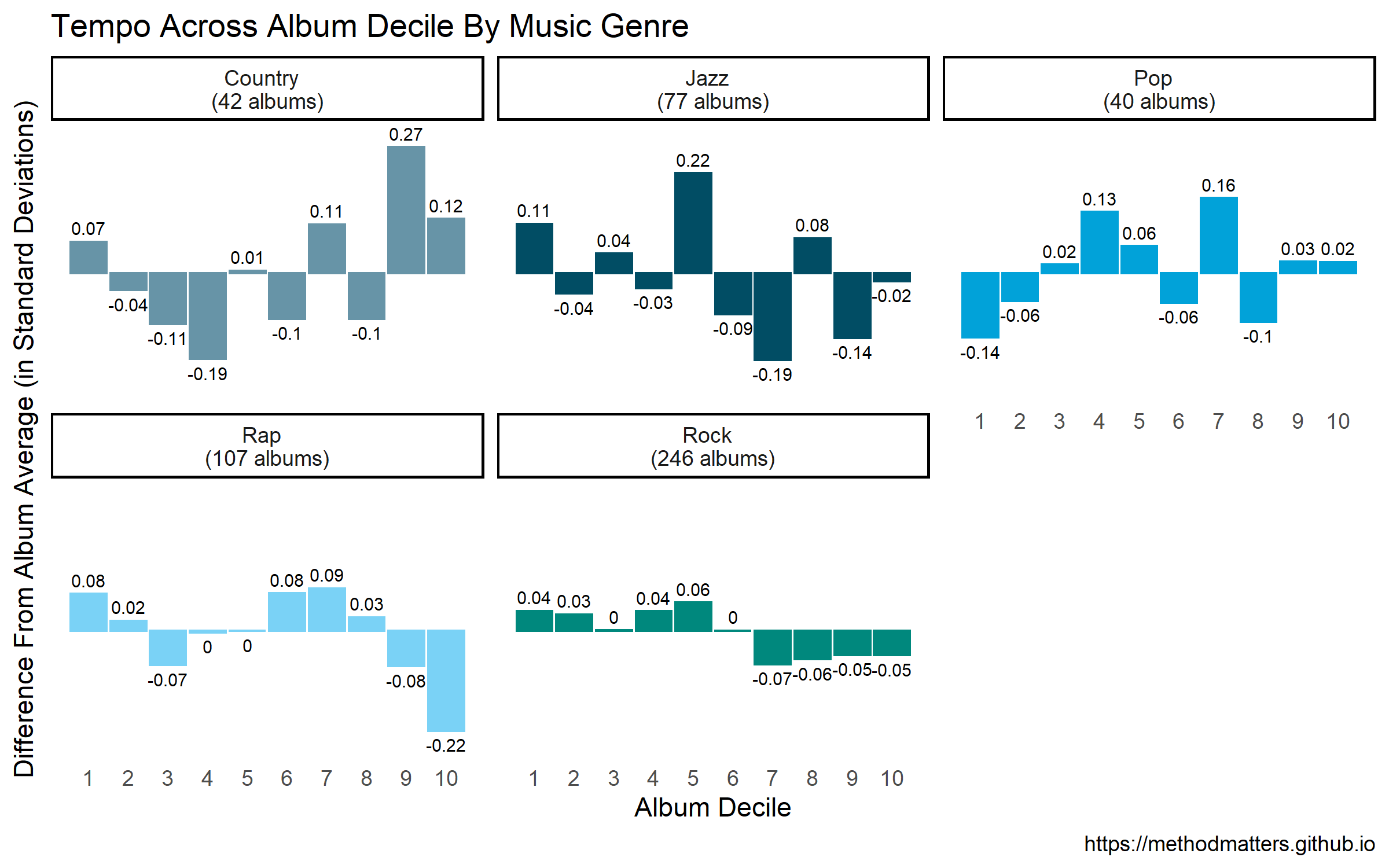
As with the histograms shown above, the patterns are definitely different across genres!
Country
Country albums start with slightly-faster-than-average tracks, with slower songs in the 3rd, 4th, 6th and 7th deciles. They tend to end with faster songs - particularly in the 9th decile. The differences from the album averages are 2-to-7 times larger than for the aggregate analysis shown above.
Jazz
Jazz albums start with faster tracks, followed by slower ones. On average, the slower songs are at the back half of the album, particularly from the 6th to 9th deciles. The general trend seems to be that the average tempo decreases across the length of the album from deciles 1 to 9, with the final decile being slightly below the average. It must be noted that the size of the differences for the jazz albums are smaller than those of the country genre.
Pop
Pop albums begin with slower songs. There appears to be a shift around the 3rd and 4th decile, with faster-than-average songs appearing at this place in the album sequence. The other noteable pattern in the graph is the uptempo songs in the 7th decile - this seems to be a place in the album sequence where the fastest tracks appear. The size of the differences from album average is on par with that for country, and much larger than in the overall data.
Rap
Rap albums seem to start with slightly faster-than-average tracks. There’s a trend for slower songs at the 3rd decile. But the largest pattern for the rap genre is the slower-than-average songs at the 10th decile, meaning that albums from this genre end with slower tracks. (In my experience, rap albums often end with an outro that’s more of a spoken-word conclusion, with shout-outs to collaborators, friends, family, etc. It makes sense that these songs are slower-than-average.).
Rock
The main trend I see for rock is that the first 6 deciles of rock albums are slightly faster-than-average, while the final 4 are slower-than average. In essence, rock albums start with the faster songs and end with the slower ones. However, it must be noted that the size of these differences is very small compared to the differences for the other genres. As the “rock” genre is something of a catch-all category, including many different sub-genres, it’s possible that these small differences mask larger sub-genre patterns.
Effect Size & Generalizability
Are these differences small or large? Good question - as described above, we’re calculating tempo differences within albums in order to compare tempo patterns between albums. This constrains the size of the differences we can observe, because albums as artistic packages necessarily have some degree of internal coherency, and therefore a somewhat limited range in terms of song tempos. Indeed, an album that contained both very slow songs (e.g. pop ballads) and very fast songs (e.g. speed metal tracks) would not make much artistic sense and would definitely result in a strange listening experience.
We can also get a sense of the relative effect sizes by comparing the overall analysis with the analysis by genre. The largest effects in the overall analysis were around .06 of a standard deviation. In contrast, the largest effects in the genre analysis were around .2 of a standard deviation: in other words, more than 3 times larger.
Finally, it’s not clear how well the observed differences would generalize across all albums from these genres. As we saw earlier, even though we started out with more than 10,000 songs, we ended up with a much smaller number of albums in the final analysis.
Summary and Conclusion
In this post, we examined the tempo of the songs in my music collection. We first examined the distributions of tempo overall and across genres. The overall tempo distribution masked larger differences that were evident when we split up the data by musical genre.
We then looked at the sequencing of album songs by tempo. Overall, we saw a small trend for albums to start with faster-than-average songs, and end with slower-than-average songs. However, when splitting the data by musical genre, we saw clear differences in the patterns of tempo sequences across album length. For example, country albums started with somewhat faster songs, with slower songs appearing at the 3rd and 4th deciles, and finally ending with relatively fast songs. Pop albums, in contrast, started out with slower songs for the first 2 deciles, with much faster songs appearing from the 2nd to the 4th deciles, and the fastest songs appearing at the 7th decile.
Finally, we considered the effect size of the differences across album sequences. Given the need for a degree of internal coherency within an album, it is difficult to imagine that albums would have very large shifts in tempo across songs. My overall conclusion is that the size of the differences across album lengths are small but reasonable given the context. They make sense to me as a consumer of music and as someone who has listened to all of the albums in this data set! It is unclear whether the observed differences generalize beyond the current data - if anyone out there wants to follow up on this with different data, please let me know what you find!
Coming Up Next
In the next post, we will look at some step count data collected from 2 different wearable fitness trackers, and see how the measurements compare with one another.
Stay tuned!
-
In comparison with the previous examination of these data, I was able to get more complete information on the musical genres of the different albums. ↩