Rap text analysis- Watch the Throne (Kanye West and Jay Z) - Part 2
In my last post, I described some first text analyses I did with R, using wordclouds to visualize language use in Kanye West and Jay-Z’s collaborative 2011 album “Watch the Throne.”
This post presents some more statistically-oriented analyses of language use in “Watch the Throne,” again with an eye towards presenting results in a visually intuitive way.
The main goal of these analyses was to examine word co-occurrence to try to understand the lyrical content. Everything I’ll show below is based on simple correlations among the terms used in the album.
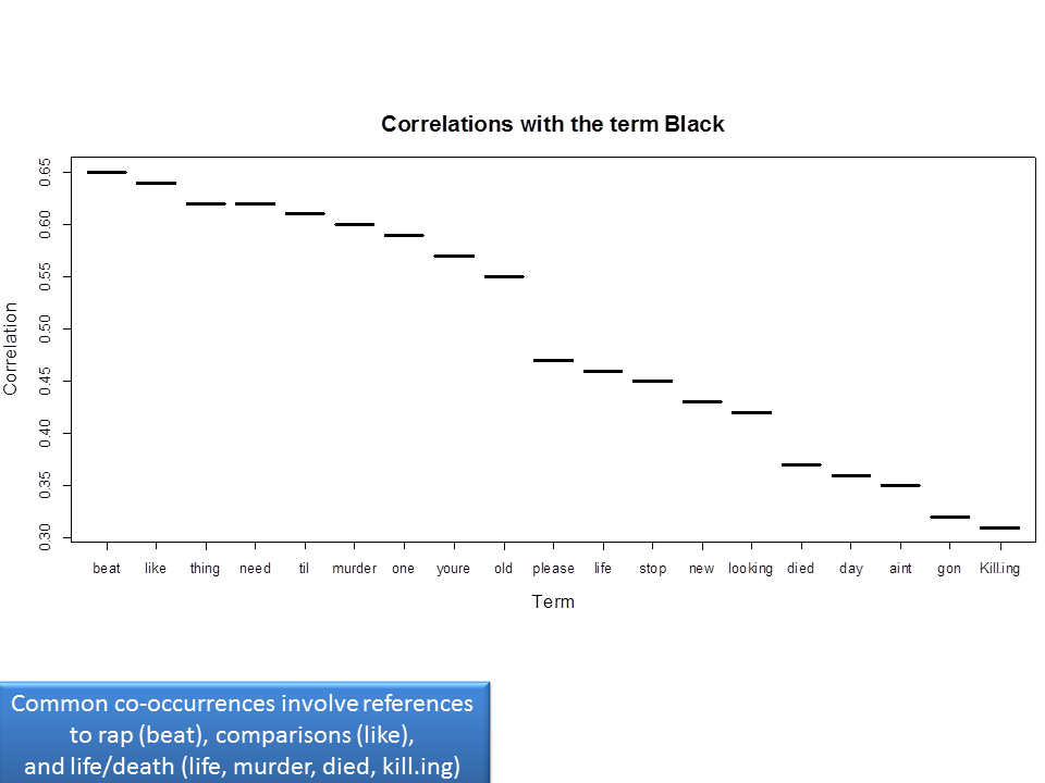
Given that many reviews of the album mention that blackness is a major theme of Watch the Throne, I decided to start there. Specifically, I looked for large correlations with the term “black” to see what other words tended to co-occur with it.

(Note I struggled with making this chart in R, but in the end think it’s pretty interpretable.)
References to black tended to co-occur with references to rap music (perhaps unsurprising given the somewhat “meta” tendency of hip hop lyrics to comment on the music, artists, and creative/production process more generally). Other associations were with comparisons more broadly (like) and life and death. Life and death and its relation to the African American experience pops up quite frequently on the album (e.g. Murder to Excellence), and it’s interesting to see that this comes through in the statistical analysis as well.
This focus on correlations with specific words can give an interesting view on relationships we think are important, but a full examination of such relationships would entail looking at these types of charts for each word we find important.
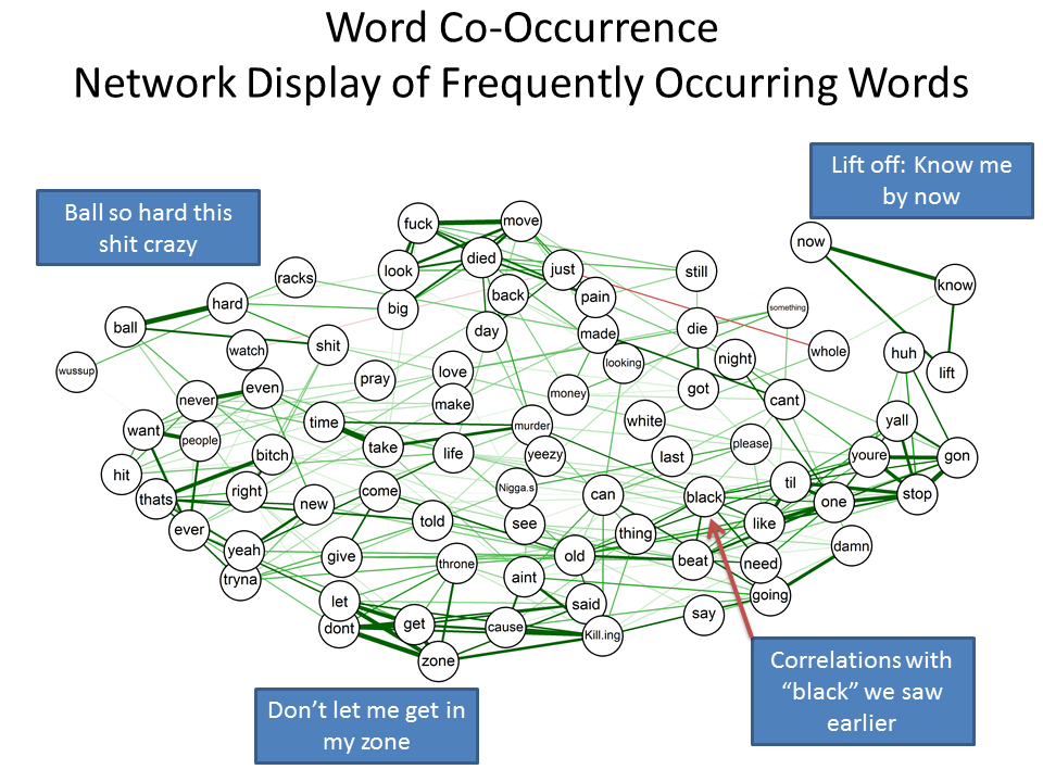
To get a more global picture of word inter-relations, I used the QGraph package to plot the correlations among all the words with more than 4 repetitions. I really had no idea if this would give anything interesting, but I was quite pleased with the resulting graph:
The graph is a bit crowded, but it gives a good high-level picture of all the inter-relationships among the words. Note that green indicates positive relationships, red indicates negative relationships, and stronger relationships are represented by thicker lines. Also, words that are more closely related to one another are located more close together on the chart.
The analysis picks up commonly-used phrases pretty well (e.g. don’t let me get in my zone from Niggas in Paris). I love that these qgraph charts can display a lot of information in a very intuitive and visual way, without overwhelming us with numeric details. (Hat tip to Joel Cadwell for his post which introduced me to this package).
In my next and final post about the text analysis of “Watch the Throne,” I’ll show a mapping I did to try to understand themes based on relationships between the song titles and word occurrences therein.
