Rap text analysis- Watch the Throne (Kanye West and Jay Z) - Part 3
This last post will give a quick overview of two other methods I used to try to understand Watch the Throne using text analysis with R. Last post about this album, I promise!
The first analysis I’ll present here has to do with clustering of songs. I was very inspired by the Stanford Literary Lab’s series of pamphlets, particularly their first one, entitled “Quantitative Formalism”. In this paper, they talk about some explorations they did using cluster analysis to determine linguistic similarities between different types of texts (Shakespeare plays, Novelistic Genres, etc.).
I was curious if this type of technique would also work to classify the different song contributions of Jay-Z and Kanye West in Watch the Throne.
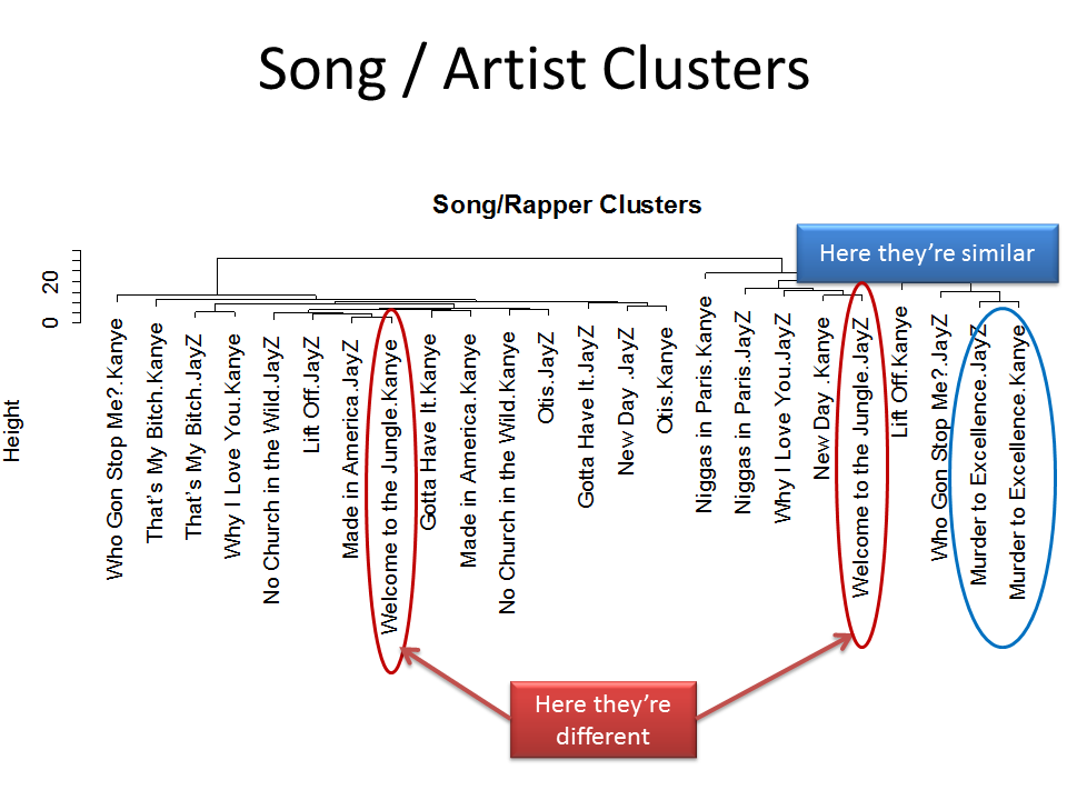
I aggregated the text to the Song/Artist level, e.g. 24 rows, each one indicating an artist + song combination. I calculated the frequency of each word in each row, only keeping words that occurred 4 or more times in the entire album. I then did a basic cluster analysis on the frequencies (using hclust, Ward’s method).
The resulting cluster dendogram is displayed below. It suggests some interesting things, but it’s not entirely clear what exactly is leading to certain song/artist combinations to be close together vs. far away from each other. For example, the two artists’ contributions fall in the same cluster for Murder to Excellence, but fall far apart for Welcome to the Jungle. The specific word patterns underlying these classifications aren’t clear from just looking at the diagram.
I’ve been doing some more exploring, and there are better ways to visualize this type of analysis. I plan on looking at this further in a future blog post (using a different corpus).
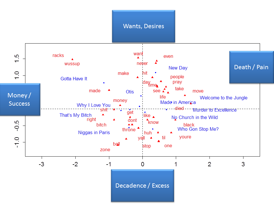
Finally, I did a mapping of the words and the songs using correspondence analysis (via the excellent FactoMineR package). This is an interesting visualization technique because it gives a map in which songs and words are plotted in a 2-dimensional space.
I displayed a number of different dimensions from the correspondence analysis against one another. Below I’m presenting what, to me, was the most interpretable chart. For these analyses, the song Lift Off was a bit of an outlier, in that there was not much linguistic content and the word “lift”, which appears in that song but not elsewhere, really had a strong influence on the dimensions and resulting graphs. So that song is removed from the charts I present below.
First, check out the x-axis (left-to-right axis) below. It seems to me that the left hand side depicts songs and words related to money and success (e.g. racks, money). Gotta Have It, That’s My Bitch and Niggas in Paris all seem to focus on these themes. On the other side of the x-axis, the right hand side of the chart appears to deal with death and pain (e.g. died, murder, pain). Murder to Excellence and Welcome to the Jungle both deal with these themes.
The y-axis (top-to-bottom axis) below seems to depict wants and desires versus decadence and excess. To me, the top part of the graph gets at want and desires (want is the most defining word for this axis in this direction). New Day and Gotta Have It are both good examples of songs with these themes. The bottom part of the graph appears to depict decadence and excess (e.g. zone and ball). Both Who Gon’ Stop me and Niggas in Paris appear to deal with these themes, and both are situated towards the lower part of the graph.
On the whole, this was an interesting project for me. I learned a lot about different statistical and text analytic techniques and a lot more about an album I really enjoy.
I’ve been working on some text analysis of other hip hop albums, and will share what I’ve done in a future post.