<?xml version="1.0" encoding="utf-8"?><feed xmlns="http://www.w3.org/2005/Atom" ><generator uri="https://jekyllrb.com/" version="3.10.0">Jekyll</generator><link href="https://methodmatters.github.io/feed.xml" rel="self" type="application/atom+xml" /><link href="https://methodmatters.github.io/" rel="alternate" type="text/html" /><updated>2025-12-08T21:32:41+01:00</updated><id>https://methodmatters.github.io/feed.xml</id><title type="html">Method Matters Blog</title><subtitle>A blog about data science, statistics, and data analysis with open-source software. 
</subtitle><author><name>Method Matters Blog</name></author><entry><title type="html">True Stories from the (Data) Battlefield – Part 1: Communicating About Data</title><link href="https://methodmatters.github.io/true-stories-part-1/" rel="alternate" type="text/html" title="True Stories from the (Data) Battlefield – Part 1: Communicating About Data" /><published>2025-12-08T09:00:00+01:00</published><updated>2025-12-08T09:00:00+01:00</updated><id>https://methodmatters.github.io/true-stories-part-1</id><content type="html" xml:base="https://methodmatters.github.io/true-stories-part-1/"><![CDATA[<p>The data professions (data science, analysis, engineering, etc.) are highly technical fields, and much online discussion (in particular, on this blog!), conference presentations and classes focus on technical aspects of data work or on the results of data analyses. These discussions are necessary for teaching important aspects of the data trade, but they often ignore the fact that data and analytics work takes place in an interpersonal and organizational context.</p>
<p>In this blog post, the first of a series, we’ll present a selection of non-technical but common issues that data professionals face in organizations. We will offer a diagnosis of “why” such problems arise and present some potential solutions.</p>

<p>We aim to contribute to the online data discourse by broadening the discussion to non-technical but important challenges to getting data work done, and to normalize the idea that, despite the decade-long hype around data, the day-to-day work is filled with common interpersonal and organizational challenges.</p>

<p>This blog post is based on a talk given by myself and <a href="https://www.linkedin.com/in/cesarlegendre">Cesar Legendre</a> at the <a href="https://www.linkedin.com/pulse/one-day-symposium-june-20th-2024-brussels-dierk-op-t-eynde-a3cdc/">2024 meeting</a> of the Royal Statistical Society of Belgium in Brussels.</p>

<h1 id="communicating-about-data">Communicating About Data</h1>

<p>In this first blog post, we will focus on problems that can occur when communicating to organizational stakeholders (colleagues, bosses, top management) about data topics.</p>

<p>Below, we present a series of short case studies illustrating a problem or challenge we have seen first-hand. We describe what happened, the reaction from organizational stakeholders or clients, a diagnosis of the underlying issue, and offer potential solutions for solving the problem or avoiding it in the first place.</p>

<h2 id="case-1-the-graph-was-too-complicated">Case 1: The Graph Was Too Complicated</h2>

<h3 id="what-happened"><em>What Happened</em></h3>

<ul>
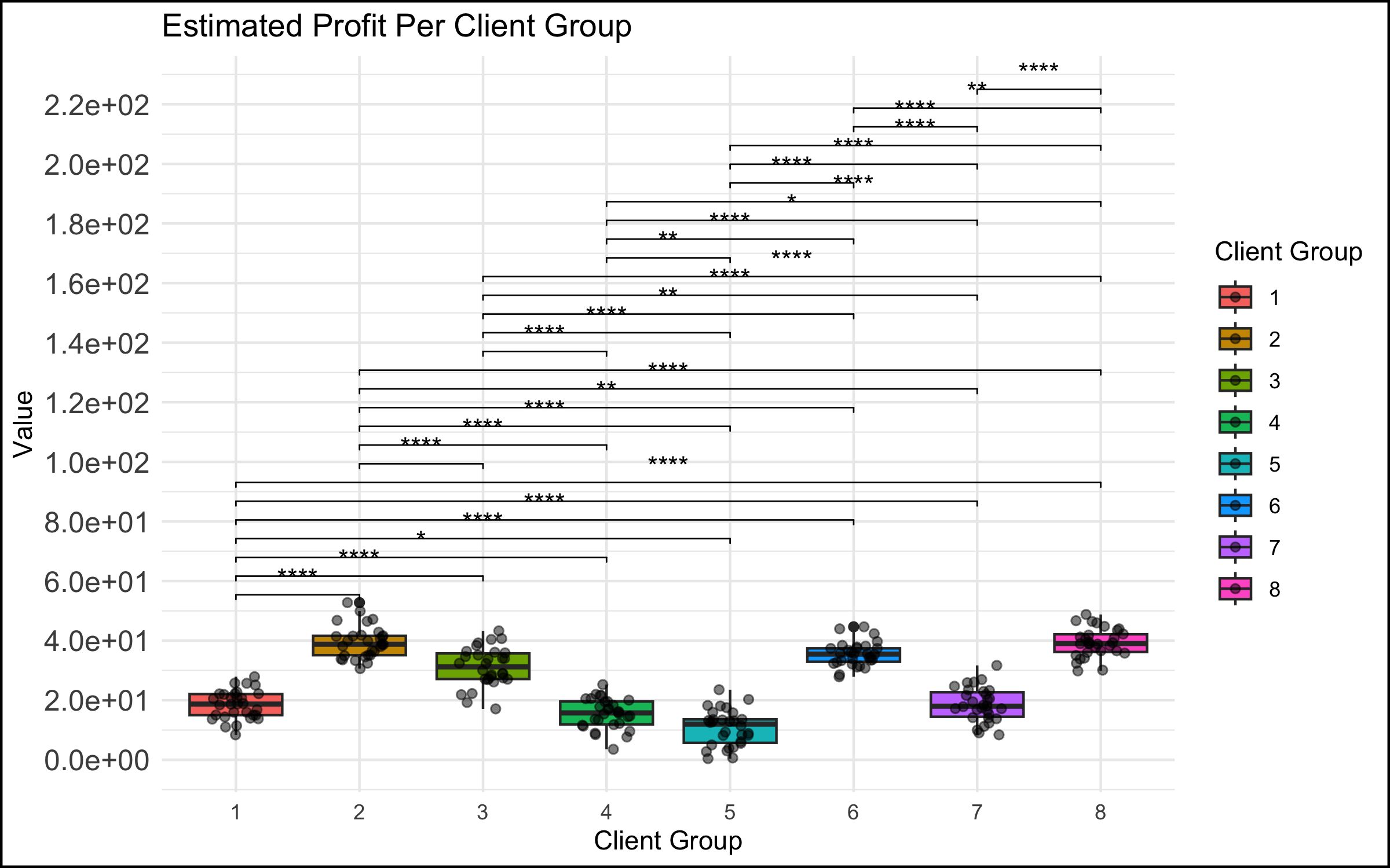
  <li>In a meeting among the data science team and top management, a data scientist showed a graph that was too complicated. We have all seen this type of graph - there are too many data points represented, the axes are unlabeled or have unclear labels, there is no takeaway message.</li>
</ul>

<p><img src="/assets/img/2025-12-08-true-stories-part-1/toocomplicated_mypng.png" alt="graph too complicated" /></p>

<h3 id="the-reaction"><em>The Reaction</em></h3>

<ul>
  <li>This did not go over well. You could feel the energy leaving the room, the executives start to lose interest and disconnect. Non-data stakeholders started checking their phones… If the goal was to communicate the takeaways from a data analysis to decision makers, it failed spectacularly.</li>
</ul>

<h3 id="the-diagnosis"><em>The Diagnosis</em></h3>

<ul>
  <li>There was no match between the goals of the stakeholders (e.g. the management members in the room, who were the invitees to the discussion) and the data scientists presenting to them. The role of the executive in these types of discussions is to take in the essence of the situation at a high level, and make a decision, provide guidance or direction to the project. An inscrutable graph with no clear conclusion does not allow the executive to accomplish any of these tasks, and so they might rightly think that their time is being wasted in such a discussion.</li>
</ul>

<h3 id="the-solution"><em>The Solution</em></h3>

<ul>
  <li>
    <p>The solution here can be very simple: make simple, easy-to-understand graphs with clear takeaways (bonus points for including the conclusion in writing on the slide itself). This is harder than it sounds for many data professionals, because we are trained to see beauty in the whole story, and we often want to present the nuances that exist, particularly if they posed challenges to us in the analysis or cleaning of the data.</p>
  </li>
  <li>
    <p>However, especially in interaction with management stakeholders, you don’t need to show everything! We have found that a good strategy is to focus on the message or conclusion you want to communicate, and to show the data that supports it. This isn’t peer-review – you have explicitly been hired by the organization to analyze and synthesize, and present the conclusions that you feel are justified. In a healthy organization (more on that below), you are empowered as an expert to make these choices.</p>
  </li>
</ul>

<h2 id="case-2-the-graph-was-too-simple">Case 2: The Graph Was Too Simple</h2>

<p>If complicated graphs can be the source of communication issues, then simple graphs should be the solution, right? Unfortunately, this is not always the case.</p>

<h3 id="what-happened-1"><em>What Happened</em></h3>

<ul>
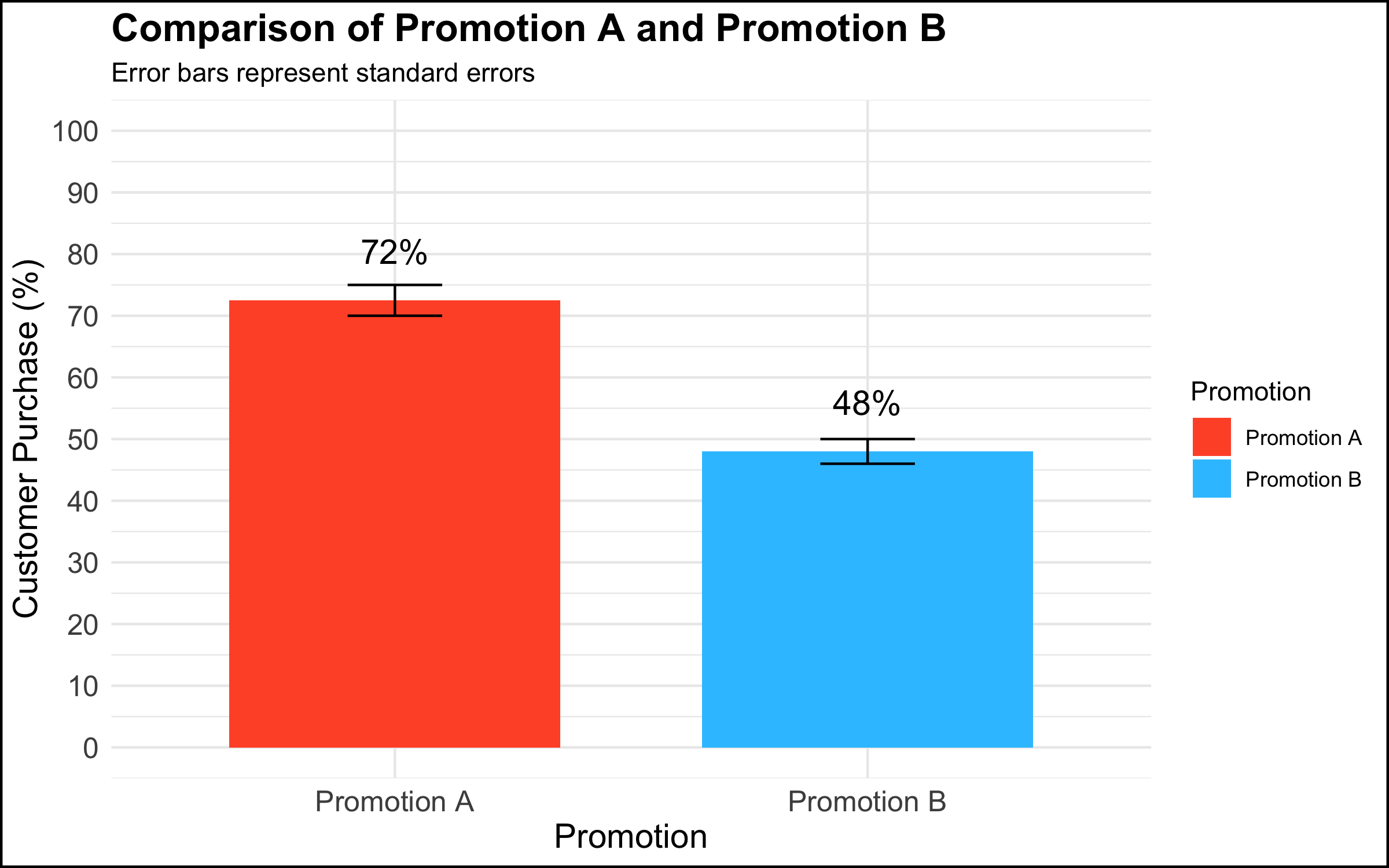
  <li>In a meeting among the data science team and top management, a data scientist presented a graph that showed a simple comparison with a clear managerial / decision implication.</li>
</ul>

<p><img src="/assets/img/2025-12-08-true-stories-part-1/toosimple_mypng.png" alt="graph too simple" /></p>

<h3 id="the-reaction-1"><em>The Reaction</em></h3>

<ul>
  <li>
    <p>Rather than being rewarded for showing a clear and compelling data visualization that had decision implications, the executives’ response was: “This isn’t good enough.” One executive in particular insisted that they needed drill downs, for example per region, per store within region, product category within store, etc.</p>
  </li>
  <li>
    <p>The marching orders from this meeting were to produce the additional visualizations and send them to management. However, there was no plan for following up on this additional work or any commitment for any resulting actions. The data team left the meeting with the feeling that this was just the beginning of a long and complicated cycle in which an endless series of graphs would be made, but that nothing would ever be done with them.</p>
  </li>
</ul>

<h3 id="the-diagnosis-1"><em>The Diagnosis</em></h3>

<p>Why does this happen? There are at least 2 diagnoses in our opinion.</p>

<ul>
  <li>
    <p>The first explanation assumes good intentions on the part of the management stakeholder. The simple truth is that not everyone is equally comfortable with data or with making data-driven decisions. Among some stakeholders there is a feeling that, if they had all of the information, they would be able to completely understand the situation and decide with confidence. A related belief is that more information is better (this is why organizations build an often overwhelming number of dashboards, showing splits of the data according to a never-ending series of categories). Furthermore, some decision makers want to make many local decisions – e.g. to manage each country, region, store, or individual product in its own way, though this can quickly become unmanageable.</p>
  </li>
  <li>
    <p>The second explanation does not assume good intentions on the part of the organizational stakeholder. To executives who are used to simply going with their intuition or gut feeling, being challenged to integrate data into the decision-making process can be a somewhat threatening proposition. One strategy to simply ignore data completely is to leave the analysis unfinished by sending the data team down a never-ending series of rabbit holes while continuing to make decisions as usual.</p>
  </li>
</ul>

<h3 id="the-solution-1"><em>The Solution</em></h3>

<p>The solution here depends on the diagnosis of the problem.</p>

<ul>
  <li>
    <p>If one assumes that the issue is a desire for mastery and a discomfort with numbers, a helpful strategy is to re-center the discussion on the high-level topic at hand. In the context of the graph shown above, one approach would be to say something along the lines of: “What are we trying to do here? We conducted an experiment to see whether using different types of promotions would impact our overall sales. We saw that customers who received Promotion A were 1.5 times more likely to buy the product than customers who received Promotion B. Our testing sample was representative of our customer base, and so the analysis suggests that we expand the use of Promotion A to all of our customers.”</p>
  </li>
  <li>
    <p>If one assumes that the issue is a desire to ignore data completely and continue on with business as usual, there’s not much that you as a data professional can do to change the managerial culture and address the underlying issue. A single occurrence of such behavior could just be a fluke, but if you keep finding yourself in this position, we would encourage you to reflect on whether you are in the right place in your organization, or in the right organization at all. If all you do is chase rabbits, you will wind up exhausted, never finish anything, and your work will have no impact.</p>
  </li>
</ul>

<h2 id="case-3-when-a-graph-leads-to-stakeholder-tunnel-vision">Case 3: When A Graph Leads to Stakeholder Tunnel Vision</h2>

<h3 id="what-happened-2"><em>What Happened</em></h3>

<ul>
  <li>In a meeting among the data science team and management, a data scientist presented a simple graph showing some patterns in the data. (The graph here is a correlation matrix of the <a href="https://www.rdocumentation.org/packages/datasets/versions/3.6.2/topics/mtcars"><em>mtcars</em> dataset</a>, included for illustrative purposes).</li>
</ul>

<p><img src="/assets/img/2025-12-08-true-stories-part-1/corr_mtcars_plot_mypng.png" alt="graph leads to tunnel vision" /></p>

<h3 id="the-reaction-2"><em>The Reaction</em></h3>

<ul>
  <li>
    <p>For reasons that were unclear to the data team, a manager exhibited an odd focus on a single data point and asked a great many questions about it, derailing the meeting and the higher-level discussion in the process.</p>
  </li>
  <li>
    <p>An example of what this looked like, applied to the correlational graph above:</p>
    <ul>
      <li>“Ah so the bubble with Weight and Weight is a big blue circle. Well, this Weight score is very important because this is one of our key metrics. So why is the dot so blue? And why is it so big? And what does it mean that the Weight and Weight has one of the biggest and bluest bubbles, compared to the other ones?” (<em>Note to the readers: the big blue circle indicates the correlation of the Weight variable with itself; the correlation is by definition 1, and explains why the bubble is big (it’s the largest possible correlation) and blue (the correlation is positive). There is nothing substantively interesting about this result.)</em></li>
    </ul>
  </li>
</ul>

<h3 id="the-diagnosis-2"><em>The Diagnosis</em></h3>

<ul>
  <li>
    <p>As in the case of the simple graph above, the problem might stem from discomfort on the part of a stakeholder who is not at ease with understanding data and graphs. Although this feels unnatural to many data professionals, the simple truth is that data makes many people uncomfortable. It is possible that this extreme focus on a single detail in a larger analysis reflects a desire for mastery over a topic that feels scary and uncontrollable.</p>
  </li>
  <li>
    <p>Another potential explanation concerns the performative function of meetings in the modern workplace. In an organizational setting, meetings are not simply a neutral environment where information is given and received. Especially in larger companies, and in meetings with large numbers of participants, simply making a point or digging into a detail is a strategy some people use to draw attention to themselves or show that they are making a contribution to the discussion. (Even if the contribution is negligible or counter-productive!)</p>
  </li>
</ul>

<h3 id="the-solution-2"><em>The Solution</em></h3>

<ul>
  <li>As described above, the recommended solution here is to take a step back and recenter the discussion. In the context of our correlation analysis above, we might step up and say – “What are we trying to do here? We are showing a correlation matrix of the most important variables, and we see that the correlations in this plot show that larger and more powerful cars get fewer miles per gallon (are less fuel-efficient). In our next slide, we show the results of a regression analysis that identifies the key drivers of our outcome metric.” And then move on to the next slide in order to continue with the story you are giving in your presentation.</li>
</ul>

<h2 id="case-4-when-the-data-reveal-an-uncomfortable-truth">Case 4: When the Data Reveal an Uncomfortable Truth</h2>

<h3 id="what-happened-3"><em>What Happened</em></h3>

<ul>
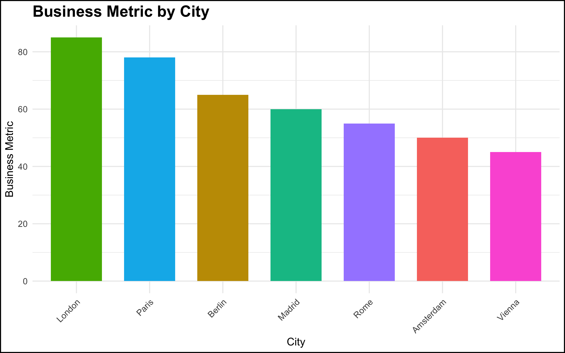
  <li>In a meeting with top management, a data scientist showed a simple chart of a metric by location, and made a simple observation about the pattern shown by the data – “ah, our metric is lower in Paris and Berlin vs. London.” This was a relatively simple observation, very clear from the graph, and the data scientist thought that this was some basic information that management should be aware of.</li>
</ul>

<p><img src="/assets/img/2025-12-08-true-stories-part-1/uncomfortable_truth.png" alt="uncomfortable truth" /></p>

<h3 id="the-reaction-3"><em>The Reaction</em></h3>

<ul>
  <li>The reaction on the part of the senior stakeholder, however, was explosive. There was a fair amount of yelling and shouting, not particularly related to the topic at hand. It was as if a toddler in a suit was having a meltdown. The meeting ended quickly, and the executive made it clear he did not want the project to continue or to see the data scientists again.</li>
</ul>

<h3 id="the-diagnosis-3"><em>The Diagnosis</em></h3>

<ul>
  <li>The executive was aware of the situation that the data visualization revealed. However, the facts that the data made clear were problematic for the executive’s scope of responsibility. Truly addressing the issue would have been difficult if not impossible given the organizational structure and geographic footprint. Rather than acknowledge the problem and work to solve it, the most expedient solution was to “shoot the messenger.”</li>
</ul>

<h3 id="the-solution-3"><em>The Solution</em></h3>

<ul>
  <li>There’s not a lot that a data scientist, or even a data scientist leader, can do in these situations. Nevertheless, shouting in meetings is completely unacceptable. Our recommendation is to simply look for another job. There is <a href="https://methodmatters.github.io/data-jobs-europe-2025-part-1/">enough work right now for data profiles</a>, and you owe it to yourself to seek out a more professional organization.</li>
</ul>

<h1 id="summary-and-conclusion">Summary and Conclusion</h1>

<p>The goal of this blog post was to describe some common non-technical problems that are encountered by data professionals while working in organizational settings. We focused here on communicating about data, and some of the many things that can go wrong when we talk about data or present the results of a data project to colleagues.</p>

<p>Communication in any organization can be difficult, and communication about data particularly so. Data topics can be complex, and such discussions can make people uncomfortable, or reveal facts that some stakeholders would prefer remain hidden. In many organizations, employees do not have much training or experience in data, and this often understandably leads to confusion as data projects start to be rolled out.</p>

<p>Our goal here was not simply to make a list of potential difficult situations, but to give you some things to think about and some solutions to try when you run into similar problems. In our view, it’s worth talking about what can and does go wrong in data projects, because we believe this work is important. It is our hope that, the more we as a field talk about problems like these, the better awareness is (among data practitioners and their stakeholders!) and hopefully the better the whole field works. There is a tremendous opportunity to do better, so let’s take it!</p>

<h3 id="coming-up-next"><em>Coming Up Next</em></h3>

<p>Our next blog post will focus on interpersonal issues that can pose problems in data projects. Stay tuned!</p>

<h4 id="post-script-r-code-used-to-produce-the-graphs-shown-above">Post-Script: R Code Used to Produce the Graphs Shown Above</h4>

<details>

  <summary>Click here to view the R code used to make the graphs shown above.</summary>

  <figure class="highlight"><pre><code class="language-r" data-lang="r"><span class="w">  

</span><span class="c1"># Load necessary libraries</span><span class="w">
</span><span class="n">library</span><span class="p">(</span><span class="n">ggplot2</span><span class="p">)</span><span class="w">
</span><span class="n">library</span><span class="p">(</span><span class="n">dplyr</span><span class="p">)</span><span class="w">
</span><span class="n">library</span><span class="p">(</span><span class="n">ggpubr</span><span class="p">)</span><span class="w">
</span><span class="n">library</span><span class="p">(</span><span class="n">corrplot</span><span class="p">)</span><span class="w">


</span><span class="c1"># Set seed for reproducibility</span><span class="w">
</span><span class="n">set.seed</span><span class="p">(</span><span class="m">43</span><span class="p">)</span><span class="w">

</span><span class="c1">################################</span><span class="w">
</span><span class="c1"># The graph was too complicated</span><span class="w">
</span><span class="c1">################################</span><span class="w">


</span><span class="c1"># Generate a random permutation of 8 predefined group means</span><span class="w">
</span><span class="c1"># These represent different average values for each group</span><span class="w">
</span><span class="n">group_means</span><span class="w"> </span><span class="o">&lt;-</span><span class="w"> </span><span class="n">sample</span><span class="p">(</span><span class="nf">c</span><span class="p">(</span><span class="m">10</span><span class="p">,</span><span class="w"> </span><span class="m">15</span><span class="p">,</span><span class="w"> </span><span class="m">20</span><span class="p">,</span><span class="w"> </span><span class="m">20.01</span><span class="p">,</span><span class="w"> </span><span class="m">30</span><span class="p">,</span><span class="w"> </span><span class="m">35</span><span class="p">,</span><span class="w"> </span><span class="m">40</span><span class="p">,</span><span class="w"> </span><span class="m">40.2</span><span class="p">))</span><span class="w">

</span><span class="c1"># Display the randomly sampled group means</span><span class="w">
</span><span class="n">group_means</span><span class="w">

</span><span class="c1"># Create a data frame with two columns: Group and Value</span><span class="w">
</span><span class="c1"># Group: factor with 8 levels, each repeated 30 times (240 observations in total)</span><span class="w">
</span><span class="c1"># Value: for each group mean, generate 30 random values from a normal distribution</span><span class="w">
</span><span class="c1"># with the specified mean from the group_means vector and a standard deviation of 5</span><span class="w">
</span><span class="n">data_too_complicated</span><span class="w"> </span><span class="o">&lt;-</span><span class="w"> </span><span class="n">data.frame</span><span class="p">(</span><span class="w">
  </span><span class="n">Group</span><span class="w"> </span><span class="o">=</span><span class="w"> </span><span class="n">factor</span><span class="p">(</span><span class="nf">rep</span><span class="p">(</span><span class="m">1</span><span class="o">:</span><span class="m">8</span><span class="p">,</span><span class="w"> </span><span class="n">each</span><span class="w"> </span><span class="o">=</span><span class="w"> </span><span class="m">30</span><span class="p">)),</span><span class="w">
  </span><span class="n">Value</span><span class="w"> </span><span class="o">=</span><span class="w"> </span><span class="n">unlist</span><span class="p">(</span><span class="n">lapply</span><span class="p">(</span><span class="n">group_means</span><span class="p">,</span><span class="w"> </span><span class="k">function</span><span class="p">(</span><span class="n">mean</span><span class="p">)</span><span class="w"> </span><span class="n">rnorm</span><span class="p">(</span><span class="m">30</span><span class="p">,</span><span class="w"> </span><span class="n">mean</span><span class="p">,</span><span class="w"> </span><span class="m">5</span><span class="p">)))</span><span class="w">
</span><span class="p">)</span><span class="w">


</span><span class="c1"># Initialize a ggplot object using the dataset 'data_too_complicated'</span><span class="w">
</span><span class="n">ggplot</span><span class="p">(</span><span class="n">data_too_complicated</span><span class="p">,</span><span class="w"> </span><span class="n">aes</span><span class="p">(</span><span class="n">x</span><span class="w"> </span><span class="o">=</span><span class="w"> </span><span class="n">Group</span><span class="p">,</span><span class="w"> </span><span class="n">y</span><span class="w"> </span><span class="o">=</span><span class="w"> </span><span class="n">Value</span><span class="p">,</span><span class="w"> </span><span class="n">fill</span><span class="w"> </span><span class="o">=</span><span class="w"> </span><span class="n">Group</span><span class="p">))</span><span class="w"> </span><span class="o">+</span><span class="w">
 </span><span class="c1"># Add a boxplot layer to show the distribution of values for each group</span><span class="w">
  </span><span class="n">geom_boxplot</span><span class="p">()</span><span class="w">  </span><span class="o">+</span><span class="w">
  </span><span class="c1"># Overlay jittered points to display individual observations</span><span class="w">
  </span><span class="c1"># width = 0.2 controls horizontal spread; alpha = 0.5 makes points semi-transparent</span><span class="w">
  </span><span class="n">geom_jitter</span><span class="p">(</span><span class="n">width</span><span class="w"> </span><span class="o">=</span><span class="w"> </span><span class="m">0.2</span><span class="p">,</span><span class="w"> </span><span class="n">alpha</span><span class="w"> </span><span class="o">=</span><span class="w"> </span><span class="m">0.5</span><span class="p">)</span><span class="w">  </span><span class="o">+</span><span class="w">
  </span><span class="c1"># Add statistical comparison between all pairs of groups using t-tests</span><span class="w">
  </span><span class="c1"># comparisons = all pairwise combinations of Group levels</span><span class="w">
  </span><span class="c1"># label = "p.signif" shows significance stars; hide.ns = TRUE hides non-significant results</span><span class="w">
  </span><span class="n">stat_compare_means</span><span class="p">(</span><span class="n">comparisons</span><span class="w"> </span><span class="o">=</span><span class="w"> </span><span class="n">combn</span><span class="p">(</span><span class="n">levels</span><span class="p">(</span><span class="n">data_too_complicated</span><span class="o">$</span><span class="n">Group</span><span class="p">),</span><span class="w"> </span><span class="m">2</span><span class="p">,</span><span class="w"> </span><span class="n">simplify</span><span class="w"> </span><span class="o">=</span><span class="w"> </span><span class="kc">FALSE</span><span class="p">),</span><span class="w">
                     </span><span class="n">method</span><span class="w"> </span><span class="o">=</span><span class="w"> </span><span class="s2">"t.test"</span><span class="p">,</span><span class="w"> </span><span class="n">label</span><span class="w"> </span><span class="o">=</span><span class="w"> </span><span class="s2">"p.signif"</span><span class="p">,</span><span class="w"> </span><span class="n">hide.ns</span><span class="w"> </span><span class="o">=</span><span class="w"> </span><span class="kc">TRUE</span><span class="p">)</span><span class="w"> </span><span class="o">+</span><span class="w">
  </span><span class="c1"># Apply a minimal theme for a clean look</span><span class="w">
  </span><span class="n">theme_minimal</span><span class="p">()</span><span class="w"> </span><span class="o">+</span><span class="w">
  </span><span class="c1"># Add plot title and axis labels; customize legend title for fill</span><span class="w">
  </span><span class="n">labs</span><span class="p">(</span><span class="n">title</span><span class="w"> </span><span class="o">=</span><span class="w"> </span><span class="s2">"Estimated Profit Per Client Group"</span><span class="p">,</span><span class="w">
       </span><span class="n">x</span><span class="w"> </span><span class="o">=</span><span class="w"> </span><span class="s2">"Client Group"</span><span class="p">,</span><span class="w">
       </span><span class="n">y</span><span class="w"> </span><span class="o">=</span><span class="w"> </span><span class="s2">"Value"</span><span class="p">,</span><span class="w">
       </span><span class="n">fill</span><span class="w"> </span><span class="o">=</span><span class="w"> </span><span class="s1">'Client Group'</span><span class="p">)</span><span class="w"> </span><span class="o">+</span><span class="w">
  </span><span class="c1"># Format y-axis: scientific notation for labels and 10 evenly spaced breaks</span><span class="w">
  </span><span class="n">scale_y_continuous</span><span class="p">(</span><span class="n">labels</span><span class="w"> </span><span class="o">=</span><span class="w"> </span><span class="n">scales</span><span class="o">::</span><span class="n">scientific</span><span class="p">,</span><span class="w">
                     </span><span class="n">breaks</span><span class="w"> </span><span class="o">=</span><span class="w"> </span><span class="n">scales</span><span class="o">::</span><span class="n">pretty_breaks</span><span class="p">(</span><span class="n">n</span><span class="w"> </span><span class="o">=</span><span class="w"> </span><span class="m">10</span><span class="p">))</span><span class="w"> </span><span class="o">+</span><span class="w">
  </span><span class="c1"># increase y-axis text size and add a black border around the plot</span><span class="w">
  </span><span class="n">theme</span><span class="p">(</span><span class="n">axis.text.y</span><span class="w"> </span><span class="o">=</span><span class="w"> </span><span class="n">element_text</span><span class="p">(</span><span class="n">size</span><span class="w"> </span><span class="o">=</span><span class="w"> </span><span class="m">12</span><span class="p">),</span><span class="w">
        </span><span class="n">plot.background</span><span class="w"> </span><span class="o">=</span><span class="w"> </span><span class="n">element_rect</span><span class="p">(</span><span class="n">colour</span><span class="w"> </span><span class="o">=</span><span class="w"> </span><span class="s2">"black"</span><span class="p">,</span><span class="w"> </span><span class="n">fill</span><span class="w"> </span><span class="o">=</span><span class="w"> </span><span class="kc">NA</span><span class="p">,</span><span class="w"> </span><span class="n">size</span><span class="w"> </span><span class="o">=</span><span class="w"> </span><span class="m">1</span><span class="p">))</span><span class="w">

</span><span class="c1">###########################</span><span class="w">
</span><span class="c1"># The graph was too simple</span><span class="w">
</span><span class="c1">###########################</span><span class="w">


</span><span class="c1"># simulate the promotion data</span><span class="w">
</span><span class="n">data_too_simple</span><span class="w"> </span><span class="o">&lt;-</span><span class="w"> </span><span class="n">data.frame</span><span class="p">(</span><span class="w">
  </span><span class="c1"># Define the 'Promotion' column as a factor with two levels: Promotion A and Promotion B</span><span class="w">
  </span><span class="n">Promotion</span><span class="w"> </span><span class="o">=</span><span class="w"> </span><span class="n">factor</span><span class="p">(</span><span class="nf">c</span><span class="p">(</span><span class="s2">"Promotion A"</span><span class="p">,</span><span class="w"> </span><span class="s2">"Promotion B"</span><span class="p">)),</span><span class="w">
  </span><span class="c1"># Define the 'Value' column: calculated values for each promotion</span><span class="w">
  </span><span class="c1"># Promotion A: 23 * 1.5 * 2.1; Promotion B: 23 * 2.1</span><span class="w">
  </span><span class="n">Value</span><span class="w"> </span><span class="o">=</span><span class="w"> </span><span class="nf">c</span><span class="p">(</span><span class="m">72.5</span><span class="p">,</span><span class="w"> </span><span class="m">48</span><span class="p">),</span><span class="w">
  </span><span class="c1"># Define the 'SE' (Standard Error) column for each promotion</span><span class="w">
  </span><span class="c1"># Promotion A: 2.5; Promotion B: 2</span><span class="w">
  </span><span class="n">SE</span><span class="w"> </span><span class="o">=</span><span class="w"> </span><span class="nf">c</span><span class="p">(</span><span class="m">2.5</span><span class="p">,</span><span class="w"> </span><span class="m">2</span><span class="p">)</span><span class="w">
</span><span class="p">)</span><span class="w">


</span><span class="c1"># plot the simulated data</span><span class="w">
</span><span class="n">ggplot</span><span class="p">(</span><span class="n">data_too_simple</span><span class="p">,</span><span class="w"> </span><span class="n">aes</span><span class="p">(</span><span class="n">x</span><span class="w"> </span><span class="o">=</span><span class="w"> </span><span class="n">Promotion</span><span class="p">,</span><span class="w"> </span><span class="n">y</span><span class="w"> </span><span class="o">=</span><span class="w"> </span><span class="n">Value</span><span class="p">,</span><span class="w"> </span><span class="n">fill</span><span class="w"> </span><span class="o">=</span><span class="w"> </span><span class="n">Promotion</span><span class="p">))</span><span class="w"> </span><span class="o">+</span><span class="w">
  </span><span class="c1"># Add bar chart layer with actual values (stat = "identity")</span><span class="w">
  </span><span class="c1"># Bars are dodged for side-by-side comparison and width set to 0.7</span><span class="w">
  </span><span class="n">geom_bar</span><span class="p">(</span><span class="n">stat</span><span class="w"> </span><span class="o">=</span><span class="w"> </span><span class="s2">"identity"</span><span class="p">,</span><span class="w"> </span><span class="n">position</span><span class="w"> </span><span class="o">=</span><span class="w"> </span><span class="n">position_dodge</span><span class="p">(),</span><span class="w"> </span><span class="n">width</span><span class="w"> </span><span class="o">=</span><span class="w"> </span><span class="m">0.7</span><span class="p">)</span><span class="w"> </span><span class="o">+</span><span class="w">
  </span><span class="c1"># Add error bars to represent standard errors</span><span class="w">
  </span><span class="c1"># ymin and ymax define lower and upper bounds; width controls bar cap size</span><span class="w">
  </span><span class="c1"># Position dodged to align with bars</span><span class="w">
  </span><span class="n">geom_errorbar</span><span class="p">(</span><span class="n">aes</span><span class="p">(</span><span class="n">ymin</span><span class="w"> </span><span class="o">=</span><span class="w"> </span><span class="n">Value</span><span class="w"> </span><span class="o">-</span><span class="w"> </span><span class="n">SE</span><span class="p">,</span><span class="w"> </span><span class="n">ymax</span><span class="w"> </span><span class="o">=</span><span class="w"> </span><span class="n">Value</span><span class="w"> </span><span class="o">+</span><span class="w"> </span><span class="n">SE</span><span class="p">),</span><span class="w"> </span><span class="n">width</span><span class="w"> </span><span class="o">=</span><span class="w"> </span><span class="m">0.2</span><span class="p">,</span><span class="w"> </span><span class="n">position</span><span class="w"> </span><span class="o">=</span><span class="w"> </span><span class="n">position_dodge</span><span class="p">(</span><span class="m">0.7</span><span class="p">))</span><span class="w"> </span><span class="o">+</span><span class="w">
  </span><span class="c1"># Add text labels showing rounded Value with a percentage sign</span><span class="w">
  </span><span class="c1"># vjust adjusts vertical position above bars; size sets font size</span><span class="w">
  </span><span class="n">geom_text</span><span class="p">(</span><span class="n">aes</span><span class="p">(</span><span class="n">label</span><span class="w"> </span><span class="o">=</span><span class="w"> </span><span class="n">paste0</span><span class="p">(</span><span class="nf">round</span><span class="p">(</span><span class="n">Value</span><span class="p">),</span><span class="w"> </span><span class="s2">"%"</span><span class="p">)),</span><span class="w"> </span><span class="n">vjust</span><span class="w"> </span><span class="o">=</span><span class="w"> </span><span class="m">-1.5</span><span class="p">,</span><span class="w"> </span><span class="n">size</span><span class="w"> </span><span class="o">=</span><span class="w"> </span><span class="m">5</span><span class="p">)</span><span class="w"> </span><span class="o">+</span><span class="w">
  </span><span class="c1"># Manually set fill colors for each promotion for a visually appealing palette</span><span class="w">
  </span><span class="n">scale_fill_manual</span><span class="p">(</span><span class="n">values</span><span class="w"> </span><span class="o">=</span><span class="w"> </span><span class="nf">c</span><span class="p">(</span><span class="s2">"Promotion A"</span><span class="w"> </span><span class="o">=</span><span class="w"> </span><span class="s2">"#FF5733"</span><span class="p">,</span><span class="w"> </span><span class="s2">"Promotion B"</span><span class="w"> </span><span class="o">=</span><span class="w"> </span><span class="s2">"#33C3FF"</span><span class="p">))</span><span class="w"> </span><span class="o">+</span><span class="w">
  </span><span class="c1"># Apply a minimal theme for a clean and modern look</span><span class="w">
  </span><span class="n">theme_minimal</span><span class="p">()</span><span class="w"> </span><span class="o">+</span><span class="w">
  </span><span class="c1"># Add plot title, axis labels, and subtitle explaining error bars</span><span class="w">
  </span><span class="n">labs</span><span class="p">(</span><span class="n">title</span><span class="w"> </span><span class="o">=</span><span class="w"> </span><span class="s2">"Comparison of Promotion A and Promotion B"</span><span class="p">,</span><span class="w">
       </span><span class="n">x</span><span class="w"> </span><span class="o">=</span><span class="w"> </span><span class="s2">"Promotion"</span><span class="p">,</span><span class="w">
       </span><span class="n">y</span><span class="w"> </span><span class="o">=</span><span class="w"> </span><span class="s2">"Customer Purchase (%)"</span><span class="p">,</span><span class="w">
       </span><span class="n">subtitle</span><span class="w"> </span><span class="o">=</span><span class="w"> </span><span class="s2">"Error bars represent standard errors"</span><span class="p">)</span><span class="w"> </span><span class="o">+</span><span class="w">
  </span><span class="c1"># Configure y-axis: set limits from 0 to 100 and breaks every 10 units</span><span class="w">
  </span><span class="n">scale_y_continuous</span><span class="p">(</span><span class="n">limits</span><span class="w"> </span><span class="o">=</span><span class="w"> </span><span class="nf">c</span><span class="p">(</span><span class="m">0</span><span class="p">,</span><span class="w"> </span><span class="m">100</span><span class="p">),</span><span class="w"> </span><span class="n">breaks</span><span class="w"> </span><span class="o">=</span><span class="w"> </span><span class="n">seq</span><span class="p">(</span><span class="m">0</span><span class="p">,</span><span class="w"> </span><span class="m">100</span><span class="p">,</span><span class="w"> </span><span class="n">by</span><span class="w"> </span><span class="o">=</span><span class="w"> </span><span class="m">10</span><span class="p">))</span><span class="w"> </span><span class="o">+</span><span class="w">
  </span><span class="c1"># Customize theme: axis text and titles size, bold plot title, and black border around plot</span><span class="w">
  </span><span class="n">theme</span><span class="p">(</span><span class="n">axis.text</span><span class="w"> </span><span class="o">=</span><span class="w"> </span><span class="n">element_text</span><span class="p">(</span><span class="n">size</span><span class="w"> </span><span class="o">=</span><span class="w"> </span><span class="m">12</span><span class="p">),</span><span class="w">
        </span><span class="n">axis.title</span><span class="w"> </span><span class="o">=</span><span class="w"> </span><span class="n">element_text</span><span class="p">(</span><span class="n">size</span><span class="w"> </span><span class="o">=</span><span class="w"> </span><span class="m">14</span><span class="p">),</span><span class="w">
        </span><span class="n">plot.title</span><span class="w"> </span><span class="o">=</span><span class="w"> </span><span class="n">element_text</span><span class="p">(</span><span class="n">size</span><span class="w"> </span><span class="o">=</span><span class="w"> </span><span class="m">16</span><span class="p">,</span><span class="w"> </span><span class="n">face</span><span class="w"> </span><span class="o">=</span><span class="w"> </span><span class="s2">"bold"</span><span class="p">),</span><span class="w">
        </span><span class="n">plot.background</span><span class="w"> </span><span class="o">=</span><span class="w"> </span><span class="n">element_rect</span><span class="p">(</span><span class="n">colour</span><span class="w"> </span><span class="o">=</span><span class="w"> </span><span class="s2">"black"</span><span class="p">,</span><span class="w"> </span><span class="n">fill</span><span class="w"> </span><span class="o">=</span><span class="w"> </span><span class="kc">NA</span><span class="p">,</span><span class="w"> </span><span class="n">size</span><span class="w"> </span><span class="o">=</span><span class="w"> </span><span class="m">1</span><span class="p">))</span><span class="w">

</span><span class="c1">##########################################</span><span class="w">
</span><span class="c1"># Graph leads to stakeholder tunnel vision</span><span class="w">
</span><span class="c1">##########################################</span><span class="w">


</span><span class="c1"># Load the mtcars dataset</span><span class="w">
</span><span class="n">data</span><span class="p">(</span><span class="n">mtcars</span><span class="p">)</span><span class="w"> 
</span><span class="c1"># make a subselection of the columns</span><span class="w">
</span><span class="n">mtcars</span><span class="w"> </span><span class="o">&lt;-</span><span class="w"> </span><span class="n">mtcars</span><span class="w"> </span><span class="o">%&gt;%</span><span class="w"> 
  </span><span class="n">select</span><span class="p">(</span><span class="n">wt</span><span class="p">,</span><span class="w"> </span><span class="n">hp</span><span class="p">,</span><span class="w"> </span><span class="n">cyl</span><span class="p">,</span><span class="w"> </span><span class="n">disp</span><span class="p">,</span><span class="w"> </span><span class="n">qsec</span><span class="p">,</span><span class="w"> </span><span class="n">mpg</span><span class="p">,</span><span class="w"> </span><span class="n">drat</span><span class="p">)</span><span class="w">

</span><span class="c1"># Calculate the correlation matrix</span><span class="w">
</span><span class="n">cor_matrix</span><span class="w"> </span><span class="o">&lt;-</span><span class="w"> </span><span class="n">cor</span><span class="p">(</span><span class="n">mtcars</span><span class="p">)</span><span class="w">

</span><span class="c1"># Rename the columns of the correlation matrix to proper English names</span><span class="w">
</span><span class="n">colnames</span><span class="p">(</span><span class="n">cor_matrix</span><span class="p">)</span><span class="w"> </span><span class="o">&lt;-</span><span class="w"> </span><span class="nf">c</span><span class="p">(</span><span class="s2">"Weight"</span><span class="p">,</span><span class="w"> </span><span class="s2">"Horsepower"</span><span class="p">,</span><span class="w"> </span><span class="s2">"Cylinders"</span><span class="p">,</span><span class="w"> </span><span class="s2">"Displacement"</span><span class="p">,</span><span class="w"> 
                          </span><span class="s2">"1/4 Mile Time"</span><span class="p">,</span><span class="w"> </span><span class="s2">"Miles per Gallon"</span><span class="p">,</span><span class="w"> </span><span class="s2">"Rear Axle Ratio"</span><span class="p">)</span><span class="w">
</span><span class="n">rownames</span><span class="p">(</span><span class="n">cor_matrix</span><span class="p">)</span><span class="w"> </span><span class="o">&lt;-</span><span class="w"> </span><span class="n">colnames</span><span class="p">(</span><span class="n">cor_matrix</span><span class="p">)</span><span class="w">

</span><span class="c1"># Create a correlation plot using circles to represent correlation strength </span><span class="w">
</span><span class="n">corrplot</span><span class="p">(</span><span class="n">cor_matrix</span><span class="p">,</span><span class="w"> </span><span class="n">method</span><span class="w"> </span><span class="o">=</span><span class="w"> </span><span class="s2">"circle"</span><span class="p">,</span><span class="w"> </span><span class="n">type</span><span class="w"> </span><span class="o">=</span><span class="w"> </span><span class="s2">"upper"</span><span class="p">,</span><span class="w">
         </span><span class="c1"># Define color palette: gradient from red (negative) to white (neutral) to blue (positive)</span><span class="w">
         </span><span class="c1"># Generate 200 color steps for smooth transitions</span><span class="w">
         </span><span class="n">col</span><span class="w"> </span><span class="o">=</span><span class="w"> </span><span class="n">colorRampPalette</span><span class="p">(</span><span class="nf">c</span><span class="p">(</span><span class="s2">"red"</span><span class="p">,</span><span class="w"> </span><span class="s2">"white"</span><span class="p">,</span><span class="w"> </span><span class="s2">"blue"</span><span class="p">))(</span><span class="m">200</span><span class="p">),</span><span class="w">
         </span><span class="c1"># Set text label size for variable names and color to black</span><span class="w">
         </span><span class="n">tl.cex</span><span class="w"> </span><span class="o">=</span><span class="w"> </span><span class="m">0.8</span><span class="p">,</span><span class="w"> </span><span class="n">tl.col</span><span class="w"> </span><span class="o">=</span><span class="w"> </span><span class="s2">"black"</span><span class="p">,</span><span class="w">
         </span><span class="c1"># Set color legend size and position on the right</span><span class="w">
         </span><span class="n">cl.cex</span><span class="w"> </span><span class="o">=</span><span class="w"> </span><span class="m">0.8</span><span class="p">,</span><span class="w"> </span><span class="n">cl.pos</span><span class="w"> </span><span class="o">=</span><span class="w"> </span><span class="s2">"r"</span><span class="p">,</span><span class="w">
         </span><span class="c1"># Add a title to the plot</span><span class="w">
         </span><span class="n">title</span><span class="w"> </span><span class="o">=</span><span class="w"> </span><span class="s1">'Correlation of Important Variables'</span><span class="p">,</span><span class="w">
         </span><span class="c1"># Adjust plot margins: bottom, left, top, right</span><span class="w">
         </span><span class="n">mar</span><span class="w"> </span><span class="o">=</span><span class="w"> </span><span class="nf">c</span><span class="p">(</span><span class="m">1</span><span class="p">,</span><span class="w"> </span><span class="m">1</span><span class="p">,</span><span class="w"> </span><span class="m">2</span><span class="p">,</span><span class="w"> </span><span class="m">1</span><span class="p">))</span><span class="w">
</span><span class="c1"># put a box around the edge of the plot</span><span class="w">
</span><span class="n">box</span><span class="p">(</span><span class="n">which</span><span class="w"> </span><span class="o">=</span><span class="w"> </span><span class="s2">"figure"</span><span class="p">,</span><span class="w"> </span><span class="n">col</span><span class="w"> </span><span class="o">=</span><span class="w"> </span><span class="s2">"black"</span><span class="p">,</span><span class="w"> </span><span class="n">lwd</span><span class="w"> </span><span class="o">=</span><span class="w"> </span><span class="m">3</span><span class="p">)</span><span class="w">


</span><span class="c1">##########################################</span><span class="w">
</span><span class="c1"># When Data Reveal an Uncomfortable Truth</span><span class="w">
</span><span class="c1">##########################################</span><span class="w">

</span><span class="c1"># Simulated data for 7 cities</span><span class="w">
</span><span class="n">data_uncomfortable_truth</span><span class="w"> </span><span class="o">&lt;-</span><span class="w"> </span><span class="n">data.frame</span><span class="p">(</span><span class="w">
  </span><span class="n">City</span><span class="w"> </span><span class="o">=</span><span class="w"> </span><span class="nf">c</span><span class="p">(</span><span class="s2">"London"</span><span class="p">,</span><span class="w"> </span><span class="s2">"Paris"</span><span class="p">,</span><span class="w"> </span><span class="s2">"Berlin"</span><span class="p">,</span><span class="w"> </span><span class="s2">"Madrid"</span><span class="p">,</span><span class="w"> </span><span class="s2">"Rome"</span><span class="p">,</span><span class="w"> </span><span class="s2">"Amsterdam"</span><span class="p">,</span><span class="w"> </span><span class="s2">"Vienna"</span><span class="p">),</span><span class="w">
  </span><span class="n">Business_Metric</span><span class="w"> </span><span class="o">=</span><span class="w"> </span><span class="nf">c</span><span class="p">(</span><span class="m">85</span><span class="p">,</span><span class="w"> </span><span class="m">78</span><span class="p">,</span><span class="w"> </span><span class="m">65</span><span class="p">,</span><span class="w"> </span><span class="m">60</span><span class="p">,</span><span class="w"> </span><span class="m">55</span><span class="p">,</span><span class="w"> </span><span class="m">50</span><span class="p">,</span><span class="w"> </span><span class="m">45</span><span class="p">)</span><span class="w">
</span><span class="p">)</span><span class="w">

</span><span class="c1"># Order the cities by Business Metric from largest to smallest</span><span class="w">
</span><span class="n">data_uncomfortable_truth</span><span class="w"> </span><span class="o">&lt;-</span><span class="w"> </span><span class="n">data_uncomfortable_truth</span><span class="w"> </span><span class="o">%&gt;%</span><span class="w">
  </span><span class="n">arrange</span><span class="p">(</span><span class="n">desc</span><span class="p">(</span><span class="n">Business_Metric</span><span class="p">))</span><span class="w">


</span><span class="c1"># Create the bar chart</span><span class="w">
</span><span class="n">data_uncomfortable_truth</span><span class="w"> </span><span class="o">%&gt;%</span><span class="w">
  </span><span class="c1"># set up plot aesthetics</span><span class="w">
  </span><span class="n">ggplot</span><span class="p">(</span><span class="n">aes</span><span class="p">(</span><span class="n">x</span><span class="w"> </span><span class="o">=</span><span class="w"> </span><span class="n">reorder</span><span class="p">(</span><span class="n">City</span><span class="p">,</span><span class="w"> </span><span class="o">-</span><span class="n">Business_Metric</span><span class="p">),</span><span class="w"> 
             </span><span class="n">y</span><span class="w"> </span><span class="o">=</span><span class="w"> </span><span class="n">Business_Metric</span><span class="p">,</span><span class="w"> 
             </span><span class="n">fill</span><span class="w"> </span><span class="o">=</span><span class="w"> </span><span class="n">City</span><span class="p">))</span><span class="w"> </span><span class="o">+</span><span class="w">
  </span><span class="c1"># specify barplot and width of bars</span><span class="w">
  </span><span class="n">geom_bar</span><span class="p">(</span><span class="n">stat</span><span class="w"> </span><span class="o">=</span><span class="w"> </span><span class="s2">"identity"</span><span class="p">,</span><span class="w"> </span><span class="n">width</span><span class="w"> </span><span class="o">=</span><span class="w"> </span><span class="m">0.7</span><span class="p">)</span><span class="w"> </span><span class="o">+</span><span class="w">
  </span><span class="c1"># minimal theme</span><span class="w">
  </span><span class="n">theme_minimal</span><span class="p">()</span><span class="w"> </span><span class="o">+</span><span class="w">
  </span><span class="c1"># make axis labels and title</span><span class="w">
  </span><span class="n">labs</span><span class="p">(</span><span class="n">title</span><span class="w"> </span><span class="o">=</span><span class="w"> </span><span class="s2">"Business Metric by City"</span><span class="p">,</span><span class="w">
       </span><span class="n">x</span><span class="w"> </span><span class="o">=</span><span class="w"> </span><span class="s2">"City"</span><span class="p">,</span><span class="w">
       </span><span class="n">y</span><span class="w"> </span><span class="o">=</span><span class="w"> </span><span class="s2">"Business Metric"</span><span class="p">)</span><span class="w"> </span><span class="o">+</span><span class="w">
  </span><span class="c1"># format text and background of the plot</span><span class="w">
  </span><span class="n">theme</span><span class="p">(</span><span class="n">axis.text.x</span><span class="w"> </span><span class="o">=</span><span class="w"> </span><span class="n">element_text</span><span class="p">(</span><span class="n">angle</span><span class="w"> </span><span class="o">=</span><span class="w"> </span><span class="m">45</span><span class="p">,</span><span class="w"> </span><span class="n">hjust</span><span class="w"> </span><span class="o">=</span><span class="w"> </span><span class="m">1</span><span class="p">),</span><span class="w">
        </span><span class="n">plot.title</span><span class="w"> </span><span class="o">=</span><span class="w"> </span><span class="n">element_text</span><span class="p">(</span><span class="n">size</span><span class="w"> </span><span class="o">=</span><span class="w"> </span><span class="m">16</span><span class="p">,</span><span class="w"> </span><span class="n">face</span><span class="w"> </span><span class="o">=</span><span class="w"> </span><span class="s2">"bold"</span><span class="p">),</span><span class="w">
        </span><span class="n">legend.position</span><span class="w"> </span><span class="o">=</span><span class="w"> </span><span class="s2">"none"</span><span class="p">,</span><span class="w">
        </span><span class="n">plot.background</span><span class="w"> </span><span class="o">=</span><span class="w"> </span><span class="n">element_rect</span><span class="p">(</span><span class="n">colour</span><span class="w"> </span><span class="o">=</span><span class="w"> </span><span class="s2">"black"</span><span class="p">,</span><span class="w"> </span><span class="n">fill</span><span class="w"> </span><span class="o">=</span><span class="w"> </span><span class="kc">NA</span><span class="p">,</span><span class="w"> </span><span class="n">size</span><span class="w"> </span><span class="o">=</span><span class="w"> </span><span class="m">1</span><span class="p">))</span></code></pre></figure>

</details>]]></content><author><name>Method Matters</name></author><category term="data work" /><category term="data visualization" /><category term="data science" /><category term="R" /><category term="communication" /><category term="stakeholders" /><category term="talking about data" /><summary type="html"><![CDATA[The data professions (data science, analysis, engineering, etc.) are highly technical fields, and much online discussion (in particular, on this blog!), conference presentations and classes focus on technical aspects of data work or on the results of data analyses. These discussions are necessary for teaching important aspects of the data trade, but they often ignore the fact that data and analytics work takes place in an interpersonal and organizational context.]]></summary></entry><entry><title type="html">Inside the 2025 Data Labor Market in Europe: What 8,086 job ads tell us about the roles, technologies and skills that really matter</title><link href="https://methodmatters.github.io/data-jobs-europe-2025-part-1/" rel="alternate" type="text/html" title="Inside the 2025 Data Labor Market in Europe: What 8,086 job ads tell us about the roles, technologies and skills that really matter" /><published>2025-09-21T10:00:00+02:00</published><updated>2025-09-21T10:00:00+02:00</updated><id>https://methodmatters.github.io/data-jobs-europe-2025-part-1</id><content type="html" xml:base="https://methodmatters.github.io/data-jobs-europe-2025-part-1/"><![CDATA[<p>There are many blog posts and think-pieces about the state of data and the data labor market in the US, but far fewer such writings focused on Europe. The goal of this blog post is to present a data-driven analysis of the job market for data profiles in Europe in 2025, based on an analysis of  <strong>8,086</strong> European job listings posted between April 13 to May 9, 2025. This blog post is based on a talk given by myself and <a href="https://www.linkedin.com/in/cesarlegendre" target="_blank">Cesar Legendre</a> at the <a href="https://rssb.be/wp-content/uploads/2025/04/RSSB-Statistics-Data-Science-and-AI-2025.pdf" target="_blank">2025 meeting</a> of the Royal Statistical Society of Belgium in Brussels.</p>

<p>The main conclusions of our analysis are:</p>

<ul>
  <li><strong>Employers are increasingly looking for “hybrid” profiles</strong> who can take on tasks that are related to multiple job titles (e.g. both data scientist and data engineer)</li>
  <li><strong>The hot job title of 2025 is “data analyst”</strong>, though employers are also looking for engineering talent across different sub-disciplines (e.g. cloud, develops and data engineers)</li>
  <li><strong>Data jobs are located in many different data-rich sectors</strong>, including IT, finance, healthcare, consulting and manufacturing</li>
  <li>Five years after the COVID-19 pandemic began, <strong>employers are expecting data employees to return to the office</strong> en masse</li>
  <li>Finally, across the data job profiles, the <strong>top requested <em>tools</em> are related to coding, cloud services, and data analysis</strong>, while the <strong>top requested <em>skills</em> focus on problem solving, soft skills and project management</strong></li>
</ul>

<p>For all of the details and more, read on below!</p>

<h1 id="data">Data</h1>

<style>

    table { 
        margin-left: auto;
        margin-right: auto;
        table-layout: fixed;
        width: 100%;
    word-wrap: break-word;
    }
    table, th, td {
        border: 1px solid grey;
        border-collapse: collapse;
    }
    th, td {
        padding: 5px;
        text-align: center;
        font-family: Helvetica, Arial, sans-serif;
        font-size: 90%;
        width: 85px;
    }
    table tbody tr:hover {
        background-color: #dddddd;
    }
    .wide {
        width: 90%; 
    }

</style>

<table>
  <thead>
    <tr>
      <th>Data set</th>
      <th>8,086 data-related job ads, scraped from a major online job board</th>
    </tr>
  </thead>
  <tbody>
    <tr>
      <td>Period</td>
      <td>13 April – 9 May 2025</td>
    </tr>
    <tr>
      <td>Job titles</td>
      <td>Data/ML/AI/Cloud/DevOps Engineers, Analysts (Data &amp; Business), Data Scientists, Statisticians, Financial Analysts</td>
    </tr>
    <tr>
      <td>Key variables</td>
      <td>Job title, country, sector, way of working, tools &amp; skills<sup>1</sup></td>
    </tr>
  </tbody>
</table>

<p><sup>1</sup> Sector, way of working, tools and skills were extracted based on open-coding of the job description text by LLMs (Gemini from Google).</p>

<h1 id="results">Results</h1>

<h2 id="more-hybrid-job-titles">More “Hybrid” Job Titles</h2>

<p>One of the first things that popped up to us in this analysis was that fully <strong>11% of job titles encompassed multiple roles</strong>. Some examples (reproduced exactly as listed in the job ads):</p>

<ul>
  <li><em>ML Engineer / Data Scientist</em></li>
  <li><em>BI Business Analyst / Data Engineer (Business-Intelligence-Consultant)</em></li>
  <li><em>AI Engineer / Data Analyst</em></li>
  <li><em>IT Business Analyst / IT Consultant (Data Engineer)</em></li>
  <li><em>SAP Team Leader SAP BI / Data Science (Data Engineer)</em></li>
</ul>

<p>This trend is a reversal from what we saw in <a href="/data-jobs-belgium/" target="_blank">previous years</a>, where a single job title (e.g. data engineer) would split into separate sub-roles (e.g. devops engineer and cloud engineer) as time went on. In 2025, companies are looking for data profiles who can handle a larger technical scope.</p>

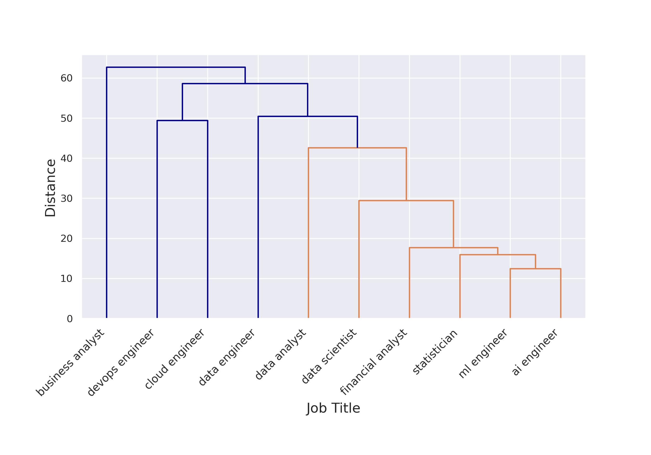
<p>In order to better understand which roles were being sought after in a single hire, we conducted a cluster analysis of the co-occurrence of job titles in our dataset:</p>

<p><strong><em>Figure 1: Clustering of Roles Based on Co-Occurrence in Job Ads</em></strong> <br />
<img src="/assets/img/2025-09-21-data-jobs-europe-2025-part-1/cluster_role_co_occurrence.jpg" alt="cluster_role_co_occurrence" /></p>

<p>This analysis shows that the job titles fall into three primary groups:</p>

<ul>
  <li>The first (on the left-hand side) is <strong>business analyst</strong>, which appears in a cluster by itself. This makes sense, in that business analyst is a broad and relatively generalist job title, covering dashboarding as well as other types of general business analysis.</li>
  <li>We next have a cluster consisting of <strong>IT engineering profiles</strong>: <em>devops</em> and <em>cloud engineer</em>. These profiles both work to deploy data solutions and move data around within an organization.</li>
  <li>Finally, we have the third group (on the right-hand side) whose <strong>members all work with data</strong> in some capacity. The data engineer job title is more on the <em>storage and transfer</em> side, and it appears in its own sub-cluster. The remaining titles (in orange in the graph above) relate to <em>analysis</em> or <em>model-building</em> in some capacity.</li>
</ul>

<h2 id="most-popular-data-job-titles-in-2025">Most Popular Data Job Titles in 2025</h2>

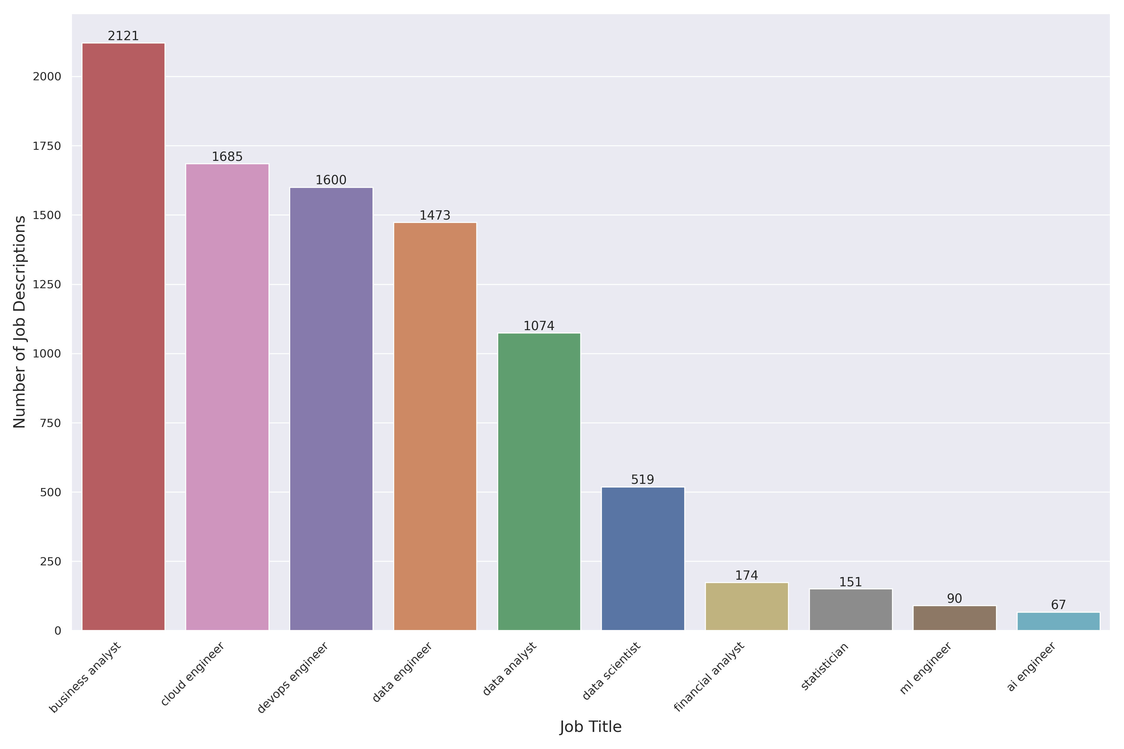
<p>The plot below shows the most frequently occurring job-titles in our jobs dataset:</p>

<p><strong><em>Figure 2: Most Popular Job Titles</em></strong>
<img src="/assets/img/2025-09-21-data-jobs-europe-2025-part-1/top_job_titles_250.png" alt="top_job_titles_250" /></p>

<p>We see three main takeaways from this analysis</p>

<ul>
  <li><strong>The hottest data job title in 2025 in Europe is business analyst</strong>; these profiles work on dashboards, business intelligence, and other general business topics linked with data. It makes sense that such a generalist title would be most frequent in the data.</li>
  <li>Second, <strong>the engineering titles</strong> (cloud, devops &amp; data engineers) <strong>are very sought after right now.</strong> These three titles are more-or-less equally mentioned, and together account for 53% of all job titles in our data.</li>
  <li><strong>Data scientist is much less popular than in previous years</strong>. Specifically, in our <a href="/data-jobs-europe/" target="_blank">2021 analysis</a>, there were more openings for data scientists than for data engineers. In our <a href="https://methodmatters.github.io/data-jobs-belgium/" target="_blank">2023 analysis</a>, there were around 2 data engineer job ads for every data scientist ad. In 2025, there are 3 data engineer job ads ford every data scientist ad, indicating the continued relative decline of data science in comparison to data engineering.</li>
</ul>

<!-- 

(https://methodmatters.github.io/data-jobs-europe/)
(/data-jobs-europe/ )

(https://methodmatters.github.io/data-jobs-belgium/)
(/data-jobs-belgium/ )

 -->
<h2 id="sectors">Sectors</h2>

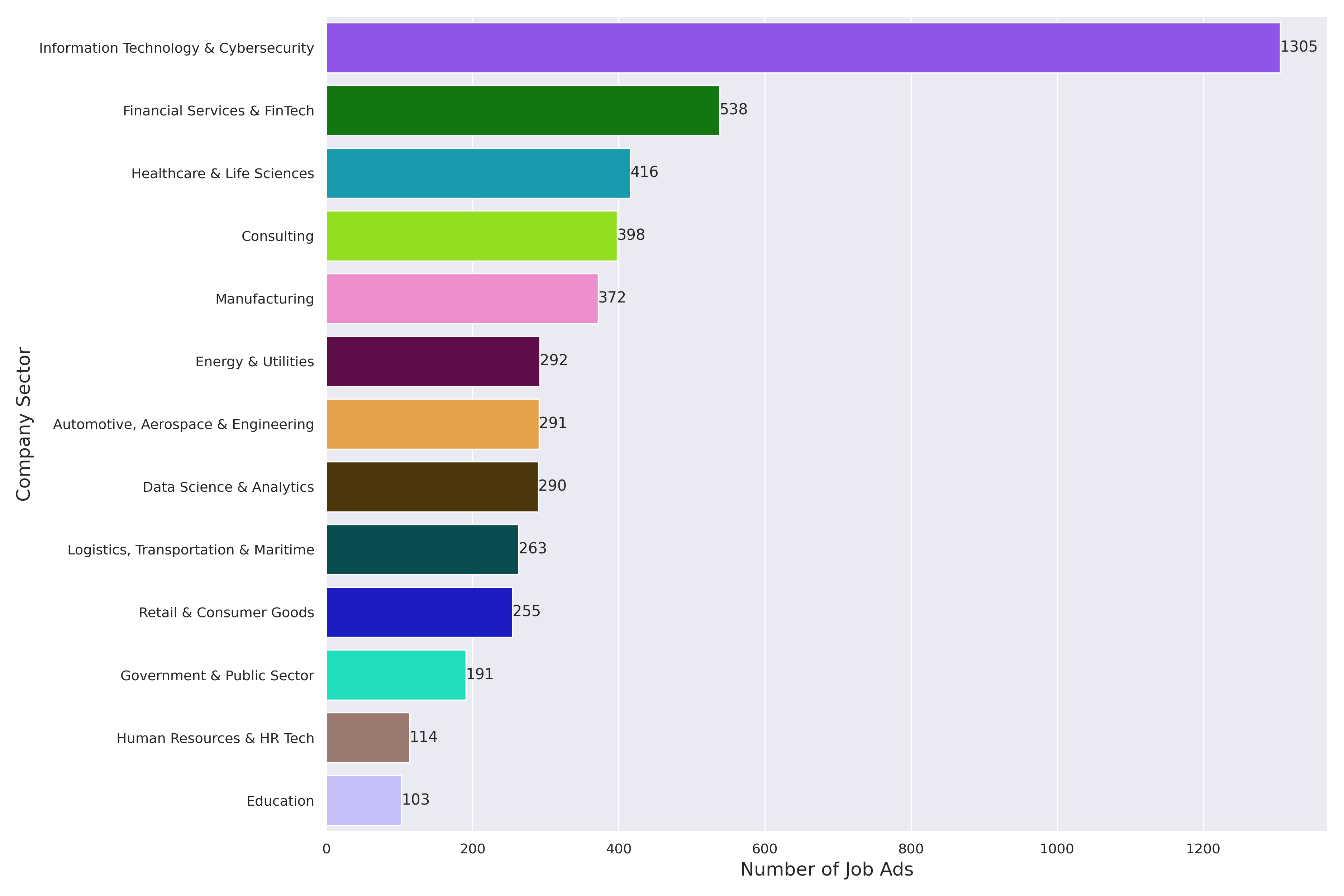
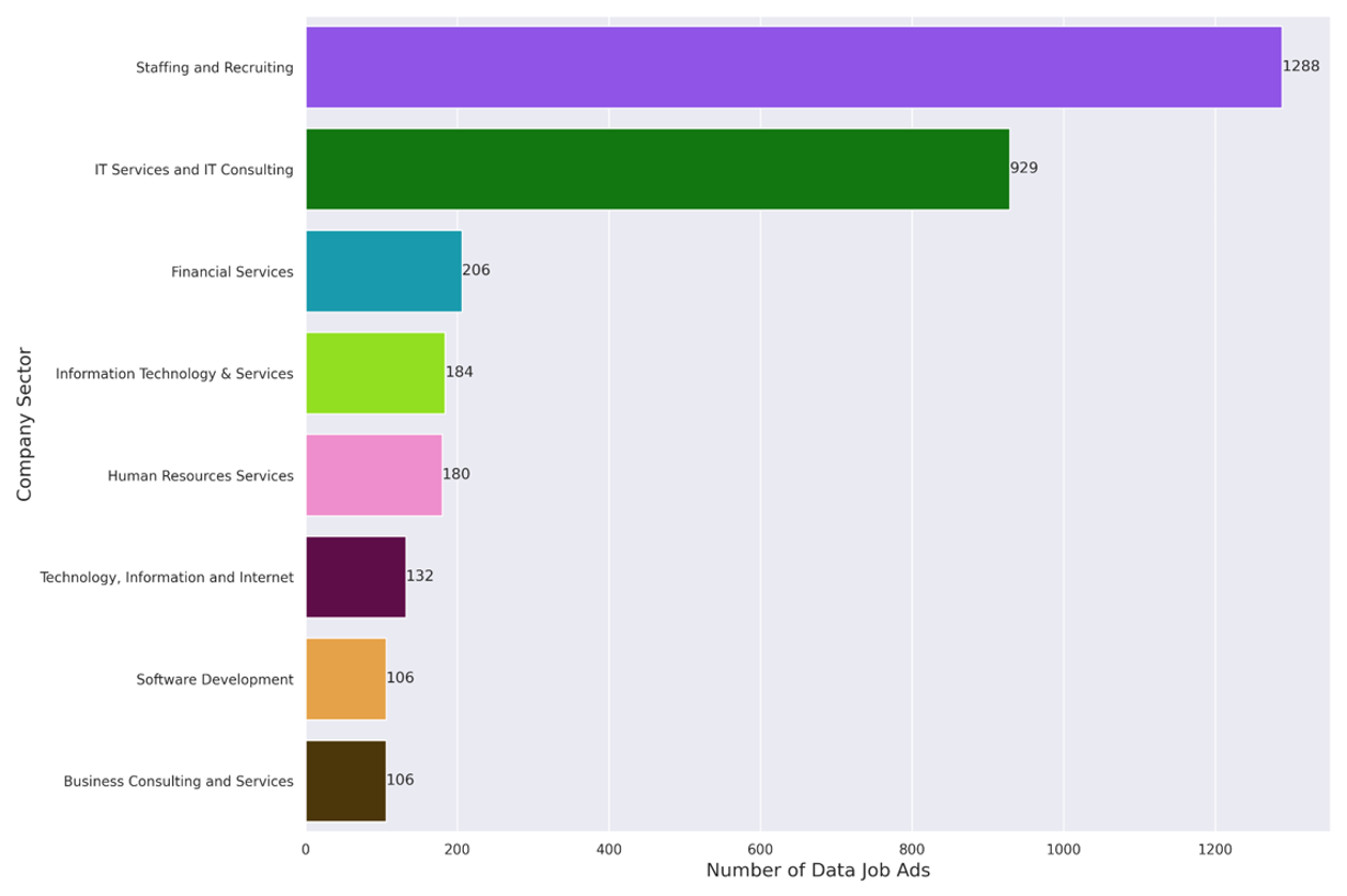
<p>Our analysis indicates that companies in data-rich sectors are the most interested in hiring data profiles. Indeed, in these domains, the potential added value from data and data analysis is substantial:</p>

<p><strong><em>Figure 3: Number of Data Jobs Per Company Sector</em></strong>
<img src="/assets/img/2025-09-21-data-jobs-europe-2025-part-1/company_sector_250.png" alt="company_sector_250" /></p>

<ul>
  <li><strong>IT and cybersecurity</strong> rank number one. Looking more closely at these job descriptions, we find jobs that sit in the IT silos of organizations. These employees are expected to work almost exclusively with IT tools, databases, SQL, cloud technologies.</li>
  <li>The second most popular sector is <strong>financial services</strong>. Here, we see many banks and insurance companies represented, and the jobs are a mix between more generalist profiles (e.g. data scientist / engineer) and specialist profiles such as financial analyst.</li>
  <li><strong>Healthcare &amp; life sciences</strong> comes next. In this group of organizations we find medtech companies working with data-intensive machines like EEG tools, along with hospitals, national cancer research centers, and SAAS companies targeting the healthcare industry.</li>
  <li>There is healthy demand, as in <a href="/data-jobs-europe/" target="_blank">previous</a> <a href="/data-jobs-belgium/" target="_blank">years</a>, in the <strong>consulting</strong> sectors. These job ads are all focused on finding people to go perform data work at various (nearly always unnamed) clients.</li>
  <li>Finally, we see a fair mount of jobs in the <strong>manufacturing</strong> sector. A great many of these positions focus on working with data from industrial processes in factories, whether in storing, analyzing and visualizing such data or on optimizing industrial processes based on data captured in factories.</li>
</ul>

<p>It is safe to say that, in 2025, a great many sectors are looking for data profiles, and that people with data skills are sought after in many different types of organizations!</p>

<h2 id="way-of-working">Way of Working</h2>

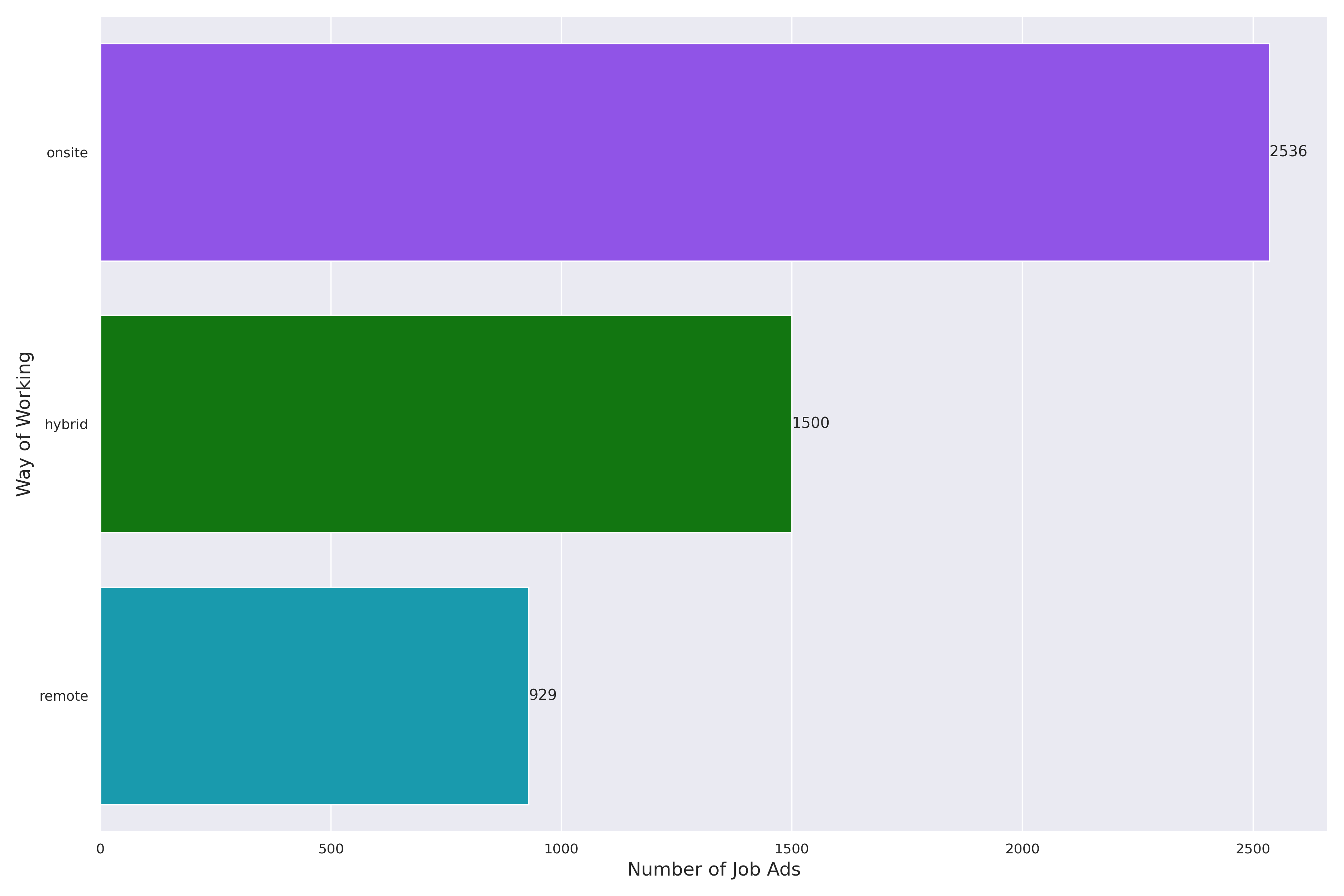
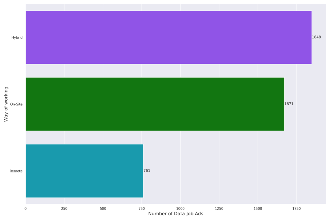
<p>One of the many ways that the COVID 19 pandemic changed our lives was in the shift to remote and hybrid ways of working.</p>

<p>In 2025, however, it seems pretty clear that companies in Europe are expecting data workers to return to the office. This is a big change from a <a href="/data-jobs-belgium/" target="_blank">similar analysis in 2023</a>. In 2023, there were more hybrid jobs advertised than there were onsite jobs. In the current data the trend has reversed itself, fairly heavily, in the opposite direction.</p>

<p><strong><em>Figure 4: Number of Data Jobs Per “Way of Working”</em></strong>
<img src="/assets/img/2025-09-21-data-jobs-europe-2025-part-1/way_of_working_250.png" alt="way_of_working_250" /></p>

<h2 id="private-vs-public-organizations">Private vs. Public Organizations</h2>

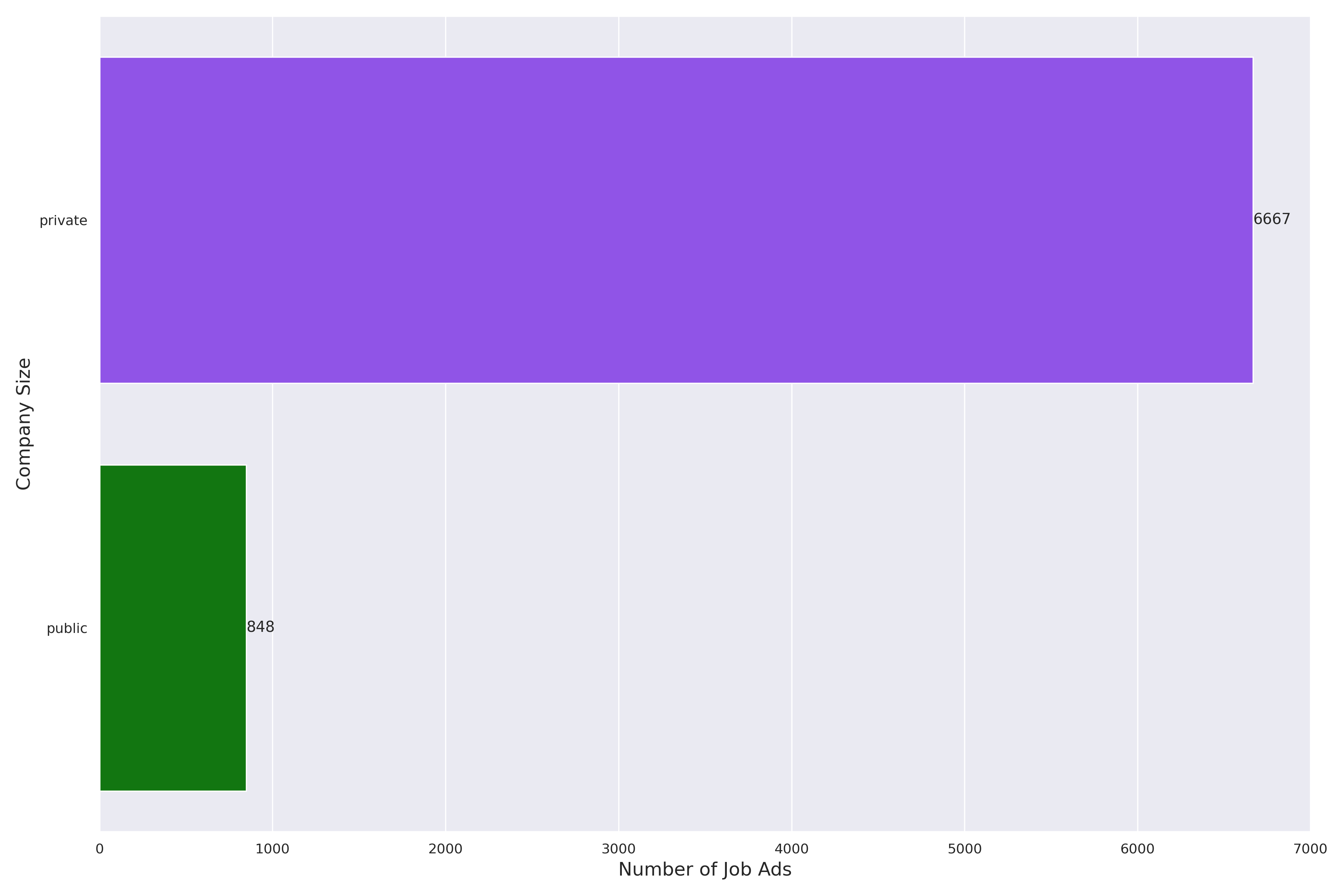
<p>The graph below shows the split in job advertisements between private and public organizations.</p>

<p>It is clear that the vast majority of data jobs in our analysis are in the private sector. However, there are a non-trivial amount of jobs in the public sector as well. In our data, public entities looking for data profiles include public transport companies (e.g. national rail and regional transportation networks), national research centers, finance ministries and tax services, along with national, regional and city governments.</p>

<p><strong><em>Figure 5: Number of Data Jobs in the Private vs. Public Sectors</em></strong>
<img src="/assets/img/2025-09-21-data-jobs-europe-2025-part-1/public_private_sector_250.png" alt="public_private_sector_250" /></p>

<h1 id="top-tools--skills">Top Tools &amp; Skills</h1>

<p>Now let’s dig in a bit more to the substance of the job advertisements, in particular into what qualities prospective employers are looking for. For this analysis, we relied on LLMs to examine the text of each job description and to extract the tools and skills that were expected of job applicants.</p>

<h2 id="tools">Tools</h2>

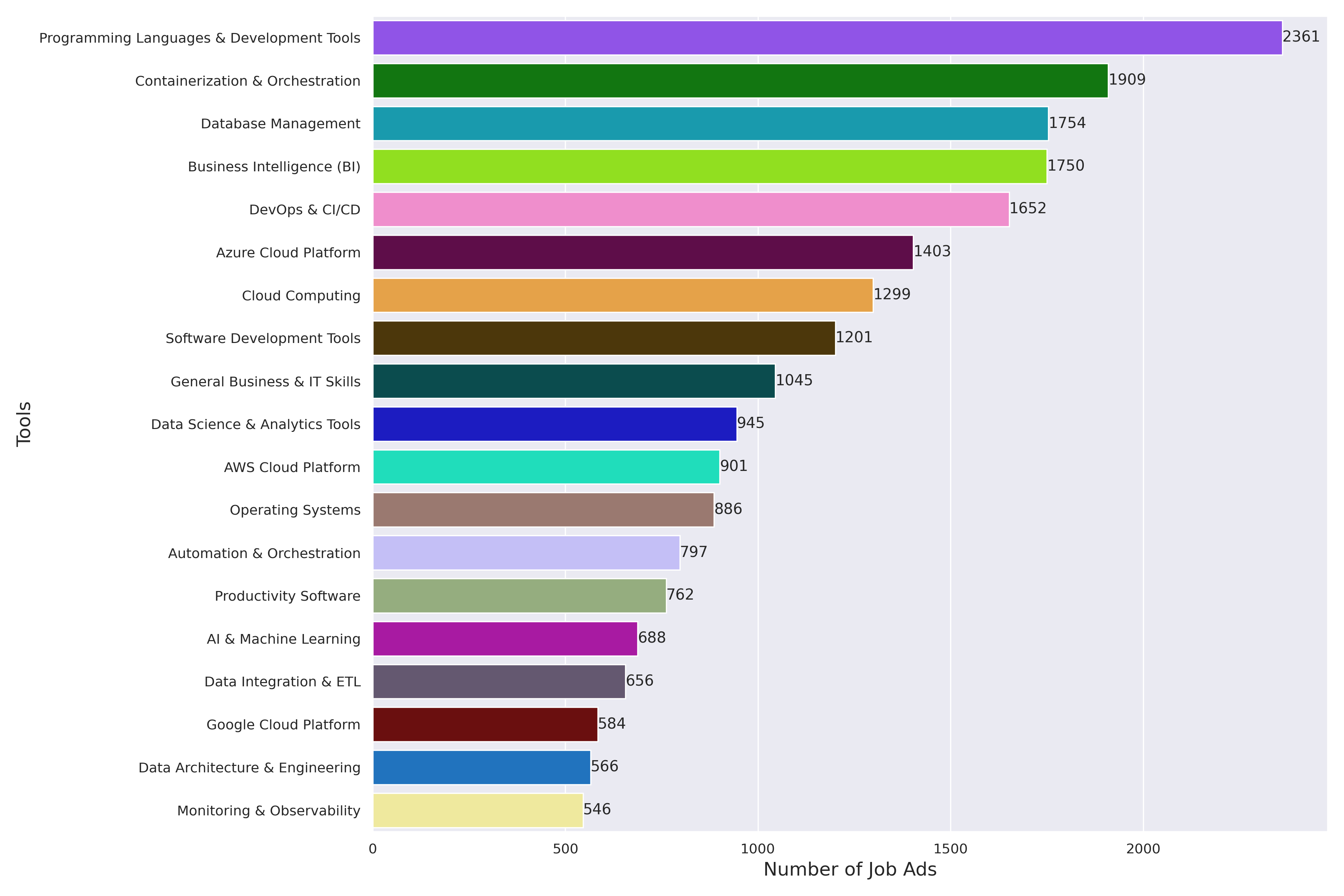
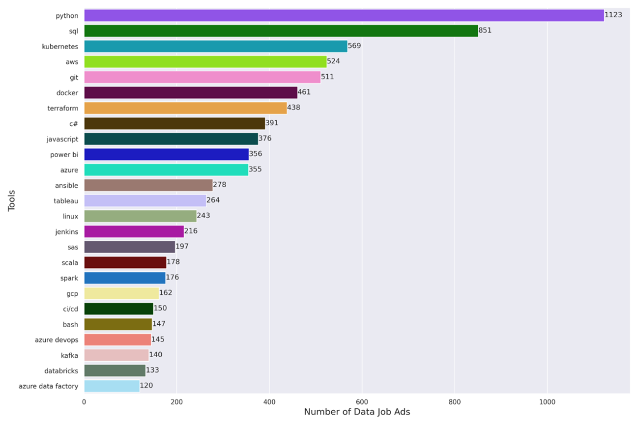
<p>The graph below shows the top requested tools. The following themes strike us as interesting:</p>

<ul>
  <li><strong>Coding</strong> (Python, SQL, etc.) and <strong>development</strong> (e.g. VSCode) <strong>tools</strong> are the number one requested toolset in this analysis. Despite the fact that LLMs are making some coding tasks easier, data professionals are still expected to know how to code!</li>
  <li>In contrast to <a href="/data-jobs-europe/" target="_blank">previous</a> <a href="https://methodmatters.github.io/data-jobs-belgium/" target="_blank">years</a>, <strong>cloud tooling</strong> and topics (e.g. containerization, Azure, Cloud computing, AWS, GCP, etc.) occurs in many places on our list. This increased focus is new, and indicates that the cloud is increasingly where companies work with data and deploy data solutions.</li>
  <li>Tools related to <strong>data analysis</strong> also make the list, whether on the BI side, or tools used for more complicated analysis like data science, statistics, and modeling.</li>
</ul>

<p><strong><em>Figure 6: Top Tools for Data Jobs</em></strong>
<img src="/assets/img/2025-09-21-data-jobs-europe-2025-part-1/top_tools_250.png" alt="top_tools_250" /></p>

<h2 id="skills">Skills</h2>

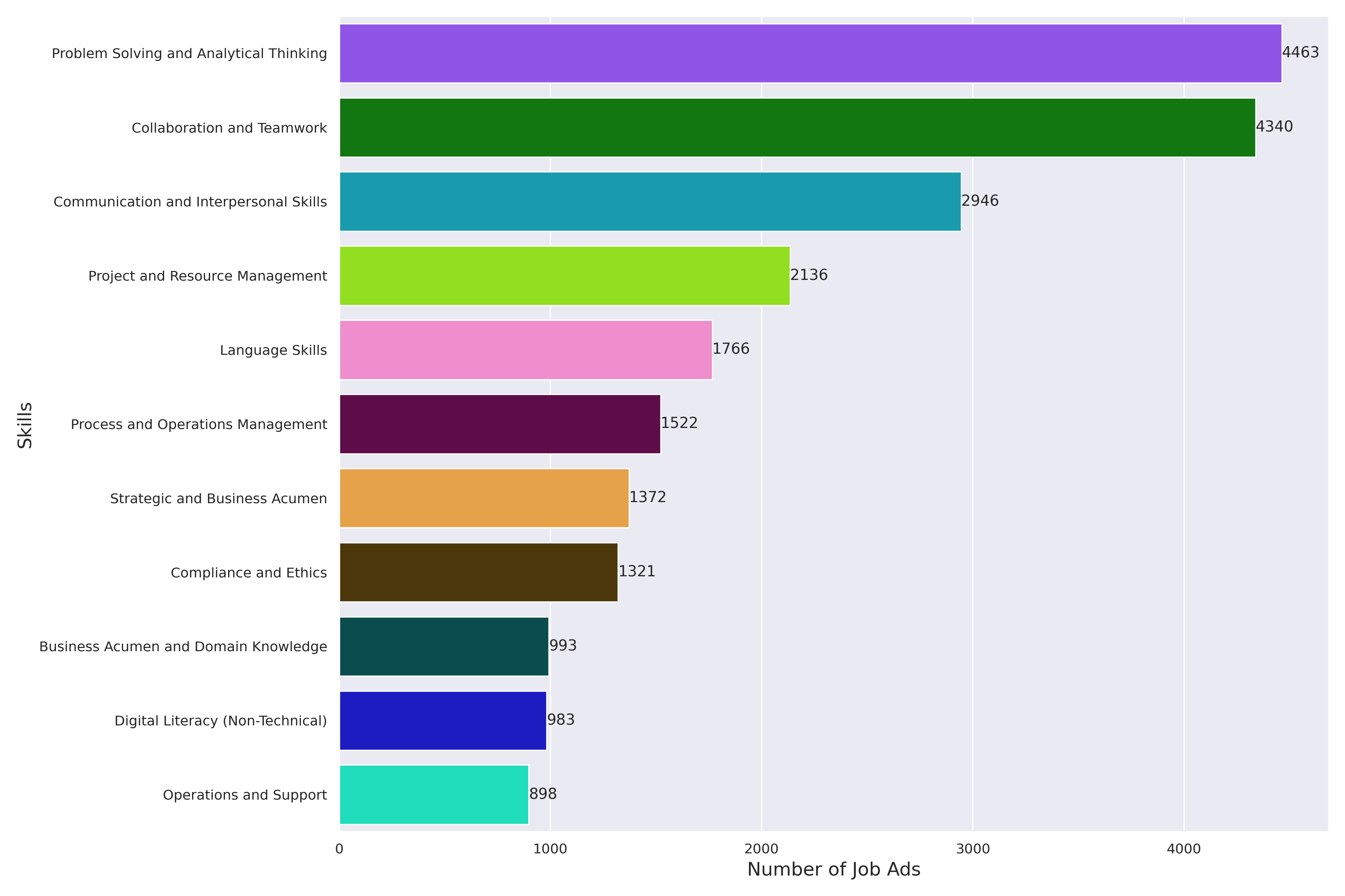
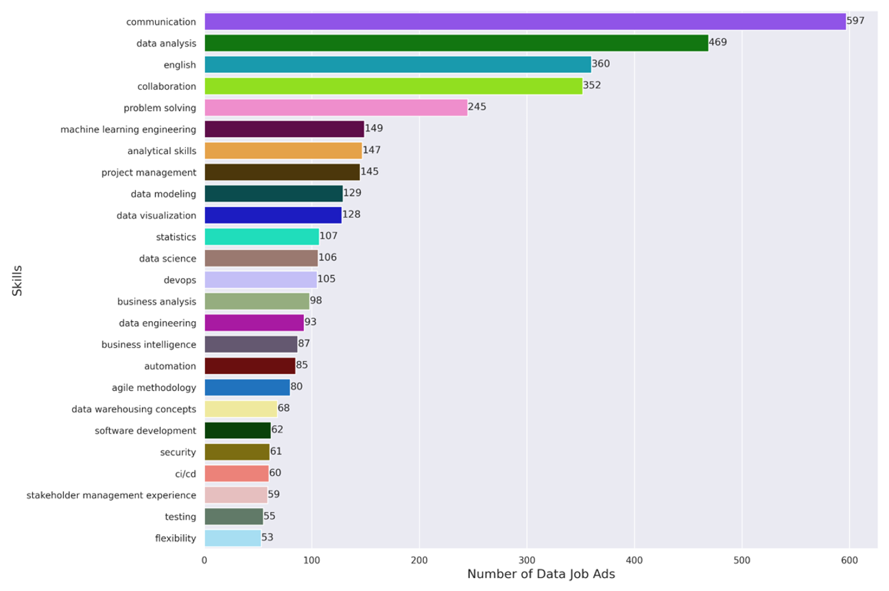
<p>The graph below shows the top-requested skills in our job ad data. The following points stick out to us:</p>

<ul>
  <li>The number one skill in this analysis is <strong>problem solving</strong> and <strong>analytical thinking</strong>. At a high-level, working with data entails a never-ending series of problem solving and analytical thinking exercises. It makes sense that these skills take the top spot!</li>
  <li>The second and third most-requested skills here are <strong>soft skills</strong> – namely <em>collaboration</em> and <em>teamwork</em> and <em>communication</em> and <em>interpersonal</em> <em>skills</em>. This represents a big change from <a href="/data-jobs-europe/" target="_blank">previous</a> <a href="/data-jobs-belgium/" target="_blank">years</a>, where technical skills were ranked much more highly than soft skills. There seems to be an increasing realization that, in the data professions, being able to communicate to others what you’ve done and why you’ve done it is critical.</li>
  <li>Finally, <strong>project management</strong> seems to be a sought-after skill – having the ability to “get things done” is important, not always easy in an organizational setting, and not necessarily intuitive for many technical profiles.</li>
</ul>

<p><strong><em>Figure 7: Top Skills for Data Jobs</em></strong>
<img src="/assets/img/2025-09-21-data-jobs-europe-2025-part-1/top_skills_250.png" alt="top_skills_250" /></p>

<p>One final thing we’ll take a look at in this blog post is to examine whether some of the job titles place more or less accent on the different skills in our analysis</p>

<h2 id="clustering-job-titles--skills">Clustering Job Titles &amp; Skills</h2>

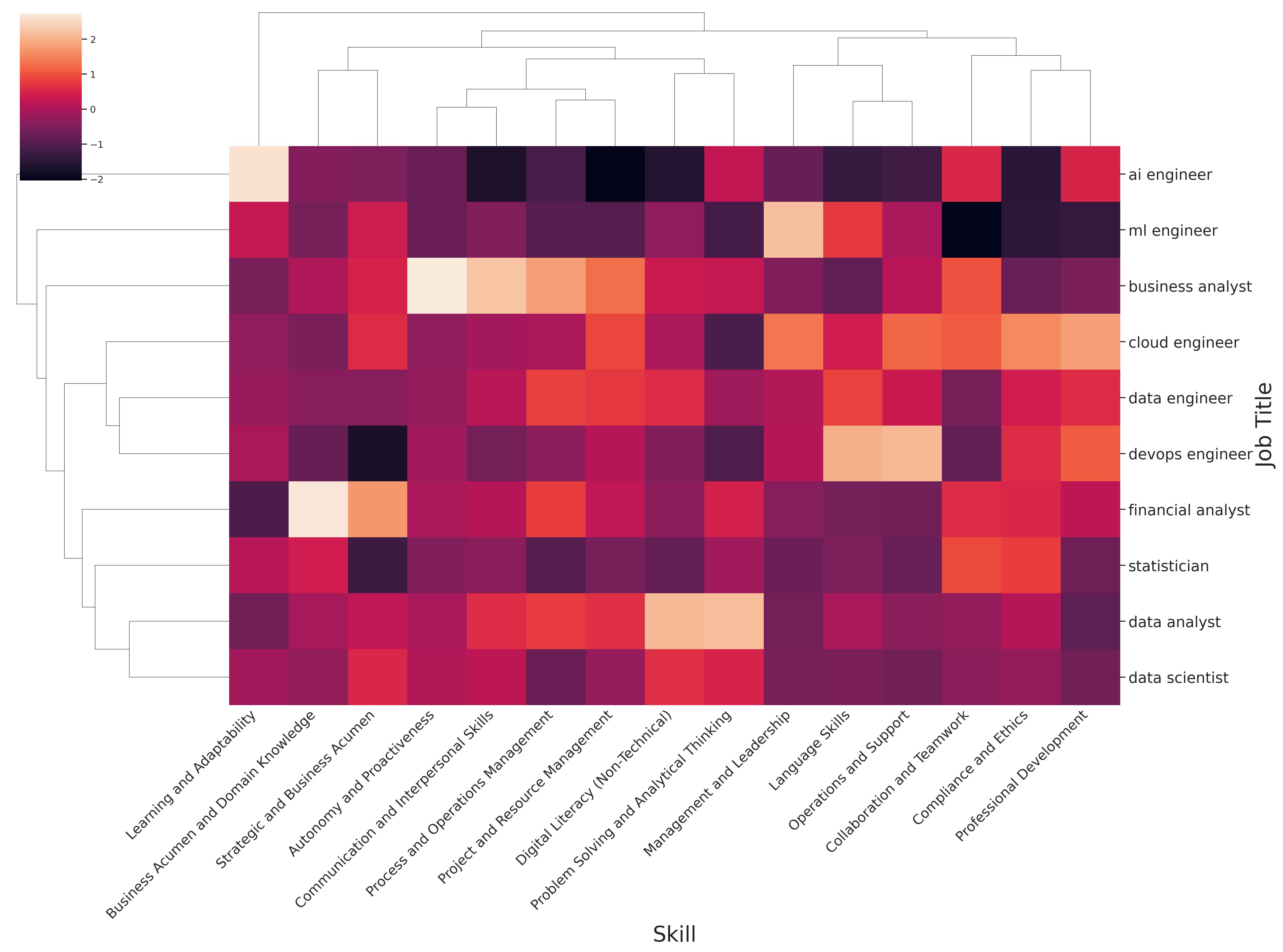
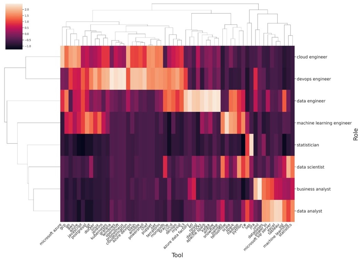
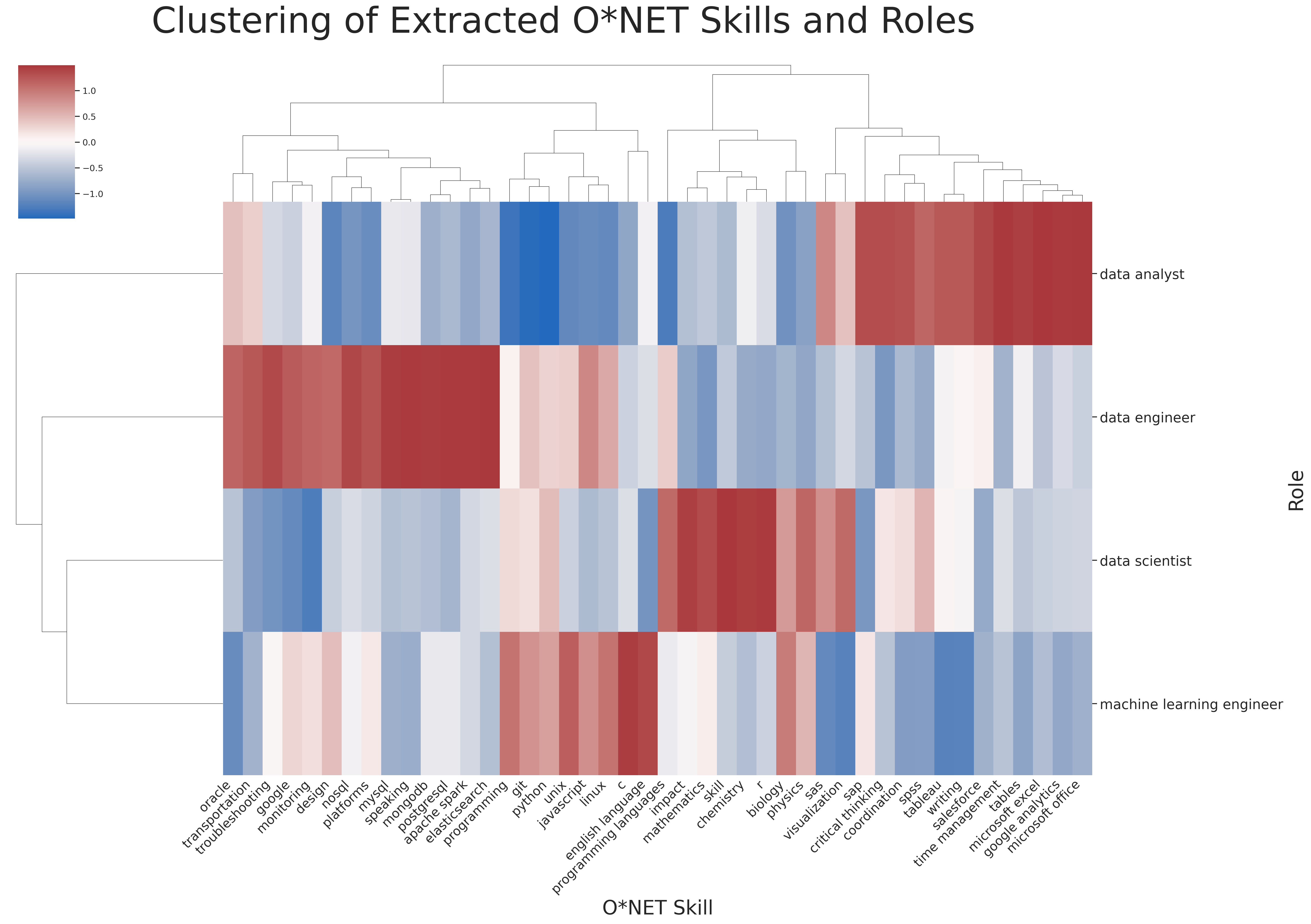
<p>In order to understand how the job titles (e.g. data analyst, scientist, data analyst, etc.) differ by the requested skills, we made the below clustermap. In this map, <em>lighter</em> colors indicate <em>higher</em> prevalence of a given skill for a given job title compared to the others, while <em>darker</em> colors indicate a <em>lower</em> prevalence of a given tool for a given job title compared to the others.</p>

<p>The graph below gives an overview of the differences in employer expectations in regards to skills for the different data job titles. There are too many data points to go over them all in detail, but the following results struck us as the most interesting:</p>

<ul>
  <li><strong>Business analysts</strong> need the most <em>communication</em> and <em>interpersonal skills</em>, likely because they often work more closely with the business and therefore have a greater need to explain their work to non-experts.</li>
  <li><strong>AI engineers</strong> are expected to be constantly learning, no doubt because this sub-domain moves so rapidly that knowledge quickly becomes out-of-date.</li>
  <li><strong>DevOps</strong> need to be good at <em>operations</em> and <em>support</em> to others – their job is to keep processes running, and when the processes fail to get them back up again.</li>
  <li><strong>Financial analysts</strong> need <em>specific domain knowledge</em> more than other data profiles. Indeed, the financial data space is one where domain knowledge is critical, given the regulation surrounding specific types of modelling applications (e.g. credit risk scoring) in the banking sector.</li>
  <li>Finally, <strong>data analysts</strong> are asked to have a <em>problem-solving</em> and <em>analytical thinking mindset</em>, compared to the other roles.</li>
</ul>

<p><strong><em>Figure 8: Clustering of Skills and Roles</em></strong>  <br />
<img src="/assets/img/2025-09-21-data-jobs-europe-2025-part-1/heatmap_skills_roles_250_20250921.jpg" alt="heatmap_skills_roles_250" /></p>

<h1 id="a-data-career-in-europe-in-2025">A Data Career in Europe in 2025</h1>

<p>So, what does this analysis suggest about how to think about a data career in 2025 in Europe? In our thinking, there are two primary types of work that data professionals could consider pursuing:</p>

<h3 id="focus-on-moving-the-data">Focus on Moving the Data:</h3>

<ul>
  <li>Job titles include <strong>data</strong> and <strong>cloud</strong> <strong>engineering</strong>, along with <strong>devops</strong></li>
  <li>These titles dominate the data jobs ads in our analysis</li>
  <li><em>This expertise is needed because</em> A) data need to be in good shape to be used effectively, B) the task is enormous (often due to past under-investment) and C) few companies are where they need to be to take advantage of the data they have.</li>
</ul>

<h3 id="focus-on-understanding-the-data">Focus on Understanding the Data:</h3>

<ul>
  <li>Job titles include <strong>business analyst</strong> / <strong>data analyst</strong> / <strong>data scientist</strong></li>
  <li>There is strong demand for these job titles in our analysis</li>
  <li><em>This expertise is needed because</em> A) understanding data is pre-requisite to act on it B) the ability to analyze, visualize and communicate clearly about data is a rare and valuable talent and C) other engineering and IT profiles are less good at this (in our experience)</li>
</ul>

<h1 id="summary-and-conclusion">Summary and Conclusion</h1>

<p>Our main takeaways from our analysis of 8,086 European data job ads are as follows:</p>

<ul>
  <li><strong>Employers are increasingly looking for “hybrid” profiles</strong> who can take on a broader set of responsibilities (e.g. handle both data engineering and data science work)</li>
  <li>The <strong>bulk of the data job titles</strong> can be <strong>clustered into two main groups</strong> with different emphases:
    <ul>
      <li><em>Data analysis</em> in some shape or form (notably data analyst, along with data scientist, statistician, etc.)</li>
      <li><em>Moving data</em> from one place to another (e.g. engineering in some capacity, notably cloud, develops and data engineers)</li>
    </ul>
  </li>
  <li><strong>Data jobs are to be found in many different sectors</strong>, and present in both private and public organizations. In short, data opportunities exist in a great many places!</li>
  <li>Across the data profiles, <strong>employers are looking for candidates who are familiar with <em>tools</em> related to coding, cloud services, and data analysis</strong></li>
  <li>Across the data profiles, <strong>employers seek candidates who have problem-solving and project management skills, and who balance their technical know-how with soft skills</strong></li>
</ul>

<h3 id="coming-up-next"><em>Coming Up Next</em></h3>

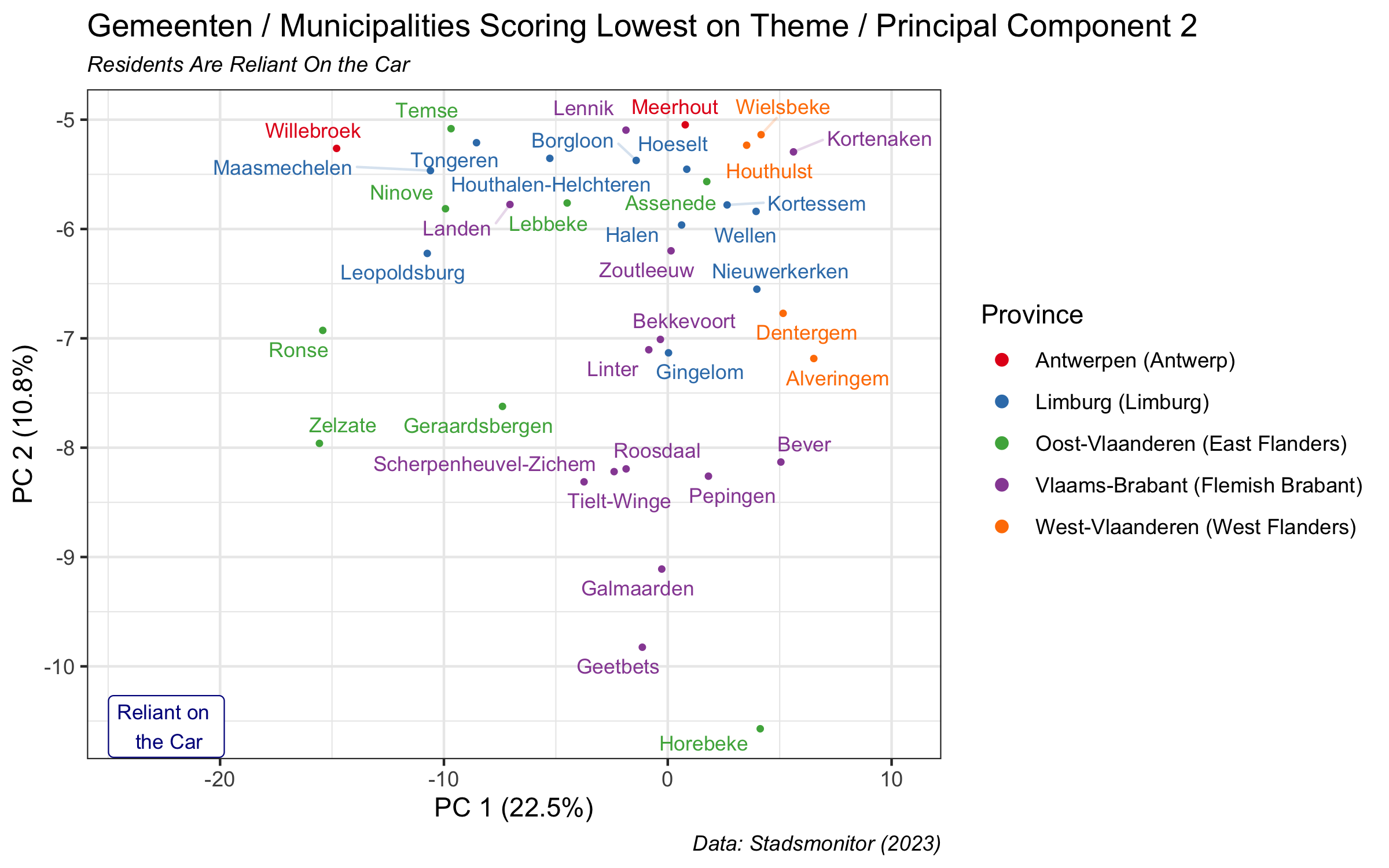
<p>How has the perception and practice of the field of data science evolved over the past decade? An <a href="https://hbr.org/2012/10/data-scientist-the-sexiest-job-of-the-21st-century" target="_blank">early and influential article</a> in the Harvard Business Review from 2012 made a great deal of promises and predictions about what the field of data science would deliver. The next blog post will discuss how those predictions have held up over the past 13 years. <em>Stay tuned!</em></p>]]></content><author><name>Method Matters</name></author><category term="Europe" /><category term="data" /><category term="data jobs" /><category term="cluster analysis" /><category term="data visualization" /><category term="text analysis" /><category term="Gemini" /><category term="LLMs" /><category term="large language models" /><category term="Python" /><category term="seaborn" /><category term="cluster map" /><category term="heatmap" /><category term="job descriptions" /><category term="labor market" /><category term="recruitment" /><category term="data scientist" /><category term="data analyst" /><category term="data engineer" /><category term="machine learning engineer" /><category term="business analyst" /><category term="devops engineer" /><category term="cloud engineer" /><category term="statistician" /><category term="recruiters" /><summary type="html"><![CDATA[There are many blog posts and think-pieces about the state of data and the data labor market in the US, but far fewer such writings focused on Europe. The goal of this blog post is to present a data-driven analysis of the job market for data profiles in Europe in 2025, based on an analysis of 8,086 European job listings posted between April 13 to May 9, 2025. This blog post is based on a talk given by myself and Cesar Legendre at the 2025 meeting of the Royal Statistical Society of Belgium in Brussels.]]></summary></entry><entry><title type="html">The Vibe of Flanders: Part 2</title><link href="https://methodmatters.github.io/vibe-of-flanders-part-2/" rel="alternate" type="text/html" title="The Vibe of Flanders: Part 2" /><published>2024-10-08T07:00:00+02:00</published><updated>2024-10-08T07:00:00+02:00</updated><id>https://methodmatters.github.io/vibe-of-flanders-part-2</id><content type="html" xml:base="https://methodmatters.github.io/vibe-of-flanders-part-2/"><![CDATA[<p>This blog post is the second installment in a series detailing analyses of the 2023 <strong>De Gemeente-Stadsmonitor</strong> (<em>The Municipality and City Monitor</em>) survey, conducted in the region of Flanders in Belgium. You can check out the first post <a href="/vibe-of-flanders/" target="_blank">here</a>.</p>

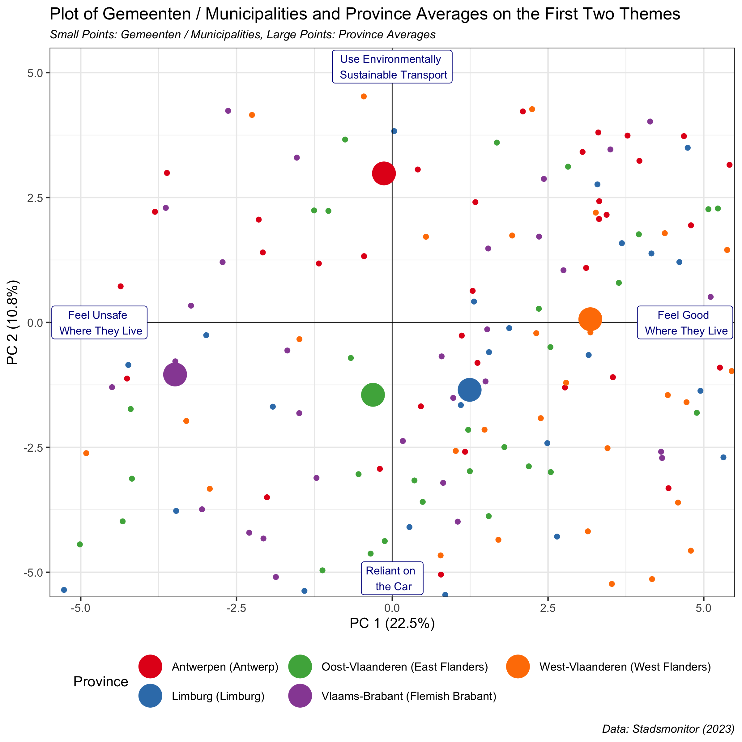
<p>In the <a href="/vibe-of-flanders/" target="_blank">previous post</a>, we used Principal Components Analysis and data visualization techniques to understand the first 2 principal components evident from the survey responses at the municipality level. The results of these analyses showed that the first two principal components concerned <em>feelings about one’s place of residence</em> and <em>transport and mobility</em>, respectively. An analysis of the principal components according to province revealed, for example, that residents in West Flanders felt best about where they lived and that residents in Antwerp Province were most likely to use environmentally sustainable transport.</p>

<p>In this post, we will focus on the third and fourth principal components from the PCA analysis, doing a deep dive into the revealed themes, and map the towns and provinces with the highest and lowest scores on these dimensions.</p>

<p>Read on to learn more!</p>

<h1 id="the-gemeente-stadsmonitor-survey">The Gemeente-Stadsmonitor Survey</h1>

<p>The <a href="https://gemeente-stadsmonitor.vlaanderen.be/over-de-monitor" target="_blank"><strong>Gemeente-Stadsmonitor</strong></a> (<em>Municipality and City Monitor</em>) is conducted every three years by the Agency of the Interior and Statistics Flanders, and the most recent survey wave was conducted in 2023. For the 2023 survey, a representative sample of residents between 17 and 85 years old was sent the survey, and in in total 389,714 people filled it out. According to the website, all 300 Flemish municipalities should be in the data, but in fact only 299 are.<sup id="fnref:1" role="doc-noteref"><a href="#fn:1" class="footnote" rel="footnote">1</a></sup></p>

<p>The survey contains questions on 11 broad topics, as designated by the creators of the survey:</p>

<ul>
  <li>Armoede (<em>Poverty</em>)</li>
  <li>Cultuur en vrije tijd (<em>Culture and leisure</em>)</li>
  <li>Demografie (<em>Demography</em>)</li>
  <li>Klimaat, milieu en natuur (<em>Climate, environment and nature</em>)</li>
  <li>Lokaal bestuur (<em>Local government</em>)</li>
  <li>Mobiliteit (<em>Mobility</em>)</li>
  <li>Onderwijs en vorming (<em>Education and training</em>)</li>
  <li>Samenleven (<em>Living together</em>)</li>
  <li>Werk (<em>Work</em>)</li>
  <li>Wonen en woonomgeving (<em>Living and living environment</em>)</li>
  <li>Zorg en gezondheid (<em>Care and health</em>)</li>
</ul>

<p>For more information about the survey, you can check out <a href="https://gemeente-stadsmonitor.vlaanderen.be/over-de-monitor" target="_blank">this website</a> (in Dutch). The 2023 survey form containing all of the question text and answer options can be found <a href="https://gemeente-stadsmonitor.vlaanderen.be/_gatsby/file/83ed6d93b1f641040c79f6c0b8edc6de/vragenlijst_gemeentemonitor_2023.pdf" target="_blank">here</a>.</p>

<h1 id="language-use-in-this-post">Language Use in This Post</h1>

<p>The <em>Gemeente-Stadsmonitor</em> survey is conducted in Dutch; all survey questions are written in this language. I’m writing this post in English in order for it to be more widely-accessible.</p>

<p>The question descriptions in the charts below will be displayed with the Dutch language descriptions. I’ll provide English language translations (created with machine-translation via Co-Pilot) throughout the text and tables. It should be possible to follow everything described in this post, even if you don’t know any Dutch!</p>

<p>Finally, though the full name of the survey is the “Gemeente-Stadsmonitor”, in the text below I will refer to the survey as the “Stadsmonitor” for simplicity. This is also the term that is used in the Flemish media when talking about the survey and its results.</p>

<h1 id="the-data">The Data</h1>

<p>The data, at the gemeente / municipality level, are <a href="https://gemeente-stadsmonitor.vlaanderen.be/download-alle-cijfers" target="_blank">freely available to the public</a>. You can download subsets of the data, or have all of it in a 100+ tab Excel file.</p>

<p>I downloaded the Excel file with all of the data, and spent a significant amount of effort preparing it for analysis. The data preparation code is available on Github <a href="https://github.com/methodmatters/vibe_of_flanders_part_1" target="_blank">here</a>. The code for the analysis presented below is available <a href="https://github.com/methodmatters/vibe_of_flanders_part_2/tree/master" target="_blank">here</a>.</p>

<p>The present analysis considers only data from the most recent survey wave, conducted in 2023. The data for the analyses below are taken from the answer options that indicate agreement with the question topic. For example, the underlying data for the question “Zich thuis voelen bij mensen in de buurt” (“<em>Feeling at home with people in the neighborhood</em>”) are the percentage of respondents per municipality who <strong>agree</strong> with this statement.</p>

<p>The dataset contains 299 rows (1 per gemeente/municipality), with the answers to each question contained in 200 columns.</p>

<h1 id="analysis-part-1-using-pca-to-uncover-latent-themes-in-the-stadsmonitor-data">Analysis Part 1: Using PCA to Uncover Latent Themes in the Stadsmonitor Data</h1>

<p>The goal of the first set of analyses is to understand the latent themes of the survey items. Each survey question is written to assess residents’ thoughts or feelings about a specific topic (the 11 subjects outlined above, e.g. Mobiliteit / Mobility). However, it is often the case that survey items have a higher-level grouping that is evidenced by the iter-relationship of responses to the questions.</p>

<p>One common data analytic technique that is often used to bring clarity to this underlying structure is called <a href="https://en.wikipedia.org/wiki/Principal_component_analysis" target="_blank">PCA (Principal Components Analysis)</a>. Principal Components Analysis is a technique that tries to reduce a set of variables into a smaller dimensional space. In the current case, we have variables describing the gemeente / municipality-level responses to the 200 questions in the Stadsmonitor. PCA allows us to find a smaller number of independent components that describe the variation in the responses to these questions. Within this reduced-dimensional space, we are better able understand the relationships among the questions, municipalities and regions.<sup id="fnref:2" role="doc-noteref"><a href="#fn:2" class="footnote" rel="footnote">2</a></sup></p>

<p>In this blog post, I will use the term <em>topic</em> to describe the designation given by the survey authors, and <em>principal components</em> to describe the data-driven groupings of survey questions from our statistical analysis.</p>

<h1 id="principal-components-3-and-4">Principal Components 3 and 4</h1>

<p>In this post, we will focus on the third and fourth dimensions uncovered by our PCA analysis. PCA analysis returns a list of underlying themes (called <em>Principal Components</em> or <em>PCs</em> in statistical terms), ranked in terms of their importance in explaining the variation in the responses to the survey questions. Each question gets a score (called a <em>loading</em> in statistical terms) for each Principal Component. The loadings range in between -1 and +1, and the larger a question’s loading on a principal component (either in a positive or negative direction), the more the question is reflective of the theme represented by that component.<sup id="fnref:3" role="doc-noteref"><a href="#fn:3" class="footnote" rel="footnote">3</a></sup></p>

<p>Note that, below, we will begin our discussion with principal component 3. For a detailed description of the first two dimensions from the principal components analysis, please see the <a href="/vibe-of-flanders/" target="_blank">first blog post in this series</a>.</p>

<h2 id="principal-component-3">Principal Component 3</h2>

<p>The table below shows the questions with the highest scores (loadings) - both positive and negative - on the third principal component. Examining these questions will give us an idea of the subject matters of the third principal component.</p>

<p>As can be seen in the table below, the third principal component encompasses questions that focus on a variety of different social and societal themes.</p>

<p>On the positive end of this principal component, we find items that focus on <strong>environmentally conscious behavior</strong> (e.g. vegetarian eating, buying organic products, limiting plastic use, etc.) and <strong>positive attitudes towards diversity</strong> (e.g. believing that having residents from different backgrounds enriches life in the town/municipality). On the negative end of this principal component, we find questions related to <strong>negative attitudes towards diversity</strong> (e.g. having unpleasant neighbors of foreign backgrounds, feeling that municipality residents come from too many different origins, etc.) and being <strong>satisfied with town services</strong> (e.g. satisfaction with facilities for elderly people, childare, etc.). Interestingly, the negative side of PC3 also encompasses items about <strong>subjective poverty and payment difficulties</strong> (suggesting that municipalities that score low on this dimension are less wealthy) and <strong>working in one’s own municipality</strong> (suggesting that more residents in municipalities that score low on this dimension work where they live).</p>

<style>

    table { 
        margin-left: auto;
        margin-right: auto;
        table-layout: fixed;
        width: 100%;
    word-wrap: break-word;
    }
    table, th, td {
        border: 1px solid grey;
        border-collapse: collapse;
    }
    th, td {
        padding: 5px;
        text-align: center;
        font-family: Helvetica, Arial, sans-serif;
        font-size: 90%;
        width: 85px;
    }
    table tbody tr:hover {
        background-color: #dddddd;
    }
    .wide {
        width: 90%; 
    }

</style>

<div style="width:1000px;overflow-x: scroll;">
<table>
 <thead>
  <tr>
   <th style="text-align:center;"> Item - Dutch </th>
   <th style="text-align:center;"> Item - English </th>
   <th style="text-align:center;"> PC3 </th>
  </tr>
 </thead>
<tbody>
  <tr>
   <td style="text-align:center;"> Milieubewust handelen - Vegetarisch eten </td>
   <td style="text-align:center;"> Environmentally conscious behavior - Vegetarian eating </td>
   <td style="text-align:center;"> 0.70 </td>
  </tr>
  <tr>
   <td style="text-align:center;"> Houding tegenover diversiteit </td>
   <td style="text-align:center;"> Attitude towards diversity </td>
   <td style="text-align:center;"> 0.70 </td>
  </tr>
  <tr>
   <td style="text-align:center;"> Milieubewust handelen - Bioproducten gekocht </td>
   <td style="text-align:center;"> Environmentally conscious behavior - Bought organic products </td>
   <td style="text-align:center;"> 0.67 </td>
  </tr>
  <tr>
   <td style="text-align:center;"> Milieubewust handelen - Fair trade </td>
   <td style="text-align:center;"> Environmentally conscious behavior - Fair trade </td>
   <td style="text-align:center;"> 0.64 </td>
  </tr>
  <tr>
   <td style="text-align:center;"> Milieubewust handelen - Plastic beperkt </td>
   <td style="text-align:center;"> Environmentally conscious behavior - Limited plastic </td>
   <td style="text-align:center;"> 0.62 </td>
  </tr>
  <tr>
   <td style="text-align:center;"> Thuiswerk </td>
   <td style="text-align:center;"> Home work </td>
   <td style="text-align:center;"> 0.60 </td>
  </tr>
  <tr>
   <td style="text-align:center;"> Vertrouwen in Europese overheid </td>
   <td style="text-align:center;"> Trust in European government </td>
   <td style="text-align:center;"> 0.56 </td>
  </tr>
  <tr>
   <td style="text-align:center;"> Houding tegenover diversiteit - Verschillende herkomst verrijking </td>
   <td style="text-align:center;"> Attitude towards diversity - Different origin enrichment </td>
   <td style="text-align:center;"> 0.55 </td>
  </tr>
  <tr>
   <td style="text-align:center;"> Milieubewust handelen </td>
   <td style="text-align:center;"> Environmentally conscious behavior </td>
   <td style="text-align:center;"> 0.54 </td>
  </tr>
  <tr>
   <td style="text-align:center;"> Sportparticipatie </td>
   <td style="text-align:center;"> Sports participation </td>
   <td style="text-align:center;"> 0.53 </td>
  </tr>
  <tr>
   <td style="text-align:center;"> Milieubewust handelen - Weggooien eten beperken </td>
   <td style="text-align:center;"> Environmentally conscious behavior - Limit throwing away food </td>
   <td style="text-align:center;"> 0.50 </td>
  </tr>
  <tr>
   <td style="text-align:center;"> Vertrouwen in medemens </td>
   <td style="text-align:center;"> Trust in fellow human beings </td>
   <td style="text-align:center;"> 0.50 </td>
  </tr>
  <tr>
   <td style="text-align:center;"> Tevredenheid over zicht op groen vanuit de woning </td>
   <td style="text-align:center;"> Satisfaction with view of green from the house </td>
   <td style="text-align:center;"> 0.50 </td>
  </tr>
  <tr>
   <td style="text-align:center;"> Milieubewust handelen - Kraantjeswater als drinkwater </td>
   <td style="text-align:center;"> Environmentally conscious behavior - Tap water as drinking water </td>
   <td style="text-align:center;"> 0.48 </td>
  </tr>
  <tr>
   <td style="text-align:center;"> Milieubewust handelen - Seizoensgroenten </td>
   <td style="text-align:center;"> Environmentally conscious behavior - Seasonal vegetables </td>
   <td style="text-align:center;"> 0.48 </td>
  </tr>
  <tr>
   <td style="text-align:center;"> Houding tegenover diversiteit - Goed samenleven </td>
   <td style="text-align:center;"> Attitude towards diversity - Good living together </td>
   <td style="text-align:center;"> 0.48 </td>
  </tr>
  <tr>
   <td style="text-align:center;"> Vervoermiddelenbezit - Abonnement openbaar vervoer </td>
   <td style="text-align:center;"> Vehicle ownership - Public transport subscription </td>
   <td style="text-align:center;"> 0.41 </td>
  </tr>
  <tr>
   <td style="text-align:center;"> Betalingsmoeilijkheden </td>
   <td style="text-align:center;"> Payment difficulties </td>
   <td style="text-align:center;"> -0.41 </td>
  </tr>
  <tr>
   <td style="text-align:center;"> Subjectieve armoede </td>
   <td style="text-align:center;"> Subjective poverty </td>
   <td style="text-align:center;"> -0.42 </td>
  </tr>
  <tr>
   <td style="text-align:center;"> Werken in eigen gemeente </td>
   <td style="text-align:center;"> Working in own municipality </td>
   <td style="text-align:center;"> -0.42 </td>
  </tr>
  <tr>
   <td style="text-align:center;"> Tevredenheid over uitgaansgelegenheden </td>
   <td style="text-align:center;"> Satisfaction with nightlife </td>
   <td style="text-align:center;"> -0.43 </td>
  </tr>
  <tr>
   <td style="text-align:center;"> Tevredenheid over kinderopvang </td>
   <td style="text-align:center;"> Satisfaction with childcare </td>
   <td style="text-align:center;"> -0.44 </td>
  </tr>
  <tr>
   <td style="text-align:center;"> Tevredenheid over ouderenvoorzieningen </td>
   <td style="text-align:center;"> Satisfaction with elderly facilities </td>
   <td style="text-align:center;"> -0.46 </td>
  </tr>
  <tr>
   <td style="text-align:center;"> Houding tegenover diversiteit - Teveel verschillende herkomst </td>
   <td style="text-align:center;"> Attitude towards diversity - Too much different origin </td>
   <td style="text-align:center;"> -0.49 </td>
  </tr>
  <tr>
   <td style="text-align:center;"> Houding tegenover diversiteit - Onprettig buren andere herkomst </td>
   <td style="text-align:center;"> Attitude towards diversity - Unpleasant neighbors other origin </td>
   <td style="text-align:center;"> -0.58 </td>
  </tr>
</tbody>
</table>
</div>

<h2 id="principal-component-4">Principal Component 4</h2>

<p>The questions with the highest scores (both positive and negative) on the fourth principal component are shown in the table below.</p>

<p>As can be seen from an examination of the items in the table, this principal component deals with two different topics at its positive and negative poles.</p>

<p>On the positive end of this principal component, we find items that focus on <strong>satisfaction with one’s local government</strong> (e.g. trust in government, satisfaction with communication towards and consultation of residents, satisfaction with contact with the municipality, etc.). On the negative end of this principal component, we find questions related to <strong>bike usage</strong> (owning and using bicycles for for short distances, leisure travel, etc.) and <strong>sustainable living</strong> (e.g. having homes which are energy efficient and well-insulated &amp; commitment to climate-friendly investments; note that bike use could also be seen as a facet of sustainable living).</p>

<style>

    table { 
        margin-left: auto;
        margin-right: auto;
        table-layout: fixed;
        width: 100%;
    word-wrap: break-word;
    }
    table, th, td {
        border: 1px solid grey;
        border-collapse: collapse;
    }
    th, td {
        padding: 5px;
        text-align: center;
        font-family: Helvetica, Arial, sans-serif;
        font-size: 90%;
        width: 85px;
    }
    table tbody tr:hover {
        background-color: #dddddd;
    }
    .wide {
        width: 90%; 
    }

</style>

<div style="width:1000px;overflow-x: scroll;">
<table>
 <thead>
  <tr>
   <th style="text-align:center;"> Item - Dutch </th>
   <th style="text-align:center;"> Item - English </th>
   <th style="text-align:center;"> PC4 </th>
  </tr>
 </thead>
<tbody>
  <tr>
   <td style="text-align:center;"> Voldoende consultatie van inwoners - Tevreden omgaan met vragen </td>
   <td style="text-align:center;"> Enough consultation of residents - Satisfied dealing with questions </td>
   <td style="text-align:center;"> 0.67 </td>
  </tr>
  <tr>
   <td style="text-align:center;"> Vertrouwen in gemeentebestuur </td>
   <td style="text-align:center;"> Trust in municipal government </td>
   <td style="text-align:center;"> 0.67 </td>
  </tr>
  <tr>
   <td style="text-align:center;"> Voldoende consultatie van inwoners </td>
   <td style="text-align:center;"> Enough consultation of residents </td>
   <td style="text-align:center;"> 0.63 </td>
  </tr>
  <tr>
   <td style="text-align:center;"> Tevredenheid over communicatie van gemeentebestuur </td>
   <td style="text-align:center;"> Satisfaction with municipal communication </td>
   <td style="text-align:center;"> 0.59 </td>
  </tr>
  <tr>
   <td style="text-align:center;"> Voldoende consultatie van inwoners - Consulatie bij veranderingen </td>
   <td style="text-align:center;"> Enough consultation of residents - Consultation with changes </td>
   <td style="text-align:center;"> 0.54 </td>
  </tr>
  <tr>
   <td style="text-align:center;"> Voldoende informatie door gemeente - Beslissingen gemeente/stad </td>
   <td style="text-align:center;"> Enough information by municipality - Decisions municipality/city </td>
   <td style="text-align:center;"> 0.51 </td>
  </tr>
  <tr>
   <td style="text-align:center;"> Contact met de gemeente </td>
   <td style="text-align:center;"> Contact with the municipality </td>
   <td style="text-align:center;"> 0.50 </td>
  </tr>
  <tr>
   <td style="text-align:center;"> Tevredenheid over loketvoorzieningen </td>
   <td style="text-align:center;"> Satisfaction with counter facilities </td>
   <td style="text-align:center;"> 0.45 </td>
  </tr>
  <tr>
   <td style="text-align:center;"> Tevredenheid over staat van voetpaden </td>
   <td style="text-align:center;"> Satisfaction with the condition of sidewalks </td>
   <td style="text-align:center;"> 0.41 </td>
  </tr>
  <tr>
   <td style="text-align:center;"> Voldoende informatie door gemeente </td>
   <td style="text-align:center;"> Enough information by municipality </td>
   <td style="text-align:center;"> 0.41 </td>
  </tr>
  <tr>
   <td style="text-align:center;"> Duurzaamheid van de woning - Isolatie muren </td>
   <td style="text-align:center;"> Sustainability of the house - Wall insulation </td>
   <td style="text-align:center;"> -0.41 </td>
  </tr>
  <tr>
   <td style="text-align:center;"> Voortransport - vervoermiddel - Fiets / elektrische fiets </td>
   <td style="text-align:center;"> Pre-transport - mode of transport - Bike / electric bike </td>
   <td style="text-align:center;"> -0.41 </td>
  </tr>
  <tr>
   <td style="text-align:center;"> Vervoermiddelenbezit - Elektrische fiets </td>
   <td style="text-align:center;"> Vehicle ownership - Electric bike </td>
   <td style="text-align:center;"> -0.43 </td>
  </tr>
  <tr>
   <td style="text-align:center;"> Inzetten op klimaatvriendelijke investeringen </td>
   <td style="text-align:center;"> Commitment to climate-friendly investments </td>
   <td style="text-align:center;"> -0.45 </td>
  </tr>
  <tr>
   <td style="text-align:center;"> Duurzaamheid woning - energiezuinig </td>
   <td style="text-align:center;"> Sustainability house - energy efficient </td>
   <td style="text-align:center;"> -0.50 </td>
  </tr>
  <tr>
   <td style="text-align:center;"> Vervoermiddelenbezit - Fiets </td>
   <td style="text-align:center;"> Vehicle ownership - Bike </td>
   <td style="text-align:center;"> -0.58 </td>
  </tr>
  <tr>
   <td style="text-align:center;"> Verplaatsingen vrije tijd - Fiets / elektrische fiets </td>
   <td style="text-align:center;"> Leisure travel - Bike / electric bike </td>
   <td style="text-align:center;"> -0.60 </td>
  </tr>
  <tr>
   <td style="text-align:center;"> Verplaatsingen vrije tijd - Fiets algemeen </td>
   <td style="text-align:center;"> Leisure travel - Bike in general </td>
   <td style="text-align:center;"> -0.60 </td>
  </tr>
  <tr>
   <td style="text-align:center;"> Milieubewust handelen - Korte afstanden met fiets </td>
   <td style="text-align:center;"> Environmentally conscious behavior - Short distances by bike </td>
   <td style="text-align:center;"> -0.62 </td>
  </tr>
  <tr>
   <td style="text-align:center;"> Duurzaam verplaatsingsgedrag voor korte afstanden - Korte afstanden met fiets </td>
   <td style="text-align:center;"> Sustainable travel behavior for short distances - Short distances by bike </td>
   <td style="text-align:center;"> -0.62 </td>
  </tr>
</tbody>
</table>
</div>

<h2 id="plotting-the-stadsmonitor-questions-according-to-their-scores-on-principal-components-3--4">Plotting the Stadsmonitor Questions According to Their Scores on Principal Components 3 &amp; 4</h2>

<p>We can plot the individual survey items in the tables above in the two-dimensional space defined by the scores of each question on the third and fourth principal components, mapping out where the questions fall with regards to one another within this space. The information shown in the plot below is the same as that contained in the above tables, but the visualization provides another way of understanding the relationships among the questions and the themes of the third and fourth principal components. The items are colored by the question topic, as determined by the agency that administered the survey.</p>

<p>Note that we are showing just a subset of the questions in this plot; there are 200 questions, and plotting them all yields in an enormous jumble that is difficult to read and to interpret.</p>

<p>The main concerns of principal component 3 (displayed on the horizontal or x-axis) come through clearly in the plot. On the positive (right-hand) side of principal component 3, we see questions in yellow describing environmentally conscious behavior (e.g. “Vegetarisch eten” / “<em>Vegetarian eating</em>”) and questions in red describing positive attitudes towards diversity (e.g. “Verschillende herkomst verrijking” / “<em>Different origins bring enrichment</em>”). On the negative (left-hand) side, we see items in light purple and green describing satisfaction with town services (e.g. “Tevredenheid over kinderopvang” / “<em>Satisfaction with childcare</em>”), items in red describing negative attitudes towards diversity (e.g. “Onprettig buren andere herkomst” / “<em>Unpleasant neighbors with foreign backgrounds</em>”) and items in black representing subjective poverty and payment difficulties (e.g. “Subjectieve armoede” / “<em>Subjective poverty</em>”).</p>

<p>The main concerns of the fourth principal component (displayed on the vertical or y-axis) are also evident in the plot. At the positive (upper) side of component 4, we see the items about satisfaction with local government in light blue (e.g. “Vertrouwen in gemeentebestuur” / “<em>Trust in municipal government</em>”). Conversely, at the negative pole (bottom end) of this dimension, we see items in red-violet and yellow representing bike use (e.g. “Verplaatsingen vrije tijd - Fiets algemeen” / “<em>Leisure travel - Bike in general</em>”) and items in dark blue representing sustainable living (e.g. “Duurzaamheid woning - energiezuinig” / “<em>Sustainability house - energy efficient</em>”).</p>

<p><img src="/assets/img/2024-10-08-vibe-of-flanders-part-2/biplot_questions_points_20240807.png" alt="biplot questions points" /></p>

<h1 id="analysis-part-2-plotting-the-gemeenten--municipalities-and-provinces-according-to-their-scores-on-principal-components-3--4">Analysis Part 2: Plotting the Gemeenten / Municipalities and Provinces According to Their Scores on Principal Components 3 &amp; 4</h1>

<p>We can use the results of our PCA analysis to plot each gemeente / municipality in the two-dimensional space defined by the third and fourth principal components, coloring the points according to the Flemish province in which they are located. We can also compute the average of each province along the principal components; these province averages are indicated by the larger dots on the plot below.</p>

<p>There is a clear ordering of the provinces according to the third principal component (displayed on the horizontal axis). The positive end of this component concerns <strong>environmentally conscious behaviors &amp; positive attitudes towards diversity</strong>. Gemeenten / municipalities in Flemish Brabant have, on average, the highest scores on this dimension, indicating that residents in this province are more likely to report <em>performing environmentally conscious behaviors</em> and <em>having positive attitudes towards diversity</em>. The provinces of East Flanders and Antwerp fall somewhere in the middle, while Limburg falls more to the lower side of principal component 3. The negative end of principal component 3 concerns <strong>negative attitudes towards diversity and satisfaction with town services</strong>; the province with the lowest average score is West Flanders. The average low score on principal component three indicates that residents in West Flanders report on average more <em>negative attitudes towards diversity</em> and are also more <em>satisfied with town services</em> than their fellow citizens in the other Flemish provinces.</p>

<p>There is much less variation by province along the fourth principal component (displayed on the vertical axis). The one data point that sticks out to me is the low average score for Antwerp province on principal component 4. This indicates that residents in Antwerp province, on average, report <strong>greater bike use and more environmentally sustainable behaviors</strong> than residents in the other Flemish provinces.</p>

<p><img src="/assets/img/2024-10-08-vibe-of-flanders-part-2/biplot_omnibus_municp_provs_20240807.png" alt="biplot gemeenten municipalities provinces" /></p>

<h2 id="focusing-on-the-gemeenten--municipalities-at-the-extremes-of-principal-components-3--4">Focusing on the Gemeenten / Municipalities at the Extremes of Principal Components 3 &amp; 4</h2>

<p>In the plot above, I’ve focused on the center of the coordinates defined by the principal components three and four. However, there are gemeenten / municipalities that fall at both positive and negative extremes along both of these two dimensions. The plots below display the gemeenten / municipalities with the most extreme scores at the positive and negative ends of each principal component.</p>

<h3 id="highest-scores-on-pc-3---environmentally-conscious-behavior--positive-attitudes-towards-diversity">Highest Scores On PC 3 - Environmentally Conscious Behavior &amp; Positive Attitudes Towards Diversity</h3>

<p>The plot below shows the gemeenten / municipalities with the highest scores on principal component 3. These are the places where survey respondents say that they engage in <strong>environmentally conscious behavior</strong> and have <strong>positive attitudes towards diversity</strong>.</p>

<p><img src="/assets/img/2024-10-08-vibe-of-flanders-part-2/biplot_highest_pc3_20240807.png" alt="most positive pc 3" /></p>

<h3 id="lowest-scores-on-pc-3---negative-attitudes-towards-diversity--satisfaction-with-town-services">Lowest Scores On PC 3 - Negative Attitudes Towards Diversity &amp; Satisfaction With Town Services</h3>

<p>The plot below shows the gemeenten / municipalities with the lowest scores on theme / principal component 3. These are the places where survey respondents report <strong>negative attitudes towards diversity, satisfaction with town services, and subjective poverty</strong>.</p>

<p><img src="/assets/img/2024-10-08-vibe-of-flanders-part-2/biplot_lowest_pc3_20240807.png" alt="most negative pc 3" /></p>

<h3 id="highest-scores-on-pc-4---satisfaction-with-local-government">Highest Scores On PC 4 - Satisfaction With Local Government</h3>

<p>The plot below shows the gemeenten / municipalities with the highest scores on principal component 4. These are the places where survey respondents report the greatest <strong>satisfaction with their local government</strong>.</p>

<p><img src="/assets/img/2024-10-08-vibe-of-flanders-part-2/biplot_highest_pc4_20240807.png" alt="most positive pc 2" /></p>

<h3 id="lowest-scores-on-pc-4---bike-usage-and-sustainable-living">Lowest Scores On PC 4 - Bike Usage and Sustainable Living</h3>

<p>The plot below shows the gemeenten / municipalities with the lowest scores on principal component 4. These are the places where survey respondents report the highest degrees of <strong>bike usage and sustainable living</strong>.</p>

<p><img src="/assets/img/2024-10-08-vibe-of-flanders-part-2/biplot_lowest_pc4_20240907.png" alt="most negative pc 2" /></p>

<h1 id="summary-and-conclusion">Summary and Conclusion</h1>

<p>In this blog post, we used principal components analysis to analyze the summary data per gemeente / municipality from the 2023 Stadsmonitor survey. This analysis followed up on the <a href="/vibe-of-flanders/" target="_blank">first post in this series</a>; we focused here on the third and fourth principal components of our PCA analysis.</p>

<p>The third principal component concerned <strong>environmentally conscious behavior and positive attitudes towards diversity</strong> at the positive end of the dimension and <strong>negative attitudes towards diversity and satisfaction with town services</strong> on the negative end. The fourth principal component concerned <strong>satisfaction with one’s local government</strong> at the positive end and <strong>bike usage and sustainable living</strong> at the negative end.</p>

<p>We then plotted the gemeenten / municipalities and provinces in the two-dimensional space defined by principal components 3 and 4. There was a clear ordering of the provinces according to the third principal component. Respondents <em>Flemish Brabant</em> are more likely to report performing environmentally conscious behaviors and having positive attitudes towards diversity, while respondents in <em>West Flemish</em> municipalities feel, on average, greater negative attitudes towards diversity and greater satisfaction with town services.</p>

<p>There was less variation by province according to the fourth principal component; the one clear difference was that gemeenten / municipalities in <em>Antwerp province</em> were much more likely to report bicycle ownership and use and were more likely to engage in environmentally sustainable behaviors. Finally, we made plots of the gemeenten / municipalities that scored the highest on the positive and negative poles of the third and fourth principal components.</p>

<p>This is the final post examining the themes revealed by our principal component analysis of the 2023 Stadsmonitor survey. In contrast to the first post, the separation of themes between the principal components was less clear here. For example, both principal components 3 and 4 contained items related to environmentally-friendly behaviors (e.g. environmentally conscious behavior like fair trade for PC 3 and sustainable living practices such as energy efficient housing for PC 4) and attitudes towards local government (e.g. satisfaction with services for PC 3 and satisfaction with communication, consultation and contact for PC 4). While there is a logic underlying this separation, the differences are somewhat subtle. This, combined with the fact that each subsequent principal component explains less variation in the underlying survey responses, suggests that we have reached the limit of what we can learn from our PCA analysis of the Stadsmonitor survey data.</p>

<p><strong>Coming Up Next</strong></p>

<p>There are two posts coming in the hopefully not-too-distant future. The first will be a technical deep-dive into the PCA analyses presented in this post and the previous one, and we will describe (with code) the details of the analyses presented above. The second is based on a talk that I gave at the Royal Statistical Society of Belgium with <a href="https://www.linkedin.com/in/cesarlegendre/" target="_blank">Cesar Legendre</a> of <a href="https://www.prophecylabs.com/" target="_blank">Prophecy Labs</a>. In this post, we will describe lessons learned from our professional experiences in doing data science in an organizational context.</p>

<p><em>Stay tuned!</em></p>

<hr />

<div class="footnotes" role="doc-endnotes">
  <ol>
    <li id="fn:1" role="doc-endnote">
      <p>If anyone from the survey team sees this, what happened to Herstappe - NIS Code 73028? <a href="#fnref:1" class="reversefootnote" role="doc-backlink">&#8617;</a></p>
    </li>
    <li id="fn:2" role="doc-endnote">
      <p>For an excellent introduction to PCA, I highly recommend these <a href="https://youtu.be/kpuQqOzQXfM" target="_blank">wonderfully clear</a> <a href="https://youtu.be/YCwSrtSoZ9M" target="_blank">videos</a> from the Hastie and Tibshirani “Introduction to Statistical Learning” online course. François Husson, a developer of the R package we’ll use to do the PCA, has a great <a href="https://www.youtube.com/playlist?list=PLnZgp6epRBbQiG5UBFU2eflRKFX8hszRf" target="_blank">open course about sensographics</a> on YouTube (in French only), and some <a href="https://www.youtube.com/watch?v=tmApJUWWnyI" target="_blank">interesting</a> <a href="https://www.youtube.com/watch?v=CTSbxU6KLbM" target="_blank">tutorials</a> about PCA in English. Also, for a similar application of PCA in a different context, you can check out this <a href="/sensographics-and-mapping-consumer/" target="_blank">previous post</a> describing a market-mapping study of beverages, based on consumer responses to a survey describing how the beverages made them feel. <a href="#fnref:2" class="reversefootnote" role="doc-backlink">&#8617;</a></p>
    </li>
    <li id="fn:3" role="doc-endnote">
      <p>The sign of a question’s score (e.g. positive or negative) is determined by the direction and magnitude of the variable’s contribution to the principal component and is arbitrary; the relative signs of loadings within a component, which indicate the pattern of correlations among variables, allow us to interpret the component’s meaning. <a href="#fnref:3" class="reversefootnote" role="doc-backlink">&#8617;</a></p>
    </li>
  </ol>
</div>]]></content><author><name>Method Matters</name></author><category term="Belgium" /><category term="Flanders" /><category term="surveys" /><category term="Gemeente-Stadsmonitor" /><category term="Stadsmonitor" /><category term="PCA" /><category term="Principal Components Analysis" /><category term="FactoMineR" /><category term="statistics" /><category term="data analysis" /><category term="data vizualization" /><category term="R" /><summary type="html"><![CDATA[This blog post is the second installment in a series detailing analyses of the 2023 De Gemeente-Stadsmonitor (The Municipality and City Monitor) survey, conducted in the region of Flanders in Belgium. You can check out the first post here.]]></summary></entry><entry><title type="html">The Vibe of Flanders: Part 1</title><link href="https://methodmatters.github.io/vibe-of-flanders/" rel="alternate" type="text/html" title="The Vibe of Flanders: Part 1" /><published>2024-05-15T07:00:00+02:00</published><updated>2024-05-15T07:00:00+02:00</updated><id>https://methodmatters.github.io/vibe-of-flanders</id><content type="html" xml:base="https://methodmatters.github.io/vibe-of-flanders/"><![CDATA[<p>What’s it like to live in Flanders these days?</p>

<p><a href="https://en.wikipedia.org/wiki/Flanders" target="_blank">Flanders</a>, the Northern, Dutch-speaking part of Belgium, conducts a regular survey of the people who live here. The survey is called <strong>De Gemeente-Stadsmonitor</strong> (<em>The Municipality and City Monitor</em>), and covers a great many topics, from large societal issues to housing to mobility and climate.</p>

<p>This post describes an analysis of the summary data (aggregated per municipality) from the most-recent survey wave, giving a data-driven view of the main underlying themes of the survey. We will analyze these themes in some detail, and make a map of Flemish municipalities (<em>gemeenten</em> in Dutch) and provinces (West Flanders, East Flanders, Flemish Brabant, Antwerp, and Limburg) according to their relationship to the themes and to one another.</p>

<p>In which municipalities and regions do residents feel good about where they live, and in contrast, where do residents say they feel unsafe? In which municipalities and regions do residents use environmentally sustainable transport and where do they seem dependent on the car? Read on to find out!</p>

<h1 id="the-gemeente-stadsmonitor-survey">The Gemeente-Stadsmonitor Survey</h1>

<p>The <a href="https://gemeente-stadsmonitor.vlaanderen.be/over-de-monitor" target="_blank"><strong>Gemeente-Stadsmonitor</strong></a> (<em>Municipality and City Monitor</em>) is conducted every three years by the Agency of the Interior and Statistics Flanders, and the most recent survey wave was conducted in 2023. For the 2023 survey, a representative sample of residents between 17 and 85 years old was sent the survey, and in in total 389,714 people filled it out. According to the website, all 300 Flemish municipalities should be in the data, but in fact only 299 are.<sup id="fnref:1" role="doc-noteref"><a href="#fn:1" class="footnote" rel="footnote">1</a></sup></p>

<p>The survey contains questions on 11 broad topics, as designated by the creators of the survey:</p>

<ul>
  <li>Armoede (<em>Poverty</em>)</li>
  <li>Cultuur en vrije tijd (<em>Culture and leisure</em>)</li>
  <li>Demografie (<em>Demography</em>)</li>
  <li>Klimaat, milieu en natuur (<em>Climate, environment and nature</em>)</li>
  <li>Lokaal bestuur (<em>Local government</em>)</li>
  <li>Mobiliteit (<em>Mobility</em>)</li>
  <li>Onderwijs en vorming (<em>Education and training</em>)</li>
  <li>Samenleven (<em>Living together</em>)</li>
  <li>Werk (<em>Work</em>)</li>
  <li>Wonen en woonomgeving (<em>Living and living environment</em>)</li>
  <li>Zorg en gezondheid (<em>Care and health</em>)</li>
</ul>

<p>For more information about the survey, you can check out <a href="https://gemeente-stadsmonitor.vlaanderen.be/over-de-monitor" target="_blank">this website</a> (in Dutch). The 2023 survey form containing all of the question text and answer options can be found <a href="https://gemeente-stadsmonitor.vlaanderen.be/_gatsby/file/83ed6d93b1f641040c79f6c0b8edc6de/vragenlijst_gemeentemonitor_2023.pdf" target="_blank">here</a></p>

<h1 id="language-use-in-this-post">Language Use in This Post</h1>

<p>The <em>Gemeente-Stadsmonitor</em> survey is conducted in Dutch; all survey questions are written in this language. I’m writing this post in English in order for it to be more widely-accessible.</p>

<p>The question descriptions in the charts below will be displayed with the Dutch language descriptions. I’ll provide English language translations (created with machine-translation via Co-Pilot) throughout the text and tables. It should be possible to follow everything described in this post, even if you don’t know any Dutch!</p>

<p>Finally, though the full name of the survey is the “Gemeente-Stadsmonitor”, in the text below I will refer to the survey as the “Stadsmonitor” for simplicity. This is also the term that is used in the Flemish media when talking about the survey and its results.</p>

<h1 id="the-data">The Data</h1>

<p>The data, at the gemeente / municipality level, are <a href="https://gemeente-stadsmonitor.vlaanderen.be/download-alle-cijfers" target="_blank">freely available to the public</a>. You can download subsets of the data, or have all of it in a 100+ tab Excel file.</p>

<p>I downloaded the Excel file with all of the data, and spent a significant amount of effort preparing it for analysis. All of the data preparation and analysis code is available on Github <a href="https://github.com/methodmatters/vibe_of_flanders_part_1" target="_blank">here</a>.</p>

<p>The present analysis considers only data from the most recent survey wave, conducted in 2023. The data for the analyses below are taken from the answer options that indicate agreement with the question topic. For example, the underlying data for the question “Zich thuis voelen bij mensen in de buurt” (“<em>Feeling at home with people in the neighborhood</em>”) are the percentage of respondents per municipality who <strong>agree</strong> with this statement.</p>

<p>The dataset contains 299 rows (1 per gemeente/municipality), with the answers to each question contained in 200 columns.</p>

<h1 id="analysis-part-1-using-pca-to-uncover-latent-themes-in-the-stadsmonitor-data">Analysis Part 1: Using PCA to Uncover Latent Themes in the Stadsmonitor Data</h1>

<p>The goal of the first set of analyses is to understand the latent themes of the survey items. Each survey question is written to assess residents’ thoughts or feelings about a specific topic (the 11 subjects outlined above, e.g. Mobiliteit / Mobility). However, it is often the case that survey items have a higher-level grouping that is evidenced by the iter-relationship of responses to the questions.</p>

<p>One common data analytic technique that is often used to bring clarity to this underlying structure is called <a href="https://en.wikipedia.org/wiki/Principal_component_analysis" target="_blank">PCA (Principal Components Analysis)</a>. Principal Components Analysis is a technique that tries to reduce a set of variables into a smaller dimensional space. In the current case, we have variables describing the gemeente / municipality-level responses to the 200 questions in the Stadsmonitor. PCA allows us to find a smaller number of independent components that describe the variation in the responses to these questions. Within this reduced-dimensional space, we are better able understand the relationships among the questions, municipalities and regions.<sup id="fnref:2" role="doc-noteref"><a href="#fn:2" class="footnote" rel="footnote">2</a></sup></p>

<p>In this blog post, I will use the term <em>topic</em> to describe the designation given by the survey authors, and <em>theme</em> to describe the data-driven groupings of survey questions from our statistical analysis (e.g. the principal components).</p>

<h1 id="revealed-themes-principal-components">Revealed Themes (Principal Components)</h1>

<p>In this post, we will focus on the top two themes uncovered by the PCA analysis. Our analysis gives us a list of underlying themes (called <em>Principal Components</em> or <em>PCs</em> in statistical terms), ranked in terms of their importance in explaining the variation in the responses to the survey questions. Each question gets a score (called a <em>loading</em> in statistical terms) for each Principal Component. The loadings range in between -1 and +1, and the larger a question’s loading on a principal component (either in a positive or negative direction), the more the question is reflective of the theme represented by that component.<sup id="fnref:3" role="doc-noteref"><a href="#fn:3" class="footnote" rel="footnote">3</a></sup></p>

<h2 id="theme-1-pc-1">Theme 1 (PC 1)</h2>

<p>The table below shows the questions with the highest scores (loadings) - both positive and negative - on the first principal component. Examining these questions will give us an idea of the subject matter of the first theme.</p>

<p>As is clear in the table, the first theme is heavily concerned with <strong>feelings about one’s place of residence</strong>, in the neighborhood or gemeente / municipality.</p>

<p>On the positive end of this principal component, we find items that focus on <strong>feeling good about where one lives</strong>. The questions deal with feeling at home, comfortable, safe, having good contacts with neighbors, etc. On the negative end of this principal component, we find questions related to <strong>feeling insecure or unsafe where one lives</strong>. The questions with the largest negative scores concern nuisances in the neighborhood, conflict, attitudes towards diversity, feeling unsafe, and interestingly, trust in the federal government.</p>

<p><strong>A Word on Interpretation</strong></p>

<p>PCA analysis is based upon the underlying correlations among the responses to the survey items at the gemeente / municipality level. We can therefore use the analysis to understand how responses to the survey questions are related to one another.</p>

<p>Firstly, items that have higher scores on PC 1 are positively correlated with one another, and items that have lower scores on PC 1 are also positively correlated with one another. For example, gemeenten / municipalities that have higher average scores on the item “Feeling at home with people in the neighborhood” (PC 1 loading of .88) also have higher average scores on the item “Satisfaction with contact in the neighborhood” (PC 1 loading of .87). And at the other end of PC 1, gemeenten / municipalities with higher average scores on the item “Feeling of insecurity in the neighborhood” (PC 1 loading of -.73) also have higher average scores on the item “Chat with people of non-Belgian origin” (PC 1 loading of -.72).</p>

<p>Furthermore, items with positive loadings on a given principal component are negatively correlated with items with negative loadings on that component. For example, gemeenten / municipalities with higher average scores on the item “Feeling at home with people in the neighborhood” (PC1 loading of .85) have lower average scores on the item “Feeling of insecurity in the municipality” (PC1 loading of -.74).</p>

<p>Note that these relationships are correlations, and not causal relationships. The table of loadings below shows that gemeenten / municipalities where residents speak more with people of non-Belgian origin (loading of -.72) also feel less safe in their neighborhood (loading of -.73). However, it is <em>not</em> the case that people feel less safe <em>because</em> they speak more frequently with individuals of non-Belgian origin.</p>

<style>

    table { 
        margin-left: auto;
        margin-right: auto;
        table-layout: fixed;
        width: 100%;
    word-wrap: break-word;
    }
    table, th, td {
        border: 1px solid grey;
        border-collapse: collapse;
    }
    th, td {
        padding: 5px;
        text-align: center;
        font-family: Helvetica, Arial, sans-serif;
        font-size: 90%;
        width: 85px;
    }
    table tbody tr:hover {
        background-color: #dddddd;
    }
    .wide {
        width: 90%; 
    }

</style>

<div style="width:1000px;overflow-x: scroll;">
<table>
 <thead>
  <tr>
   <th style="text-align:center;"> Item - Dutch </th>
   <th style="text-align:center;"> Item - English </th>
   <th style="text-align:center;"> PC 1 </th>
  </tr>
 </thead>
<tbody>
  <tr>
   <td style="text-align:center;"> Sociaal weefsel in de buurt - Zich thuis voelen bij mensen in de buurt </td>
   <td style="text-align:center;"> Social fabric in the neighborhood - Feeling at home with people in the neighborhood </td>
   <td style="text-align:center;"> 0.88 </td>
  </tr>
  <tr>
   <td style="text-align:center;"> Tevredenheid over contact in de buurt </td>
   <td style="text-align:center;"> Satisfaction with contact in the neighborhood </td>
   <td style="text-align:center;"> 0.87 </td>
  </tr>
  <tr>
   <td style="text-align:center;"> Tevredenheid over de buurt </td>
   <td style="text-align:center;"> Satisfaction with the neighborhood </td>
   <td style="text-align:center;"> 0.85 </td>
  </tr>
  <tr>
   <td style="text-align:center;"> Zich thuis voelen in de buurt </td>
   <td style="text-align:center;"> Feeling at home in the neighborhood </td>
   <td style="text-align:center;"> 0.85 </td>
  </tr>
  <tr>
   <td style="text-align:center;"> Sociaal weefsel in de buurt </td>
   <td style="text-align:center;"> Social fabric in the neighborhood </td>
   <td style="text-align:center;"> 0.85 </td>
  </tr>
  <tr>
   <td style="text-align:center;"> Sociaal weefsel in de buurt - Mensen in de buurt zijn te vertrouwen </td>
   <td style="text-align:center;"> Social fabric in the neighborhood - People in the neighborhood are trustworthy </td>
   <td style="text-align:center;"> 0.84 </td>
  </tr>
  <tr>
   <td style="text-align:center;"> Sociaal weefsel in de buurt - Mensen in de buurt willen hun buren helpen </td>
   <td style="text-align:center;"> Social fabric in the neighborhood - People in the neighborhood want to help their neighbors </td>
   <td style="text-align:center;"> 0.84 </td>
  </tr>
  <tr>
   <td style="text-align:center;"> Graag wonen in de gemeente </td>
   <td style="text-align:center;"> Like living in the municipality </td>
   <td style="text-align:center;"> 0.80 </td>
  </tr>
  <tr>
   <td style="text-align:center;"> Plaats om fietsen te stallen in of bij de woning </td>
   <td style="text-align:center;"> Place to park bicycles in or at the house </td>
   <td style="text-align:center;"> 0.79 </td>
  </tr>
  <tr>
   <td style="text-align:center;"> Duurzaamheid van de woning - Zonnepanelen </td>
   <td style="text-align:center;"> Sustainability of the house - Solar panels </td>
   <td style="text-align:center;"> 0.79 </td>
  </tr>
  <tr>
   <td style="text-align:center;"> Private buitenruimte of garage - Garage </td>
   <td style="text-align:center;"> Private outdoor space or garage - Garage </td>
   <td style="text-align:center;"> 0.76 </td>
  </tr>
  <tr>
   <td style="text-align:center;"> Netheid van het centrum </td>
   <td style="text-align:center;"> Cleanliness of the center </td>
   <td style="text-align:center;"> 0.76 </td>
  </tr>
  <tr>
   <td style="text-align:center;"> Buurthinder: lastiggevallen worden op straat </td>
   <td style="text-align:center;"> Neighborhood nuisance: being harassed on the street </td>
   <td style="text-align:center;"> -0.62 </td>
  </tr>
  <tr>
   <td style="text-align:center;"> Diversiteit vriendenkring - Vrienden niet-Belgische herkomst </td>
   <td style="text-align:center;"> Diversity of friends - Friends non-Belgian origin </td>
   <td style="text-align:center;"> -0.63 </td>
  </tr>
  <tr>
   <td style="text-align:center;"> Vertrouwen in federale overheid </td>
   <td style="text-align:center;"> Trust in federal government </td>
   <td style="text-align:center;"> -0.63 </td>
  </tr>
  <tr>
   <td style="text-align:center;"> Verplaatsingen vrije tijd - Bus, tram of metro </td>
   <td style="text-align:center;"> Leisure travel - Bus, tram or metro </td>
   <td style="text-align:center;"> -0.64 </td>
  </tr>
  <tr>
   <td style="text-align:center;"> Houding tegenover diversiteit - Teveel verschillende herkomst </td>
   <td style="text-align:center;"> Attitude towards diversity - Too much different origin </td>
   <td style="text-align:center;"> -0.64 </td>
  </tr>
  <tr>
   <td style="text-align:center;"> Buurthinder: vandalisme en drugsdealing - Drugsdealing </td>
   <td style="text-align:center;"> Neighborhood nuisance: vandalism and drug dealing - Drug dealing </td>
   <td style="text-align:center;"> -0.69 </td>
  </tr>
  <tr>
   <td style="text-align:center;"> Intensiteit van contacten - Praatje met mensen van niet-Belgische herkomst </td>
   <td style="text-align:center;"> Intensity of contacts - Chat with people of non-Belgian origin </td>
   <td style="text-align:center;"> -0.72 </td>
  </tr>
  <tr>
   <td style="text-align:center;"> Onveiligheidsgevoel in de buurt </td>
   <td style="text-align:center;"> Feeling of insecurity in the neighborhood </td>
   <td style="text-align:center;"> -0.73 </td>
  </tr>
  <tr>
   <td style="text-align:center;"> Buurthinder: milieuhinder - Hondenpoep </td>
   <td style="text-align:center;"> Neighborhood nuisance: environmental nuisance - Dog poop </td>
   <td style="text-align:center;"> -0.73 </td>
  </tr>
  <tr>
   <td style="text-align:center;"> Onveiligheidsgevoel in de gemeente </td>
   <td style="text-align:center;"> Feeling of insecurity in the municipality </td>
   <td style="text-align:center;"> -0.74 </td>
  </tr>
  <tr>
   <td style="text-align:center;"> Buurthinder: vandalisme en drugsdealing - Vandalisme </td>
   <td style="text-align:center;"> Neighborhood nuisance: vandalism and drug dealing - Vandalism </td>
   <td style="text-align:center;"> -0.76 </td>
  </tr>
  <tr>
   <td style="text-align:center;"> Buurthinder </td>
   <td style="text-align:center;"> Neighborhood nuisance </td>
   <td style="text-align:center;"> -0.82 </td>
  </tr>
</tbody>
</table>
</div>

<h2 id="theme-2--pc-2">Theme 2 / PC 2</h2>

<p>The questions with the highest scores (both positive and negative) on the second underlying theme are shown in the table below. This theme is heavily focused on <strong>transport and mobility</strong>, important topics in a country where the near-constant traffic jams have enormous <a href="https://www.brusselstimes.com/360094/over-e4-5-billion-lost-due-to-traffic-jams-in-belgium-last-year" target="_blank">negative impacts on the economy</a> and <a href="https://www.belganewsagency.eu/belgium-ranked-worst-in-european-traffic-behaviour-survey" target="_blank">commuter well-being</a>.</p>

<p>On the positive dimension of the principal component, the questions focus on <strong>environmentally sustainable transportation</strong>. Many of the top items concern <em>bicycle use</em> - whether respondents frequently use their bikes, the state of the bike infrastructure, and whether they feel safe while cycling. Mixed in with these items are questions related to walking and being physically active. At the negative end of the second theme, we find mostly items about <strong>frequent car usage</strong>.</p>

<style>

    table { 
        margin-left: auto;
        margin-right: auto;
        table-layout: fixed;
        width: 100%;
    word-wrap: break-word;
    }
    table, th, td {
        border: 1px solid grey;
        border-collapse: collapse;
    }
    th, td {
        padding: 5px;
        text-align: center;
        font-family: Helvetica, Arial, sans-serif;
        font-size: 90%;
        width: 85px;
    }
    table tbody tr:hover {
        background-color: #dddddd;
    }
    .wide {
        width: 90%; 
    }

</style>

<div style="width:1000px;overflow-x: scroll;">
<table>
 <thead>
  <tr>
   <th style="text-align:center;"> Item - Dutch </th>
   <th style="text-align:center;"> Item - English </th>
   <th style="text-align:center;"> PC 2 </th>
  </tr>
 </thead>
<tbody>
  <tr>
   <td style="text-align:center;"> Duurzaam verplaatsingsgedrag voor korte afstanden </td>
   <td style="text-align:center;"> Sustainable travel behavior for short distances </td>
   <td style="text-align:center;"> 0.68 </td>
  </tr>
  <tr>
   <td style="text-align:center;"> Voldoende fietsenstallingen </td>
   <td style="text-align:center;"> Enough bicycle parking </td>
   <td style="text-align:center;"> 0.64 </td>
  </tr>
  <tr>
   <td style="text-align:center;"> Milieubewust handelen </td>
   <td style="text-align:center;"> Environmentally conscious behavior </td>
   <td style="text-align:center;"> 0.64 </td>
  </tr>
  <tr>
   <td style="text-align:center;"> Veilig fietsen </td>
   <td style="text-align:center;"> Safe cycling </td>
   <td style="text-align:center;"> 0.63 </td>
  </tr>
  <tr>
   <td style="text-align:center;"> Voldoende autoluwe en autovrije zones </td>
   <td style="text-align:center;"> Enough car-free and car-free zones </td>
   <td style="text-align:center;"> 0.62 </td>
  </tr>
  <tr>
   <td style="text-align:center;"> Verplaatsingen vrije tijd - Fiets / elektrische fiets </td>
   <td style="text-align:center;"> Leisure travel - Bike / electric bike </td>
   <td style="text-align:center;"> 0.62 </td>
  </tr>
  <tr>
   <td style="text-align:center;"> Verplaatsingen vrije tijd - Fiets algemeen </td>
   <td style="text-align:center;"> Leisure travel - Bike in general </td>
   <td style="text-align:center;"> 0.62 </td>
  </tr>
  <tr>
   <td style="text-align:center;"> Milieubewust handelen - Korte afstanden te voet </td>
   <td style="text-align:center;"> Environmentally conscious behavior - Short distances on foot </td>
   <td style="text-align:center;"> 0.61 </td>
  </tr>
  <tr>
   <td style="text-align:center;"> Duurzaam verplaatsingsgedrag voor korte afstanden - Korte afstanden te voet </td>
   <td style="text-align:center;"> Sustainable travel behavior for short distances - Short distances on foot </td>
   <td style="text-align:center;"> 0.61 </td>
  </tr>
  <tr>
   <td style="text-align:center;"> Tevredenheid over staat van fietsinfrastructuur </td>
   <td style="text-align:center;"> Satisfaction with the condition of cycling infrastructure </td>
   <td style="text-align:center;"> 0.60 </td>
  </tr>
  <tr>
   <td style="text-align:center;"> Actief bewegen </td>
   <td style="text-align:center;"> Active movement </td>
   <td style="text-align:center;"> 0.58 </td>
  </tr>
  <tr>
   <td style="text-align:center;"> Voldoende fietsinfrastructuur </td>
   <td style="text-align:center;"> Enough cycling infrastructure </td>
   <td style="text-align:center;"> 0.58 </td>
  </tr>
  <tr>
   <td style="text-align:center;"> Verplaatsingen vrije tijd - Te voet </td>
   <td style="text-align:center;"> Leisure travel - On foot </td>
   <td style="text-align:center;"> 0.57 </td>
  </tr>
  <tr>
   <td style="text-align:center;"> Voldoende openbaar vervoer </td>
   <td style="text-align:center;"> Enough public transport </td>
   <td style="text-align:center;"> 0.56 </td>
  </tr>
  <tr>
   <td style="text-align:center;"> Buurthinder: milieuhinder - Zwerfvuil </td>
   <td style="text-align:center;"> Neighborhood nuisance: environmental nuisance - Litter </td>
   <td style="text-align:center;"> -0.54 </td>
  </tr>
  <tr>
   <td style="text-align:center;"> Verplaatsingen vrije tijd - Autopassagier </td>
   <td style="text-align:center;"> Leisure travel - Car passenger </td>
   <td style="text-align:center;"> -0.57 </td>
  </tr>
  <tr>
   <td style="text-align:center;"> Buurthinder: verkeershinder - Snel rijden </td>
   <td style="text-align:center;"> Neighborhood nuisance: traffic nuisance - Fast driving </td>
   <td style="text-align:center;"> -0.57 </td>
  </tr>
  <tr>
   <td style="text-align:center;"> Verplaatsingen woon-werk/woon-school: dominant vervoermiddel - Auto </td>
   <td style="text-align:center;"> Commuting: dominant mode of transport - Car </td>
   <td style="text-align:center;"> -0.60 </td>
  </tr>
  <tr>
   <td style="text-align:center;"> Verplaatsingen vrije tijd - Autobestuurder </td>
   <td style="text-align:center;"> Leisure travel - Car driver </td>
   <td style="text-align:center;"> -0.60 </td>
  </tr>
</tbody>
</table>
</div>

<h2 id="plotting-the-stadsmonitor-questions-according-to-their-scores-on-themes-1--2">Plotting the Stadsmonitor Questions According to Their Scores on Themes 1 &amp; 2</h2>

<p>We can plot the individual survey items in the tables above in the two-dimensional space defined by the scores of each question on the first two principal components, mapping out where the questions fall with regards to one another within this space. The information shown in the plot below is the same as that contained in the above tables, but the visualization provides another way of understanding the relationships among the questions and the themes of the first two principal components. The items are colored by the question topic, as determined by the agency that administered the survey.</p>

<p>Note that we are showing just a subset of the questions in this plot; there are 200 questions, and plotting them all yields in an enormous jumble that is difficult to read and to interpret.</p>

<p>The main concerns of the first theme (displayed on the horizontal or x-axis) - of feelings about one’s place of residence - are very clear. On the positive (right-hand) side, we see the questions describing positive feelings about where one lives (e.g. “Zich thuis voelen in de buurt” / “<em>Feeling at home in the neighborhood</em>”). On the negative (left-hand) side, we see the items about feeling insecure or unsafe in the place where one lives (e.g. “Onveiligheidsgevoel in de buurt” / “<em>Feeling of insecurity in the neighborhood</em>”).</p>

<p>The main concerns of the second theme (displayed on the vertical or y-axis) - all about transport and mobility - are also quite clear. At the positive (upper) side, we see the items about using bikes or other environmentally sustainable transportation modes, whereas on the negative (bottom) side, we see items about using the car.</p>

<p>Notice that the question topics (assigned by the survey writers) are grouped into higher level themes by the PCA analysis. For example, the first theme / principal component - about feeling good or bad where one lives - contains survey items from the Wonen en woonomgeving (<em>Living and living environment</em>), Samenleven (<em>Living together</em>), and Cultuur en vrije tijd (<em>Culture &amp; leisure</em>) topics.</p>

<p><img src="/assets/img/2024-05-15-vibe-of-flanders/biplot_questions_points_20240513.png" alt="biplot questions points" /></p>

<h1 id="analysis-part-2-plotting-the-gemeenten--municipalities-and-provinces-according-to-their-scores-on-themes-1--2">Analysis Part 2: Plotting the Gemeenten / Municipalities and Provinces According to Their Scores on Themes 1 &amp; 2</h1>

<p>We can use the results of our PCA analysis to plot each gemeente / municipality in the two-dimensional space defined by the first two principal components, coloring the points by the color of the Flemish province in which they are located. We can also compute the average of each province along the principal components; these province averages are indicated by the larger dots on the plot below.</p>

<p>There is a clear ordering of the provinces according to the first theme / principal component (displayed on the horizontal axis), which concerns <strong>feelings about one’s place of residence</strong>. Gemeenten / municipalities in West Flanders have, on average, the highest scores on this dimension, indicating that residents in this province <em>feel the most positive</em> about where they live. West Flanders is followed closely by Limburg, while Antwerp and East Flanders fall somewhere in the middle. Flemish Brabant has the lowest average scores on the first theme / principal component, indicating that gemeenten / municipalities in this province are the least positive about their place of residence, and that on average <em>feelings of insecurity</em> are higher there.</p>

<p>There is much less variation by province along the second theme / principal component (displayed on the vertical axis). On this <strong>transport and mobility</strong> dimension, Antwerp scores the highest, indicating that gemeenten / municipalities in this province, on average, indicate greater use of <em>environmentally sustainable transportation</em>. West Flanders falls in the middle, while the remaining provinces are located on the <em>frequent car usage</em> side of this dimension.</p>

<p><img src="/assets/img/2024-05-15-vibe-of-flanders/biplot_omnibus_municp_provs_20240513.png" alt="biplot gemeenten municipalities provinces" /></p>

<h2 id="focusing-on-the-gemeenten--municipalities-at-the-extremes-of-themes-1--2">Focusing on the Gemeenten / Municipalities at the Extremes of Themes 1 &amp; 2</h2>

<p>In the plot above, I’ve focused on the center of the coordinates defined by the first two principal components. However, there are gemeenten / municipalities that fall at both positive and negative extremes along both of these two dimensions. The plots below display the gemeenten / municipalities with the most extreme scores at the positive and negative ends of each theme.</p>

<h3 id="highest-scores-on-theme--pc-1---feelings-about-ones-place-of-residence">Highest Scores On Theme / PC 1 - Feelings About One’s Place of Residence</h3>

<p>The plot below shows the gemeenten / municipalities with the highest scores on theme / principal component 1. These are the places where survey respondents <strong>feel the most positive about where they live</strong>.</p>

<p><img src="/assets/img/2024-05-15-vibe-of-flanders/biplot_highest_pc1_20240513.png" alt="most positive pc 1" /></p>

<h3 id="lowest-scores-on-theme--pc-1---feelings-about-ones-place-of-residence">Lowest Scores On Theme / PC 1 - Feelings About One’s Place of Residence</h3>

<p>The plot below shows the gemeenten / municipalities with the lowest scores on theme / principal component 1. These are the places where survey respondents report the greatest <strong>feelings of insecurity where they live</strong>.</p>

<p><img src="/assets/img/2024-05-15-vibe-of-flanders/biplot_lowest_pc1_20240513.png" alt="most negative pc 1" /></p>

<h3 id="highest-scores-on-theme--pc-2---transport--mobility">Highest Scores On Theme / PC 2 - Transport &amp; Mobility</h3>

<p>The plot below shows the gemeenten / municipalities with the highest scores on theme / principal component 2. These are the places where survey respondents report the greatest use of <strong>environmentally sustainable transportation</strong>; people here regularly walk or use the bike in their daily lives.</p>

<p><img src="/assets/img/2024-05-15-vibe-of-flanders/biplot_highest_pc2_20240513.png" alt="most positive pc 2" /></p>

<h3 id="lowest-scores-on-theme--pc-2---transport--mobility">Lowest Scores On Theme / PC 2 - Transport &amp; Mobility</h3>

<p>The plot below shows the gemeenten / municipalities with the lowest scores on theme / principal component 2. These are the places where survey respondents report the highest degrees of <strong>frequent car usage</strong>; people here travel more by car in their daily lives.</p>

<p><img src="/assets/img/2024-05-15-vibe-of-flanders/biplot_lowest_pc2_20240513.png" alt="most negative pc 2" /></p>

<h1 id="summary-and-conclusion">Summary and Conclusion</h1>

<p>In this blog post, we used principal components analysis to analyze the summary data per gemeente / municipality from the 2023 Stadsmonitor survey. This analysis allowed us to uncover the main themes that underlie the survey responses. We focused here on the first two themes or principal components.</p>

<p>The first theme concerned <strong>feelings about one’s place of residence</strong>. At the positive end of this dimension, we found questions related to <em>feeling good about where one lives</em>. At the negative end of this dimension, we found questions related to <em>feeling insecure or unsafe where one lives</em>.</p>

<p>The second theme concerned <strong>transport and mobility</strong>. At the positive end of this dimension, we found questions related to the usage of <em>environmentally sustainable transportation</em>, while at the negative end of this dimension, we found questions related to <em>frequent car usage</em>.</p>

<p>We then plotted the gemeenten / municipalities and provinces in the two-dimensional space defined by the first two themes / principal components. There was a clear ordering of the provinces according to the first dimension. Respondents in <em>West Flemish</em> municipalities feel, on average, the best about their places of residence, while residents in <em>Flemish Brabant</em> report the greatest feelings of insecurity about where they live. There was less variation by province according to the second dimension; the one clear difference was that gemeenten / municipalities in <em>Antwerp</em> were much more likely to report greater use of environmentally sustainable transportation such as biking or walking, compared to the other provinces. Finally, we made plots of the gemeenten / municipalities that scored the highest on the positive and negative dimensions of the two dimensions, highlighting the places that feel the best vs. worst about where they live, and the places that make the greatest use of environmentally sustainable transport options vs. the places where residents are most likely to make use of the car in their daily lives.</p>

<p><strong>Coming Up Next</strong></p>

<p>The next two posts will also focus on the data from the 2023 Stadsmonitor survey. We will further explore the dimensions of the PCA analysis described above, and understand how Flemish gementeen and provinces differ according to the third theme / principal component.<sup id="fnref:4" role="doc-noteref"><a href="#fn:4" class="footnote" rel="footnote">4</a></sup> The final post in this series will be a technical one, and will present (with code) the details of the analyses described above.</p>

<p><em>Stay tuned!</em></p>

<hr />

<div class="footnotes" role="doc-endnotes">
  <ol>
    <li id="fn:1" role="doc-endnote">
      <p>If anyone from the survey team sees this, what happened to Herstappe - NIS Code 73028? <a href="#fnref:1" class="reversefootnote" role="doc-backlink">&#8617;</a></p>
    </li>
    <li id="fn:2" role="doc-endnote">
      <p>For an excellent introduction to PCA, I highly recommend these <a href="https://youtu.be/kpuQqOzQXfM" target="_blank">wonderfully clear</a> <a href="https://youtu.be/YCwSrtSoZ9M" target="_blank">videos</a> from the Hastie and Tibshirani “Introduction to Statistical Learning” online course. François Husson, a developer of the R package we’ll use to do the PCA, has a great <a href="https://www.youtube.com/playlist?list=PLnZgp6epRBbQiG5UBFU2eflRKFX8hszRf" target="_blank">open course about sensographics</a> on YouTube (in French only), and some <a href="https://www.youtube.com/watch?v=tmApJUWWnyI" target="_blank">interesting</a> <a href="https://www.youtube.com/watch?v=CTSbxU6KLbM" target="_blank">tutorials</a> about PCA in English. Also, for a similar application of PCA in a different context, you can check out this <a href="/sensographics-and-mapping-consumer/" target="_blank">previous post</a> describing a market-mapping study of beverages, based on consumer responses to a survey describing how the beverages made them feel. <a href="#fnref:2" class="reversefootnote" role="doc-backlink">&#8617;</a></p>
    </li>
    <li id="fn:3" role="doc-endnote">
      <p>The sign of a question’s score (e.g. positive or negative) is determined by the direction and magnitude of the variable’s contribution to the principal component and is arbitrary; the relative signs of loadings within a component, which indicate the pattern of correlations among variables, allow us to interpret the component’s meaning. <a href="#fnref:3" class="reversefootnote" role="doc-backlink">&#8617;</a></p>
    </li>
    <li id="fn:4" role="doc-endnote">
      <p>Spoiler alert: the third principal component concerns lefty, green, or “crunchy” themes such as organic and fair trade product purchases, vegetarian eating, limiting plastic use, etc. <a href="#fnref:4" class="reversefootnote" role="doc-backlink">&#8617;</a></p>
    </li>
  </ol>
</div>]]></content><author><name>Method Matters</name></author><category term="Belgium" /><category term="Flanders" /><category term="surveys" /><category term="Gemeente-Stadsmonitor" /><category term="Stadsmonitor" /><category term="PCA" /><category term="Principal Components Analysis" /><category term="FactoMineR" /><category term="statistics" /><category term="data analysis" /><category term="data vizualization" /><category term="R" /><summary type="html"><![CDATA[What’s it like to live in Flanders these days?]]></summary></entry><entry><title type="html">Statistics for Aquaculture: Studying Lab Measurement Variability Using the Coefficient of Variation</title><link href="https://methodmatters.github.io/shrimp-newsletter-linkedin/" rel="alternate" type="text/html" title="Statistics for Aquaculture: Studying Lab Measurement Variability Using the Coefficient of Variation" /><published>2024-04-01T10:00:00+02:00</published><updated>2024-04-01T10:00:00+02:00</updated><id>https://methodmatters.github.io/shrimp-newsletter-linkedin</id><content type="html" xml:base="https://methodmatters.github.io/shrimp-newsletter-linkedin/"><![CDATA[<p>I don’t normally write about what I do at work (it’s not often allowed), but I’m happy to share a link to a piece I wrote with colleagues about doing data analysis and statistics in the aquaculture sector.</p>

<p>Shrimp farmers often have laboratory tests conducted of the water in their shrimp ponds. The data they receive provide vital information that they can use to adjust their farming practics, with the goal of keeping their animals healthy and attaining the largest possible harvest.</p>

<p>How reliable are the results of such lab tests? Using data we collected from 60 different laboratory tests of water from the same pond, we use the <a href="https://en.wikipedia.org/wiki/Coefficient_of_variation" target="_blank">coefficient of variation</a> to understand the extent to which tests of the same parameters from the same pond water vary across tests and across laboratories.</p>

<p>You can check out the full post <a href="https://www.linkedin.com/pulse/measurement-reliability-commercial-lab-tests-aqua-pharma-mnjie?trk=public_post_feed-article-content" target="_blank">here</a>!</p>

<p><a href="https://www.linkedin.com/pulse/measurement-reliability-commercial-lab-tests-aqua-pharma-mnjie?trk=public_post_feed-article-content" target="_blank"><img src="/assets/img/2024-04-01-shrimp-newsletter-linkedin/cov.jpeg#center" /></a></p>

<p><a href="https://www.linkedin.com/pulse/measurement-reliability-commercial-lab-tests-aqua-pharma-mnjie?trk=public_post_feed-article-content" target="_blank"><img src="/assets/img/2024-04-01-shrimp-newsletter-linkedin/linkedin_newsletter_screenshot.png#center" /></a></p>]]></content><author><name>Method Matters</name></author><category term="work" /><category term="statistics" /><category term="shrimp" /><category term="LinkedIn" /><category term="coefficient of variation" /><summary type="html"><![CDATA[I don’t normally write about what I do at work (it’s not often allowed), but I’m happy to share a link to a piece I wrote with colleagues about doing data analysis and statistics in the aquaculture sector.]]></summary></entry><entry><title type="html">Beyond Buzzwords: A Closer Look at Data Job Descriptions in Belgium</title><link href="https://methodmatters.github.io/data-jobs-belgium/" rel="alternate" type="text/html" title="Beyond Buzzwords: A Closer Look at Data Job Descriptions in Belgium" /><published>2023-09-10T10:00:00+02:00</published><updated>2023-09-10T10:00:00+02:00</updated><id>https://methodmatters.github.io/data-jobs-belgium</id><content type="html" xml:base="https://methodmatters.github.io/data-jobs-belgium/"><![CDATA[<p><em>This post was co-written with <a href="https://www.linkedin.com/in/cesarlegendre/" target="_blank">Cesar Legendre</a> of <a href="https://www.prophecylabs.com/" target="_blank">Prophecy Labs</a></em></p>

<h3 id="exasperated-data-scientists-applying-for-jobs-credit-jesse-blum-via-midjourney"><strong><em>Exasperated Data Scientists Applying for Jobs. Credit: <a href="https://mediavault.ai" target="_blank">Jesse Blum</a> via Midjourney</em></strong></h3>

<p><img src="/assets/img/2023-09-10-data-jobs-belgium/Figure_0_N.jpg" width="500" /></p>

<h1 id="introduction">Introduction</h1>

<p>Has “data science” peaked? It’s an intriguing question, with strong arguments for and against this provocative proposition. On the one hand, deep learning has recently captivated popular attention, with amazing innovations in text (e.g. large language models such as <a href="https://openai.com/chatgpt" target="_blank">Chat-GPT</a>) and image generation (e.g. services such as <a href="https://openai.com/research/dall-e" target="_blank">DALL-E</a> and <a href="https://www.midjourney.com/" target="_blank">Midjourney</a>, the rise of deepfakes in the political sphere, etc.) promising to disrupt many professions from screenwriting to advertising to customer service. On the other hand, many organizations struggle in the data/AI space, facing problems ranging from basic (e.g. collection and storage of basic transactional data) to sophisticated (e.g. struggles with migration to the cloud, deployment of data solutions into existing business or client-facing applications), not to mention the ever-present talent problem (with the relative lack of qualified professionals and a workforce that is not in all cases ready for the digital disruption that data has the potential to deliver). It appears as though progress in developing and adopting data solutions is bifurcated - a relative few companies are adopting advanced analytics solutions to great success, while many are taking their first steps and struggling to fully adopt the promise of AI.</p>

<p>In this landscape, what does the job market for data professionals look like in 2023? Our analysis of <a href="/data-jobs-europe/" target="_blank">European data science job ads from 2022</a> suggested that European companies looking for data talent placed a great deal of importance on technological skills, to the detriment of softer skills such as empathy and communication, which are important in a larger organizational context.</p>

<p>This blog post presents an update of our 2022 analysis of European data job advertisements, with an examination of a larger portfolio of roles, in order to understand the rapidly-evolving labor market and data role landscape. In contrast to last year’s analysis, we focus here exclusively on the Belgian job market, as this is the country where both authors live and work.</p>

<p>The results revealed a great deal about the data job market in 2023 in Belgium. Specifically, business analyst, devops engineer, and data engineers were the most in-demand job titles, recruitment agencies and consultancies were the main posters of data job advertisements, and about half of the posted jobs were in smaller-sized companies. Three years after the start of the COVID pandemic, Belgian employers expect data employees to work from the office at least some of the time. As was the case last year, the most in-demand data tools are Python and SQL, and each role within the data space is associated with a distinct collection of tools that sets each role apart from the others. In contrast to last year’s analysis, employers are placing increasing importance on soft skills such as communication and collaboration. Finally, our data suggest that employers frequently re-post the same job description multiple times (presumably to remain at the top of the “new jobs” list), and use emojis to appeal to a younger, tech-savvy demographic.</p>

<p>For all of the details, read on below!</p>

<h1 id="data">Data</h1>

<p>Our primary data source consists of 25,965 unique job descriptions scraped from a major online job board. Specifically, we scraped all jobs that were returned with the query “data scientist” from January to April 2023. For each job description, we extracted the following pieces of information: the job title, the job description text, the posting company name, company size, company sector and the way of working (e.g. office, remote, or hybrid).</p>

<h1 id="what-roles-are-most-in-demand">What Roles are Most In Demand?</h1>

<p>We first examined which roles were most sought-after. The most-frequent job titles for the scraped job advertisements (searching explicitly for “data scientist”) was <em>software developer</em>, followed by <em>project manager</em>. This is quite interesting, and perhaps captures important areas of overlap: software tools such as Python, CI/CD, are common between the data scientist and software developer roles, while the agile methodology is common between the data scientist and project manager roles.</p>

<p><strong><em>Figure 1: Most Frequent Job Titles Returned with the Query “Data Scientist”</em></strong>
<img src="/assets/img/2023-09-10-data-jobs-belgium/Figure_1.png" alt="role frequency" /></p>

<p>Data scientist roles, meanwhile, were only the <ins>8th most-common job title</ins> for searches for data scientist jobs!</p>

<h2 id="a-focus-on-data-roles">A Focus on Data Roles</h2>

<p>For the remainder of this blog post, we will focus exclusively on data roles (N = 4280), specifically on the following job titles:</p>

<ul>
  <li>business analyst</li>
  <li>devops engineer</li>
  <li>data engineer</li>
  <li>data analyst</li>
  <li>cloud engineer</li>
  <li>data scientist</li>
  <li>statistician</li>
  <li>machine learning engineer</li>
</ul>

<p><strong><em>Figure 2: Number of Data Jobs Per Role</em></strong></p>

<p><img src="/assets/img/2023-09-10-data-jobs-belgium/Figure_2.png" alt="Data Jobs Per Role" /></p>

<h1 id="who-is-looking-for-data-talent">Who Is Looking for Data Talent?</h1>

<h2 id="company-sector">Company Sector</h2>

<p>In Belgium, by far the largest sector recruiting for data profiles is the <strong>staffing and recruitment sector</strong>. Anyone who has spent any time in the data space has surely dealt with recruiters! In Belgium, it appears that many companies feel unable to recruit data profiles on their own (or they’re simply looking for freelancers), and so many jobs are advertised and filled by recruitment agencies.</p>

<p><strong><em>Figure 3: Number of Data Jobs Per Sector</em></strong></p>

<p><img src="/assets/img/2023-09-10-data-jobs-belgium/Figure_3.png" alt="Data Jobs Per Sector" /></p>

<p>The other major sector represented in the above graph is the <strong>services / consulting sector</strong> (e.g. financial services, IT services, etc.). In Belgium, in 2023, this is where many of the jobs are. Some of these jobs are of course with the big consulting companies, but others are in small tech/data consultancies, often but not always specialized in a specific sector (e.g. finance).</p>

<h2 id="company-size">Company Size</h2>

<p>As was the case last year, most data jobs are at smaller organizations - in between 1-500 employees. Many of these companies are smaller startups or consultancies with a digital / tech flavor baked in from the very beginning.</p>

<p><strong><em>Figure 4: Number of Data Jobs Per Company Size</em></strong></p>

<p><img src="/assets/img/2023-09-10-data-jobs-belgium/Figure_4.png" alt="Data Jobs Per Company Size" /></p>

<h2 id="three-years-since-covid-began---are-data-profiles-expected-back-in-the-office">Three Years Since COVID Began - Are Data Profiles Expected Back in the Office?</h2>

<p>The COVID pandemic radically changed the way that many people in the data space work. While the pre-COVID norm in Belgium placed a great deal of importance on being physically present at the office, when the pandemic began, many companies adopted remote working practices overnight.</p>

<p>Three years after the pandemic began, what are the expectations in terms of ways of working for data profiles? According to our data, the most frequent way-of-working is <strong>hybrid</strong>, followed closely by <strong>on-site</strong> roles, with <strong>remote</strong> appearing least frequently.</p>

<p><strong><em>Figure 5: Number of Data Jobs Per “Way of Working”</em></strong></p>

<p><img src="/assets/img/2023-09-10-data-jobs-belgium/Figure_5.png" alt="Number of Data Jobs Per “Way of Working”" /></p>

<p>It therefore appears that companies in Belgium are reluctant to fully embrace remote working for data roles in 2023. It’s clear that, for many jobs, we’re not going back to the pre-pandemic world just yet, as evidenced by the large number of hybrid roles. But given the relatively small share of remote jobs, it is clear that Belgian organizations expect data employees to be on-site at least some of the time.</p>

<h1 id="what-are-employers-looking-for">What Are Employers Looking For?</h1>

<p>Unlike last year’s analysis, the current data do not contain employer-provided keywords of the desired skills for each job description. Therefore, we used <a href="https://openai.com" target="_blank">openAI</a>) models to analyze each job description and return the tools and skills mentioned in the job description texts.</p>

<p>To accomplish this task, we relied on state-of-the-art <strong>language models</strong> like <a href="https://openai.com/blog/gpt-3-5-turbo-fine-tuning-and-api-updates" target="_blank">GPT-Turbo-3.5</a> (May 2023 version) and <a href="https://openai.com/gpt-4" target="_blank">GPT4</a>, accessed via the official APIs. Coupled with prompt engineering techniques, these models enabled efficient and accurate extraction of the desired information from the job description texts.</p>

<p>The LLMs (<strong>L</strong>arge <strong>L</strong>anguage <strong>M</strong>odels) were able to extract the <strong>tools</strong> (<em>python, kubernetes</em>, etc.) from the texts relatively easily, as data tools are typically referred to by their unique names. However, the extraction of <strong>skills</strong> presents a bit more of a challenge. The language used to describe the same skill can vary between sectors or even individual job listings. For instance, the skill of <em>‘time management’</em> could be described in several ways, including <em>‘time organization’</em> and <em>‘efficiency in scheduling’</em>. The LLM skill-extraction analysis therefore gave us a long list of skills that contained many terms that embodied the same concept, but described in different words.</p>

<p>To make this list more manageable, we turned to sentence embeddings, using the <a href="https://openai.com/blog/new-and-improved-embedding-model" target="_blank">text-embedding-ada-002</a> model. By grouping together skills with a high level of similarity (i.e. cosine similarity of 0.95 or above), we were able to aggregate the long list of separate skills (e.g. <em>‘time organization’</em> and <em>‘efficiency in scheduling’</em>) into a fewer number of higher-level categories (e.g. <em>‘time management’</em>) that captured the essence of the underlying skill.</p>

<h2 id="tools">Tools</h2>

<p>Despite the fact that the data science toolkit is constantly evolving, the top two tools are the <a href="/data-jobs-europe/" target="_blank">same as last year</a>, the <strong>programming languages</strong> <em>Python</em> and <em>SQL</em>. These are both undeniably important for most data science jobs, and are joined on the list by other programming languages like <em>c#</em> and <em>JavaScript</em>.</p>

<p><strong><em>Figure 6: Top 25 Tools for Data Jobs</em></strong></p>

<p><img src="/assets/img/2023-09-10-data-jobs-belgium/Figure_6.png" alt="Top 25 Tools for Data Jobs" /></p>

<p>We see many tools related to the <strong>cloud</strong>, such as <em>AWS, Azure, GCP, Kubernetes, Terraform,</em> and <em>Ansible</em>. Increasingly, it appears, data science work is taking place in cloud-based systems, making experience with cloud platforms a valuable asset.</p>

<p>Unsurprisingly, given the link between data science and software, we see a number of <strong>software development</strong> tools in the list, such as <em>git, CI/CD, bash</em>, and <em>Jenkins</em>.</p>

<p>Data science is a large universe, and one aspect involves data visualization. This aspect is represented in the list with the most popular <strong>BI</strong> tools, <em>Power BI</em> and <em>Tableau</em>.</p>

<p>Finally, we see a number of tools based on the previously en vogue buzzword <strong>“big data”</strong>: <em>Scala, Spark, Databricks</em>, and <em>Kafka</em>.</p>

<h2 id="skills">Skills</h2>

<p>When examining the most frequently-mentioned skills in the data job advertisements, we see a number of different themes emerging.</p>

<p><strong><em>Figure 7: Top 25 Skills for Data Jobs</em></strong></p>

<p><img src="/assets/img/2023-09-10-data-jobs-belgium/Figure_7.png" alt="Top 25 Skills for Data Jobs" /></p>

<p>In contrast to last year, we see a number of <strong>“soft” skills</strong> such as <em>communication, collaboration</em>, and <em>stakeholder management</em>. In our view, these <a href="/data-jobs-europe/" target="_blank">skills are fundamental</a> to getting data projects done, and we are encouraged that the job advertisements increasingly mention this critical skill set.</p>

<p>We also see a number of <strong>data-related skills</strong>, such as <em>analysis, visualization, ML engineering</em>, and <em>statistics</em>. These skills get at the analysis, interpretation, and modeling of data, which are all core tasks in the data science role.</p>

<p>Interestingly, and importantly given that data science is a role that exists to serve overall business needs, we see a number of what we term <strong>“general business skills”</strong> such as <em>problem solving, project management</em>, and <em>business analysis</em>.</p>

<p>Finally, we see a number of skills related to <strong>software development</strong> such as <em>devops, automation, security</em>, and <em>CI/CD</em>.</p>

<h2 id="clustering-roles-by-tools">Clustering Roles by Tools</h2>

<p>In order to understand how the roles (e.g. data scientist, data analyst, etc.) differ by the requested tools, we made the below clustermap. We first calculated the percentage of job ads per role that contained each tool, filtering on tools that appeared in more than 50 job ads. These percentages were converted to z-scores per tool, such that higher numbers indicate that a given tool was mentioned more often for a given role compared to the others. This final matrix was then passed to the <a href="https://seaborn.pydata.org/generated/seaborn.clustermap.html" target="_blank">cluster map algorithm</a>, which performs a simultaneous clustering of both the job roles and of the mentioned tools.</p>

<p>In this map, <em>lighter</em> colors indicate <em>higher</em> prevalence of a given tool for a given role compared to the others, while <em>darker</em> colors indicate a <em>lower</em> prevalence of a given tool for a given role compared to the others.</p>

<p>This analysis gives a good overview of the differences in employer expectations in regards to tools for the different data roles.</p>

<p><strong><em>Figure 8: Clustering of Tools and Roles</em></strong></p>

<p><img src="/assets/img/2023-09-10-data-jobs-belgium/Figure_8.jpg" alt="Clustering of Tools and Roles" /></p>

<p><strong>Cloud engineers</strong> are expected to know about <em>cloud platforms</em> (e.g. Azure, Google Cloud Platform and AWS), <strong>devops engineers</strong> are expected to know about <em>deploying data solutions</em> (e.g. Chef, Puppet) and <em>infra as code</em> (e.g. Ansible), while <strong>data engineers</strong> are expected to know about tools that are required for building <em>data pipelines</em> (e.g. ETL, Spark, Kafka, etc.). <strong>ML engineers</strong> are expected to know about <em>deep learning</em> (e.g. Tensorflow) and <em>big data</em> (e.g. Scala, Spark, Hadoop), while <strong>statisticians</strong> are expected to know <em>SAS</em> (but not <em>Python</em>, according to the graph!), and <strong>data scientists</strong> are expected to understand <em>machine learning</em> and <em>statistics</em> with <em>Python</em>. Finally, <strong>business analysts</strong> are expected to master tools to design <em>data flows</em> (e.g. UML) and <em>dashboards</em> (e.g. Power BI), while <strong>data analysts</strong> are expected to know tools that allow them to build <em>dashboards</em> (e.g. Tableau, Power BI).</p>

<p>One of the new up-and-coming data roles is the <strong>devops engineer</strong>. According to this analysis, they manage <em>cloud infrastructure</em> (e.g. OpenShift, Ansible), take care of <em>deployment, industrialization</em> of a data solution and <em>integration</em> into business systems (e.g. Chef, Puppet). This job title appears to reflect a splitting of the “data engineer” profile, and is a sign of the market evolving. Employers seem to be realizing that one person can’t do everything that’s needed in order to develop and deploy data solutions! As a consequence, <strong>data engineers</strong>, in this analysis, seem to be expected just to work on the <em>data pipelines</em>, leaving behind the cloud and devops aspects that were in their scope last year.</p>

<h1 id="what-to-watch-out-for">What to Watch Out For?</h1>

<p>The data and AI space is very hot right now, promising new technologies and possibilities that many employers do not fully understand. As such, it is filled with creative, ambitious people trying to do something new (bring business value through data), but also with opportunists trying to make a quick buck (both employers and job candidates can be guilty of this!).</p>

<p>In analyzing the 2023 data job descriptions, we noticed a couple of things that prospective job applicants should be aware of when navigating the data job market.</p>

<h2 id="duplicate-job-ads">Duplicate Job Ads</h2>

<p>One tendency is for employers to post the same job ad multiple times, often weekly, presumably to ensure that the job description is returned at the top of the list. We found that <strong>25% of the jobs in our dataset were duplicated</strong>, and that this pattern occurred most frequently among jobs posted by recruitment agencies.</p>

<h2 id="trying-to-impress-the-cool-kids">Trying to Impress the Cool Kids</h2>

<p><strong><em>Inspired by the iconic “How Do You Do, Fellow Kids?” meme, <a href="https://en.wikipedia.org/wiki/Steve_Buscemi" target="_blank">Steve Buscemi</a> in the role of an old-style recruiter trying to convince young data scientists that a particular job description is ‘cool’ enough.</em></strong>
<img src="/assets/img/2023-09-10-data-jobs-belgium/Figure_7.5.png" width="500" /></p>

<p>When looking to attract young talent, <strong>job posters</strong> often employ a variety of creative marketing techniques. These include using social media, sharing engaging videos, spreading relatable memes, and posting motivational quotes. However, the conventional format of job descriptions may limit their creative arsenal of techniques.</p>

<p>As a result, integrating non-verbal communication tools like <strong>emojis</strong> into these descriptions can be a strategic move to bring them to life, making them more dynamic and visually engaging. A money bag emoji 💰, for instance, could emphasize the salary aspect, while a globe emoji 🌎 might indicate a remote working opportunity. Emojis can also subtly hint at a company’s culture (a consistent use of emojis might suggest a more casual, friendly, or creative work environment).</p>

<p><strong><em>Figure 9: Count of Data Job Descriptions With Different Number of Emojis</em></strong></p>

<p><img src="/assets/img/2023-09-10-data-jobs-belgium/Figure_9.png" alt="count jobs with emojis" /></p>

<p>Our analysis reveals that 5.3% (1,376) of job advertisements contain emojis, with 465 postings including only one emoji, and 16 descriptions containing 17 or more emojis! The registered symbol ® (both emoji and unicode form) is the most frequently used, followed by the check mark ✅ and the rocket 🚀.</p>

<p><strong><em>Figure 10: Most Frequent Emojis in Data Job Descriptions</em></strong></p>

<p><img src="/assets/img/2023-09-10-data-jobs-belgium/Figure_10.png" alt="most frequent emojis" /></p>

<p>The registered symbol ® might be used to emphasize the authenticity or official status of the company, reflecting a sense of professionalism and legitimacy; the check mark ✅, often associated with completion or validation, could signify the fulfillment of certain criteria, thereby reassuring potential candidates that the position meets specific standards or qualifications; and the rocket 🚀, symbolizing growth, innovation, or a dynamic approach, could convey the company’s forward-thinking mindset, aspiration for growth, or enthusiasm for new ideas, making the job opportunity seem more exciting and progressive.</p>

<h1 id="the-future-of-data-analysis---ask-a-model">The Future of Data Analysis - Ask a Model!</h1>

<p>The path to a successful data job can often feel like navigating a labyrinth. With nearly 26,000 data job descriptions posted in the first 4 months of this year (only in Belgium!), aspiring data scientists find themselves overwhelmed by an ocean of information.</p>

<p><strong><em>AI Assistants Trying to Navigate Thousands of Data Job Descriptions. Credit: <a href="https://mediavault.ai" target="_blank">Jesse Blum</a> via Midjourney</em></strong>
<img src="/assets/img/2023-09-10-data-jobs-belgium/Figure_1_N.jpg" width="500" /></p>

<p>As a young data scientist, you do not have to fear, as the future of AI is here to change the game! Imagine having a personal AI assistant that accompanies you on your job search, simplifying the process, and illuminating the way to your ideal data role. The solution lies in an AI assistant powered by a RAG (Retrieval Augmented Generation) model, combining the best of both worlds: the search capabilities of a search engine and the interactive experience of a chatbot. Here’s how this approach works:</p>

<ol>
  <li><strong>The Question:</strong>  Picture yourself as a curious job seeker, eager to explore the realm of data opportunities. Armed with your burning questions, you simply ask away.</li>
  <li><strong>Question Transformation:</strong> The AI assistant springs into action, converting your questions into a document embedding (using OpenAI API)</li>
  <li><strong>Semantic Similarity Search:</strong>  with your question’s document embedding, the AI assistant conducts a semantic similarity search, sifting through a vast pool of job posts to find the N most relevant matches.</li>
  <li><strong>Prompt Engineering:</strong>  with the most pertinent job listings in hand, it’s time for some prompt engineering. By summoning the power of advanced generative models like GPT-4 or GPT-3, the solution uses a compelling and insightful prompt.</li>
  <li><strong>Text Generation:</strong> As your questions reach the generative model or LLM (Large Language Model), the solution brings back comprehensive answers,</li>
  <li><strong>Answer Building:</strong> with the text generation at hand, this is  further enriched with relevant links and other artifacts.</li>
</ol>

<p><img src="/assets/img/2023-09-10-data-jobs-belgium/Figure_11.png" alt="chatbot methodology" /></p>

<p>The following video shows our AI assistant in action:</p>

<p><a href="http://www.youtube.com/watch?feature=player_embedded&amp;v=Ds1cuP_7Gv4" target="_blank">
 <img src="http://img.youtube.com/vi/Ds1cuP_7Gv4/hqdefault.jpg" alt="AI Assistant in Action" width="700" border="6" />
</a></p>

<h1 id="summary-and-conclusion">Summary and Conclusion</h1>

<p>In summary, in this blog post, we describe the results of a data analysis of 25,965 job ads for the Belgian market returned for the query “data scientist” from a major online job board in the first four months of 2023.</p>

<p>We found that the most-frequently-returned job ads for the data scientist were not data science jobs! The most frequent job title by far was “software developer”, followed a distant second by “project manager”.</p>

<p>When focusing on data roles specifically, we found that the top three most common job titles were business analyst, devops engineer, and data engineer. The vast majority of the data job ads were posted by recruiting companies and IT consultancies. In 2023 in Belgium, the route to a data job passes much more through external companies than through direct hiring for internal roles (what consultancies typically call the “client-side”). There were many more roles at smaller companies than there were at larger organizations, and data professionals in the Belgian market are expected to be present at the office, either occasionally (through a hybrid work arrangement), or full-time.</p>

<p>Using insights provided by a chat GPT analysis of the job description text, we were able to examine which software tools and skills employers were looking for data roles. As in last year’s analysis, Python and SQL were the most-frequently mentioned tools. In contrast to last year, soft skills such as communication and stakeholder management appeared frequently in our analysis. In our view, this is encouraging, and suggests that employers are recognizing that a mix of technical and people skills are necessary to deliver successful data projects.</p>

<p>A simultaneous clustering of the software tools and data roles revealed how technologies and tasks that were previously the purview of data engineers (e.g. managing cloud infrastructure and deployment), are being split among newer up-and-coming roles (e.g. the cloud part usurped by the cloud engineers and the deployment part usurped by the devops engineers). This example serves as a nice illustration of the fast-pace of simultaneous evolution of technology and data job titles that characterizes the data space in 2023.</p>

<p>Finally, we uncovered a number of types of behaviors from prospective employers that job applicants should be aware of. Firstly, we saw that recruitment companies in particular often post the same job multiple times, likely to surge to the top of returned results on the job platform. We also found that some employers made somewhat gratuitous use of emoji’s in their job ads, presumably to appear “cool” to prospective applicants.</p>

<p>We hope you’ve found this analysis interesting and perhaps even useful. The data job market in Belgium in 2023 is vibrant and large, and our analysis should be encouraging to prospective data workers - there’s lots of opportunities out there - we hope you find a job that you love!</p>

<p><strong><em>Data Scientists Find Professional Satisfaction. Credit: <a href="https://mediavault.ai" target="_blank">Jesse Blum</a> via Midjourney</em></strong></p>

<p><img src="/assets/img/2023-09-10-data-jobs-belgium/Figure_12.png" width="500" /></p>]]></content><author><name>Method Matters</name></author><category term="Europe" /><category term="Belgium" /><category term="data" /><category term="data jobs" /><category term="cluster analysis" /><category term="data visualization" /><category term="text analysis" /><category term="ChatGPT" /><category term="OpenAI" /><category term="LLMs" /><category term="large language models" /><category term="word embeddings" /><category term="document embeddings" /><category term="Python" /><category term="seaborn" /><category term="cluster map" /><category term="heatmap" /><category term="job descriptions" /><category term="labor market" /><category term="recruitment" /><category term="data scientist" /><category term="data analyst" /><category term="data engineer" /><category term="machine learning engineer" /><category term="business analyst" /><category term="devops engineer" /><category term="cloud engineer" /><category term="statistician" /><category term="recruiters" /><summary type="html"><![CDATA[This post was co-written with Cesar Legendre of Prophecy Labs]]></summary></entry><entry><title type="html">A Linguistic Category Analysis of Hit Country &amp;amp; R&amp;amp;B/Hip-Hop Lyrics: An Exploration With Empath and Python</title><link href="https://methodmatters.github.io/country-vs-rb-hiphop-lyrics-part-3-empath/" rel="alternate" type="text/html" title="A Linguistic Category Analysis of Hit Country &amp;amp; R&amp;amp;B/Hip-Hop Lyrics: An Exploration With Empath and Python" /><published>2023-03-29T10:00:00+02:00</published><updated>2023-03-29T10:00:00+02:00</updated><id>https://methodmatters.github.io/country-vs-rb-hiphop-lyrics-part-3-empath</id><content type="html" xml:base="https://methodmatters.github.io/country-vs-rb-hiphop-lyrics-part-3-empath/"><![CDATA[<p>In this post, we will return to the dataset containing song lyrics from country and R&amp;B/hip-hop music that we analyzed in the two <a href="/country-vs-rb-hiphop-lyrics-part-1-scattertext/" target="_blank">previous</a> <a href="/country-vs-rb-hiphop-lyrics-part-2-tidytext/" target="_blank">posts</a>. The data consist of popular songs from the <a href="https://www.billboard.com/charts/year-end/" target="_blank">Billboard year-end music charts</a>, and we will use the Python package <a href="https://github.com/Ejhfast/empath-client" target="_blank">Empath</a> to measure the presence of higher-level categories (e.g. positive emotion words) in the song lyrics texts. This approach to text analysis uses specifically-constructed dictionaries of words belonging to categories (e.g. <em>happiness</em>, <em>pride</em>, and <em>joy</em> are all words from the “positive emotion” category), and counting the proportion of words in a given text that belong to a specific category dictionary (e.g. 1% of the words in a text are positive emotion words).</p>

<p>You can find the data and code used for this analysis on Github <a href="https://github.com/methodmatters/empath_country_rb_hip_hop" target="_blank">here</a>.</p>

<h1 id="the-data">The Data</h1>

<p>The data come from two different sources. The <a href="https://en.wikipedia.org/wiki/Sampling_frame" target="_blank">sampling frame</a> is the <a href="https://www.billboard.com/charts/year-end/" target="_blank">Billboard year end top 100 song charts</a> for two different genres: country and R&amp;B/hip-hop from the years 1990 until 2021. Note that while the second genre encompasses both R&amp;B and hip-hop, from the period 1990 onward, the bulk of the songs listed lean more towards hip-hop than R&amp;B.</p>

<p>I scraped most of the Billboard data in July 2021 and used the excellent Python package <a href="https://lyricsgenius.readthedocs.io/en/master/" target="_blank">LyricsGenius</a> to extract the song lyric data from the <a href="https://genius.com/" target="_blank">Genius website</a>. Hat tip to <a href="https://macardle.medium.com/" target="_blank">Mark MacArdle’s</a> <a href="https://github.com/MarkMacArdle/music_by_genre_analysis/blob/master/charts_and_lyrics_scraping.ipynb" target="_blank">script on Github</a> that made it really straightforward to get these data!<sup id="fnref:1" role="doc-noteref"><a href="#fn:1" class="footnote" rel="footnote">1</a></sup></p>

<p>In total, the raw dataset contains lyrics for 2754 R&amp;B/Hip-Hop songs and 2444 Country songs that appeared in the Top 100 year-end Billboard song rankings. Some songs are repeated in the raw dataset, because a given song can be popular across multiple years. After removing duplicate songs, we are left with 4620 songs for the current analysis: 2423 R&amp;B/hip-hop and 2197 country songs.</p>

<p>The head of our dataset, called <em>clean_df</em>, looks like this:</p>

<html>
<head>
<style>


    table { 
        margin-left: auto;
        margin-right: auto;
        table-layout: fixed;
        width: 100%;
    }
    table, th, td {
        border: 1px solid grey;
        border-collapse: collapse;
    }
    th, td {
        padding: 5px;
        text-align: center;
        font-family: Helvetica, Arial, sans-serif;
        font-size: 90%;
        width: 85px;
        word-wrap:break-word;
    }
    table tbody tr:hover {
        background-color: #dddddd;
    }
    .wide {
        width: 90%; 
    }

</style>
</head>
<body>
    <div style="width:1000px;overflow-x: scroll;">
<table border="1" class="dataframe wide">
  <thead>
    <tr style="text-align: right;">
      <th>song</th>
      <th>artist</th>
      <th>genre</th>
      <th>lyrics_clean</th>
      <th>lyrics_scrubbed</th>
    </tr>
  </thead>
  <tbody>
    <tr>
      <td>Nobody's Home</td>
      <td>Clint Black</td>
      <td>Country</td>
      <td>Move slowly to my dresser drawers Put my blue jean...</td>
      <td>slowly dresser drawers blue jeans cowboy boots but...</td>
    </tr>
    <tr>
      <td>Hard Rock Bottom Of Your Heart</td>
      <td>Randy Travis</td>
      <td>Country</td>
      <td>Since the day I was led to temptation And in weakn...</td>
      <td>day led temptation weakness love prayed time compa...</td>
    </tr>
    <tr>
      <td>On Second Thought</td>
      <td>Eddie Rabbitt</td>
      <td>Country</td>
      <td>Sometimes a man does things without half thinking...</td>
      <td>man things half thinking understand called names t...</td>
    </tr>
    <tr>
      <td>Love Without End, Amen</td>
      <td>George Strait</td>
      <td>Country</td>
      <td>I got sent home from school one day with a shiner...</td>
      <td>school day shiner eye fighting rules matter dad to...</td>
    </tr>
    <tr>
      <td>Walkin' Away</td>
      <td>Clint Black</td>
      <td>Country</td>
      <td>Walkin' away I saw a side of you That I knew was t...</td>
      <td>walkin knew someday goodbye wrong start difference...</td>
    </tr>
  </tbody>
</table>
</div>
</body>
</html>

<p>The column <em>lyrics_clean</em> contains the song lyrics, from which I’ve removed carriage returns and additional text that is not part of the lyrics (e.g. [Verse 1], etc.). The column <em>lyrics_scrubbed</em> contains the same text as <em>lyrics_clean</em>, but with stopwords removed and all letters set to lower case.</p>

<h1 id="empath-python-library">Empath Python Library</h1>

<p>The <a href="https://github.com/Ejhfast/empath-client" target="_blank">Empath</a> <a href="https://hci.stanford.edu/publications/2016/ethan/empath-chi-2016.pdf" target="_blank">approach to text analysis</a> is an interesting (but at this point somewhat old-fashioned) way of analyzing text. Empath uses a dictionary approach, constructing <em>a priori</em> categories representing different subjects (e.g. positive emotion, health), and determining keywords that represent the different categories (e.g. “joy” is a word in the “positive emotion” category). A given text is evaluated against each of the categories in the dictionary, and a final score per category is determined per text. This final score can simply be the count of the number of words in a category present in the text; a more common approach is to divide the number of matching words per category by the total number of words in the text. This “normalizes” or adjusts for the fact that longer texts will likely have more matches for each category simply because they contain a greater number of words.</p>

<p>The following table, taken from the <a href="https://hci.stanford.edu/publications/2016/ethan/empath-chi-2016.pdf" target="_blank">paper</a> describing the development of the Empath library, gives examples of 8 of the linguistic categories and some of the words for each:</p>

<h3 id="empath-category-examples">Empath Category Examples</h3>

<p align="center">
<img src="/assets/img/2023-03-29-country-vs-rb-hiphop-lyrics-part-3-empath/empath_category_examples.png" width="950" />
</p>

<p>There are many advantages to using the dictionary approach - it is transparent, fast to execute, relatively light on computational resources, and has been validated by human raters. The Empath program, which has 194 linguistic categories, was built using a combination of top-down (e.g. inspiration for categories from <a href="https://en.wikipedia.org/wiki/Open_Mind_Common_Sense#ConceptNet" target="_blank">ConceptNet</a>) and bottom-up (e.g. dictionary words created by a data-driven approach using a <a href="https://en.wikipedia.org/wiki/Vector_space_model" target="_blank">vector space model</a> and word embeddings to find words that are representative of each category) approaches. The Empath dictionaries were further validated by crowdsourced workers on Mechanical Turk, adding a final layer of human evaluation to the dictionary construction process. For a detailed overview, check out <a href="https://hci.stanford.edu/publications/2016/ethan/empath-chi-2016.pdf" target="_blank">this paper</a> which describes the creation and validation of the Empath library.</p>

<p>The downside of the dictionary approach is that it cannot deal with the specific context in which each word is used, meaning that it does not pick up on sarcasm and cannot disambiguate uses of a word that can mean different things depending on the context. For example, the word “hit” can refer to an act of physical violence or a popular song; dictionary-based approaches would not be able to tell the difference between these uses.</p>

<p>(Note that we’ve seen many of these topics previously on the blog: a number of posts have used <a href="/using-word2vec-to-analyze-word/" target="_blank">vector</a> <a href="/transfer-learning-influential-rap-albums/" target="_blank">space</a> <a href="/network-community-detection/" target="_blank">models</a>, and we’ve also used the <a href="/sentiment-use-across-course-of/" target="_blank">dictionary approach to text analysis</a> with TidyText in R.)</p>

<h1 id="extracting-linguistic-categories-with-empath">Extracting Linguistic Categories With Empath</h1>

<h2 id="import-the-library-and-test-it-out">Import the Library and Test It Out</h2>

<p>It’s very straightforward to extract linguistic categories from text with Empath.</p>

<p>We first import the library and initialize a lexicon like so:</p>

<figure class="highlight"><pre><code class="language-python" data-lang="python"><span class="kn">from</span> <span class="nn">empath</span> <span class="kn">import</span> <span class="n">Empath</span>
<span class="n">lexicon</span> <span class="o">=</span> <span class="n">Empath</span><span class="p">()</span></code></pre></figure>

<p>The <a href="https://github.com/Ejhfast/empath-client">Empath documentation</a> has a nice example test case that gives an intuitive feel for how the coding system works. We simply pass a single sentence to the Empath program, and it returns the coding for all 194 categories. We specify <em>normalize=True</em> in order to get the percentages per document for each category (e.g. number of occurences / total word count):</p>

<figure class="highlight"><pre><code class="language-python" data-lang="python"><span class="n">empath_example</span> <span class="o">=</span> <span class="n">lexicon</span><span class="p">.</span><span class="n">analyze</span><span class="p">(</span><span class="s">"he hit the other person"</span><span class="p">,</span> <span class="n">normalize</span><span class="o">=</span><span class="bp">True</span><span class="p">)</span>
<span class="n">empath_example</span></code></pre></figure>

<p>Which returns a dictionary with the resulting values for each of the 194 categories:</p>

<figure class="highlight"><pre><code class="language-text" data-lang="text">  
{'help': 0.0,
 'office': 0.0,
 'dance': 0.0,
 'money': 0.0,
 'wedding': 0.0,
 'domestic_work': 0.0,
 'sleep': 0.0, 
...
}</code></pre></figure>

<p>Because there are nearly 200 categories, it’s not immediately obvious which categories are picked up by Empath. If we sort the dictionary keys by their values (the Empath scores), we see which categories the Empath program finds in our example text:</p>

<figure class="highlight"><pre><code class="language-python" data-lang="python"><span class="c1"># https://stackoverflow.com/questions/613183/how-do-i-sort-a-dictionary-by-value
</span><span class="k">for</span> <span class="n">w</span> <span class="ow">in</span> <span class="nb">sorted</span><span class="p">(</span><span class="n">empath_example</span><span class="p">,</span> <span class="n">key</span><span class="o">=</span><span class="n">empath_example</span><span class="p">.</span><span class="n">get</span><span class="p">,</span> <span class="n">reverse</span><span class="o">=</span><span class="bp">True</span><span class="p">):</span>
    <span class="k">print</span><span class="p">(</span><span class="n">w</span><span class="p">,</span> <span class="n">empath_example</span><span class="p">[</span><span class="n">w</span><span class="p">])</span></code></pre></figure>

<p>Which returns the categories with scores greater than zero at the top:</p>

<figure class="highlight"><pre><code class="language-text" data-lang="text">  
movement 0.2
violence 0.2
pain 0.2
negative_emotion 0.2
help 0.0
office 0.0
...</code></pre></figure>

<p>According to Empath, the example sentence (“he hit the other person”) contains words that are part of the <em>movement</em>, <em>violence</em>, <em>pain</em>, and <em>negative_emotion</em> categories.</p>

<h2 id="extract-linguistic-categories-from-the-song-lyrics-texts">Extract Linguistic Categories from the Song Lyrics Texts</h2>

<p>Let’s apply the Empath coding system to our <em>lyrics_clean</em> column in our dataset using a list comprehension:</p>

<figure class="highlight"><pre><code class="language-python" data-lang="python"><span class="c1"># apply Empath algorithm to each of the song lyrics texts
</span><span class="n">empath_analysis</span> <span class="o">=</span> <span class="p">[</span><span class="n">lexicon</span><span class="p">.</span><span class="n">analyze</span><span class="p">(</span><span class="n">x</span><span class="p">,</span> <span class="n">normalize</span><span class="o">=</span><span class="bp">True</span><span class="p">)</span> <span class="k">for</span> <span class="n">x</span> <span class="ow">in</span> <span class="n">clean_df</span><span class="p">.</span><span class="n">lyrics_clean</span><span class="p">]</span></code></pre></figure>

<p>This returns a list with 4620 dictionaries of Empath codes, e.g. 1 dictionary per song.</p>

<p>We then turn the dictionaries into a DataFrame, while at the same time multiplying each entry by 100 to have the values expressed in percentages (e.g. .01 becomes 1) - this will make our visualizations easier to read and to understand. Finally, we can look at the resulting dataframe (I’m only showing 5 of the 194 columns for illustrative purposes):</p>

<figure class="highlight"><pre><code class="language-python" data-lang="python"><span class="n">empath_perc</span> <span class="o">=</span> <span class="n">pd</span><span class="p">.</span><span class="n">DataFrame</span><span class="p">(</span><span class="n">empath_analysis</span><span class="p">)</span> <span class="o">*</span> <span class="mi">100</span>
<span class="n">empath_perc</span><span class="p">.</span><span class="n">iloc</span><span class="p">[:,</span> <span class="mi">1</span><span class="p">:</span><span class="mi">6</span><span class="p">].</span><span class="n">head</span><span class="p">()</span></code></pre></figure>

<p>The first 5 columns and rows of the resulting dataframe, called <em>empath_perc</em> look like this:</p>

<html>
<head>
<style>


    table { 
        margin-left: auto;
        margin-right: auto;
        table-layout: fixed;
        width: 100%;
    }
    table, th, td {
        border: 1px solid grey;
        border-collapse: collapse;
    }
    th, td {
        padding: 5px;
        text-align: center;
        font-family: Helvetica, Arial, sans-serif;
        font-size: 90%;
        width: 85px;
        word-wrap:break-word;
    }
    table tbody tr:hover {
        background-color: #dddddd;
    }
    .wide {
        width: 90%; 
    }

</style>
</head>
<body>
    <div style="width:1000px;overflow-x: scroll;">
<table border="1" class="dataframe wide">
  <thead>
    <tr style="text-align: right;">
      <th>help</th>
      <th>office</th>
      <th>dance</th>
      <th>money</th>
      <th>wedding</th>
    </tr>
  </thead>
  <tbody>
    <tr>
      <td>0.0</td>
      <td>0.0</td>
      <td>0.000000</td>
      <td>1.363636</td>
      <td>0.000000</td>
    </tr>
    <tr>
      <td>0.0</td>
      <td>0.0</td>
      <td>3.053435</td>
      <td>0.000000</td>
      <td>0.000000</td>
    </tr>
    <tr>
      <td>0.0</td>
      <td>0.0</td>
      <td>0.829876</td>
      <td>0.000000</td>
      <td>0.000000</td>
    </tr>
    <tr>
      <td>0.0</td>
      <td>0.0</td>
      <td>0.000000</td>
      <td>0.000000</td>
      <td>0.353357</td>
    </tr>
    <tr>
      <td>0.0</td>
      <td>0.0</td>
      <td>0.000000</td>
      <td>0.000000</td>
      <td>0.617284</td>
    </tr>
  </tbody>
</table>
</div>
</body>
</html>

<h1 id="prepare-data-for-visualization">Prepare Data for Visualization</h1>

<h2 id="merge-linguistic-categories-into-master-data">Merge Linguistic Categories Into Master Data</h2>

<p>We can now merge this dataframe of Empath codes back into our master data, and then aggregate all of the Empath scores by genre in order to make our visualizations.</p>

<p>We first concantenate our original dataframe and the Empath codes like so, checking the shape of the result at the end:</p>

<figure class="highlight"><pre><code class="language-python" data-lang="python"><span class="n">master_empath_df</span> <span class="o">=</span> <span class="n">pd</span><span class="p">.</span><span class="n">concat</span><span class="p">([</span><span class="n">clean_df</span><span class="p">,</span> <span class="n">empath_perc</span><span class="p">],</span> <span class="n">axis</span> <span class="o">=</span> <span class="mi">1</span><span class="p">)</span>
<span class="n">master_empath_df</span><span class="p">.</span><span class="n">shape</span></code></pre></figure>

<p>The resulting shape is <em>(4620, 199)</em>, which is what we should expect - our original 5 columns + the 194 Empath categories results in 199 total columns, while the number of rows has remained the same at 4620.</p>

<p>The head of our resulting dataframe, <em>master_empath_df</em>, looks like this (only first 10 columns shown):</p>

<html>
<head>
<style>


    table { 
        margin-left: auto;
        margin-right: auto;
        table-layout: fixed;
        width: 100%;
    }
    table, th, td {
        border: 1px solid grey;
        border-collapse: collapse;
    }
    th, td {
        padding: 5px;
        text-align: center;
        font-family: Helvetica, Arial, sans-serif;
        font-size: 90%;
        width: 85px;
        word-wrap:break-word;
    }
    table tbody tr:hover {
        background-color: #dddddd;
    }
    .wide {
        width: 90%; 
    }

</style>
</head>
<body>
    <div style="width:1000px;overflow-x: scroll;">
<table border="1" class="dataframe wide">
  <thead>
    <tr style="text-align: right;">
      <th>song</th>
      <th>artist</th>
      <th>genre</th>
      <th>lyrics_clean</th>
      <th>lyrics_scrubbed</th>
      <th>help</th>
      <th>office</th>
      <th>dance</th>
      <th>money</th>
      <th>wedding</th>
    </tr>
  </thead>
  <tbody>
    <tr>
      <td>Nobody's Home</td>
      <td>Clint Black</td>
      <td>Country</td>
      <td>Move slowly to my dresser drawers Put my blue jean...</td>
      <td>slowly dresser drawers blue jeans cowboy boots but...</td>
      <td>0.0</td>
      <td>0.0</td>
      <td>0.000000</td>
      <td>1.363636</td>
      <td>0.000000</td>
    </tr>
    <tr>
      <td>Hard Rock Bottom Of Your Heart</td>
      <td>Randy Travis</td>
      <td>Country</td>
      <td>Since the day I was led to temptation And in weakn...</td>
      <td>day led temptation weakness love prayed time compa...</td>
      <td>0.0</td>
      <td>0.0</td>
      <td>3.053435</td>
      <td>0.000000</td>
      <td>0.000000</td>
    </tr>
    <tr>
      <td>On Second Thought</td>
      <td>Eddie Rabbitt</td>
      <td>Country</td>
      <td>Sometimes a man does things without half thinking...</td>
      <td>man things half thinking understand called names t...</td>
      <td>0.0</td>
      <td>0.0</td>
      <td>0.829876</td>
      <td>0.000000</td>
      <td>0.000000</td>
    </tr>
    <tr>
      <td>Love Without End, Amen</td>
      <td>George Strait</td>
      <td>Country</td>
      <td>I got sent home from school one day with a shiner...</td>
      <td>school day shiner eye fighting rules matter dad to...</td>
      <td>0.0</td>
      <td>0.0</td>
      <td>0.000000</td>
      <td>0.000000</td>
      <td>0.353357</td>
    </tr>
    <tr>
      <td>Walkin' Away</td>
      <td>Clint Black</td>
      <td>Country</td>
      <td>Walkin' away I saw a side of you That I knew was t...</td>
      <td>walkin knew someday goodbye wrong start difference...</td>
      <td>0.0</td>
      <td>0.0</td>
      <td>0.000000</td>
      <td>0.000000</td>
      <td>0.617284</td>
    </tr>
  </tbody>
</table>
</div>
</body>
</html>

<h2 id="aggregate-the-empath-linguistic-categories-by-genre">Aggregate the Empath Linguistic Categories by Genre</h2>

<p>We now have 1 line per song in our dataframe. We need to summarize the data for each genre in order to make the data visualizations that will help us understand how country and R&amp;B/hip-hop music differ from one another in terms of the most-frequent linguistic categories. Therefore, we will take averages per genre of each of the 194 Empath categories, and use these aggregated data for our plots.</p>

<p>We first identify the names of the columns we will use for our aggregation - which are all the Empath category columns, along with the column indicating genre (which we will use as the grouping variable in our aggregation below):</p>

<figure class="highlight"><pre><code class="language-python" data-lang="python"><span class="n">cols_to_agg</span> <span class="o">=</span> <span class="p">[</span><span class="n">x</span> <span class="k">for</span> <span class="n">x</span> <span class="ow">in</span> <span class="n">master_empath_df</span><span class="p">.</span><span class="n">columns</span> <span class="k">if</span> <span class="n">x</span> <span class="ow">not</span> <span class="ow">in</span> <span class="p">[</span><span class="s">'song'</span><span class="p">,</span> <span class="s">'artist'</span><span class="p">,</span> <span class="s">'lyrics_clean'</span><span class="p">,</span> <span class="s">'lyrics_scrubbed'</span><span class="p">]]</span>
<span class="n">cols_to_agg</span><span class="p">[</span><span class="mi">0</span><span class="p">:</span><span class="mi">10</span><span class="p">]</span></code></pre></figure>

<p>The <em>cols_to_agg</em> list contains our “genre” column name, along with all of the Empath categories. The first 10 entries in the list look like this:</p>

<figure class="highlight"><pre><code class="language-text" data-lang="text">  
['genre',
 'help',
 'office',
 'dance',
 'money',
 'wedding',
 'domestic_work',
 'sleep',
 'medical_emergency',
 'cold']</code></pre></figure>

<p>We then take the average of all of the Empath categories per song genre, using a group by command:</p>

<figure class="highlight"><pre><code class="language-python" data-lang="python"><span class="n">agg_df</span> <span class="o">=</span> <span class="n">master_empath_df</span><span class="p">[</span><span class="n">cols_to_agg</span><span class="p">].</span><span class="n">groupby</span><span class="p">(</span><span class="s">'genre'</span><span class="p">).</span><span class="n">mean</span><span class="p">().</span><span class="n">reset_index</span><span class="p">(</span><span class="n">drop</span> <span class="o">=</span> <span class="bp">False</span><span class="p">)</span>
<span class="n">agg_df</span><span class="p">.</span><span class="n">shape</span></code></pre></figure>

<p>The shape of our aggregated dataframe, called <em>agg_df</em>, is 2 rows and 195 columns. The head of this dataset looks like this (only the first 10 columns shown):</p>

<html>
<head>
<style>


    table { 
        margin-left: auto;
        margin-right: auto;
        table-layout: fixed;
        width: 100%;
    }
    table, th, td {
        border: 1px solid grey;
        border-collapse: collapse;
    }
    th, td {
        padding: 5px;
        text-align: center;
        font-family: Helvetica, Arial, sans-serif;
        font-size: 90%;
        width: 85px;
        word-wrap:break-word;
    }
    table tbody tr:hover {
        background-color: #dddddd;
    }
    .wide {
        width: 90%; 
    }

</style>
</head>
<body>
    <div style="width:1000px;overflow-x: scroll;">
<table border="1" class="dataframe wide">
  <thead>
    <tr style="text-align: right;">
      <th>genre</th>
      <th>help</th>
      <th>office</th>
      <th>dance</th>
      <th>money</th>
      <th>wedding</th>
      <th>domestic_work</th>
      <th>sleep</th>
      <th>medical_emergency</th>
      <th>cold</th>
    </tr>
  </thead>
  <tbody>
    <tr>
      <td>Country</td>
      <td>0.115607</td>
      <td>0.055725</td>
      <td>0.318444</td>
      <td>0.252351</td>
      <td>0.222713</td>
      <td>0.259330</td>
      <td>0.394744</td>
      <td>0.048475</td>
      <td>0.329031</td>
    </tr>
    <tr>
      <td>R&amp;B/Hip-Hop</td>
      <td>0.126585</td>
      <td>0.036254</td>
      <td>0.212807</td>
      <td>0.286520</td>
      <td>0.157358</td>
      <td>0.141973</td>
      <td>0.250625</td>
      <td>0.056807</td>
      <td>0.359551</td>
    </tr>
  </tbody>
</table>
</div>
</body>
</html>

<p>This is exactly what we wanted!</p>

<h2 id="transform-the-aggregated-data-from-wide-to-long-format">Transform the Aggregated Data From Wide to Long Format</h2>

<p>We have one final data transformation step before we can begin to make our visualizations. Specifically, our data is in the <a href="https://en.wikipedia.org/wiki/Wide_and_narrow_data" target="_blank">wide format</a>, while the <a href="https://seaborn.pydata.org/" target="_blank">seaborn plotting library</a> requires the data to be in the <a href="https://en.wikipedia.org/wiki/Wide_and_narrow_data" target="_blank">long format</a>. In essence, instead of having one column for each Empath category, we want a longer dataframe with one row per genre/Empath category combination.</p>

<p>We can achieve this using the <a href="https://pandas.pydata.org/docs/reference/api/pandas.melt.html" target="_blank">melt</a> function in Pandas:</p>

<figure class="highlight"><pre><code class="language-python" data-lang="python"><span class="n">long_df</span> <span class="o">=</span> <span class="n">pd</span><span class="p">.</span><span class="n">melt</span><span class="p">(</span><span class="n">agg_df</span><span class="p">,</span> <span class="n">id_vars</span><span class="o">=</span><span class="s">'genre'</span><span class="p">)</span>
<span class="n">long_df</span><span class="p">.</span><span class="n">shape</span></code></pre></figure>

<p>The resulting shape of our dataframe (<em>long_df</em>) is 388 rows by 3 columns, and the head of the dataframe looks like this:</p>

<html>
<head>
<style>


    table { 
        margin-left: auto;
        margin-right: auto;
        table-layout: fixed;
        width: 100%;
    }
    table, th, td {
        border: 1px solid grey;
        border-collapse: collapse;
    }
    th, td {
        padding: 5px;
        text-align: center;
        font-family: Helvetica, Arial, sans-serif;
        font-size: 90%;
        width: 85px;
        word-wrap:break-word;
    }
    table tbody tr:hover {
        background-color: #dddddd;
    }
    .wide {
        width: 90%; 
    }

</style>
</head>
<body>
    <div style="width:1000px;overflow-x: scroll;">
<table border="1" class="dataframe wide">
  <thead>
    <tr style="text-align: right;">
      <th>genre</th>
      <th>variable</th>
      <th>value</th>
    </tr>
  </thead>
  <tbody>
    <tr>
      <td>Country</td>
      <td>help</td>
      <td>0.115607</td>
    </tr>
    <tr>
      <td>R&amp;B/Hip-Hop</td>
      <td>help</td>
      <td>0.126585</td>
    </tr>
    <tr>
      <td>Country</td>
      <td>office</td>
      <td>0.055725</td>
    </tr>
    <tr>
      <td>R&amp;B/Hip-Hop</td>
      <td>office</td>
      <td>0.036254</td>
    </tr>
    <tr>
      <td>Country</td>
      <td>dance</td>
      <td>0.318444</td>
    </tr>
  </tbody>
</table>
</div>
</body>
</html>

<p>We are now ready to make our data visualizations!</p>

<h1 id="visualizations">Visualizations</h1>

<p>We will make a number of different charts to better understand the linguistic topics that occur in the country and R&amp;B/hip-hop lyrics.</p>

<p>Let’s start by examining the most frequently-occurring Empath topics in each genre.</p>

<h2 id="top-empath-linguistic-categories-for-country-music">Top Empath Linguistic Categories for Country Music</h2>

<p>In order to make the plots of the top categories for both country and R&amp;B/hip-hop music, I made a function that can be used for this purpose.</p>

<p>This function takes as input the dataframe, the genre to be plotted (country or R&amp;B/hip-hop), the color to use for the plot, the x and y axis labels, and the title. Optional arguments include the directory to save the plot to, and the title of the saved plot.</p>

<figure class="highlight"><pre><code class="language-python" data-lang="python"><span class="c1"># function to produce the frequency plots
# function to produce the frequency plots
</span><span class="k">def</span> <span class="nf">plot_top_categories</span><span class="p">(</span><span class="n">input_df_f</span><span class="p">,</span> <span class="n">genre_f</span><span class="p">,</span> <span class="n">color_f</span><span class="p">,</span> <span class="n">x_axis_label_f</span><span class="p">,</span> 
                        <span class="n">y_axis_label_f</span><span class="p">,</span> <span class="n">title_f</span><span class="p">,</span> <span class="n">sample_size_f</span><span class="p">,</span> <span class="o">*</span><span class="n">args</span><span class="p">,</span> <span class="o">**</span><span class="n">kwargs</span><span class="p">):</span>
    <span class="c1"># round the values - so value labels are readable
</span>    <span class="n">input_df_f</span><span class="p">.</span><span class="n">value</span> <span class="o">=</span> <span class="nb">round</span><span class="p">(</span><span class="n">input_df_f</span><span class="p">.</span><span class="n">value</span><span class="p">,</span><span class="mi">2</span><span class="p">)</span>
    <span class="c1"># optional keyword args to save the image to a file - get set up
</span>    <span class="n">plot_out_dir_f</span> <span class="o">=</span> <span class="n">kwargs</span><span class="p">.</span><span class="n">get</span><span class="p">(</span><span class="s">'plot_out_dir_f'</span><span class="p">,</span> <span class="bp">None</span><span class="p">)</span>
    <span class="n">image_file_title_f</span> <span class="o">=</span> <span class="n">kwargs</span><span class="p">.</span><span class="n">get</span><span class="p">(</span><span class="s">'image_file_title_f'</span><span class="p">,</span> <span class="bp">None</span><span class="p">)</span>
    
    <span class="c1"># print shapes to make sure subset is working
</span>    <span class="k">print</span><span class="p">(</span><span class="n">input_df_f</span><span class="p">.</span><span class="n">shape</span><span class="p">)</span>
    <span class="n">genre_data_f</span> <span class="o">=</span> <span class="n">input_df_f</span><span class="p">[</span><span class="n">input_df_f</span><span class="p">.</span><span class="n">genre</span> <span class="o">==</span> <span class="n">genre_f</span><span class="p">]</span>
    <span class="k">print</span><span class="p">(</span><span class="n">genre_data_f</span><span class="p">.</span><span class="n">shape</span><span class="p">)</span>
    
    <span class="c1"># make a version of dataframe with terms sorted by value
</span>    <span class="n">top_cats</span> <span class="o">=</span> <span class="n">genre_data_f</span><span class="p">.</span><span class="n">sort_values</span><span class="p">(</span><span class="n">by</span> <span class="o">=</span> <span class="s">'value'</span><span class="p">,</span>
                                    <span class="n">ascending</span><span class="o">=</span><span class="bp">False</span><span class="p">)</span>
    
    <span class="c1"># set up the palette - higher numbers have deeper/darker colors
</span>    <span class="n">mypal</span> <span class="o">=</span> <span class="n">sns</span><span class="p">.</span><span class="n">light_palette</span><span class="p">(</span><span class="n">color_f</span><span class="p">,</span> <span class="n">n_colors</span> <span class="o">=</span> <span class="mi">15</span><span class="p">,</span> <span class="n">reverse</span> <span class="o">=</span> <span class="bp">True</span><span class="p">)</span>  
    
    <span class="c1"># make the basic barplot object, using above-defined color palette
</span>    <span class="n">ax</span> <span class="o">=</span> <span class="n">sns</span><span class="p">.</span><span class="n">barplot</span><span class="p">(</span><span class="n">y</span> <span class="o">=</span> <span class="s">'variable'</span><span class="p">,</span> <span class="n">x</span><span class="o">=</span><span class="s">"value"</span><span class="p">,</span>
                 <span class="n">data</span><span class="o">=</span><span class="n">top_cats</span><span class="p">[</span><span class="mi">0</span><span class="p">:</span><span class="mi">15</span><span class="p">],</span> 
                 <span class="n">palette</span> <span class="o">=</span> <span class="n">mypal</span><span class="p">)</span>
    <span class="c1"># add the value labels for each bar
</span>    <span class="n">ax</span><span class="p">.</span><span class="n">bar_label</span><span class="p">(</span><span class="n">ax</span><span class="p">.</span><span class="n">containers</span><span class="p">[</span><span class="mi">0</span><span class="p">])</span>
    <span class="c1"># set the x axis label (value needs to be input in the function call)
</span>    <span class="n">ax</span><span class="p">.</span><span class="nb">set</span><span class="p">(</span><span class="n">xlabel</span><span class="o">=</span><span class="sa">f</span><span class="s">"""</span><span class="si">{</span><span class="n">x_axis_label_f</span><span class="si">}</span><span class="s">"""</span><span class="p">)</span>
    <span class="c1"># set the y axis label (value needs to be input in the function call)
</span>    <span class="n">ax</span><span class="p">.</span><span class="nb">set</span><span class="p">(</span><span class="n">ylabel</span><span class="o">=</span><span class="sa">f</span><span class="s">"""</span><span class="si">{</span><span class="n">y_axis_label_f</span><span class="si">}</span><span class="s">"""</span><span class="p">)</span>
    <span class="c1"># set the font size for the x and y axis labels
</span>    <span class="n">ax</span><span class="p">.</span><span class="n">xaxis</span><span class="p">.</span><span class="n">get_label</span><span class="p">().</span><span class="n">set_fontsize</span><span class="p">(</span><span class="mi">18</span><span class="p">)</span>
    <span class="n">ax</span><span class="p">.</span><span class="n">yaxis</span><span class="p">.</span><span class="n">get_label</span><span class="p">().</span><span class="n">set_fontsize</span><span class="p">(</span><span class="mi">18</span><span class="p">)</span>
    <span class="c1"># set the axis title
</span>    <span class="n">ax</span><span class="p">.</span><span class="n">set_title</span><span class="p">(</span><span class="sa">f</span><span class="s">"""</span><span class="si">{</span><span class="n">title_f</span><span class="si">}</span><span class="s">"""</span><span class="p">,</span> <span class="n">fontsize</span> <span class="o">=</span> <span class="mi">25</span><span class="p">)</span>
    <span class="c1"># set the size of the ticks for each axis 
</span>    <span class="c1"># (in particular the words on the y axis)
</span>    <span class="n">ax</span><span class="p">.</span><span class="n">tick_params</span><span class="p">(</span><span class="n">labelsize</span><span class="o">=</span><span class="mi">15</span><span class="p">)</span> 
    <span class="c1"># add sample size notation in bottom-right side of the plot
</span>    <span class="n">plt</span><span class="p">.</span><span class="n">figtext</span><span class="p">(</span><span class="mf">0.97</span><span class="p">,</span> <span class="o">-</span><span class="mf">0.01</span><span class="p">,</span> <span class="sa">f</span><span class="s">'(N = </span><span class="si">{</span><span class="n">sample_size_f</span><span class="si">}</span><span class="s">)'</span><span class="p">,</span> 
            <span class="n">horizontalalignment</span><span class="o">=</span><span class="s">'right'</span><span class="p">,</span> 
            <span class="n">fontsize</span> <span class="o">=</span> <span class="mi">14</span><span class="p">)</span> 
    <span class="c1"># save out the picture to a file (optional)
</span>    <span class="c1"># need to specify plot_out_dir_f and image_file_title_f
</span>    <span class="c1"># in function call
</span>    <span class="k">if</span> <span class="n">plot_out_dir_f</span> <span class="ow">and</span> <span class="n">image_file_title_f</span><span class="p">:</span>
        <span class="n">plt</span><span class="p">.</span><span class="n">tight_layout</span><span class="p">()</span>
        <span class="n">fig</span> <span class="o">=</span> <span class="n">ax</span><span class="p">.</span><span class="n">get_figure</span><span class="p">()</span>
        <span class="n">fig</span><span class="p">.</span><span class="n">savefig</span><span class="p">(</span><span class="n">plot_out_dir_f</span> <span class="o">+</span> <span class="sa">f</span><span class="s">"""</span><span class="si">{</span><span class="n">image_file_title_f</span><span class="si">}</span><span class="s">"""</span> <span class="o">+</span> <span class="s">'_250.png'</span><span class="p">,</span> 
                    <span class="n">dpi</span><span class="o">=</span><span class="mi">250</span><span class="p">,</span> 
                    <span class="n">transparent</span><span class="o">=</span><span class="bp">False</span><span class="p">,</span>
                    <span class="n">bbox_inches</span> <span class="o">=</span> <span class="s">"tight"</span><span class="p">)</span> </code></pre></figure>

<p>We can apply the function to produce the country plot like so:</p>

<figure class="highlight"><pre><code class="language-python" data-lang="python"><span class="c1"># apply the function to make the country plot
</span><span class="n">plot_top_categories</span><span class="p">(</span><span class="n">input_df_f</span> <span class="o">=</span> <span class="n">long_df</span><span class="p">,</span> 
                    <span class="n">genre_f</span> <span class="o">=</span> <span class="s">'Country'</span><span class="p">,</span>
                    <span class="n">color_f</span> <span class="o">=</span> <span class="s">'darkred'</span><span class="p">,</span>
                    <span class="n">x_axis_label_f</span> <span class="o">=</span> <span class="s">'Average % / Category Across All Songs'</span><span class="p">,</span>
                    <span class="n">y_axis_label_f</span> <span class="o">=</span> <span class="s">'Empath Category'</span><span class="p">,</span>
                    <span class="n">title_f</span> <span class="o">=</span> <span class="s">'Most Frequent Empath Categories: Country Music'</span><span class="p">,</span>
                    <span class="n">sample_size_f</span> <span class="o">=</span> <span class="s">'2,197'</span><span class="p">)</span></code></pre></figure>

<p>Which returns the following plot:</p>

<p><img src="/assets/img/2023-03-29-country-vs-rb-hiphop-lyrics-part-3-empath/country_most_frequent_empath_250.png" alt="Country Top Empath Categories" /></p>

<p>The most frequently-occurring topics on average are <em>positive</em> and <em>negative emotion</em>, along with <em>friends</em> and <em>love</em>. Interestingly, <em>optimism</em> is identified as a relatively common category in country music, as are <em>speaking</em> and <em>listening</em>, <em>family</em>, <em>vacation</em> and <em>pain</em>.</p>

<h2 id="top-empath-linguistic-categories-for-rbhip-hop-music">Top Empath Linguistic Categories for R&amp;B/Hip-Hop Music</h2>

<p>We can apply our function to produce the R&amp;B/hip-hop plot like so:</p>

<figure class="highlight"><pre><code class="language-python" data-lang="python"><span class="c1"># apply the function to make the R&amp;B/hip-hop plot
</span><span class="n">plot_top_categories</span><span class="p">(</span><span class="n">input_df_f</span> <span class="o">=</span> <span class="n">long_df</span><span class="p">,</span> 
                    <span class="n">genre_f</span> <span class="o">=</span> <span class="s">'R&amp;B/Hip-Hop'</span><span class="p">,</span>
                    <span class="n">color_f</span> <span class="o">=</span> <span class="s">'darkblue'</span><span class="p">,</span>
                    <span class="n">x_axis_label_f</span> <span class="o">=</span> <span class="s">'Average % / Category Across All Songs'</span><span class="p">,</span>
                    <span class="n">y_axis_label_f</span> <span class="o">=</span> <span class="s">'Empath Category'</span><span class="p">,</span>
                    <span class="n">title_f</span> <span class="o">=</span> <span class="s">'Most Frequent Empath Categories: R&amp;B/Hip-Hop Music'</span><span class="p">,</span>
                    <span class="n">sample_size_f</span> <span class="o">=</span> <span class="s">'2,423'</span><span class="p">)</span></code></pre></figure>

<p>Which returns the following plot:</p>

<p><img src="/assets/img/2023-03-29-country-vs-rb-hiphop-lyrics-part-3-empath/rbhh_most_frequent_empath_250.png" alt="R&amp;B/Hip-Hop Top Empath Categories" /></p>

<p>The most frequently-occurring topics on average are <em>friends</em>, <em>positive</em> and <em>negative emotion</em>, and <em>love</em> and <em>affection</em>. R&amp;B/hip-hop is definitely a youth-driven musical genre, and there are a number of topics related to this - children and youth, primarily.</p>

<p>Many of the topics overlap with those from the country list, with two exceptions: <em>violence</em> and <em>swearing terms</em>. As we saw in our <a href="/country-vs-rb-hiphop-lyrics-part-1-scattertext/" target="_blank">previous</a> <a href="/country-vs-rb-hiphop-lyrics-part-2-tidytext/" target="_blank">analyses</a>, vulgar language and descriptions of violence are common themes in R&amp;B/hip-hop, particularly when compared to country music.</p>

<h2 id="largest-differences-between-country-and-rbhip-hop-music">Largest Differences Between Country and R&amp;B/Hip-Hop Music</h2>

<p>The next plot we will make will directly compare each Empath category between the country and R&amp;B/hip-hop genres. We will need to do some additional data preparation in order to make this plot - specifically, we will need to construct a difference score for each Empath category, comparing the percentages for each category between the two musical genres.</p>

<h3 id="data-preparation">Data Preparation</h3>

<p>We will start with our <em>long_df</em> object we prepared to make the above two plots.</p>

<p>We can create a difference score for the two genres by grouping the data by <em>variable</em> (which is the Empath category) and then taking a <a href="https://pandas.pydata.org/docs/reference/api/pandas.DataFrame.diff.html" target="_blank"><em>diff</em></a> between the two values for each category. We then duplicate the difference score for each genre/category combination with <a href="https://pandas.pydata.org/docs/reference/api/pandas.DataFrame.bfill.html" target="_blank">bfill</a>.</p>

<figure class="highlight"><pre><code class="language-python" data-lang="python"><span class="c1"># create a difference score for rbhh minus country for each theme
</span><span class="n">long_df</span><span class="p">[</span><span class="s">'diff_rbhh_country'</span><span class="p">]</span> <span class="o">=</span>  <span class="n">long_df</span><span class="p">.</span><span class="n">groupby</span><span class="p">([</span><span class="s">'variable'</span><span class="p">])[</span><span class="s">'value'</span><span class="p">].</span><span class="n">diff</span><span class="p">().</span><span class="n">bfill</span><span class="p">()</span> 
<span class="c1"># what does it look like?
</span><span class="n">long_df</span><span class="p">.</span><span class="n">head</span><span class="p">()</span></code></pre></figure>

<p>The head of the resulting dataframe looks like this:</p>

<html>
<head>
<style>


    table { 
        margin-left: auto;
        margin-right: auto;
        table-layout: fixed;
        width: 100%;
    }
    table, th, td {
        border: 1px solid grey;
        border-collapse: collapse;
    }
    th, td {
        padding: 5px;
        text-align: center;
        font-family: Helvetica, Arial, sans-serif;
        font-size: 90%;
        width: 85px;
        word-wrap:break-word;
    }
    table tbody tr:hover {
        background-color: #dddddd;
    }
    .wide {
        width: 90%; 
    }

</style>
</head>
<body>
    <div style="width:1000px;overflow-x: scroll;">
<table border="1" class="dataframe wide">
  <thead>
    <tr style="text-align: right;">
      <th>genre</th>
      <th>variable</th>
      <th>value</th>
      <th>diff_rbhh_country</th>
    </tr>
  </thead>
  <tbody>
    <tr>
      <td>Country</td>
      <td>help</td>
      <td>0.12</td>
      <td>0.01</td>
    </tr>
    <tr>
      <td>R&amp;B/Hip-Hop</td>
      <td>help</td>
      <td>0.13</td>
      <td>0.01</td>
    </tr>
    <tr>
      <td>Country</td>
      <td>office</td>
      <td>0.06</td>
      <td>-0.02</td>
    </tr>
    <tr>
      <td>R&amp;B/Hip-Hop</td>
      <td>office</td>
      <td>0.04</td>
      <td>-0.02</td>
    </tr>
    <tr>
      <td>Country</td>
      <td>dance</td>
      <td>0.32</td>
      <td>-0.11</td>
    </tr>
  </tbody>
</table>
</div>
</body>
</html>

<p>I then take the top 15 categories with the largest positive and negative difference scores, and assign them to two separate objects:</p>

<figure class="highlight"><pre><code class="language-python" data-lang="python"><span class="c1"># extract the top 15 Empath categories with the largest negative differences (R&amp;B/Hip-Hop - Country)
</span><span class="n">top_neg_diff</span> <span class="o">=</span> <span class="n">long_df</span><span class="p">[[</span><span class="s">'variable'</span><span class="p">,</span> <span class="s">'diff_rbhh_country'</span><span class="p">]].</span><span class="n">drop_duplicates</span><span class="p">().</span><span class="n">sort_values</span><span class="p">(</span><span class="n">by</span> <span class="o">=</span> <span class="s">'diff_rbhh_country'</span><span class="p">)[</span><span class="mi">0</span><span class="p">:</span><span class="mi">15</span><span class="p">]</span>
<span class="c1"># extract the top 15 Empath categories with the largest positive differences (R&amp;B/Hip-Hop - Country)
</span><span class="n">top_pos_diff</span> <span class="o">=</span> <span class="n">long_df</span><span class="p">[[</span><span class="s">'variable'</span><span class="p">,</span> <span class="s">'diff_rbhh_country'</span><span class="p">]].</span><span class="n">drop_duplicates</span><span class="p">().</span><span class="n">sort_values</span><span class="p">(</span><span class="n">by</span> <span class="o">=</span> <span class="s">'diff_rbhh_country'</span><span class="p">,</span> <span class="n">ascending</span> <span class="o">=</span> <span class="bp">False</span><span class="p">)[</span><span class="o">-</span><span class="mi">0</span><span class="p">:</span><span class="mi">15</span><span class="p">]</span></code></pre></figure>

<p>I then concatenate the two difference dataframes to make the final data to plot:</p>

<figure class="highlight"><pre><code class="language-python" data-lang="python"><span class="c1"># concatenate above dataframes with top positive/negative scores
</span><span class="n">top_pos_neg_df</span> <span class="o">=</span> <span class="n">pd</span><span class="p">.</span><span class="n">concat</span><span class="p">([</span><span class="n">top_pos_diff</span><span class="p">,</span> <span class="n">top_neg_diff</span><span class="p">],</span> <span class="n">axis</span> <span class="o">=</span> <span class="mi">0</span><span class="p">).</span><span class="n">reset_index</span><span class="p">(</span><span class="n">drop</span> <span class="o">=</span> <span class="bp">True</span><span class="p">)</span>
<span class="n">top_pos_neg_df</span><span class="p">.</span><span class="n">shape</span></code></pre></figure>

<p>Our final dataframe, called <em>top_pos_neg_df</em>, has 30 rows and 2 columns, and looks like this:</p>

<html>
<head>
<style>


    table { 
        margin-left: auto;
        margin-right: auto;
        table-layout: fixed;
        width: 100%;
    }
    table, th, td {
        border: 1px solid grey;
        border-collapse: collapse;
    }
    th, td {
        padding: 5px;
        text-align: center;
        font-family: Helvetica, Arial, sans-serif;
        font-size: 90%;
        width: 85px;
        word-wrap:break-word;
    }
    table tbody tr:hover {
        background-color: #dddddd;
    }
    .wide {
        width: 90%; 
    }

</style>
</head>
<body>
    <div style="width:1000px;overflow-x: scroll;">
<table border="1" class="dataframe wide">
  <thead>
    <tr style="text-align: right;">
      <th>variable</th>
      <th>diff_rbhh_country</th>
    </tr>
  </thead>
  <tbody>
    <tr>
      <td>swearing_terms</td>
      <td>0.43</td>
    </tr>
    <tr>
      <td>giving</td>
      <td>0.20</td>
    </tr>
    <tr>
      <td>youth</td>
      <td>0.14</td>
    </tr>
    <tr>
      <td>business</td>
      <td>0.13</td>
    </tr>
    <tr>
      <td>violence</td>
      <td>0.12</td>
    </tr>
    <tr>
      <td>speaking</td>
      <td>0.08</td>
    </tr>
    <tr>
      <td>communication</td>
      <td>0.08</td>
    </tr>
    <tr>
      <td>valuable</td>
      <td>0.07</td>
    </tr>
    <tr>
      <td>banking</td>
      <td>0.07</td>
    </tr>
    <tr>
      <td>friends</td>
      <td>0.06</td>
    </tr>
    <tr>
      <td>love</td>
      <td>0.06</td>
    </tr>
    <tr>
      <td>sports</td>
      <td>0.06</td>
    </tr>
    <tr>
      <td>shame</td>
      <td>0.05</td>
    </tr>
    <tr>
      <td>affection</td>
      <td>0.05</td>
    </tr>
    <tr>
      <td>order</td>
      <td>0.05</td>
    </tr>
    <tr>
      <td>shape_and_size</td>
      <td>-0.35</td>
    </tr>
    <tr>
      <td>night</td>
      <td>-0.33</td>
    </tr>
    <tr>
      <td>childish</td>
      <td>-0.32</td>
    </tr>
    <tr>
      <td>driving</td>
      <td>-0.27</td>
    </tr>
    <tr>
      <td>car</td>
      <td>-0.26</td>
    </tr>
    <tr>
      <td>home</td>
      <td>-0.25</td>
    </tr>
    <tr>
      <td>vehicle</td>
      <td>-0.25</td>
    </tr>
    <tr>
      <td>alcohol</td>
      <td>-0.24</td>
    </tr>
    <tr>
      <td>weather</td>
      <td>-0.24</td>
    </tr>
    <tr>
      <td>vacation</td>
      <td>-0.21</td>
    </tr>
    <tr>
      <td>liquid</td>
      <td>-0.20</td>
    </tr>
    <tr>
      <td>children</td>
      <td>-0.19</td>
    </tr>
    <tr>
      <td>listen</td>
      <td>-0.16</td>
    </tr>
    <tr>
      <td>negative_emotion</td>
      <td>-0.16</td>
    </tr>
    <tr>
      <td>music</td>
      <td>-0.15</td>
    </tr>
  </tbody>
</table>
</div>
</body>
</html>

<h3 id="plotting-between-genre-differences">Plotting Between-Genre Differences</h3>

<p>We are now ready to make our final plot of the Empath categories with the biggest between-genre differences.</p>

<p>The code to produce this plot uses all of the tricks that we used above, specifying the main and axis titles, font sizes, colors, etc.:</p>

<figure class="highlight"><pre><code class="language-python" data-lang="python"><span class="c1"># define the color palette for country 
</span><span class="n">country_pal</span> <span class="o">=</span> <span class="n">sns</span><span class="p">.</span><span class="n">light_palette</span><span class="p">(</span><span class="s">'darkred'</span><span class="p">,</span> <span class="n">n_colors</span> <span class="o">=</span> <span class="mi">15</span><span class="p">,</span> <span class="n">reverse</span> <span class="o">=</span> <span class="bp">False</span><span class="p">)</span>  
<span class="c1"># define the color palette for R&amp;B/hip-hop  
</span><span class="n">rbhh_pal</span> <span class="o">=</span> <span class="n">sns</span><span class="p">.</span><span class="n">light_palette</span><span class="p">(</span><span class="s">'darkblue'</span><span class="p">,</span> <span class="n">n_colors</span> <span class="o">=</span> <span class="mi">15</span><span class="p">,</span> <span class="n">reverse</span> <span class="o">=</span> <span class="bp">True</span><span class="p">)</span>  
<span class="c1"># make the basic barplot object, using above-defined color palettes
</span><span class="n">ax</span> <span class="o">=</span> <span class="n">sns</span><span class="p">.</span><span class="n">barplot</span><span class="p">(</span><span class="n">y</span><span class="o">=</span><span class="s">"variable"</span><span class="p">,</span> 
                 <span class="n">x</span><span class="o">=</span><span class="s">"diff_rbhh_country"</span><span class="p">,</span> 
                 <span class="n">data</span><span class="o">=</span><span class="n">top_pos_neg_df</span><span class="p">.</span><span class="n">sort_values</span><span class="p">(</span><span class="n">by</span> <span class="o">=</span> <span class="s">'diff_rbhh_country'</span><span class="p">,</span> 
                                                 <span class="n">ascending</span> <span class="o">=</span> <span class="bp">False</span> <span class="p">),</span>
                <span class="n">palette</span> <span class="o">=</span> <span class="n">rbhh_pal</span> <span class="o">+</span> <span class="n">country_pal</span><span class="p">)</span>
<span class="c1"># add the value labels for each bar
</span><span class="n">ax</span><span class="p">.</span><span class="n">bar_label</span><span class="p">(</span><span class="n">ax</span><span class="p">.</span><span class="n">containers</span><span class="p">[</span><span class="mi">0</span><span class="p">],</span> <span class="n">fontsize</span> <span class="o">=</span> <span class="mi">10</span><span class="p">)</span>
<span class="c1"># set the x axis label 
</span><span class="n">ax</span><span class="p">.</span><span class="nb">set</span><span class="p">(</span><span class="n">xlabel</span><span class="o">=</span><span class="s">'Difference: R&amp;B/Hip-Hop - Country'</span><span class="p">)</span>  
<span class="c1"># set the y axis label 
</span><span class="n">ax</span><span class="p">.</span><span class="nb">set</span><span class="p">(</span><span class="n">ylabel</span><span class="o">=</span><span class="s">'Empath Category'</span><span class="p">)</span>
<span class="c1"># set the chart title
</span><span class="n">ax</span><span class="p">.</span><span class="n">set_title</span><span class="p">(</span><span class="s">"Empath Categories With Largest Between-Genre Differences"</span><span class="p">,</span> <span class="n">fontsize</span> <span class="o">=</span> <span class="mi">25</span><span class="p">)</span>
<span class="c1"># set the font size for the x and y axis labels
</span><span class="n">ax</span><span class="p">.</span><span class="n">xaxis</span><span class="p">.</span><span class="n">get_label</span><span class="p">().</span><span class="n">set_fontsize</span><span class="p">(</span><span class="mi">18</span><span class="p">)</span> 
<span class="n">ax</span><span class="p">.</span><span class="n">yaxis</span><span class="p">.</span><span class="n">get_label</span><span class="p">().</span><span class="n">set_fontsize</span><span class="p">(</span><span class="mi">18</span><span class="p">)</span>
<span class="c1"># set the size of the ticks for each axis 
# (in particular the words on the y axis)
</span><span class="n">ax</span><span class="p">.</span><span class="n">tick_params</span><span class="p">(</span><span class="n">labelsize</span><span class="o">=</span><span class="mi">12</span><span class="p">)</span>
<span class="c1"># set the figure subtitles - give context as to what
# positive &amp; negative scores mean
# https://matplotlib.org/3.1.1/api/_as_gen/matplotlib.pyplot.figtext.html
</span><span class="n">plt</span><span class="p">.</span><span class="n">figtext</span><span class="p">(</span><span class="mf">0.90</span><span class="p">,</span> <span class="mf">0.05</span><span class="p">,</span> <span class="s">'Used More in </span><span class="se">\n</span><span class="s"> R&amp;B/Hip-Hop'</span><span class="p">,</span> 
            <span class="n">horizontalalignment</span><span class="o">=</span><span class="s">'right'</span><span class="p">,</span> 
            <span class="n">fontstyle</span> <span class="o">=</span> <span class="s">'italic'</span><span class="p">,</span> 
            <span class="n">fontsize</span> <span class="o">=</span> <span class="mi">11</span><span class="p">)</span> 
<span class="n">plt</span><span class="p">.</span><span class="n">figtext</span><span class="p">(</span><span class="mf">0.13</span><span class="p">,</span> <span class="mf">0.05</span><span class="p">,</span> <span class="s">'Used More in </span><span class="se">\n</span><span class="s"> Country'</span><span class="p">,</span> 
            <span class="n">horizontalalignment</span><span class="o">=</span><span class="s">'left'</span><span class="p">,</span> 
            <span class="n">fontstyle</span> <span class="o">=</span> <span class="s">'italic'</span><span class="p">,</span> 
            <span class="n">fontsize</span> <span class="o">=</span> <span class="mi">11</span><span class="p">)</span></code></pre></figure>

<p>And it returns the following plot:</p>

<p><img src="/assets/img/2023-03-29-country-vs-rb-hiphop-lyrics-part-3-empath/bw_genre_diff_gradient_250_final.png" alt="Empath Between-Genre Differences" /></p>

<p>At the <strong>top of the plot</strong> are Empath categories that are <strong>more frequent in R&amp;B/hip-hop as compared to country</strong>. The number one category is <em>swearing_terms</em>, which is no surprise given our <a href="/country-vs-rb-hiphop-lyrics-part-1-scattertext/" target="_blank">previous</a> <a href="/country-vs-rb-hiphop-lyrics-part-2-tidytext/" target="_blank">analyses</a> of these data. <em>Violence</em> is also a category that is more frequent in R&amp;B/hip-hop, as are <em>business</em>, <em>banking</em> and <em>valuable</em> (which are primarily due to mentions of money).</p>

<p>At the <strong>bottom of the plot</strong> are Empath categories that are <strong>more frequent in country music as compared R&amp;B/hip-hop</strong>. The number one category difference here is <em>shape_and_size</em>, which is ambiguous - we’ll dive into this difference in more detail below. Interestingly, country songs appear to have more references to <em>night</em> than do R&amp;B/hip-hop. There are a number of categories (<em>driving</em>, <em>car</em>, and <em>vehicle</em>) related to vehicles and driving (as we saw in <a href="/country-vs-rb-hiphop-lyrics-part-1-scattertext/" target="_blank">an earlier post</a>, trucks are a common theme in popular country music). <em>Alcohol</em> and <em>liquid</em> are related to the numerous references to drinking in country (vs. R&amp;B/hip-hop) music, while <em>weather</em> and <em>vacation</em> seem to indicate the “kick back and relax” trope that characterizes some country songs.</p>

<h2 id="visualizing-empath-category-differences-with-scattertext">Visualizing Empath Category Differences With Scattertext</h2>

<p>The plot with the between-genre differences is certainly provocative, but it is not immediately obvious <em>why</em> some Empath categories are more frequent in one genre vs. the other. We will use the <a href="https://github.com/JasonKessler/scattertext" target="_blank">Scattertext</a> library (which we used in the <a href="/country-vs-rb-hiphop-lyrics-part-1-scattertext/" target="_blank">first blog post in this series</a>) to visualize these data. The Scattertext visualization has an interactive feature that will allow us to click on an Empath category, and see examples of song lyrics (and the specific words) that are linked to each Empath category.<sup id="fnref:2" role="doc-noteref"><a href="#fn:2" class="footnote" rel="footnote">2</a></sup></p>

<p>We can produce the Scattertext visualization as a standalone html file with the following code:</p>

<figure class="highlight"><pre><code class="language-python" data-lang="python"><span class="kn">import</span> <span class="nn">scattertext</span> <span class="k">as</span> <span class="n">st</span>
<span class="n">feat_builder</span> <span class="o">=</span> <span class="n">st</span><span class="p">.</span><span class="n">FeatsFromOnlyEmpath</span><span class="p">()</span>
<span class="n">empath_corpus</span> <span class="o">=</span> <span class="n">st</span><span class="p">.</span><span class="n">CorpusFromParsedDocuments</span><span class="p">(</span><span class="n">clean_df</span><span class="p">,</span>
                                            <span class="n">category_col</span><span class="o">=</span><span class="s">'genre'</span><span class="p">,</span>
                                            <span class="n">feats_from_spacy_doc</span><span class="o">=</span><span class="n">feat_builder</span><span class="p">,</span>
                                            <span class="n">parsed_col</span><span class="o">=</span><span class="s">'lyrics_clean'</span><span class="p">).</span><span class="n">build</span><span class="p">()</span>
<span class="n">html</span> <span class="o">=</span> <span class="n">st</span><span class="p">.</span><span class="n">produce_scattertext_explorer</span><span class="p">(</span><span class="n">empath_corpus</span><span class="p">,</span>
                                        <span class="n">category</span><span class="o">=</span><span class="s">'R&amp;B/Hip-Hop'</span><span class="p">,</span>
                                        <span class="n">category_name</span><span class="o">=</span><span class="s">'R&amp;B/Hip-Hop'</span><span class="p">,</span>
                                        <span class="n">not_category_name</span><span class="o">=</span><span class="s">'Country'</span><span class="p">,</span>
                                        <span class="n">width_in_pixels</span><span class="o">=</span><span class="mi">1000</span><span class="p">,</span>
                                        <span class="n">metadata</span><span class="o">=</span><span class="n">clean_df</span><span class="p">[</span><span class="s">'song'</span><span class="p">],</span>
                                        <span class="n">use_non_text_features</span><span class="o">=</span><span class="bp">True</span><span class="p">,</span>
                                        <span class="n">use_full_doc</span><span class="o">=</span><span class="bp">True</span><span class="p">,</span>
                                        <span class="n">topic_model_term_lists</span><span class="o">=</span><span class="n">feat_builder</span><span class="p">.</span><span class="n">get_top_model_term_lists</span><span class="p">())</span>
<span class="nb">open</span><span class="p">(</span><span class="s">"rbhh-country-empath.html"</span><span class="p">,</span> <span class="s">'wb'</span><span class="p">).</span><span class="n">write</span><span class="p">(</span><span class="n">html</span><span class="p">.</span><span class="n">encode</span><span class="p">(</span><span class="s">'utf-8'</span><span class="p">))</span></code></pre></figure>

<p>Which produces the following html visualization:</p>

<iframe width="1000" height="700" src="/assets/img/2023-03-29-country-vs-rb-hiphop-lyrics-part-3-empath/rbhh-country-empath_orig.html" frameborder="1"></iframe>

<h2 id="what-do-we-see">What Do We See?</h2>

<p>Using the interactive visualization, it is possible to dive into detail for all of the Empath categories. Clicking on a category in the chart gives examples of songs for each genre that contain the category, and the specific words in the text that are linked to the category are placed in <strong>bold</strong>. The interactive Scatterplot visualization is a tremendous tool to quickly and easily understand <em>why</em> a pattern revealed by the data analysis exists.</p>

<p>As one concrete example, let’s take the <em>shape_and_size</em> category, which is the top category that appears in country but not R&amp;B/hip-hop music. If we click on this category in the Scatterplot visualization, we get examples of how the term is used in the lyrics texts for both music genres. Country, in particular, seems to have a great many uses of <em>big</em> (e.g. “big ol’ city”, “big plans”), <em>small</em> (the “small town” is a recurrent feature in many country songs), and most especially <em>little</em> (“kiss a little more”, “it’s a little too late”, “the little man”). When looking at the lyrics texts, the use of “little” is very striking - it occurs in many songs, and even in the song titles themselves (e.g. “Make a Little”, “Smoke a Little Smoke”, “A Little More Country Than That”, etc.). It appears that a music genre that has its heart in the wide-open country makes frequent use of the term “little” in its lyrics!</p>

<h1 id="summary-and-conclusion">Summary and Conclusion</h1>

<p>In this post, we took R&amp;B/hip-hop and country songs from the Billboard Year End 100 song lists from 1990 through 2021 and used the Python Empath library to extract linguistic categories from the song lyrics. Analysis of the top categories per genre revealed more similarities than differences. In particular, positive and negative emotion, as well as friends, love and children are common topics across both music genres.</p>

<p>However, the genres differ from one another in terms of their linguistic categories in important ways. We used two visualization techniques to analyze the differences in Empath topics between country and R&amp;B/hip-hop music. The first was a simple comparison of the topics that differed the most between the genres. <strong>R&amp;B/hip-hop lyrics</strong>, in comparison to country lyrics, contain more references to vulgar language (e.g. <em>swearing terms</em>), along with references to <em>violence</em>, money (via the categories <em>business</em>, <em>banking</em>, and <em>valuable</em>), and <em>youth</em> and <em>giving</em>. <strong>Country music lyrics</strong>, in comparison to R&amp;B/hip-hop lyrics, contain more references to <em>shape and size</em> (in larger part due to the surprisingly frequent use of the word “little” in country lyrics), <em>night</em>, references to driving (e.g. <em>driving</em>, <em>car</em>, <em>vehicle</em>; trucks are an evergreen country music subject), references to <em>drinking</em> alcohol (the “drinking song” is a classic country music trope), and references to “kicking back and relaxing” (through the topics <em>weather</em> and <em>vacation</em>).</p>

<p>The second visualization we used in order to understand the differences between the Empath topics between country and R&amp;B/hip-hop music was the Scattertext plot of the Empath topics. This visualization allowed us to examine all of the 194 topics, and to explore the data interactively by choosing a category and viewing the song lyrics and the words linked to the category. This interactive feature is of tremendous use in understanding the results of a quantitative text analysis, and is a critical part of NLP projects where the results must be understood and explained to others. This type of analysis is less in vogue at the moment (the big topic in text analysis is currently LLMs like Chat GPT), but nevertheless has its place in many applied projects where the goal is to make a decision based on the results of a data analysis!</p>

<hr />

<div class="footnotes" role="doc-endnotes">
  <ol>
    <li id="fn:1" role="doc-endnote">
      <p>Note that since the original Billboard data were scraped, the site has undergone a redesign and fewer years of data are currently retrievable than in July 2021. <a href="#fnref:1" class="reversefootnote" role="doc-backlink">&#8617;</a></p>
    </li>
    <li id="fn:2" role="doc-endnote">
      <p>For more information on Scattertext check out <a href="https://github.com/JasonKessler/scattertext" target="_blank">these</a> <a href="https://www.youtube.com/watch?v=H7X9CA2pWKo" target="_blank">links</a>, and for all of the details about using Scattertext to visualize Empath categories, see <a href="https://github.com/JasonKessler/scattertext#visualizing-empath-topics-and-categories" target="_blank">here</a>. <a href="#fnref:2" class="reversefootnote" role="doc-backlink">&#8617;</a></p>
    </li>
  </ol>
</div>]]></content><author><name>Method Matters</name></author><category term="data analysis" /><category term="data visualization" /><category term="exploratory data analysis" /><category term="music" /><category term="rap music" /><category term="country music" /><category term="natural language processing" /><category term="text analysis" /><category term="rap" /><category term="hip-hop" /><category term="Python" /><category term="Empath" /><category term="text dictionaries" /><category term="scattertext" /><category term="Billboard" /><category term="R&amp;B" /><summary type="html"><![CDATA[In this post, we will return to the dataset containing song lyrics from country and R&amp;B/hip-hop music that we analyzed in the two previous posts. The data consist of popular songs from the Billboard year-end music charts, and we will use the Python package Empath to measure the presence of higher-level categories (e.g. positive emotion words) in the song lyrics texts. This approach to text analysis uses specifically-constructed dictionaries of words belonging to categories (e.g. happiness, pride, and joy are all words from the “positive emotion” category), and counting the proportion of words in a given text that belong to a specific category dictionary (e.g. 1% of the words in a text are positive emotion words).]]></summary></entry><entry><title type="html">Gender Roles in Hit Country &amp;amp; R&amp;amp;B/Hip-Hop Lyrics (1990-2021): A TidyText Analysis With R</title><link href="https://methodmatters.github.io/country-vs-rb-hiphop-lyrics-part-2-tidytext/" rel="alternate" type="text/html" title="Gender Roles in Hit Country &amp;amp; R&amp;amp;B/Hip-Hop Lyrics (1990-2021): A TidyText Analysis With R" /><published>2022-10-16T16:00:00+02:00</published><updated>2022-10-16T16:00:00+02:00</updated><id>https://methodmatters.github.io/country-vs-rb-hiphop-lyrics-part-2-tidytext</id><content type="html" xml:base="https://methodmatters.github.io/country-vs-rb-hiphop-lyrics-part-2-tidytext/"><![CDATA[<p>In this post, we will return to the dataset containing song lyrics from country and R&amp;B/hip-hop songs that <a href="/country-vs-rb-hiphop-lyrics-part-1-scattertext/" target="_blank">we analyzed in the previous post</a>. The data consist of popular songs from the <a href="https://www.billboard.com/charts/year-end/" target="_blank">Billboard year-end music charts</a>, and we will use the <a href="https://www.tidytextmining.com/" target="_blank">tidy analytic approach to text analysis</a> to analyze how the two genres differ in their descriptions of men and women. This analytical approach is taken fairly directly from <a href="https://juliasilge.com/" target="_blank">Julia Silge’s</a> analyses of gendered language in <a href="https://juliasilge.com/blog/gender-pronouns/" target="_blank">Jane Austen novels</a> and <a href="https://pudding.cool/2017/08/screen-direction/" target="_blank">movie scripts</a>.</p>

<p>You can find the data and code used for this analysis on Github <a href="https://github.com/methodmatters/tidytext_country_rb_hip_hop" target="_blank">here</a>.</p>

<h1 id="the-data">The Data</h1>

<p>The data come from two different sources. The <a href="https://en.wikipedia.org/wiki/Sampling_frame" target="_blank">sampling frame</a> is the <a href="https://www.billboard.com/charts/year-end/" target="_blank">Billboard year end top 100 song charts</a> for two different genres: country and R&amp;B/hip-hop from the years 1990 until 2021. Note that while the second genre encompasses both R&amp;B and hip-hop, from the period 1990 onward, the bulk of the songs listed lean more towards hip-hop than R&amp;B.</p>

<p>I scraped most of the Billboard data in July 2021 and used the excellent Python package <a href="https://lyricsgenius.readthedocs.io/en/master/" target="_blank">LyricsGenius</a> to extract the song lyric data from the <a href="https://genius.com/" target="_blank">Genius website</a>. Hat tip to <a href="https://macardle.medium.com/" target="_blank">Mark MacArdle’s</a> <a href="https://github.com/MarkMacArdle/music_by_genre_analysis/blob/master/charts_and_lyrics_scraping.ipynb" target="_blank">script on Github</a> that made it really straightforward to get these data!<sup id="fnref:1" role="doc-noteref"><a href="#fn:1" class="footnote" rel="footnote">1</a></sup></p>

<p>In total, the raw dataset contains lyrics for 2754 R&amp;B/Hip-Hop songs and 2444 Country songs that appeared in the Top 100 year-end Billboard song rankings. Some songs are repeated in the raw dataset, because a given song can be popular across multiple years. After removing duplicate songs, we are left with 4620 songs for the current analysis: 2423 R&amp;B/hip-hop and 2197 country songs.</p>

<p>The head of our dataset, called <em>clean_data</em>, looks like this:</p>

<style>

    table {
        margin-left: auto;
        margin-right: auto;
        table-layout: fixed;
        width: 100%;
        word-wrap: break-word;
    }
    table, th, td {
        border: 1px solid grey;
        border-collapse: collapse;
    }
    th, td {
        padding: 5px;
        text-align: center;
        font-family: Helvetica, Arial, sans-serif;
        font-size: 90%;
        width: 85px;
    }
    table tbody tr:hover {
        background-color: #dddddd;
    }
    .wide {
        width: 90%;
    }

</style>

<div style="width:1000px;overflow-x: scroll;">

<table>
 <thead>
  <tr>
   <th style="text-align:center;"> song </th>
   <th style="text-align:center;"> artist </th>
   <th style="text-align:center;"> genre </th>
   <th style="text-align:center;"> lyrics_clean </th>
   <th style="text-align:center;"> lyrics_scrubbed </th>
  </tr>
 </thead>
<tbody>
  <tr>
   <td style="text-align:center;"> Nobody's Home </td>
   <td style="text-align:center;"> Clint Black </td>
   <td style="text-align:center;"> Country </td>
   <td style="text-align:center;"> Move slowly to my dresser drawers Put my... </td>
   <td style="text-align:center;"> slowly dresser drawers blue jeans cowboy... </td>
  </tr>
  <tr>
   <td style="text-align:center;"> Hard Rock Bottom Of Your Heart </td>
   <td style="text-align:center;"> Randy Travis </td>
   <td style="text-align:center;"> Country </td>
   <td style="text-align:center;"> Since the day I was led to temptation An... </td>
   <td style="text-align:center;"> day led temptation weakness love prayed... </td>
  </tr>
  <tr>
   <td style="text-align:center;"> On Second Thought </td>
   <td style="text-align:center;"> Eddie Rabbitt </td>
   <td style="text-align:center;"> Country </td>
   <td style="text-align:center;"> Sometimes a man does things without half... </td>
   <td style="text-align:center;"> man things half thinking understand call... </td>
  </tr>
  <tr>
   <td style="text-align:center;"> Love Without End, Amen </td>
   <td style="text-align:center;"> George Strait </td>
   <td style="text-align:center;"> Country </td>
   <td style="text-align:center;"> I got sent home from school one day with... </td>
   <td style="text-align:center;"> school day shiner eye fighting rules mat... </td>
  </tr>
  <tr>
   <td style="text-align:center;"> Walkin' Away </td>
   <td style="text-align:center;"> Clint Black </td>
   <td style="text-align:center;"> Country </td>
   <td style="text-align:center;"> Walkin' away I saw a side of you That I... </td>
   <td style="text-align:center;"> walkin knew someday goodbye wrong start... </td>
  </tr>
  <tr>
   <td style="text-align:center;"> I've Cried My Last Tear For You </td>
   <td style="text-align:center;"> Ricky Van Shelton </td>
   <td style="text-align:center;"> Country </td>
   <td style="text-align:center;"> When you left me lonely here I thought t... </td>
   <td style="text-align:center;"> left lonely thought drown tears wiped pl... </td>
  </tr>
</tbody>
</table>
</div>

<p>The column <em>lyrics_clean</em> contains the song lyrics, from which I’ve removed carriage returns and additional text that is not part of the lyrics (e.g. [Verse 1], etc.). The column <em>lyrics_scrubbed</em> contains the same text as <em>lyrics_clean</em>, but with stopwords removed and all letters set to lower case.</p>

<h1 id="the-tidy-approach-to-text-analysis">The Tidy Approach to Text Analysis</h1>

<p>We have already used the <a href="https://vita.had.co.nz/papers/tidy-data.html" target="_blank">tidy</a> approach to <a href="https://www.tidytextmining.com/" target="_blank">text analysis</a> in a <a href="/sentiment-use-across-course-of/" target="_blank">previous post</a> examining the text of Pitchfork music reviews. The basic idea behind the tidytext framework is that we represent our data with 1 line per token (a sub-division of a longer text, typically a single word although here we will use two-word combinations called bigrams), keeping track of important meta-data (e.g. the song title, genre, etc.) in additional columns.</p>

<h1 id="step-1-lyrics-texts-to-bigrams">Step 1: Lyrics Texts to Bigrams</h1>

<p>In the first step, we will pass our individual song lyrics column in the original data and extract two word combinations called <a href="https://en.wikipedia.org/wiki/Bigram" target="_blank">“bigrams”</a>. We will also do two counting exercises in order to select which bigrams to include in our analysis.</p>

<p>The first exercise will be to count how many times each bigram appears in each song. The second will be to count how many times each bigram appears in each genre. The reason that we do this is to identify which bigrams <em>only</em> appear in a single song. Because song lyrics can be more repetitive than other types of written text, we want to exclude bigrams that appear very frequently but only in one song.<sup id="fnref:2" role="doc-noteref"><a href="#fn:2" class="footnote" rel="footnote">2</a></sup></p>

<p>We can accomplish all of this with the <a href="https://dplyr.tidyverse.org/" target="_blank"><strong>dplyr</strong></a> and <a href="https://www.tidytextmining.com/" target="_blank"><strong>tidytext</strong></a> packages, and view the head of the resulting dataframe, with the following code:</p>

<figure class="highlight"><pre><code class="language-r" data-lang="r"><span class="w">  
</span><span class="c1"># load packages that we'll need</span><span class="w">
</span><span class="n">library</span><span class="p">(</span><span class="n">readr</span><span class="p">)</span><span class="w">
</span><span class="n">library</span><span class="p">(</span><span class="n">dplyr</span><span class="p">)</span><span class="w">
</span><span class="n">library</span><span class="p">(</span><span class="n">tidytext</span><span class="p">)</span><span class="w">
</span><span class="n">library</span><span class="p">(</span><span class="n">tidyverse</span><span class="p">)</span><span class="w">
</span><span class="n">library</span><span class="p">(</span><span class="n">stringr</span><span class="p">)</span><span class="w">

</span><span class="c1"># make a tidy df with the bigrams</span><span class="w">
</span><span class="n">song_bigrams</span><span class="w"> </span><span class="o">&lt;-</span><span class="w"> </span><span class="n">clean_data</span><span class="w"> </span><span class="o">%&gt;%</span><span class="w"> </span><span class="n">select</span><span class="p">(</span><span class="n">song</span><span class="p">,</span><span class="w"> </span><span class="n">genre</span><span class="p">,</span><span class="w"> </span><span class="n">lyrics_clean</span><span class="p">)</span><span class="w"> </span><span class="o">%&gt;%</span><span class="w"> 
  </span><span class="c1"># extract bigrams (2-word combinations) from the "lyrics_clean" text column</span><span class="w">
  </span><span class="n">unnest_tokens</span><span class="p">(</span><span class="n">bigram</span><span class="p">,</span><span class="w"> </span><span class="n">lyrics_clean</span><span class="p">,</span><span class="w"> </span><span class="n">token</span><span class="w"> </span><span class="o">=</span><span class="w"> </span><span class="s2">"ngrams"</span><span class="p">,</span><span class="w"> </span><span class="n">n</span><span class="w"> </span><span class="o">=</span><span class="w"> </span><span class="m">2</span><span class="p">)</span><span class="w"> </span><span class="o">%&gt;%</span><span class="w">
  </span><span class="c1"># count - how many times does each bigram appear in each song? </span><span class="w">
  </span><span class="n">group_by</span><span class="p">(</span><span class="n">song</span><span class="p">,</span><span class="w"> </span><span class="n">bigram</span><span class="p">)</span><span class="w"> </span><span class="o">%&gt;%</span><span class="w">
  </span><span class="n">mutate</span><span class="p">(</span><span class="n">n_bigram_per_song</span><span class="w"> </span><span class="o">=</span><span class="w"> </span><span class="n">n</span><span class="p">())</span><span class="w"> </span><span class="o">%&gt;%</span><span class="w">
  </span><span class="n">ungroup</span><span class="p">()</span><span class="w"> </span><span class="o">%&gt;%</span><span class="w">
  </span><span class="c1"># count - how many times does each bigram appear in each genre?</span><span class="w">
  </span><span class="n">group_by</span><span class="p">(</span><span class="n">genre</span><span class="p">,</span><span class="w"> </span><span class="n">bigram</span><span class="p">)</span><span class="w"> </span><span class="o">%&gt;%</span><span class="w">
  </span><span class="n">mutate</span><span class="p">(</span><span class="n">n_bigram_per_genre</span><span class="w"> </span><span class="o">=</span><span class="w"> </span><span class="n">n</span><span class="p">())</span><span class="w">

</span><span class="n">head</span><span class="p">(</span><span class="n">song_bigrams</span><span class="p">)</span></code></pre></figure>

<p>Which returns a dataframe called <em>song_bigrams</em>, with 1,924,106 rows, one for each two-word combination in all of the songs in our corpus. The head of the <em>song_bigrams</em> dataframe looks like this:</p>

<table>
 <thead>
  <tr>
   <th style="text-align:center;"> song </th>
   <th style="text-align:center;"> genre </th>
   <th style="text-align:center;"> bigram </th>
   <th style="text-align:center;"> n_bigram_per_song </th>
   <th style="text-align:center;"> n_bigram_per_genre </th>
  </tr>
 </thead>
<tbody>
  <tr>
   <td style="text-align:center;"> Nobody's Home </td>
   <td style="text-align:center;"> Country </td>
   <td style="text-align:center;"> move slowly </td>
   <td style="text-align:center;"> 1 </td>
   <td style="text-align:center;"> 1 </td>
  </tr>
  <tr>
   <td style="text-align:center;"> Nobody's Home </td>
   <td style="text-align:center;"> Country </td>
   <td style="text-align:center;"> slowly to </td>
   <td style="text-align:center;"> 1 </td>
   <td style="text-align:center;"> 2 </td>
  </tr>
  <tr>
   <td style="text-align:center;"> Nobody's Home </td>
   <td style="text-align:center;"> Country </td>
   <td style="text-align:center;"> to my </td>
   <td style="text-align:center;"> 1 </td>
   <td style="text-align:center;"> 200 </td>
  </tr>
  <tr>
   <td style="text-align:center;"> Nobody's Home </td>
   <td style="text-align:center;"> Country </td>
   <td style="text-align:center;"> my dresser </td>
   <td style="text-align:center;"> 1 </td>
   <td style="text-align:center;"> 2 </td>
  </tr>
  <tr>
   <td style="text-align:center;"> Nobody's Home </td>
   <td style="text-align:center;"> Country </td>
   <td style="text-align:center;"> dresser drawers </td>
   <td style="text-align:center;"> 1 </td>
   <td style="text-align:center;"> 1 </td>
  </tr>
  <tr>
   <td style="text-align:center;"> Nobody's Home </td>
   <td style="text-align:center;"> Country </td>
   <td style="text-align:center;"> drawers put </td>
   <td style="text-align:center;"> 1 </td>
   <td style="text-align:center;"> 1 </td>
  </tr>
</tbody>
</table>

<p>We can see from the column <em>n_bigram_per_song</em> how many times each line’s bigram appears in the song, and in the column <em>n_bigram_per_genre</em>, how many times each line’s bigram appears in the song’s genre. When these two columns are equal, it means that the given bigram on a given line appears in a single song in its genre. In the sample of the data shown above, “<em>move slowly</em>” appears once in the song “<em>Nobody’s Home</em>”, and once in the country music genre: meaning that this bigram <strong>only</strong> appears in a single song. In the analysis that follows, we will exclude rows where this is the case, in order not to consider bigrams that appear frequently, but only in one song.</p>

<h1 id="step-2-counting-gender-bigrams-per-genre">Step 2: Counting Gender Bigrams Per Genre</h1>

<p>Next, we take our <em>song_bigrams</em> dataframe and produce an aggregated dataframe with the counts of each bigram in each genre. Specifically, the following code first removes bigrams that only appear in a single song (e.g. lines where <em>n_bigram_per_song</em> is not equal to <em>n_bigram_per_genre</em>), and aggregates the bigrams to produce a dataset which contains one line per bigram per genre, with the counts of the number of occurrences of each bigram in a column called “total”. Note that we also split the bigrams into two columns, one per word, and only retain those bigrams that begin with <em>she</em> or <em>he</em>.</p>

<p>Our code to produce this aggregated dataset looks like this:</p>

<figure class="highlight"><pre><code class="language-r" data-lang="r"><span class="w">  
</span><span class="n">bigram_counts</span><span class="w"> </span><span class="o">&lt;-</span><span class="w"> </span><span class="n">song_bigrams</span><span class="w"> </span><span class="o">%&gt;%</span><span class="w">
  </span><span class="c1"># we *only* want bigrams that appear in more than 1 song</span><span class="w">
  </span><span class="c1"># we can make this selection by only keeping rows</span><span class="w">
  </span><span class="c1"># where n_bigram_per_song is not equal to n_bigram_per_genre</span><span class="w">
  </span><span class="c1"># (if these are equal, it means that the bigram only appears in 1 song</span><span class="w">
  </span><span class="c1"># in the given genre)</span><span class="w">
  </span><span class="n">filter</span><span class="p">(</span><span class="n">n_bigram_per_song</span><span class="w"> </span><span class="o">!=</span><span class="w"> </span><span class="n">n_bigram_per_genre</span><span class="p">)</span><span class="w"> </span><span class="o">%&gt;%</span><span class="w">
  </span><span class="c1"># count the number of occurrences of each bigram in each genre</span><span class="w">
  </span><span class="n">count</span><span class="p">(</span><span class="n">genre</span><span class="p">,</span><span class="w"> </span><span class="n">bigram</span><span class="p">,</span><span class="w"> </span><span class="n">sort</span><span class="w"> </span><span class="o">=</span><span class="w"> </span><span class="kc">TRUE</span><span class="p">)</span><span class="w"> </span><span class="o">%&gt;%</span><span class="w">
  </span><span class="c1"># split up the bigrams into two columns, one per word</span><span class="w">
  </span><span class="n">separate</span><span class="p">(</span><span class="n">bigram</span><span class="p">,</span><span class="w"> </span><span class="nf">c</span><span class="p">(</span><span class="s2">"word1"</span><span class="p">,</span><span class="w"> </span><span class="s2">"word2"</span><span class="p">),</span><span class="w"> </span><span class="n">sep</span><span class="w"> </span><span class="o">=</span><span class="w"> </span><span class="s2">" "</span><span class="p">)</span><span class="w"> </span><span class="o">%&gt;%</span><span class="w">
  </span><span class="c1"># only keep bigrams that start with he or she</span><span class="w">
  </span><span class="n">filter</span><span class="p">(</span><span class="n">word1</span><span class="w"> </span><span class="o">%in%</span><span class="w">  </span><span class="nf">c</span><span class="p">(</span><span class="s2">"he"</span><span class="p">,</span><span class="w"> </span><span class="s2">"she"</span><span class="p">))</span><span class="w"> </span><span class="o">%&gt;%</span><span class="w">
  </span><span class="c1"># removes some repetition - she she</span><span class="w">
  </span><span class="n">filter</span><span class="p">(</span><span class="n">word1</span><span class="w"> </span><span class="o">!=</span><span class="w"> </span><span class="n">word2</span><span class="p">)</span><span class="w"> </span><span class="o">%&gt;%</span><span class="w">
  </span><span class="c1"># rename the bigram count column "total"</span><span class="w">
  </span><span class="n">rename</span><span class="p">(</span><span class="n">total</span><span class="w"> </span><span class="o">=</span><span class="w"> </span><span class="n">n</span><span class="p">)</span><span class="w">

</span><span class="n">head</span><span class="p">(</span><span class="n">bigram_counts</span><span class="p">)</span></code></pre></figure>

<p>And yields the following dataset, called <em>bigram_counts</em>, with 880 rows:</p>

<table>
 <thead>
  <tr>
   <th style="text-align:center;"> genre </th>
   <th style="text-align:center;"> word1 </th>
   <th style="text-align:center;"> word2 </th>
   <th style="text-align:center;"> total </th>
  </tr>
 </thead>
<tbody>
  <tr>
   <td style="text-align:center;"> R&amp;B/Hip-Hop </td>
   <td style="text-align:center;"> she </td>
   <td style="text-align:center;"> got </td>
   <td style="text-align:center;"> 396 </td>
  </tr>
  <tr>
   <td style="text-align:center;"> R&amp;B/Hip-Hop </td>
   <td style="text-align:center;"> she </td>
   <td style="text-align:center;"> said </td>
   <td style="text-align:center;"> 285 </td>
  </tr>
  <tr>
   <td style="text-align:center;"> Country </td>
   <td style="text-align:center;"> she </td>
   <td style="text-align:center;"> was </td>
   <td style="text-align:center;"> 268 </td>
  </tr>
  <tr>
   <td style="text-align:center;"> Country </td>
   <td style="text-align:center;"> she </td>
   <td style="text-align:center;"> said </td>
   <td style="text-align:center;"> 182 </td>
  </tr>
  <tr>
   <td style="text-align:center;"> R&amp;B/Hip-Hop </td>
   <td style="text-align:center;"> she </td>
   <td style="text-align:center;"> like </td>
   <td style="text-align:center;"> 178 </td>
  </tr>
  <tr>
   <td style="text-align:center;"> Country </td>
   <td style="text-align:center;"> he </td>
   <td style="text-align:center;"> said </td>
   <td style="text-align:center;"> 176 </td>
  </tr>
</tbody>
</table>

<h1 id="step-3-visualize-common-words-paired-with-she-and-he">Step 3: Visualize Common Words Paired with “She” and “He”</h1>

<p>The first set of analyses will examine the common words paired with “she” and “he”, separately for each genre. We can take our <em>bigram_counts</em> dataframe, and for each genre, plot the top 10 most frequent words that are paired with “she” and “he” (a huge hat tip to Julia Silge’s post on <a href="https://juliasilge.com/blog/reorder-within/" target="_blank">ordering bar charts per group</a>). The colors used for the gendered descriptions are taken from this <a href="https://blog.datawrapper.de/gendercolor/" target="_blank">very interesting blog post</a> on using color to represent topics related to gender and male/female differences.</p>

<p>The code to produce the country chart is as follows (the R&amp;B/hip-hop code is available in the <a href="https://github.com/methodmatters/tidytext_country_rb_hip_hop" target="_blank">Github repo</a>):</p>

<figure class="highlight"><pre><code class="language-r" data-lang="r"><span class="w">  
</span><span class="c1"># colors inspired by:</span><span class="w">
</span><span class="c1"># https://blog.datawrapper.de/gendercolor/</span><span class="w">
</span><span class="c1"># #8624f5 - for women</span><span class="w">
</span><span class="c1"># #1fc3aa - for men</span><span class="w">

</span><span class="n">hex_pal</span><span class="w"> </span><span class="o">=</span><span class="w"> </span><span class="nf">c</span><span class="p">(</span><span class="s1">'#8624f5'</span><span class="w"> </span><span class="p">,</span><span class="w"> </span><span class="s1">'#1fc3aa'</span><span class="p">)</span><span class="w">

</span><span class="c1"># country</span><span class="w">
</span><span class="c1"># https://juliasilge.com/blog/reorder-within/</span><span class="w">
</span><span class="n">bigram_counts</span><span class="w"> </span><span class="o">%&gt;%</span><span class="w">
  </span><span class="c1"># select only country songs</span><span class="w">
  </span><span class="n">filter</span><span class="p">(</span><span class="n">genre</span><span class="w"> </span><span class="o">==</span><span class="w"> </span><span class="s1">'Country'</span><span class="p">)</span><span class="w"> </span><span class="o">%&gt;%</span><span class="w">
  </span><span class="c1"># group by first word of bigram</span><span class="w">
  </span><span class="n">group_by</span><span class="p">(</span><span class="n">word1</span><span class="p">)</span><span class="w"> </span><span class="o">%&gt;%</span><span class="w">
  </span><span class="c1"># and keep only the 10 most-frequently</span><span class="w">
  </span><span class="c1"># occurring bigrams</span><span class="w">
  </span><span class="n">slice_max</span><span class="p">(</span><span class="n">total</span><span class="p">,</span><span class="w"> </span><span class="n">n</span><span class="w"> </span><span class="o">=</span><span class="w"> </span><span class="m">10</span><span class="p">)</span><span class="w"> </span><span class="o">%&gt;%</span><span class="w">
  </span><span class="n">ungroup</span><span class="w"> </span><span class="o">%&gt;%</span><span class="w">
  </span><span class="c1"># set factor levels so that graph for women appears </span><span class="w">
  </span><span class="c1"># on the left</span><span class="w">
  </span><span class="c1"># and re-order the dataset - by second bigram word,</span><span class="w">
  </span><span class="c1"># then the total number of occurrences and first bigram word (she/he)</span><span class="w">
  </span><span class="n">mutate</span><span class="p">(</span><span class="n">word1</span><span class="w"> </span><span class="o">=</span><span class="w"> </span><span class="n">factor</span><span class="p">(</span><span class="n">word1</span><span class="p">,</span><span class="w"> </span><span class="n">levels</span><span class="w"> </span><span class="o">=</span><span class="w"> </span><span class="nf">c</span><span class="p">(</span><span class="s1">'she'</span><span class="p">,</span><span class="w"> </span><span class="s1">'he'</span><span class="p">)),</span><span class="w">
         </span><span class="n">word2</span><span class="w"> </span><span class="o">=</span><span class="w"> </span><span class="n">reorder_within</span><span class="p">(</span><span class="n">word2</span><span class="p">,</span><span class="w"> </span><span class="n">total</span><span class="p">,</span><span class="w"> </span><span class="n">word1</span><span class="p">))</span><span class="w"> </span><span class="o">%&gt;%</span><span class="w">
  </span><span class="c1"># set up our plot with ggplot</span><span class="w">
  </span><span class="n">ggplot</span><span class="p">(</span><span class="n">aes</span><span class="p">(</span><span class="n">word2</span><span class="p">,</span><span class="w"> </span><span class="n">total</span><span class="p">,</span><span class="w"> </span><span class="n">fill</span><span class="w"> </span><span class="o">=</span><span class="w"> </span><span class="n">word1</span><span class="p">))</span><span class="w"> </span><span class="o">+</span><span class="w">
  </span><span class="c1"># we want a bar chart with no legend</span><span class="w">
  </span><span class="n">geom_col</span><span class="p">(</span><span class="n">show.legend</span><span class="w"> </span><span class="o">=</span><span class="w"> </span><span class="kc">FALSE</span><span class="p">)</span><span class="w"> </span><span class="o">+</span><span class="w">
  </span><span class="c1"># separate panels for she &amp; he, panels</span><span class="w">
  </span><span class="c1"># can have their own scales </span><span class="w">
  </span><span class="c1"># (there are more words for women than men)</span><span class="w">
  </span><span class="n">facet_wrap</span><span class="p">(</span><span class="o">~</span><span class="n">word1</span><span class="p">,</span><span class="w"> </span><span class="n">scales</span><span class="w"> </span><span class="o">=</span><span class="w"> </span><span class="s2">"free_y"</span><span class="p">)</span><span class="w"> </span><span class="o">+</span><span class="w">
  </span><span class="c1"># set the labels for the chart</span><span class="w">
  </span><span class="n">labs</span><span class="p">(</span><span class="n">x</span><span class="w"> </span><span class="o">=</span><span class="w"> </span><span class="kc">NULL</span><span class="p">,</span><span class="w">
       </span><span class="n">y</span><span class="w"> </span><span class="o">=</span><span class="w"> </span><span class="s2">"Number of occurences following 'she' vs. 'he'"</span><span class="p">,</span><span class="w">
       </span><span class="n">title</span><span class="w"> </span><span class="o">=</span><span class="w"> </span><span class="s2">"Most common words paired with 'she' and 'he' in popular country songs"</span><span class="p">,</span><span class="w">
       </span><span class="n">subtitle</span><span class="w"> </span><span class="o">=</span><span class="w"> </span><span class="s2">"Billboard Top 100 Year End Country Songs (1990-2021)"</span><span class="p">,</span><span class="w">
       </span><span class="n">caption</span><span class="w"> </span><span class="o">=</span><span class="w"> </span><span class="s2">"(N = 2,197)"</span><span class="p">)</span><span class="w"> </span><span class="o">+</span><span class="w">
  </span><span class="c1"># flip x and y in chart</span><span class="w">
  </span><span class="n">coord_flip</span><span class="p">()</span><span class="w"> </span><span class="o">+</span><span class="w">
  </span><span class="c1"># black and white theme (more basic than standard one)</span><span class="w">
  </span><span class="n">theme_bw</span><span class="p">()</span><span class="w"> </span><span class="o">+</span><span class="w">
  </span><span class="c1"># set the colors </span><span class="w">
  </span><span class="n">scale_fill_manual</span><span class="p">(</span><span class="n">values</span><span class="w"> </span><span class="o">=</span><span class="w"> </span><span class="n">hex_pal</span><span class="p">)</span><span class="w"> </span><span class="o">+</span><span class="w">
  </span><span class="c1"># from tidytext - Reorder a column before plotting with faceting, </span><span class="w">
  </span><span class="c1"># such that the values are ordered within each facet.</span><span class="w">
  </span><span class="c1"># (re-order words separately for she/he facet panels)</span><span class="w">
  </span><span class="n">scale_x_reordered</span><span class="p">()</span><span class="w"> </span><span class="o">+</span><span class="w">
  </span><span class="c1"># set limits for axis showing the total number of occurrences</span><span class="w">
  </span><span class="n">scale_y_continuous</span><span class="p">(</span><span class="n">expand</span><span class="w"> </span><span class="o">=</span><span class="w"> </span><span class="nf">c</span><span class="p">(</span><span class="m">0</span><span class="p">,</span><span class="m">5</span><span class="p">))</span></code></pre></figure>

<h2 id="common-words-paired-with-gender-pronouns-in-country-music">Common Words Paired with Gender Pronouns in Country Music</h2>

<p>The plot for country music looks like this:</p>

<p><img src="/assets/img/2022-10-16-country-vs-rb-hiphop-lyrics-part-2-tidytext/country_topwords.png" alt="Country Top Words She vs. He" /></p>

<p>The first observation is that there are far more bigrams that begin with “she” than begin with “he.” This is perhaps unsurprising - <a href="https://songdata.ca/2019/08/02/new-report-gender-representation-on-billboards-country-airplay-chart/" target="_blank">most of the country songs in the Billboard lists</a> are <a href="https://eu.tennessean.com/story/entertainment/music/2016/01/01/girl-power-rallies-country-music/77996396/" target="_blank">sung by men</a>, and a common theme (as we saw in the <a href="/country-vs-rb-hiphop-lyrics-part-1-scattertext/" target="_blank">previous post</a>) is love and romantic relationships, which in this traditional music genre, tend to be with women.</p>

<p>The second is that the most frequent words across genders are more-or-less the same. In country music, gender pronouns are followed by the following words: <em>said</em>, <em>was</em>, <em>don’t</em>, <em>ain’t</em>, <em>can’t</em>, <em>says</em>, and <em>had</em>. All in all, country music lyrics concern themselves with what women and men are saying (<em>said</em>, <em>says</em>), and what they were doing (<em>was</em>, <em>had</em>), and what they are not (<em>don’t</em>, <em>ain’t</em>, <em>can’t</em>).</p>

<h2 id="common-words-paired-with-gender-pronouns-in-rbhip-hop-music">Common Words Paired with Gender Pronouns in R&amp;B/Hip-Hop Music</h2>

<p>The plot for R&amp;B/hip-hop music looks like this:</p>

<p><img src="/assets/img/2022-10-16-country-vs-rb-hiphop-lyrics-part-2-tidytext/rbhh_topwords.png" alt="R&amp;B/Hip-Hop Top Words She vs. He" /></p>

<p>As with country music, there are far more bigrams that begin with “she” than begin with “he”. As with country music, the R&amp;B/hip-hop charts tend to be dominated by male performers, with the narrative focusing on women.</p>

<p>There is also a great deal of overlap among the words following she and he in R&amp;B/hip-hop music (though less so than for country), with the following words common among both genders: <em>got</em>, <em>said</em>, <em>ain’t</em>, <em>was</em>, <em>don’t</em>, and <em>gon</em>. As with country music, in R&amp;B/hip-hop lyrics, the lyrics describe what men and women are saying, doing and what they are not.</p>

<h1 id="step-4-visualize-differences-between-words-paired-with-she-and-he">Step 4: Visualize Differences Between Words Paired with “She” and “He”</h1>

<p>The final analyses will focus on the <em>differences</em> in the bigrams that start with she and he. In other words, how do country and R&amp;B/hip-hop music genres describe women differently from men? This analysis is focused on gender differences <em>within</em> each genre, though we will also comment on differences between the genres.</p>

<p>In order to conduct this analysis, we need to analyze the bigrams in terms of their differences across the genders, which we will do separately per music genre. We use code adapted from <a href="https://juliasilge.com/blog/gender-pronouns/" target="_blank">here</a> and <a href="https://www.tidytextmining.com/twitter.html#comparing-word-usage" target="_blank">here</a> to do so. The following code describes the process for country music; for the analagous analysis for Hip-Hop/R&amp;B music, check out the <a href="https://github.com/methodmatters/tidytext_country_rb_hip_hop" target="_blank">Github repo</a>.</p>

<p>We first filter out any bigrams that appear fewer than 10 times in the country song lyrics. We then create separate columns for each bigram with the counts following “she” and “he”, and then calculate a ratio which is the number of times the bigram appears following each gender pronoun, divided by the total number of bigram occurrences for each gender pronoun. Finally, we take the <a href="https://en.wikipedia.org/wiki/Binary_logarithm" target="_blank">binary logarithm (<em>log2</em>)</a> of the ratio of the bigram ratios for “she” vs. “he” - this is our “log odds ratio” which we will use as the x-axis in our visualization. The advantage of using the binary logarithm (e.g. <em>log2</em>) instead of the natural logarithm (e.g. <em>log</em>) is that an <a href="http://cass.lancs.ac.uk/log-ratio-an-informal-introduction/" target="_blank">increase of 1 on the log2 scale corresponds to a doubling of the values on the original scale</a>, making for an intuitive scaling in the x-axis of our graph.</p>

<p>The following code performs these operations and makes the plots, using the colors we defined above for women and men:</p>

<figure class="highlight"><pre><code class="language-r" data-lang="r"><span class="w">  
</span><span class="c1"># country</span><span class="w">
</span><span class="n">word_ratios_country</span><span class="w"> </span><span class="o">&lt;-</span><span class="w"> </span><span class="n">bigram_counts</span><span class="w"> </span><span class="o">%&gt;%</span><span class="w"> 
  </span><span class="c1"># select only country music songs</span><span class="w">
  </span><span class="n">filter</span><span class="p">(</span><span class="n">genre</span><span class="w"> </span><span class="o">==</span><span class="w"> </span><span class="s1">'Country'</span><span class="p">)</span><span class="w"> </span><span class="o">%&gt;%</span><span class="w"> 
  </span><span class="c1"># group by music genre and second bigram word</span><span class="w">
  </span><span class="n">group_by</span><span class="p">(</span><span class="n">genre</span><span class="p">,</span><span class="w"> </span><span class="n">word2</span><span class="p">)</span><span class="w"> </span><span class="o">%&gt;%</span><span class="w">
  </span><span class="c1"># filter any bigrams that appear fewer than 10 times</span><span class="w">
  </span><span class="n">filter</span><span class="p">(</span><span class="nf">sum</span><span class="p">(</span><span class="n">total</span><span class="p">)</span><span class="w"> </span><span class="o">&gt;</span><span class="w"> </span><span class="m">10</span><span class="p">)</span><span class="w"> </span><span class="o">%&gt;%</span><span class="w"> 
  </span><span class="n">ungroup</span><span class="p">()</span><span class="w"> </span><span class="o">%&gt;%</span><span class="w">
  </span><span class="c1"># long to wide transformation, making separate columns</span><span class="w">
  </span><span class="c1"># for she and he, with the total number of occurrences per gender</span><span class="w">
  </span><span class="c1"># as data points. Fill empty cells with zero</span><span class="w">
  </span><span class="n">spread</span><span class="p">(</span><span class="n">word1</span><span class="p">,</span><span class="w"> </span><span class="n">total</span><span class="p">,</span><span class="w"> </span><span class="n">fill</span><span class="w"> </span><span class="o">=</span><span class="w"> </span><span class="m">0</span><span class="p">)</span><span class="w"> </span><span class="o">%&gt;%</span><span class="w"> 
  </span><span class="c1"># https://www.tidytextmining.com/twitter.html#comparing-word-usage</span><span class="w">
  </span><span class="c1"># ratio, for each bigram: total uses of bigram (+1),</span><span class="w">
  </span><span class="c1"># divided by the sum of all of the bigram uses (+1)</span><span class="w">
  </span><span class="n">mutate_if</span><span class="p">(</span><span class="n">is.numeric</span><span class="p">,</span><span class="w"> </span><span class="nf">list</span><span class="p">(</span><span class="o">~</span><span class="p">(</span><span class="n">.</span><span class="w"> </span><span class="o">+</span><span class="w"> </span><span class="m">1</span><span class="p">)</span><span class="w"> </span><span class="o">/</span><span class="w"> </span><span class="p">(</span><span class="nf">sum</span><span class="p">(</span><span class="n">.</span><span class="p">)</span><span class="w"> </span><span class="o">+</span><span class="w"> </span><span class="m">1</span><span class="p">)))</span><span class="w"> </span><span class="o">%&gt;%</span><span class="w">
  </span><span class="c1"># divide she ratio by he ratio, and take the log2 of the result</span><span class="w">
  </span><span class="c1"># we use log2 because the interpretability / logic is better</span><span class="w">
  </span><span class="c1"># with log2 vs. log (increase of 1 indicates doubling of original metric)</span><span class="w">
  </span><span class="n">mutate</span><span class="p">(</span><span class="n">logratio</span><span class="w"> </span><span class="o">=</span><span class="w"> </span><span class="n">log2</span><span class="p">(</span><span class="n">she</span><span class="w"> </span><span class="o">/</span><span class="w"> </span><span class="n">he</span><span class="p">))</span><span class="w"> </span><span class="o">%&gt;%</span><span class="w">
  </span><span class="c1"># sort the dataframe by the log ratio variable</span><span class="w">
  </span><span class="n">arrange</span><span class="p">(</span><span class="n">desc</span><span class="p">(</span><span class="n">logratio</span><span class="p">))</span><span class="w"> </span></code></pre></figure>

<h2 id="differences-between-how-women-and-men-are-described-in-country-music">Differences Between How Women and Men Are Described in Country Music</h2>

<p>The plot for country music looks like this:</p>

<p><img src="/assets/img/2022-10-16-country-vs-rb-hiphop-lyrics-part-2-tidytext/country_gender_diffs.png" alt="Country Differences She vs. He" /></p>

<p>There are clearly differences between how women and men are described in country music. Here are some of the things that jump out to me in the above plot.</p>

<h3 id="women">Women</h3>

<ul>
  <li>
    <p>There is a group of words that describe women in terms of <strong>desires, needs and pleasures</strong> (<em>needs</em>, <em>needed</em>, <em>wants</em>, <em>likes</em>). Women, more so than men, are described in terms of their preferences - not by what they do, but by what they need, want, or enjoy. Examples include - <em>she needs him</em>, <em>what she wants is love</em>, and <em>she likes to feel the sand beneath her feet</em>.</p>
  </li>
  <li>
    <p><strong>Giving</strong> is an important theme for women in country music. Women are described as giving many different things (<em>She gives me hot and cold fever</em>, <em>she gives me a kiss</em>, <em>she gives you the green light</em>, <em>she gives her love</em>, <em>she gives me hope</em>); the receivers are typically men. By describing them as givers, the country lyrics attribute some agency to women, although one could argue that someone who gives something to someone else is in a comparatively subservient position to the recipient.</p>
  </li>
  <li>
    <p><strong>Falling</strong> (<em>fell</em>) is another important word that occurs more frequently following “she” than “he.” In country music, this refers (perhaps unsurprisingly) to falling in love (<em>she fell this time and broke her heart in two</em>, <em>she fell in love</em>). As we saw in the <a href="/country-vs-rb-hiphop-lyrics-part-1-scattertext/" target="_blank">previous post</a>, in both country and R&amp;B/hip-hop, love and romance is a prominent theme. In the country music lyrics, it’s more often the women who fall in love (with men, exclusively, in these popular songs).</p>
  </li>
  <li>
    <p>There are two variations on <strong>coming</strong> (<em>comes</em> &amp; <em>came</em>) that are more common following “she” vs. “he” in country lyrics. Upon closer examination of the lyrics, it appears that these word choices often describe male reactions to women who show up at any place where the male narrator happens to be. Examples include <em>she comes in here</em>, <em>here she comes</em>, <em>she came in looking good</em>, and <em>she came across so cool</em>. This makes sense, given that most country songs are written from the perspective of a male narrator, and that women are therefore described from a masculine viewpoint.</p>
  </li>
  <li>
    <p>Finally, one interesting term that comes up more following “she” vs. “he” is <strong>calls</strong>. This term is primarily used to describe talking on the telephone (<em>she calls him</em>), or referring to the male narrator using a term of endearment (e.g. <em>she calls me honey / buttercup / baby</em>, etc.)</p>
  </li>
</ul>

<h3 id="men">Men</h3>

<ul>
  <li>
    <p>The number one term that is more frequent in country lyrics following “he” vs. “she” is <strong>stood</strong>. On the one hand, the lyrics sometimes evoke the “strong silent type” who stands in the middle of the action - what’s important is his presence and not necessarily his actions or words (e.g. <em>He stood and he stared a while when their eyes met</em> or <em>He stood there smilin’, holdin’ on</em>). On the other hand, the term is sometimes used to represent the male character’s values or beliefs, as in <em>He stood for Uncle Sam.</em> All in all, the use of the word <em>stood</em> evokes a man who stands steady in his boots, regardless of the situation, and who stands up for his beliefs and values.</p>
  </li>
  <li>
    <p>Interestingly, <strong>thought</strong> is more common in country lyrics following “he” vs. “she.” Examples include <em>he thought that she’d surely run away</em>, <em>happiness is what he thought he’d find</em> and <em>he thought she’d be sitting home crying</em>. To me, this suggests that the inner life of men is more taken into consideration, which is understandable if most of the country songs are told from the perspective of a male narrator. But the comparison to the patterns for women we saw above is striking; in country music, women want, need, and like, but men think.</p>
  </li>
  <li>
    <p>There are two different words in the chart that refer to <strong>seeing</strong> - (<em>saw</em> &amp; <em>looked</em>). Men, more so than women, are described as observers in the situations in which they find themselves. For example, <em>he saw the hit, the run, the slide, there ain’t no bigger fan</em>, <em>well he looked me up and he looked me down</em>, and <em>he looked at me with knowing eyes</em>. Seeing and looking are particular types of action that fit in with the larger pattern of male agency in popular country music lyrics.</p>
  </li>
  <li>
    <p>Finally, there are two words that describe men (vs. women) in <strong>absolute terms</strong>: <em>always</em> and <em>never</em>. Lyrically, it is perhaps easier (arguably too easy) to use these terms to describe a character in a song. Examples of always include <em>he always sang a cowboy’s song</em>, <em>he always drinks for free</em>, <em>he always had a plan</em>, while examples of never include <em>he never said a word</em>, <em>he never had a lot of luck with the ladies</em>, and <em>he never polished his boots</em>. By describing men in these absolute terms, country music lyrics paint male characters with certainty as solid, inflexible, with little room for ambiguity or nuance.</p>
  </li>
</ul>

<h2 id="differences-between-how-women-and-men-are-described-in-rbhip-hop-music">Differences Between How Women and Men Are Described in R&amp;B/Hip-Hop Music</h2>

<p>The plot for R&amp;B/hip-hop music looks like this:</p>

<p><img src="/assets/img/2022-10-16-country-vs-rb-hiphop-lyrics-part-2-tidytext/rbhh_gender_diffs.png" alt="R&amp;B/Hip-Hop Differences She vs. He" /></p>

<p>It is clear that there are also differences between how men and women are described in R&amp;B/hip-hop music. These are some of the things that I find striking:</p>

<h3 id="women-1">Women</h3>

<ul>
  <li>
    <p>The number one term that distinguishes women vs. men is <strong>my</strong> (also note that <em>mine</em> appears in the list). In the R&amp;B/hip-hop song lyrics, there are many different examples of what the woman is in regards to the (mostly male) narrators: <em>she my girlfriend</em>, <em>she my fiance</em>, <em>she my better half</em>, along with <em>she my lil’ boo</em> and even <em>she my therapist</em>. Nearly all of these mentions are meant as compliments, but what they all have in common is that the woman is defined in terms of her relationship to the male lyricist.</p>
  </li>
  <li>
    <p>The second term that distinguishes women vs. men is <strong>twerkin</strong>. For the uninitiated, twerking is an act <a href="https://en.wikipedia.org/wiki/Twerking" target="_blank">“performed chiefly but not exclusively by women, [in which] performers dance to popular music in a sexually provocative manner involving throwing or thrusting their hips back or shaking their buttocks, often in a low squatting stance.”</a>. In a way, it makes sense that twerkin appears more following she than he, as it is a dance move performed mostly by women, and because as we saw in the <a href="/country-vs-rb-hiphop-lyrics-part-1-scattertext/" target="_blank">previous post</a>, a big theme in hip-hop/R&amp;B music is “the club.” Nevertheless, it is an inherently sexual description that portrays women as objects of desire.</p>
  </li>
  <li>
    <p>The third term in R&amp;B/hip-hop lyrics that occurs more frequently following “she” vs. “he” is <strong>bad</strong>. Some examples include <em>she bad to the bone</em>, <em>she bad as it get</em>, <em>she bad as hell</em>, and <em>she bad as controversy</em>. These lyrics suggest that <em>bad</em> is not necessarily meant in a negative way. It seems to be related to the notion of the <a href="https://www.urbandictionary.com/define.php?term=Bad%20Bitch" target="_blank"><em>bad bitch</em></a>, who according to Urban Dictionary, is a “badass, solid chick with self respect.” In other words, the R&amp;B/hip-hop lyrics describe women (not men) as <em>bad</em> as a compliment (although using a word that is, in most other cases, used to describe something negative).</p>
  </li>
  <li>
    <p>Finally, there is a cluster of words that are more common after “she” vs. “he” that are related to <strong>physical appearance</strong>: <em>lookin</em>, <em>working</em>, and <em>rockin</em>. In the lyrics texts, <em>lookin</em> often refers to the woman’s appearance (e.g. <em>she lookin’ decent</em>), <em>working</em> often refers to physical attributes (e.g. <em>she working that back</em>, <em>she working them jeans</em>, etc.), and <em>rockin</em> often refers to physical appearance or clothing (e.g. <em>she rockin that thang</em>, <em>she rockin Sean John</em> [the clothing brand], etc.).</p>
  </li>
</ul>

<h3 id="men-1">Men</h3>

<ul>
  <li>
    <p><strong>Makes</strong> is the number one term that is more prevalent following “he” vs. “she”. There are many different uses of “he makes” in the song lyrics (e.g. <em>he makes his money</em>, <em>he makes a mess</em>, <em>he makes love</em> etc.). What they all seem to have in common is action and agency - men, in contrast to women, are <em>doing</em> things in the hip-hop lyrics, imposing their way upon the world.</p>
  </li>
  <li>
    <p><strong>Should</strong> is the second term that differs the most between “he” and “she.” The use of <em>should</em> is interesting because it describes the way things ought to be, not the way the they actually are. Examining the R&amp;B/hip-hop lyrics, <em>should</em> is often used when depicting bad or messed-up situations, and suggesting how things might be better if only the male character acted differently (<em>he ain’t gonna love you the way he should</em>, <em>a man would treat a woman like he knew he should</em>, <em>he probably think he could… but I don’t think he should</em>, <em>I’m colder than your man he should be your ex now</em>). This analysis suggests that the R&amp;B/hip-hop lyrics are more likely to take a position on how men (vs. women) ought to act (vs. how they are currently behaving).</p>
  </li>
  <li>
    <p>A final theme that emerges from this analysis is that <strong>negations</strong> (e.g. <em>wasn’t</em>, <em>wouldn’t</em>, <em>can’t</em>, <em>doesn’t</em>) are more commonly used following “he” than “she” in R&amp;B/hip-hop lyrics. These words describe the way things are <strong>not</strong>, in contrast to the way things are. Examples include <em>he wasn’t frontin’</em>, <em>he wasn’t man enough</em>, <em>he wouldn’t believe us</em>, <em>he can’t seem to keep hisself out of trouble</em>, <em>for his life he can’t tell the truth</em>, <em>he doesn’t know he’s to blame</em>, and <em>[he] acts like he doesn’t even care</em>. This use of negations describes male (vs. female) song characters in opposition to how they actually are - in terms of what he wasn’t, doesn’t, wouldn’t or can’t do or be.</p>
  </li>
</ul>

<h1 id="summary-and-conclusion">Summary and Conclusion</h1>

<p>In this post, we took R&amp;B/hip-hop and country songs from the Billboard Year End 100 song lists from 1990 through 2021 and used the tidytext analytic framework to examine how both music genres describe women and men. Specifically, we looked at two-word combinations called bigrams and examined the words that were most likely to be paired with “she” and “he”.</p>

<p>The first analyses examined the most common words and found that, in both country and R&amp;B/hip-hop, there were more words that followed “she” as opposed to “he.” In other words, the lyrics for both genres were more likely to contain descriptions of women vs. men. This is likely due to the overwhelming gender imbalance in both genres among the performers represented on the music charts; because men are the singers/rappers in these mainstream genres (where LGBTQ+ themes are not common), and because (as we saw in the <a href="/country-vs-rb-hiphop-lyrics-part-1-scattertext/" target="_blank">previous post</a>) love and romance is a frequent subject in both genres, the lyrics more often focus on descriptions of women. Nevertheless, in both country and R&amp;B/hip-hop lyrics, the top words following he/she were largely the same within each genre. Country lyrics are focused on what women and men are saying (<em>said</em>, <em>says</em>), what they were doing (<em>was</em>, <em>had</em>), and what they are not (<em>don’t</em>, <em>ain’t</em>, <em>can’t</em>) while R&amp;B/hip-hop lyrics are focused on what men and women have (<em>got</em>), say (<em>said</em>), are (<em>was</em>), and what they will do in the future (<em>gon</em>).</p>

<p>We next examined, within each genre, the differences between words that followed “she” vs. “he.” In <strong>country music</strong>, <u>women (vs. men)</u> were more likely to be described in terms of what they <strong>desired, needed or liked</strong> (often men or love), as <strong>givers</strong> (of kisses, love, affection, etc.), as <strong>falling</strong> in love (of course, with a man), and as <strong>calling</strong> (either using the telephone or calling a male narrator by a nickname such as honey, buttercup, etc.). In <strong>country music</strong>, <u>men (vs. women)</u> were more likely to be described as <strong>standing</strong> in the middle of the action (e.g. the strong silent type) or standing up for their values or beliefs, as <strong>thinkers</strong> whose inner life is worthy of consideration in the song lyrics, as <strong>observers</strong> who <em>saw</em> and <em>looked</em> at the world around them, and as <strong>solid and inflexible</strong> individuals who who <em>always</em> or <em>never</em> engaged in certain behaviors.</p>

<p>In <strong>R&amp;B/hip-hop music</strong>, <u>women (vs. men)</u> were more likely to be described in terms of their <strong>relationship to the male narrator</strong> (<em>she my girlfriend</em>, <em>she my lil’ boo</em>), as engaging in <strong>sexually provocative danse moves</strong> (<em>twerkin</em>), as being <strong>full of confidence and self-respect</strong> (<em>bad</em>), and in terms of their <strong>physical appearance</strong> (<em>she lookin’ decent</em>, <em>she working them jeans</em>, <em>she rockin that thang</em>). In <strong>R&amp;B/hip-hop music</strong>, <u>men (vs. women)</u> were more likely to be described as <strong>agentic</strong>, doing and making things happen, as <strong>not behaving properly</strong> (with the lyrics taking a position refering to what characters <em>should</em> be doing), and with many <strong>negations</strong> (<em>wasn’t</em>, <em>wouldn’t</em>, <em>can’t</em>, <em>doesn’t</em>) which serve to define men in opposition to how they actually are (e.g. <em>he wasn’t man enough</em>).</p>

<h2 id="a-mea-culpa-from-a-music-fan">A Mea Culpa From a Music Fan</h2>

<p>In sum, these analyses show that, despite the many cultural and musical differences between the two genres, both country and R&amp;B/hip-hop music engage in stereotypical portrayals of men and women (men as strong, agentic “doers” and women as givers, accessories to the males, and sexualized objects of desire).</p>

<p>I’m of course not the first to point out <a href="https://songdata.ca/2019/08/02/new-report-gender-representation-on-billboards-country-airplay-chart/" target="_blank">gender imbalances in country music</a>, or the stereotypical portrayal of women in country music (there’s even an <a href="https://en.wikipedia.org/wiki/Girl_in_a_Country_Song" target="_blank">entire country song</a> devoted to this). Furthermore, much ink has been spilled in discussing <a href="https://www.npr.org/2007/06/06/10783904/the-complex-intersection-of-gender-and-hip-hop?t=1660393284105" target="_blank">sexist portrayals of women in hip-hop/R&amp;B music</a> (there’s even <a href="https://en.wikipedia.org/wiki/Misogyny_in_rap_music" target="_blank">a whole wikipedia article</a> devoted to this subject). My observations in this blog post are data-driven but they are hardly original.</p>

<p>Despite the gender imbalances and the problematic ways in which men and women are described, I nevertheless remain a fan of both music genres. If you can ignore the lyrics and focus on the music (which I understand not everyone can or will do), both country and hip-hop/R&amp;B music have many unique and compelling qualities. Hip-hop is a celebration of rhythm and rhyme. In the best R&amp;B/hip-hop music, these elements come together in tight, lyrical, energetic package that I personally find very compelling. Country music can be deceptively simple - a single idea told in 3 versus, a couple of choruses and perhaps a bridge. Harmonically, it’s rarely surprising or adventurous (in comparison to jazz or prog rock, for example). However, there is much to appreciate in the musicianship on the records - the bands are composed of terrific musicians playing real instruments, often live, with impeccable skill, feeling, and musicality. The singers are truly excellent vocalists and the production is top-notch. Despite not agreeing with the stereotypical gender roles espoused by certain lyrics, I am still able to appreciate much about both of these musical genres.</p>

<h1 id="coming-up-next">Coming Up Next</h1>

<p>In our next post, we will return to this dataset once again and use a different approach - dictionary-based thematic coding - to examine themes that country and R&amp;B/hip-hop music lyrics deal with.</p>

<p><em>Stay tuned!</em></p>

<hr />

<div class="footnotes" role="doc-endnotes">
  <ol>
    <li id="fn:1" role="doc-endnote">
      <p>Note that since the original Billboard data were scraped, the site has undergone a redesign and fewer years of data are currently retrievable than in July 2021. <a href="#fnref:1" class="reversefootnote" role="doc-backlink">&#8617;</a></p>
    </li>
    <li id="fn:2" role="doc-endnote">
      <p>This is the case, for example, for the bigram “she cranks” which appears 24 times, but only in one song - Dustin Lynch’s <a href="https://en.wikipedia.org/wiki/She_Cranks_My_Tractor" target="_blank"><em>She Cranks My Tractor</em></a>. <a href="#fnref:2" class="reversefootnote" role="doc-backlink">&#8617;</a></p>
    </li>
  </ol>
</div>]]></content><author><name>Method Matters</name></author><category term="data analysis" /><category term="data visualization" /><category term="exploratory data analysis" /><category term="music" /><category term="rap music" /><category term="country music" /><category term="natural language processing" /><category term="text analysis" /><category term="rap" /><category term="hip-hop" /><category term="spaCy" /><category term="R" /><category term="tidytext" /><category term="gender" /><category term="gender roles" /><category term="Billboard" /><category term="R&amp;B" /><summary type="html"><![CDATA[In this post, we will return to the dataset containing song lyrics from country and R&amp;B/hip-hop songs that we analyzed in the previous post. The data consist of popular songs from the Billboard year-end music charts, and we will use the tidy analytic approach to text analysis to analyze how the two genres differ in their descriptions of men and women. This analytical approach is taken fairly directly from Julia Silge’s analyses of gendered language in Jane Austen novels and movie scripts.]]></summary></entry><entry><title type="html">A Text Analysis of Hit Country &amp;amp; R&amp;amp;B/Hip-Hop Lyrics (1990-2021) With Scattertext and Python</title><link href="https://methodmatters.github.io/country-vs-rb-hiphop-lyrics-part-1-scattertext/" rel="alternate" type="text/html" title="A Text Analysis of Hit Country &amp;amp; R&amp;amp;B/Hip-Hop Lyrics (1990-2021) With Scattertext and Python" /><published>2022-09-04T09:00:00+02:00</published><updated>2022-09-04T09:00:00+02:00</updated><id>https://methodmatters.github.io/country-vs-rb-hiphop-lyrics-part-1-scattertext</id><content type="html" xml:base="https://methodmatters.github.io/country-vs-rb-hiphop-lyrics-part-1-scattertext/"><![CDATA[<p>In this post, we will analyze text data from song lyrics from two very different (yet quintessentially American) musical styles: country and R&amp;B/hip-hop. The data consist of popular songs from the <a href="https://www.billboard.com/charts/year-end/" target="_blank">Billboard year-end music charts</a>, and we will use a Python library called <a href="https://github.com/JasonKessler/scattertext" target="_blank">Scattertext</a> to produce a visualization that gives a high-level view of the words that distinguish and are common across the musical genres.</p>

<p>You can find the data and code used for this analysis on Github <a href="https://github.com/methodmatters/scattertext_country_rb_hip_hop" target="_blank">here</a>.</p>

<h1 id="the-data">The Data</h1>

<p>The data come from two different sources. The <a href="https://en.wikipedia.org/wiki/Sampling_frame" target="_blank">sampling frame</a> is the <a href="https://www.billboard.com/charts/year-end/" target="_blank">Billboard year end top 100 song charts</a> for two different genres: country and R&amp;B/hip-hop from the years 1990 until 2021. Note that while the second genre encompasses both R&amp;B and hip-hop, from the period 1990 onward, the bulk of the songs listed lean more towards hip-hop than R&amp;B.</p>

<p>I scraped most of the Billboard data in July 2021 and used the excellent Python package <a href="https://lyricsgenius.readthedocs.io/en/master/" target="_blank">LyricsGenius</a> to extract the song lyric data from the <a href="https://genius.com/" target="_blank">Genius website</a>. Hat tip to <a href="https://macardle.medium.com/" target="_blank">Mark MacArdle’s</a> <a href="https://github.com/MarkMacArdle/music_by_genre_analysis/blob/master/charts_and_lyrics_scraping.ipynb" target="_blank">script on Github</a> that made it really straightforward to get these data!<sup id="fnref:1" role="doc-noteref"><a href="#fn:1" class="footnote" rel="footnote">1</a></sup></p>

<p>In total, the raw dataset contains lyrics for 2754 R&amp;B/Hip-Hop songs and 2444 Country songs that appeared in the Top 100 year-end Billboard song rankings. Some songs are repeated in the raw dataset, because a given song can be popular across multiple years. After removing duplicate songs, we are left with 4620 songs for the current analysis: 2423 R&amp;B/hip-hop and 2197 country songs.</p>

<p>The head of our dataset, called <em>clean_df</em>, looks like this:</p>

<html>
<style>

    table {
        margin-left: auto;
        margin-right: auto;
        table-layout: fixed;
        width: 100%;
        word-wrap: break-word;
    }
    table, th, td {
        border: 1px solid grey;
        border-collapse: collapse;
    }
    th, td {
        padding: 5px;
        text-align: center;
        font-family: Helvetica, Arial, sans-serif;
        font-size: 90%;
        width: 85px;
    }
    table tbody tr:hover {
        background-color: #dddddd;
    }
    .wide {
        width: 90%;
    }

</style>
<body>
<div style="width:1000px;overflow-x: scroll;">
<table border="1" class="dataframe wide">
  <thead>
    <tr style="text-align: right;">
      <th></th>
      <th>song</th>
      <th>artist</th>
      <th>genre</th>
      <th>lyrics_clean</th>
      <th>lyrics_scrubbed</th>
    </tr>
  </thead>
  <tbody>
    <tr>
      <th>0</th>
      <td>Nobody's Home</td>
      <td>Clint Black</td>
      <td>Country</td>
      <td>Move slowly to my dresser drawers Put my blue...</td>
      <td>slowly dresser drawers blue jeans cowboy boots...</td>
    </tr>
    <tr>
      <th>1</th>
      <td>Hard Rock Bottom Of Your Heart</td>
      <td>Randy Travis</td>
      <td>Country</td>
      <td>Since the day I was led to temptation And in... </td>
      <td>day led temptation weakness love prayed time c...</td>
    </tr>
    <tr>
      <th>2</th>
      <td>On Second Thought</td>
      <td>Eddie Rabbitt</td>
      <td>Country</td>
      <td>Sometimes a man does things without half think...</td>
      <td>man things half thinking understand called name...</td>
    </tr>
    <tr>
      <th>3</th>
      <td>Love Without End, Amen</td>
      <td>George Strait</td>
      <td>Country</td>
      <td>I got sent home from school one day with a shi...</td>
      <td>school day shiner eye fighting rules matter dad...</td>
    </tr>
    <tr>
      <th>4</th>
      <td>Walkin' Away</td>
      <td>Clint Black</td>
      <td>Country</td>
      <td>Walkin' away I saw a side of you That I knew w...</td>
      <td>walkin knew someday goodbye wrong start differ...</td>
    </tr>
  </tbody>
</table>
</div>
</body>
</html>

<p>The column <em>lyrics_clean</em> contains the song lyrics, from which I’ve removed carriage returns and additional text that is not part of the lyrics (e.g. [Verse 1], etc.). The column <em>lyrics_scrubbed</em> contains the same text as <em>lyrics_clean</em>, but with stopwords removed and all letters set to lower case.</p>

<h1 id="visualization-with-scattertext">Visualization with Scattertext</h1>

<p><a href="https://github.com/JasonKessler/scattertext" target="_blank">Scattertext</a> is a Python text analysis library that produces visualizations displaying distinguishing terms between different categories of text. Scattertext makes use of a <a href="https://spacy.io/" target="_blank">spaCy</a> pipeline to process the text data for plotting. Therefore, we will need first to load a spaCy language model (the first time you run this code, you’ll also need to download a model to your computer). Because we are not using word vectors or any other model output for our Scattertext analysis below, I’ve chosen to use the small English language model here. For more information about spaCy models see <a href="https://spacy.io/models" target="_blank">here</a>.</p>

<h2 id="import-libraries-and-load-spacy-model">Import Libraries and Load spaCy Model</h2>

<p>We can import spaCy, load the language model, and import all the Scattertext functions like so:</p>

<div class="language-python highlighter-rouge"><div class="highlight"><pre class="highlight"><code><span class="kn">import</span> <span class="nn">spacy</span>
<span class="c1"># load the spaCy English language model
# we use the small one here
# for more info see:
# https://spacy.io/models/en
</span><span class="n">nlp</span> <span class="o">=</span> <span class="n">spacy</span><span class="p">.</span><span class="n">load</span><span class="p">(</span><span class="s">'en_core_web_sm'</span><span class="p">)</span>

<span class="c1"># import scattertext
</span><span class="kn">import</span> <span class="nn">scattertext</span> <span class="k">as</span> <span class="n">st</span>

</code></pre></div></div>

<h2 id="create-scattertext-corpus-object">Create Scattertext Corpus Object</h2>

<p>We next create a Scattertext corpus object directly from our Pandas dataframe using the spaCy pipeline. We need to define the category column, in our case <em>genre</em>, which we’ll use to define the X and Y axes of our scatterplot. We also need to define which column contains the text we would like to analyze - here I select the <em>lyrics_scrubbed</em> column. The <a href="https://spacy.io/usage/spacy-101#annotations-token" target="_blank">spaCy word tokenizers</a> split off tokens like “<strong>’s</strong>”, which makes sense for some applications, but in our case clutters up the graph with commonly appearing tokens which provide no additional insights. The <em>lyrics_scrubbed</em> column, in contrast, has been cleaned to remove these awkward tokens and other stopwords, and so produces a much cleaner, more interpretable graph.</p>

<div class="language-python highlighter-rouge"><div class="highlight"><pre class="highlight"><code><span class="c1"># lyrics scrubbed
</span><span class="n">corpus_scrubbed</span> <span class="o">=</span> <span class="n">st</span><span class="p">.</span><span class="n">CorpusFromPandas</span><span class="p">(</span><span class="n">clean_df</span><span class="p">,</span>
                             <span class="n">category_col</span><span class="o">=</span><span class="s">'genre'</span><span class="p">,</span>
                             <span class="n">text_col</span><span class="o">=</span><span class="s">'lyrics_scrubbed'</span><span class="p">,</span>
                             <span class="n">nlp</span><span class="o">=</span><span class="n">nlp</span><span class="p">).</span><span class="n">build</span><span class="p">()</span>
</code></pre></div></div>

<h2 id="produce-the-plot">Produce the Plot</h2>

<p>In order to produce the Scattertext plot, we simply pass our corpus object to the text plotting function. We must specify the focal category and its name (this category will appear on the y-axis of our plot), as well as the name we would like to give our “other” category (which will appear on the x-axis). I set a minimum term frequency to 50 (otherwise the plot is too full of infrequently-occurring words), set the size of the plot to be 1000 pixels, and specify the song (our “documents”) as the meta-data.</p>

<div class="language-python highlighter-rouge"><div class="highlight"><pre class="highlight"><code><span class="n">html</span> <span class="o">=</span> <span class="n">st</span><span class="p">.</span><span class="n">produce_scattertext_explorer</span><span class="p">(</span>
    <span class="n">corpus_scrubbed</span><span class="p">,</span>
    <span class="n">category</span><span class="o">=</span><span class="s">'R&amp;B/Hip-Hop'</span><span class="p">,</span> <span class="n">category_name</span><span class="o">=</span><span class="s">'R&amp;B/Hip-Hop'</span><span class="p">,</span> <span class="n">not_category_name</span><span class="o">=</span><span class="s">'Country'</span><span class="p">,</span>
    <span class="n">minimum_term_frequency</span><span class="o">=</span><span class="mi">50</span><span class="p">,</span> <span class="n">pmi_threshold_coefficient</span><span class="o">=</span><span class="mi">4</span><span class="p">,</span>
    <span class="n">width_in_pixels</span><span class="o">=</span><span class="mi">1000</span><span class="p">,</span> <span class="n">metadata</span><span class="o">=</span><span class="n">corpus_scrubbed</span><span class="p">.</span><span class="n">get_df</span><span class="p">()[</span><span class="s">'song'</span><span class="p">],</span>
    <span class="n">transform</span><span class="o">=</span><span class="n">st</span><span class="p">.</span><span class="n">Scalers</span><span class="p">.</span><span class="n">dense_rank</span>
<span class="p">)</span>
<span class="nb">open</span><span class="p">(</span><span class="s">'lyrics_scrubbed_scatterplot.html'</span><span class="p">,</span> <span class="s">'w'</span><span class="p">).</span><span class="n">write</span><span class="p">(</span><span class="n">html</span><span class="p">)</span>

</code></pre></div></div>

<p>This code produces a standalone html file with our visualization, which I’m embedding below:</p>

<iframe width="1000" height="700" src="/assets/img/2022-07-22-country-vs-rb-hiphop-lyrics-part-1-scattertext/lyrics_scrubbed_country_rbhh_csv.html" frameborder="1"></iframe>

<h2 id="what-do-we-see">What Do We See?</h2>

<p>The plot displays each word as a point. The position on the x and y axes is <a href="https://nbviewer.org/github/JasonKessler/Scattertext-PyData/blob/master/PyData-Scattertext-Part-1.ipynb" target="_blank">determined by their frequency percentiles</a> for each category. For example, a term at the middle of the x-axis will be mentioned in country songs at the median frequency.</p>

<p>The color of the words is <a href="https://www.youtube.com/watch?v=H7X9CA2pWKo" target="_blank">determined by the scaled F score</a>, a value that aggregates both A) the <em>frequency</em> of a word in a given category (e.g. how many times a word appears in a given category, divided by the total word count of that category) and B) the <em>precision</em> of the word (e.g. the number of times a word appears in a given category, divided by the the number of times the word appears across all categories in the entire corpus of documents). Words with higher frequency and precision have higher scaled F scores, which range between -1 and 1. In the plot, words with a higher scaled F score for hip-hop are colored in a darker shade of blue, while words with a higher scaled F score for country are colored in a darker shade of red.<sup id="fnref:2" role="doc-noteref"><a href="#fn:2" class="footnote" rel="footnote">2</a></sup></p>

<p>The top left corner contains words that are characteristic of R&amp;B/hip-hop but not for country. The bottom right corner shows words that are characteristic of country but not R&amp;B/hip-hop. The top right corner displays words that are common in both musical genres, while the bottom left corner displays words that are infrequent in both genres.</p>

<p>The bottom of the plot contains a legend that gives some information about the corpus. As noted above, we have 2423 hip-hop songs and 2197 country songs. The plot also displays the word count for each genre. While the number of songs is more-or-less balanced between the genres, the R&amp;B/hip-hop songs collectively contain more than twice as many words as the country songs! While both genres often share a common song structure of three verses and a chorus (often called the “hook” in hip-hop), hip-hop songs contain more words than the comparatively “lyrically tighter” country songs. (My general sense is that, purely in terms of the vocal performance, rapping allows one to get out more words per measure than singing).</p>

<p>Finally, note that you can hover over each point to get additional information for each word (the scaled F score for the dominant genre and its frequency for both genres per 25000 words). Clicking on a word in the plot opens up a panel underneath which shows selected examples of the word used in the original documents (though because the text was cleaned before passing it to the Scattertext algorithm, the resulting output is difficult to interpret).</p>

<h3 id="words-unique-to-rbhip-hop">Words Unique to R&amp;B/Hip-Hop</h3>

<p>The words that are most typical of R&amp;B/hip-hop (vs. country) are displayed in a list to the right of the plot (under the title “Top R&amp;B/Hip-Hop”). We can get a broader sense of these typical words by looking at the upper-left quadrant of the plot. The words that are most characteristic of R&amp;B/hip-hop (regardless of whether or not they also occur in country music) are displayed in a list at the right of the plot under the title “Characteristic”.</p>

<p>Many but not all of these words are vulgarities that I will display in the plot but not repeat here. As we’ve seen <a href="/nas-vs-doom-model-based-text-analysis/" target="_blank">elsewhere on this blog</a>, this type of language is very characteristic of rap &amp; hip-hop. The most typical non-vulgar words in the upper-left quadrant include <strong>shawty</strong>, <strong>woo</strong> and <strong>game</strong> (a word often used to describe the rap music industry).</p>

<h3 id="words-unique-to-country">Words Unique to Country</h3>

<p>The words that are most typical of country (vs. R&amp;B/hip-hop) are displayed in a list to the right of the plot. We can get a broader sense of the typical words for country music by looking at the lower right quadrant of the plot. It appears that there are comparatively fewer unique words for country music. Not surprisingly <strong>whiskey</strong>, <strong>beer</strong>, <strong>country</strong>, and <strong>truck</strong> are comparatively more frequent in country music.</p>

<h3 id="words-common-to-both-genres">Words Common to Both Genres</h3>

<p>Despite the evident differences in language use between country and R&amp;B/hip-hop music, it is interesting to see that some words are common in both genres. Among the common terms, we find mentions of <strong>love</strong>, <strong>boy</strong> meeting <strong>girl</strong>, <strong>leaving</strong> and <strong>staying</strong>; in sum, many different matters of the <strong>heart</strong>. Some topics are truly universal!</p>

<h3 id="infrequently-used-words-in-both-genres">Infrequently Used Words in Both Genres</h3>

<p>There are many words that are rarely used across both genres, clustered together at the bottom left hand corner of the plot. Some of those that lean towards the country side are <strong>redneck</strong> and <strong>dirt road</strong>, while some that lean towards the R&amp;B/hip-hop side include <strong>gangsta</strong> and <strong>frontin</strong>. These words are used more often in one genre vs. the other, but appear infrequently in the song lyrics corpus.</p>

<h1 id="summary-and-conclusion">Summary and Conclusion</h1>

<p>In this post, we took R&amp;B/hip-hop and country songs from the Billboard Year End 100 song lists from 1990 through 2021 and used the Python Scattertext library to visualize differences in word use between the genres.</p>

<p>Many but not all of the most unique words in the R&amp;B/hip-hop genre were curse words; use of this type of language is rather characteristic of songs in this genre. Other notable R&amp;B/hip-hop words included <em>club</em> (an important theme in many songs, and also a place where hip-hop music is played), <em>shawty</em> (a term of endearment for one’s female companion), and <em>game</em> (hip-hop shorthand for the music business).</p>

<p>In contrast, there were comparatively fewer unique words in the country music lyrics. Among the top unique terms were <em>country</em>, <em>whiskey</em>, <em>beer</em>, and <em>truck</em>, which fits nicely with the stereotypical conception of what country music is about. Interestingly, both country and R&amp;B/hip-hop music are rather “meta” in that they reference their own music genre and the surrounding industry quite often in their lyrics (see the references in the hip-hop lyrics to the “game”).</p>

<p>Despite their many differences in terms of language use, this analysis revealed certain thematic similarities between R&amp;B/hip-hop and country music. In particular, words such as <em>love</em>, <em>boy</em> and <em>girl</em>, references to <em>hearts</em> and <em>baby</em> suggest love and relationships as central topics in both genres. Country music might describe goings on on a <em>dirt road</em> in a <em>small town</em> in the <em>country</em>, and R&amp;B/hip-hop music might describe what happens in the <em>club</em> (<em>shawties</em> <em>bouncing</em> and <em>shaking</em>?), but songs from both genres clearly draw on timeless subjects like physical attraction, love and the joys and pains of romantic relationships.</p>

<h1 id="coming-up-next">Coming Up Next</h1>

<p>In our next post, we will return to this dataset and examine the lyrical content in greater detail. In particular, we will look at gender roles in country and R&amp;B/hip-hop lyrics, in order to understand how the different genres portray men and women.</p>

<p><em>Stay tuned!</em></p>

<hr />

<div class="footnotes" role="doc-endnotes">
  <ol>
    <li id="fn:1" role="doc-endnote">
      <p>Note that since the original Billboard data were scraped, the site has undergone a redesign and fewer years of data are currently retrievable than in July 2021. <a href="#fnref:1" class="reversefootnote" role="doc-backlink">&#8617;</a></p>
    </li>
    <li id="fn:2" role="doc-endnote">
      <p>Note that the actual calculation of the scaled F score is slightly more involved, and you can read about the details <a href="https://github.com/JasonKessler/scattertext#understanding-scaled-f-score" target="_blank">here</a>. <a href="#fnref:2" class="reversefootnote" role="doc-backlink">&#8617;</a></p>
    </li>
  </ol>
</div>]]></content><author><name>Method Matters</name></author><category term="data analysis" /><category term="data visualization" /><category term="exploratory data analysis" /><category term="music" /><category term="rap music" /><category term="country music" /><category term="natural language processing" /><category term="text analysis" /><category term="rap" /><category term="hip-hop" /><category term="spaCy" /><category term="Python" /><category term="Scattertext" /><category term="Billboard" /><category term="R&amp;B music" /><summary type="html"><![CDATA[In this post, we will analyze text data from song lyrics from two very different (yet quintessentially American) musical styles: country and R&amp;B/hip-hop. The data consist of popular songs from the Billboard year-end music charts, and we will use a Python library called Scattertext to produce a visualization that gives a high-level view of the words that distinguish and are common across the musical genres. You can find the data and code used for this analysis on Github here. The Data The data come from two different sources. The sampling frame is the Billboard year end top 100 song charts for two different genres: country and R&amp;B/hip-hop from the years 1990 until 2021. Note that while the second genre encompasses both R&amp;B and hip-hop, from the period 1990 onward, the bulk of the songs listed lean more towards hip-hop than R&amp;B. I scraped most of the Billboard data in July 2021 and used the excellent Python package LyricsGenius to extract the song lyric data from the Genius website. Hat tip to Mark MacArdle’s script on Github that made it really straightforward to get these data!1 In total, the raw dataset contains lyrics for 2754 R&amp;B/Hip-Hop songs and 2444 Country songs that appeared in the Top 100 year-end Billboard song rankings. Some songs are repeated in the raw dataset, because a given song can be popular across multiple years. After removing duplicate songs, we are left with 4620 songs for the current analysis: 2423 R&amp;B/hip-hop and 2197 country songs. The head of our dataset, called clean_df, looks like this: song artist genre lyrics_clean lyrics_scrubbed 0 Nobody's Home Clint Black Country Move slowly to my dresser drawers Put my blue... slowly dresser drawers blue jeans cowboy boots... 1 Hard Rock Bottom Of Your Heart Randy Travis Country Since the day I was led to temptation And in... day led temptation weakness love prayed time c... 2 On Second Thought Eddie Rabbitt Country Sometimes a man does things without half think... man things half thinking understand called name... 3 Love Without End, Amen George Strait Country I got sent home from school one day with a shi... school day shiner eye fighting rules matter dad... 4 Walkin' Away Clint Black Country Walkin' away I saw a side of you That I knew w... walkin knew someday goodbye wrong start differ... The column lyrics_clean contains the song lyrics, from which I’ve removed carriage returns and additional text that is not part of the lyrics (e.g. [Verse 1], etc.). The column lyrics_scrubbed contains the same text as lyrics_clean, but with stopwords removed and all letters set to lower case. Visualization with Scattertext Scattertext is a Python text analysis library that produces visualizations displaying distinguishing terms between different categories of text. Scattertext makes use of a spaCy pipeline to process the text data for plotting. Therefore, we will need first to load a spaCy language model (the first time you run this code, you’ll also need to download a model to your computer). Because we are not using word vectors or any other model output for our Scattertext analysis below, I’ve chosen to use the small English language model here. For more information about spaCy models see here. Import Libraries and Load spaCy Model We can import spaCy, load the language model, and import all the Scattertext functions like so: import spacy # load the spaCy English language model # we use the small one here # for more info see: # https://spacy.io/models/en nlp = spacy.load('en_core_web_sm') # import scattertext import scattertext as st Create Scattertext Corpus Object We next create a Scattertext corpus object directly from our Pandas dataframe using the spaCy pipeline. We need to define the category column, in our case genre, which we’ll use to define the X and Y axes of our scatterplot. We also need to define which column contains the text we would like to analyze - here I select the lyrics_scrubbed column. The spaCy word tokenizers split off tokens like “’s”, which makes sense for some applications, but in our case clutters up the graph with commonly appearing tokens which provide no additional insights. The lyrics_scrubbed column, in contrast, has been cleaned to remove these awkward tokens and other stopwords, and so produces a much cleaner, more interpretable graph. # lyrics scrubbed corpus_scrubbed = st.CorpusFromPandas(clean_df, category_col='genre', text_col='lyrics_scrubbed', nlp=nlp).build() Produce the Plot In order to produce the Scattertext plot, we simply pass our corpus object to the text plotting function. We must specify the focal category and its name (this category will appear on the y-axis of our plot), as well as the name we would like to give our “other” category (which will appear on the x-axis). I set a minimum term frequency to 50 (otherwise the plot is too full of infrequently-occurring words), set the size of the plot to be 1000 pixels, and specify the song (our “documents”) as the meta-data. html = st.produce_scattertext_explorer( corpus_scrubbed, category='R&amp;B/Hip-Hop', category_name='R&amp;B/Hip-Hop', not_category_name='Country', minimum_term_frequency=50, pmi_threshold_coefficient=4, width_in_pixels=1000, metadata=corpus_scrubbed.get_df()['song'], transform=st.Scalers.dense_rank ) open('lyrics_scrubbed_scatterplot.html', 'w').write(html) This code produces a standalone html file with our visualization, which I’m embedding below: What Do We See? The plot displays each word as a point. The position on the x and y axes is determined by their frequency percentiles for each category. For example, a term at the middle of the x-axis will be mentioned in country songs at the median frequency. The color of the words is determined by the scaled F score, a value that aggregates both A) the frequency of a word in a given category (e.g. how many times a word appears in a given category, divided by the total word count of that category) and B) the precision of the word (e.g. the number of times a word appears in a given category, divided by the the number of times the word appears across all categories in the entire corpus of documents). Words with higher frequency and precision have higher scaled F scores, which range between -1 and 1. In the plot, words with a higher scaled F score for hip-hop are colored in a darker shade of blue, while words with a higher scaled F score for country are colored in a darker shade of red.2 The top left corner contains words that are characteristic of R&amp;B/hip-hop but not for country. The bottom right corner shows words that are characteristic of country but not R&amp;B/hip-hop. The top right corner displays words that are common in both musical genres, while the bottom left corner displays words that are infrequent in both genres. The bottom of the plot contains a legend that gives some information about the corpus. As noted above, we have 2423 hip-hop songs and 2197 country songs. The plot also displays the word count for each genre. While the number of songs is more-or-less balanced between the genres, the R&amp;B/hip-hop songs collectively contain more than twice as many words as the country songs! While both genres often share a common song structure of three verses and a chorus (often called the “hook” in hip-hop), hip-hop songs contain more words than the comparatively “lyrically tighter” country songs. (My general sense is that, purely in terms of the vocal performance, rapping allows one to get out more words per measure than singing). Finally, note that you can hover over each point to get additional information for each word (the scaled F score for the dominant genre and its frequency for both genres per 25000 words). Clicking on a word in the plot opens up a panel underneath which shows selected examples of the word used in the original documents (though because the text was cleaned before passing it to the Scattertext algorithm, the resulting output is difficult to interpret). Words Unique to R&amp;B/Hip-Hop The words that are most typical of R&amp;B/hip-hop (vs. country) are displayed in a list to the right of the plot (under the title “Top R&amp;B/Hip-Hop”). We can get a broader sense of these typical words by looking at the upper-left quadrant of the plot. The words that are most characteristic of R&amp;B/hip-hop (regardless of whether or not they also occur in country music) are displayed in a list at the right of the plot under the title “Characteristic”. Many but not all of these words are vulgarities that I will display in the plot but not repeat here. As we’ve seen elsewhere on this blog, this type of language is very characteristic of rap &amp; hip-hop. The most typical non-vulgar words in the upper-left quadrant include shawty, woo and game (a word often used to describe the rap music industry). Words Unique to Country The words that are most typical of country (vs. R&amp;B/hip-hop) are displayed in a list to the right of the plot. We can get a broader sense of the typical words for country music by looking at the lower right quadrant of the plot. It appears that there are comparatively fewer unique words for country music. Not surprisingly whiskey, beer, country, and truck are comparatively more frequent in country music. Words Common to Both Genres Despite the evident differences in language use between country and R&amp;B/hip-hop music, it is interesting to see that some words are common in both genres. Among the common terms, we find mentions of love, boy meeting girl, leaving and staying; in sum, many different matters of the heart. Some topics are truly universal! Infrequently Used Words in Both Genres There are many words that are rarely used across both genres, clustered together at the bottom left hand corner of the plot. Some of those that lean towards the country side are redneck and dirt road, while some that lean towards the R&amp;B/hip-hop side include gangsta and frontin. These words are used more often in one genre vs. the other, but appear infrequently in the song lyrics corpus. Summary and Conclusion In this post, we took R&amp;B/hip-hop and country songs from the Billboard Year End 100 song lists from 1990 through 2021 and used the Python Scattertext library to visualize differences in word use between the genres. Many but not all of the most unique words in the R&amp;B/hip-hop genre were curse words; use of this type of language is rather characteristic of songs in this genre. Other notable R&amp;B/hip-hop words included club (an important theme in many songs, and also a place where hip-hop music is played), shawty (a term of endearment for one’s female companion), and game (hip-hop shorthand for the music business). In contrast, there were comparatively fewer unique words in the country music lyrics. Among the top unique terms were country, whiskey, beer, and truck, which fits nicely with the stereotypical conception of what country music is about. Interestingly, both country and R&amp;B/hip-hop music are rather “meta” in that they reference their own music genre and the surrounding industry quite often in their lyrics (see the references in the hip-hop lyrics to the “game”). Despite their many differences in terms of language use, this analysis revealed certain thematic similarities between R&amp;B/hip-hop and country music. In particular, words such as love, boy and girl, references to hearts and baby suggest love and relationships as central topics in both genres. Country music might describe goings on on a dirt road in a small town in the country, and R&amp;B/hip-hop music might describe what happens in the club (shawties bouncing and shaking?), but songs from both genres clearly draw on timeless subjects like physical attraction, love and the joys and pains of romantic relationships. Coming Up Next In our next post, we will return to this dataset and examine the lyrical content in greater detail. In particular, we will look at gender roles in country and R&amp;B/hip-hop lyrics, in order to understand how the different genres portray men and women. Stay tuned! Note that since the original Billboard data were scraped, the site has undergone a redesign and fewer years of data are currently retrievable than in July 2021. &#8617; Note that the actual calculation of the scaled F score is slightly more involved, and you can read about the details here. &#8617;]]></summary></entry><entry><title type="html">Text Analysis of Job Descriptions for Data Scientists, Data Engineers, Machine Learning Engineers and Data Analysts</title><link href="https://methodmatters.github.io/data-jobs-europe-2-text/" rel="alternate" type="text/html" title="Text Analysis of Job Descriptions for Data Scientists, Data Engineers, Machine Learning Engineers and Data Analysts" /><published>2022-04-18T09:00:00+02:00</published><updated>2022-04-18T09:00:00+02:00</updated><id>https://methodmatters.github.io/data-jobs-europe-2-text</id><content type="html" xml:base="https://methodmatters.github.io/data-jobs-europe-2-text/"><![CDATA[<h1 id="introduction">Introduction</h1>

<p>In the <a href="/data-jobs-europe/" target="_blank">previous post</a>, the intrepid <a href="https://www.linkedin.com/in/jblum1/" target="_blank">Jesse Blum</a> and I analyzed metadata from over 6,500 job descriptions for data roles in seven European countries. In this post, we’ll apply text analysis to those job postings to better understand the technologies and skills that employers are looking for in data scientists, data engineers, data analysts, and machine learning engineers.</p>

<p>In this post we present results from text analyses that show that:</p>
<ul>
  <li><strong>Data analysts</strong> are expected to have skills in reporting, dashboarding, data analysis, and office suite software.</li>
  <li><strong>Data scientists</strong> are expected to know more about data science, statistics, mathematics, and making predictions.</li>
  <li><strong>Data engineers</strong> are expected to industrialize organizrations’ cloud and data architecture and infrastructure.</li>
  <li><strong>Machine learning</strong> engineers are expected to use artificial intelligence and deep learning frameworks such as TensorFlow and Pytorch.</li>
</ul>

<p>The results of this analysis complement and extend the results we presented last time, showing that employers have distinct visions of the (mostly technical &amp; software-related) skillsets that data analysts, data scientists, data engineers, and machine learning engineers should possess.</p>

<h1 id="the-data">The Data</h1>

<p>The data come from a web scraping program developed by Jesse and myself. Every 2 weeks, we scraped job advertisements from a major job portal website, extracting all jobs posted within the previous 2-week period for the following job titles: Data Engineer, Data Analyst, Data Scientist and Machine Learning Engineer for the following countries: the United Kingdom, Ireland, Germany, France, the Netherlands, Belgium and Luxembourg.</p>

<p>We started data collection mid-August and finished by the end of December, 2021, ending up with 6,590 job descriptions scraped. All the data and code used for this analysis are available on <a href="https://github.com/methodmatters/data-jobs-europe-2" target="_blank">Github</a>. Feedback welcome!</p>

<h1 id="results">Results</h1>

<p>Our dataset includes job descriptions for data roles across four languages (English, French, Dutch and German). We wanted to see if there were any differences in word usage among the different roles (data scientist, data engineer, machine learning engineer and data analyst), and therefore conducted language-specific analyses to contrast and compare the roles according to the words used to describe the job openings.</p>

<h2 id="word-clouds">Word Clouds</h2>

<p>Our first set of analyses uses a great <a href="https://search.r-project.org/CRAN/refmans/wordcloud/html/comparison.cloud.html" target="_blank">R function</a> to create comparison clouds. This type of analysis allows us to compare the frequency of words across groups of documents, and highlight words that appear more in a given group versus the others.</p>

<p>Jesse and I are more comfortable in English, French, and Dutch than German, so we limited our analysis to those three languages. However, there were far fewer Dutch job descriptions than for the other two, so the resulting Dutch comparison cloud was not particularly informative. Below, we focus on the English and French wordclouds and what they reveal about employers’ expectations for the different roles.</p>

<p>The French word cloud looks like this:</p>

<p><img src="/assets/img/2022-04-18-data-jobs-europe-2-text/comparison_cloud_fr_data_jobs.png" alt="French comparison cloud" /></p>

<p>The English word cloud looks like this:</p>

<p><img src="/assets/img/2022-04-18-data-jobs-europe-2-text/comparison_cloud_en_data_jobs.png" alt="English comparison cloud" /></p>

<p>Overall, we found that there were clear differences between the roles in the language used in the job advertisements. Furthermore, these differences were largely consistent across the English and French language job ads.</p>

<p>The following table summarizes the comparison:</p>

<style>


    th, td {
        padding: 5px;
        text-align: center;
        font-family: Helvetica, Arial, sans-serif;
        width: 85px;
        vertical-align: middle;
    }
    .wide {
        width: 100%; 
    }

</style>

<div style="width:1000px;overflow-x: scroll;">
<table>
    <tr>
        <td><b>Role</b></td>
        <td><b>French (N = 1,349) Job Descriptions</b></td>
        <td><b>English (N = 3,869) Job Descriptions</b></td>
    </tr>
    <tr>
        <td><b>Data analysts</b></td>
        <td><ul><li> Expected to know about <b>data analysis</b> (<i>analyse</i>), <b>reporting</b> (<i>reporting</i>, <i>tableau de bord</i>), and <b>data visualization</b> (<i>visualisation</i>).   </li><li> Likely work more with <b>stakeholders</b> in the business (<i>métier</i>).   </li><li> In contrast to the English job description texts, data analysts are expected to know more about <b>SQL</b> (in English this word appeared more frequently in data engineering job descriptions). </li></ul></td>
        <td><ul><li> Expected to have skills in <b>reporting, dashboarding, data analysis</b> and <b>office suite.</b>   </li><li> More interaction with other <b>stakeholders</b> throughout the larger organization.  </li><li> More emphasis on identifying <b>insights</b> (which need to be communicated to others in order to inform decision making). </li></ul></td>
    </tr>
    <tr>
        <td><b>Data scientists</b></td>
        <td><ul><li> Relatively few unique skills.  </li><li> Expected to know <b>data science</b> and <b>statistics</b> (<i>statistique</i>), and to build <b>models</b> (<i>modèle</i>) and make <b>predictions</b> (<i>prédiction</i>). </li></ul></td>
        <td><ul><li> Relatively few unique skills.  </li><li> Expected to know about <b>data science, statistics, mathematics</b> and making <b>predictions</b>. </li></ul></td>
    </tr>
    <tr>
        <td><b>Data engineers</b></td>
        <td><ul><li> Greater expectation to work with <b>cloud platforms</b> (<i>plateforme, cloud, Azure</i>), <b>big data technologies</b> (<b>Scala</b> and <b>Spark</b>), <b>data pipelines</b>, <b>etl</b> and <b>data storage</b> (<i>stockage</i>).  </li><li> Somewhat surprisingly, data engineers, compared to the other roles, are expected to work with <b>agile</b> methodology. </li></ul></td>
        <td><ul><li> Greater expectation to work with <b>cloud</b> and <b>data platforms</b>, <b>etl</b> (<b>data transfer</b> &amp; <b>storage</b>) and <b>data pipelines</b>, <b>databases</b>, <b>data architecture</b> and <b>infrastructure</b>, <b>Spark</b> and <b>SQL</b>.   </li><li> Essentially, the technologies and databases that go along with storing and transferring data from one place to another are under the responsibility of the data engineer. </li></ul></td>
    </tr>
    <tr>
        <td><b>Machine learning engineers</b></td>
        <td><ul><li> Greater expectation to use <b>machine learning</b> (<i>apprentissage automatique</i>), <b>artificial intelligence</b> (<i>intelligence artificielle</i>), and tools for <b>deep learning algorithms</b> / <b>neural networks</b> (<i>réseau de neurones artificiels</i>) like <b>TensorFlow</b> and <b>Pytorch</b>. </li></ul></td>
        <td><ul><li> Greater expectation to use <b>artificial intelligence</b> and <b>deep learning</b> frameworks such as <b>TensorFlow</b> and <b>Pytorch</b>.  </li><li> Greater expectation to know more about <b>software engineering</b> and <b>computer science</b>.  </li><li> Interestingly, the text of the English job ads reveals that machine learning engineers are being asked to work on <b>computer vision</b> problems. </li></ul></td>
    </tr>
</table>
</div>

<p>Some other observations that we found noteworthy:</p>

<ul>
  <li>
    <p>There are strikingly few terms that are unique to the data scientist role, suggesting large overlaps with the other profiles. As recently as a couple of years ago, the roles of data engineer and machine learning engineer were much less prevalent and many of the responsibilities  currently assigned to these roles fell under the purview of data scientists. With the growth of other data roles and a resulting divvying up of data work, it seems as though organizations are not entirely clear as to what exactly the unique characteristics of data scientists are.</p>
  </li>
  <li>
    <p>While the conclusions from the wordclouds were virtually identical across languages, there were some notable differences among the different roles between English and French. For example, the French machine learning engineer ads were more likely to include <em>innovation</em> than the English ones, perhaps suggesting that this work is taking place in R&amp;D or innovation centers of larger companies. The French job descriptions for data engineers were more likely to mention <em>agile</em> methodology, and the French job descriptions for data analysts were more likely to mention <em>SQL</em> (in English, this technology was more prevalent for the data engineer job ads).</p>
  </li>
  <li>
    <p>Finally, it was interesting to note that many of the terms used in French job descriptions are actually English words. For example, <em>cloud</em>, <em>reporting</em>, and <em>deep learning</em> could all be translated into French, but they’re usually left in English. Other jargon surrounding data professions, however, has well-established French equivalents. For instance, <em>tableau de bord</em> is the French equivalent of <em>dashboard</em>, <em>intelligence artificielle</em> is the French equivalent of <em>artificial intelligence</em>, and <em>apprentissage automatique</em> is the French equivalent of <em>machine learning</em>. So if you’re trying to understand the tech industry in France, it’s perhaps worth brushing up on your English vocabulary!</p>
  </li>
</ul>

<h2 id="using-skills-ml-to-extract-skills-from-job-ads">Using Skills-ML to Extract Skills from Job Ads</h2>

<p>The <a href="http://dataatwork.org/skills-ml/" target="_blank">Skills ML library</a> is a great tool for extracting high-level skills from job descriptions. The Skills ML library uses a dictionary-based word search approach to scan through text and identify skills from the <a href="https://en.wikipedia.org/wiki/Occupational_Information_Network" target="_blank">ONET</a> <a href="https://www.onetcenter.org/content.html" target="_blank">skill ontology</a>, allowing for the extraction of important high-level skills mapped by labor market experts. This approach is more comprehensive than simply counting words (as we did with the comparison clouds above), and it takes into account the fact that some words are synonyms or represent the same skill or technology (e.g.”database”, “data warehouse”, “data lake”, etc. can be grouped under a higher-level term such as “data storage”). Because the ONET skills are only available in English, this analysis was conducted only on the English-language job descriptions.</p>

<h3 id="most-common-skills">Most Common Skills</h3>

<p>As the following figure shows, <em>Python</em> was the most common skill represented in the English-language job descriptions. Other top skills include <em>R</em>, <em>programming</em>, <em>mathematics</em>, <em>Tableau</em>, <em>visualization</em>, <em>writing</em>, <em>Git</em>, and <em>physics</em>. However, this analysis collapses all the skills across the four data roles. We saw in the wordcloud analysis above and in the <a href="/data-jobs-europe/" target="_blank">previous analysis</a> of job keywords that the desired skillsets can look quite different between the different data profiles.</p>

<p><img src="/assets/img/2022-04-18-data-jobs-europe-2-text/top_skills_extracted_onet_better_title.png" alt="Most common ONET skills" /></p>

<h3 id="clustering-skills-and-roles">Clustering Skills and Roles</h3>

<p>In order to get a sense of how the extracted skills differed across the data roles, we made a <a href="https://seaborn.pydata.org/generated/seaborn.clustermap.html" target="_blank">cluster map</a> using the Python <a href="https://seaborn.pydata.org/index.html" target="_blank">Seaborn</a> library. Specifically, we calculated the percentage of job ads per role that contained each skill, filtering on skills that appeared in more than 50 job ads. These percentages were converted to z-scores, such that higher numbers indicate that a given skill is mentioned more often for a given role compared to the others. This final matrix was then passed to the cluster map algorithm, which performs a simultaneous clustering of both the job roles and of the extracted skills.</p>

<p>The results of this analysis showed that there are clear clusters of skillsets required for different types of data-related roles.</p>

<p><img src="/assets/img/2022-04-18-data-jobs-europe-2-text/heatmap_onet_vlag_better_title.png" alt="Heatmap ONET skills" /></p>

<p>In the clustering diagram, shades of <span style="color:red">red</span> indicate a <em>higher</em> prevalence of a given skill for a given role compared to the others, while shades of <span style="color:blue">blue</span> indicate a <em>lower</em> prevalence of a given skill for a given role compared to the others.</p>

<p>Along the horizontal axis, individual skills are clustered together in logical ways. For instance, at the right side of the chart, <em>Microsoft Office</em> is grouped together with <em>Microsoft Excel</em> and <em>Google Analytics</em>.</p>

<p>On the vertical axis, roles cluster into three separate groups according to their required skills:</p>

<ul>
  <li><strong>Data analysts</strong> are in their own cluster at the top of the graph, with skills that are most different from the other roles. In particular, job ads for data analysts are more likely to mention office-suite software (e.g. <em>Microsoft Office &amp; Excel, Google Analytics</em>), data visualization / dashboarding tools (e.g. <em>Tableau</em>), and sales management &amp; tracking tools (e.g. <em>Salesforce</em>). Job ads for data analysts are less likely to mention programming tools such as <em>Git, Python, programming languages</em>, etc.</li>
  <li><strong>Data engineers</strong> are grouped in an overall cluster with data scientists and machine learning engineers, but have a separate branch from the other two. The job ads for data engineers were comparatively more likely to mention data tools (<em>Oracle, noSQL, MySQL, MongoDB, PostgreSQL</em>, and <em>Apache Spark</em>). This suggests that data engineers are expected to play greater roles in the development and maintenance of an organization’s data infrastructure, compared to the other three roles.</li>
  <li><strong>Data scientists</strong> and <strong>machine learning engineers</strong> are placed together in the same cluster at the bottom of the graph. These two roles overlap in terms of computer science skills like <em>programming</em>, <em>Python</em>, and <em>Git</em>, and in domain knowledge in scientific fields such as <em>biology</em> and <em>physics</em>. Furthermore, job ads for these two roles are also less likely to require office suite software capabilities (e.g. <em>Excel</em>), visualization (e.g. <em>Tableau</em>), and business tools (e.g. <em>Salesforce</em>) that are most characteristic of data analysts. However, there are some differences between data scientists and machine learning engineers. Data scientists’ job ads have higher prevalence of <em>mathematics</em>, <em>chemistry</em> and <em>R</em>, while job ads for machine learning engineers have higher prevalence of operating systems (e.g. <em>Unix</em> and <em>Linux</em>), and programming languages (e.g. <em>Javascript</em> and <em>C</em>).</li>
</ul>

<h1 id="the-added-value-of-analyzing-job-description-texts">The Added Value of Analyzing Job Description Texts</h1>

<p>Overall, the above analysis serves as a useful extension of the Metadata analysis we described <a href="/data-jobs-europe/" target="_blank">in our previous post</a>. Here, we first presented comparison clouds showing the relative frequency of words that were unique to a given role compared to the others. We made separate word clouds for the texts of the English and French job ads, respectively, and found that the main conclusions from these visualizations were the same. Interesting findings from this analysis included:</p>

<ul>
  <li>
    <p><em>Data analysts</em> are expected to work with dashboarding, data analysis and Office tools like Excel. Of all of the profiles, job descriptions for data analysts were more likely to mention contact with the business, interacting with stakeholders and generating and communicating insights.</p>
  </li>
  <li>
    <p><em>Data scientists</em>, in contrast, had relatively few unique words in their job descriptions. Compared to the other roles, they are expected to know about statistics, mathematics and making predictions from models. Our sense was that, given the recent growth of other data roles such as data engineers and machine learning engineers, there is some degree of ambiguity regarding the distinct characteristics that data scientists should have compared to the other roles.</p>
  </li>
  <li>
    <p>The job ads for <em>data engineers</em> had a long list of data storage and transfer technologies that were unique to this role. Data engineers are expected to master many different types of databases and cloud platforms in order to move data around and store it in a proper way.</p>
  </li>
  <li>
    <p>Finally, job ads for <em>machine learning engineers</em> were more likely to contain mentions of artificial intelligence and deep learning frameworks like Pytorch and TensorFlow, applied to domains such as computer vision.</p>
  </li>
</ul>

<p>We also extracted skills from the English language job descriptions using the ONET skill classification. As in our previous analysis of skill keywords, Python was the most frequently-appearing skill. We then made a clustermap to see how the extracted skills differed across the roles.</p>

<p>In this analysis, the data analysts role had least in common with the others. Data analysts in particular were more likely to use office tools (<em>Excel</em>, <em>Google Analytics</em>), visualization tools (e.g. <em>Tableau</em>) and business software (e.g. <em>Salesforce</em>), and less likely to use programming tools and languages (e.g. <em>Git</em> and <em>Python</em>).</p>

<p>Data Engineers also had their own specialties, being particularly likely to work with a wider variety of data storage, big data, and query technologies (e.g. many flavors of <em>SQL</em>, <em>Apache Spark</em> etc.) This analysis shows that data analysts and data engineers have very different skillsets, with data analysts being more focused on office and business software, and data engineers being more focused on programming and databases. This highlights the importance of having both roles on a team in order to have a well-rounded skillset, and the unlikeliness of having one person being equally good at both skillsets (the <a href="https://hdsr.mitpress.mit.edu/pub/t37qjoi7/release/4" target="_blank">long-sought after</a> but <a href="https://www.infoworld.com/article/3429185/stop-searching-for-that-data-science-unicorn.html" target="_blank">rarely-found</a> <a href="https://pubsonline.informs.org/do/10.1287/LYTX.2019.04.02/full/" target="_blank">“unicorn”</a> <a href="https://www.forbes.com/sites/cognitiveworld/2019/09/11/the-full-stack-data-scientist-myth-unicorn-or-new-normal/" target="_blank">profile</a>).</p>

<h1 id="the-end">The End</h1>

<p>This is the final post that we’ll make of the analysis of these job description data. All of the data and code for these analyses <a href="https://github.com/methodmatters/data-jobs-europe" target="_blank">are available</a> <a href="https://github.com/methodmatters/data-jobs-europe-2" target="_blank">on Github</a>, and we encourage you to explore them further!</p>

<p>This exercise was very meta for us, challenging ourselves across data analysis, data science, data engineering. Both the <a href="/data-jobs-europe/" target="_blank">metadata analysis</a> presented previously and the current text analysis helped us clarify our thinking about the market for data profiles in Europe, and we hope to have expanded your understanding of the data professions and the skills that unite and differentiate them. The job market is evolving quickly, as are the technologies and tools that data professionals are being asked to master. Our analysis of European job descriptions offers a snapshot of the current job market, and we are excited to see what the future brings as European companies’ and institutions’ data efforts mature and as the market continues to evolve!</p>]]></content><author><name>Method Matters</name></author><category term="Europe" /><category term="data" /><category term="data jobs" /><category term="cluster analysis" /><category term="data visualization" /><category term="Python" /><category term="R" /><category term="text analysis" /><category term="NLP" /><category term="natural language processing" /><category term="wordclouds" /><category term="word clouds" /><category term="text analysis" /><category term="O*NET" /><category term="Quanteda" /><category term="SkillsML" /><category term="seaborn" /><category term="cluster map" /><category term="heatmap" /><category term="job descriptions" /><category term="labor market" /><category term="recruitment" /><category term="data scientist" /><category term="data analyst" /><category term="data engineer" /><category term="machine learning engineer" /><summary type="html"><![CDATA[Introduction]]></summary></entry></feed>