Exploratory Data Analysis of Cell Phone Usage with R: Part 2
In this post, we will follow up on the data set we examined in the previous post, which contains information from my cell phone provider on my phone usage. This time, we will focus on the volume of my mobile data use across time. We will use exploratory data analysis to understand how my usage of mobile data varies across the hours of the day, and examine whether the way I use my phone differs between weekdays and weekends. Finally, we will examine my total monthly mobile data use across 21 months: from January 2018 to August 2019.
The Data
The data come from Excel files that I regularly receive from my employer. The Excel files provide a detailed summary of my phone usage. The idea is that I should be aware of my cell phone use, because the company is paying the bill (thanks!).
The cleaned and formatted data we will analyze are available in this Github Repository, along with the code presented in this blog post.
The format of the data is as follows. For every hour of every day for the entire period for which the data were recorded, the file contains information detailing when I did one of three things with my phone: sent a text message, made a phone call (outgoing calls only), and used mobile data. The first observation is on 2018-01-19, and the last observation is on 2019-09-06, for a total of 548 unique days and 13,372 lines of data.
The data look like this:
library(knitr)
full_data[90:100,] %>%
kable("html", align= 'c') | oneday | hour | call_type | n | data_usage_kb | dow | week_weekend |
|---|---|---|---|---|---|---|
| 2018-01-22 | 16 | Text Message | 1 | 0.0000 | Mon | Weekday |
| 2018-01-22 | 17 | Data | 1 | 1.0537 | Mon | Weekday |
| 2018-01-22 | 17 | Text Message | 3 | 0.0000 | Mon | Weekday |
| 2018-01-22 | 18 | Text Message | 3 | 0.0000 | Mon | Weekday |
| 2018-01-22 | 19 | Data | 1 | 0.6031 | Mon | Weekday |
| 2018-01-22 | 20 | NA | NA | NA | Mon | Weekday |
| 2018-01-22 | 21 | Data | 2 | 2.5078 | Mon | Weekday |
| 2018-01-22 | 22 | NA | NA | NA | Mon | Weekday |
| 2018-01-22 | 23 | Data | 1 | 2.8590 | Mon | Weekday |
| 2018-01-22 | 23 | Text Message | 1 | 0.0000 | Mon | Weekday |
| 2018-01-23 | 0 | NA | NA | NA | Tue | Weekday |
dim(full_data)## [1] 13372 7In this post, we will focus on the mobile data usage, contained in the column called “data_usage_kb.” According to the second line of the above data, at 5 PM 22 January 2018, I used 1.05 kb of mobile data.
However, I have other information (based on the files that I receive) that suggests that there is an error in the units that the mobile data are recorded in. To make matters more complicated, the data were recorded in different units at different time periods. We will therefore need to do some data cleaning before we can begin analyzing the data.
Data Cleaning
The Problem
The issue in the original data is that the first 15 months (from January 2018 to March 2019) are recorded in megabytes (mb), whereas the last 6 months (from April to August 2019) are in kilobytes. Because we typically talk about mobile data use in megabytes, we will convert the data in kilobytes to megabytes (by dividing the kilobytes by 1000).
The code below specifies which months are in megabytes (and should therefore be kept in the original units), and which months are in kilobytes (and should therefore be divided by 1000 to convert to megabytes).
# make a year/month column

# we will use this to determine whether we

# should convert the data from

full_data$year_month = format(as.Date(full_data$oneday), "%Y-%m")

# convert data usage to same scale, based on the months

# first, we specify the months for which the data are in

# megabytes

months_in_mb = c("2018-01", "2018-02", "2018-03",
                 "2018-04", "2018-05", "2018-06",
                 "2018-07", "2018-08", "2018-09",
                 "2018-10", "2018-11", "2018-12",
                 "2019-01", "2019-02", "2019-03")

# create a function with logic built in:

# if data are already in mb, use that number

# if data are in kb, divide by 1000

# to convert to mb

divide_it <- function(year_month_col_f, data_col_f){
  if (year_month_col_f %in% months_in_mb) {
    data_use_mb = data_col_f
  } else {
    data_use_mb = data_col_f/1000
  }
  return(data_use_mb)
}

# apply the function to our dataset to create

# the harmonized data usage variable

# all values are now in mb

full_data$data_mb <- mapply(divide_it,
                            year_month_col_f = full_data$year_month,
                            data_col_f = full_data$data_usage_kb)
Now that our data are harmonized, with all values for data usage in megabytes, we are ready to make some visualizations!
Data Visualization
Mean Mobile Data Use Across Hours of the Day
Let’s first plot the mean data use in mb across the hours of the day. We will keep the same color for the mobile data plot as we used in the previous post.
Because of the format of our data, which occasionally has more than one line per hour of the day (in the case where, for example, I sent a text message and used mobile data in the same hour), the data manipulation needed to product the plot is somewhat complicated. In the end, we group the data by hour of the day, sum the mobile data usage for each hour, and divide each value by the number of unique days in the dataset. We then pass the result to ggplot2, and make a bar plot.
# load the libraries we'll need

library(ggplot2)
library(RColorBrewer)

# Hexadecimal color specification

# for the color of the plot

color_palette <- brewer.pal(n = 3, name = "Dark2")

# set up the x-axis labels

x_axis_labels = seq(from = 0, to = 23, by = 1)

# pass the full data to a dplyr chain

# we will format the data and then plot it

full_data %>%
  # select just the variables we will need

  select(oneday, hour, data_mb) %>%
  # create the variable that represents the

  # number of days in the dataset (n_days)

  mutate(n_days = length(unique(oneday))) %>%
  # group by hour and calculate the mean data use per hour of day

  # we do this by calculating the sum for each hour, and

  # dividing it by the n_days variable created above

  group_by(hour) %>%
  # because n_days is a constant, we can use the max() to

  # grab the correct number of observed days for the division

  summarize(sum_data_mb = sum(data_mb, na.rm = TRUE),
            mean_data_mb = sum_data_mb / max(n_days)) %>%
  # pass the data ggplot

  ggplot(aes(x = hour, y = mean_data_mb))  +
  # ask for a bar plot, using the same color for mobile data

  # as in the previous post

  geom_bar(stat = 'identity', fill = color_palette[1])  +
  # set up the axis labels and plot title

  labs(x = "Hour of Day", y = "Mean Mobile Data Usage (mb)",
       title = 'Mean Mobile Data Usage Across the Day' ) +
  # set up the x-axis - one tick per hour of the day

  scale_x_continuous(labels = x_axis_labels,
breaks = x_axis_labels) 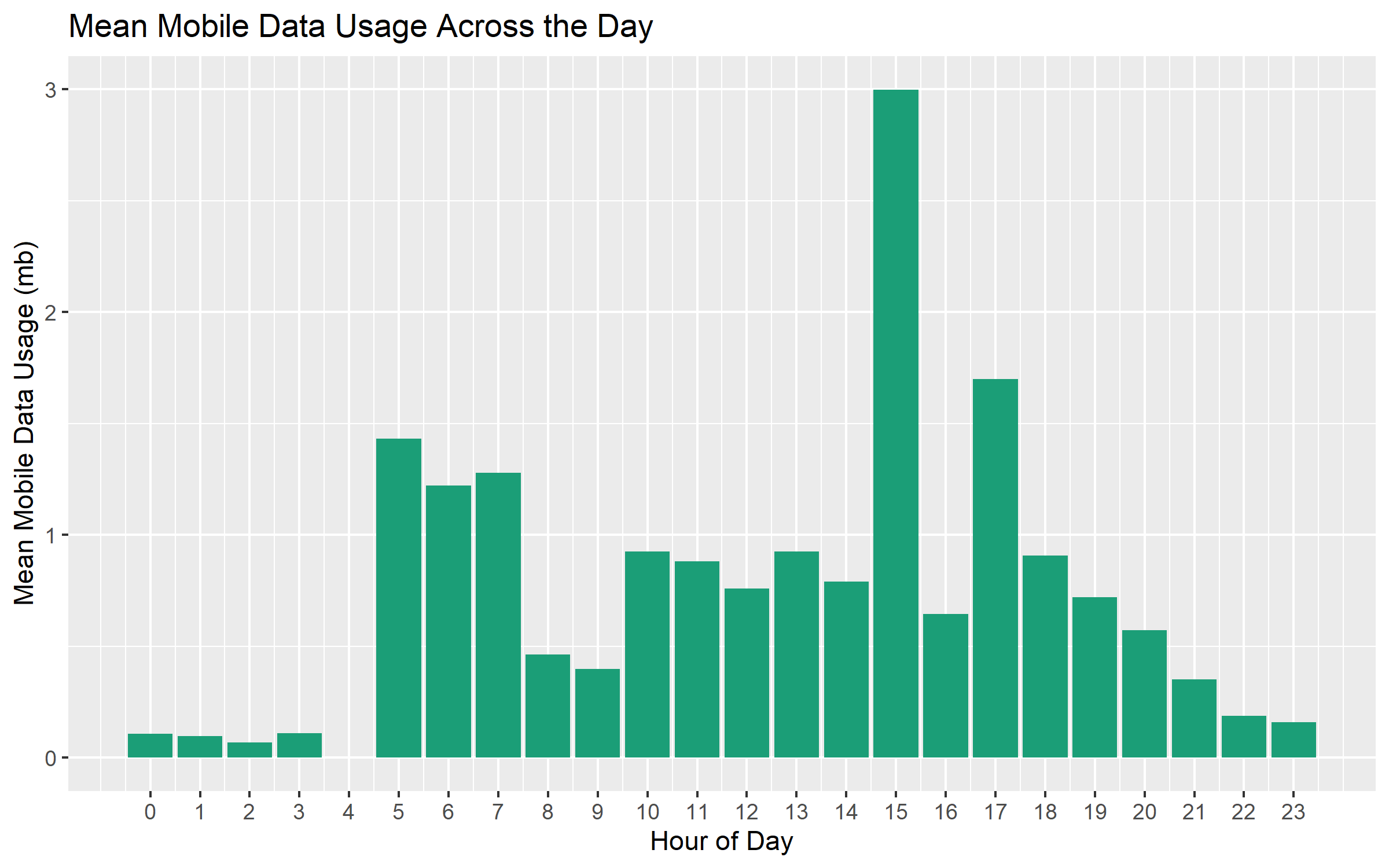
This plot is similar to the one we saw in the previous post. The hours with the highest average mobile data use are 3 PM and 5 PM. I’m guessing that this has something to do with the use of Google Maps during my afternoon commute.
Weekday vs. Weekend Differences
Let’s separate out the data by the type of day: weekdays vs. weekends. We saw in the previous post that the patterns of phone use were quite different on weekdays vs. weekends, and it is likely that such differences are also present for my mobile data use.
The code below is somewhat complicated, again due to the format of the original data. In essence, we group the data by type of day (weekday vs. weekend) and hour, and calculate the sum mobile data use for each hour on each type of day. We then divide these values by the number of days (which are different for weekdays and weekends), and pass the resulting data to ggplot2, producing different facet plots for each type of day.
# separate out week/weekend

full_data %>%
  # select only the columns we'll need

  select(week_weekend, hour, data_mb) %>%
  # group by week_weekend and hour because we need to

  # calculate the mean data usage per hour on the

  # weekdays and on the weekends separately

  group_by(week_weekend, hour) %>%
  # as above, we calculate the sum data used.

  # we also calculate the minimum number of obsersations

  # for each hour of the day

  # as noted above, some days have more than 1 line,

  # e.g. when I sent a text message and used mobile data

  # for a given hour on a given day

  summarize(sum_data_mb = sum(data_mb, na.rm = TRUE),
            n = n()) %>%
  # we mutate here to get the minimum number of days

  # observed for each weekday / weekend

  # we take the minimum, because some days have more

  # than one line per hour as noted above

  mutate(min_n = min(n),
         mean_data_mb = sum_data_mb/min_n) %>%
  # pass the data ggplot

  ggplot(aes(x = hour, y = mean_data_mb))  +
  # ask for a bar plot, using the same color for mobile data

  # as in the previous post

  geom_bar(stat = 'identity', fill = color_palette[1])  +
  # set up the axis labels and plot title

  labs(x = "Hour of Day", y = "Mean Mobile Data Usage (mb)",
       title = 'Mean Mobile Data Usage Across the Day' ) +
  # set up the x-axis - one tick per hour of the day

  scale_x_continuous(labels = x_axis_labels, breaks = x_axis_labels) +
  # facet by week_weekend to get separate panels

  # for weekdays and weekends

facet_grid(week_weekend ~ .) 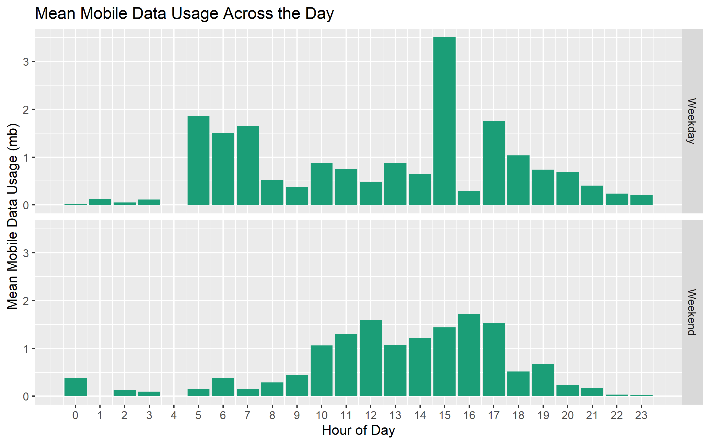
The clear pattern here is that 3 PM on the weekdays is when my average mobile data usage is highest. This is definitely an hour when I’m commuting (I tend to arrive and leave early to beat the traffic!). I’m somewhat surprised that the average values are similar between 5 and 7 AM on the weekdays. I have no idea what I’m doing using mobile data at 5 AM, but the graph clearly shows that I’m doing something with the phone at that time.
On weekends, mobile data usage is more-or-less constant between 10 AM and 5 PM, with light usage in the morning and evening.
Monthly Mobile Data Usage Across Time
Finally, let’s take a look at my total monthly mobile data usage across time. This is an interesting analysis, as cell phone plans typically have a monthly billing cycle and monthly rate limits. I ended up switching my phone number to a private carrier in September of 2019, and this analysis helped me pick the right cell phone plan!
The data aggregation is relatively straightforward here. We group the data by month and sum the total usage. We specify the color as above, and plot the values per month above each bar.
# plot total monthly mobile data usage across time

# select just the columns we're interested in

full_data %>% select(year_month, data_mb) %>%
  # group by year/month

  # (we created this variable above)

  group_by(year_month) %>%
  # calculate the sum of all the data used for each year/month

  summarize(sum_data_mb = sum(data_mb, na.rm = TRUE)) %>%
  # remove September 2019 because we don't have the entire month

  # in our dataset

  filter(year_month != "2019-09" )  %>%
  # pass the data ggplot

  ggplot(., aes(x = year_month, y = sum_data_mb, group = 1)) +
  # ask for a bar plot, using the same color for mobile data

  # as in the previous post

  geom_bar(stat = 'identity', fill = color_palette[1])  +
  # set up the axis labels and plot title

  labs(x = "Year-Month", y = "Total Mobile Data Use (mb)",
       title = 'Mobile Data Usage (mb) Across Time' ) +
  # rotate the x axis labels 90 degrees so they're horizontal

  theme(axis.text.x = element_text(angle = 90, vjust = 0.5, hjust=-1)) +
  # add the value labels above the bars

  geom_text(aes(label = round(sum_data_mb)), vjust = -0.5) +
  # set the y axis limits to extend all the way to zero

  # at the bottom

coord_cartesian(ylim = c(0, 1650)) 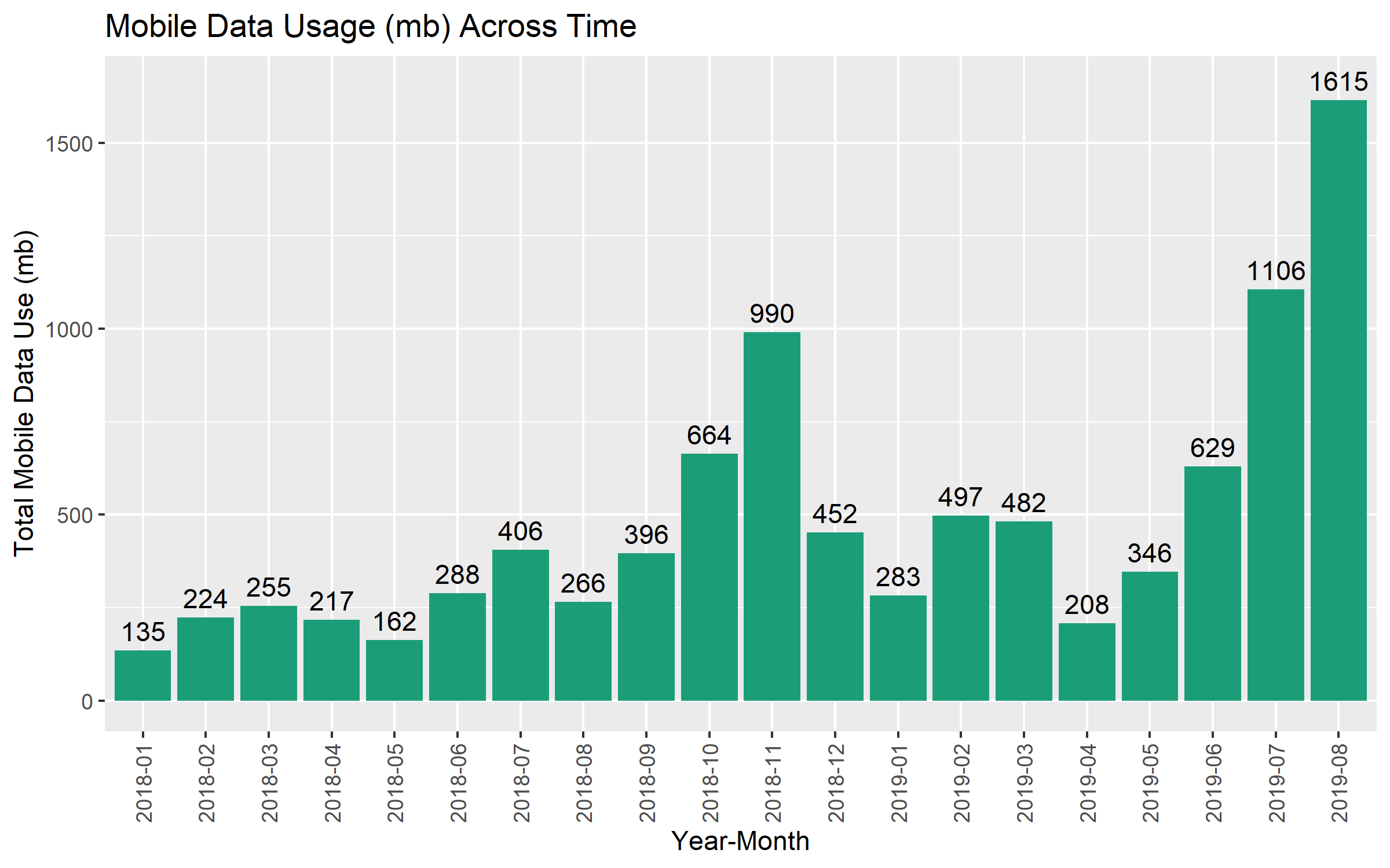
In the first months that I had my phone, I didn’t use much mobile data. Up until June 2019, I hardly ever went above 500 mb (e.g. 1/2 a gigabyte) a month.
Something happened from June to August 2019, however. In those months, my mobile data use sort of exploded, especially in July and August. I am fairly sure this is due to being on vacation.
There are likely 2 causes of increased mobile data use when on holiday. The first is the use of Google Maps when driving to a vacation destination. This summer, I had a couple of short getaways to neighboring countries, which were a couple of hours each way by car. This likely resulted in a higher use of mobile data for Google Maps during the drives.
The second is the use of the internet on my phone while away from home. When I’m at home, I tend to connect to the internet on the phone via the wi-fi. However, I don’t always have wi-fi access when I’m travelling (it depends on the hotel/air-bnb that I’m staying at). I seem to have continued to use the internet on my phone like I normally would, but instead using mobile data. The consequences in terms of mobile data use are very clear!
Summary and Conclusion
In this post, we used data provided by my work on my phone usage. We focused on my mobile data usage, examining the patterns across the hours of the day overall, and separately for weekdays and weekends. We also examined the total mobile data usage per month across the 20 complete months for which we have data.
The clearest pattern across the hours of the day is that my average mobile data use is highest at 3 PM. This is likely due to the usage of Google Maps during my afternoon commute.
My monthly mobile data use was fairly constant across the first 18 months in the data set. During these months, I hardly ever used more than 500 mbs (1/2 a gig) of mobile data. However, in July and August of 2019, I used more than 1 gigabyte of data each month. I’m pretty sure this is due to increased use of Google Maps when driving to and around vacation destinations, and using mobile internet instead of wi-fi when staying in hotels or Airbnb’s.
This analysis was actually quite helpful when it came time to choose a mobile plan. In September of 2019, I transferred my phone number to a private carrier, in the hopes of creating a better work-life balance (in the evening and on the weekends, I can shut off work messages). When choosing a cell phone plan, I took one that comes with a limit of 1 gig (e.g. 1000 mbs) of mobile data. According the analysis above, I can definitely stay within that range under most circumstances. I’ll have to be careful when on vacation, though!
Coming up next
In the next post, we’ll take a look at the ideas and code behind a Twitter bot (that tweets about statistics!) I recently developed. We’ll also look at some issues related to statistical inference and question the utility of p-values for interpreting the results of research in published (social science) papers.
Stay tuned!