Mi Band 5 vs. Mi Band 5: Convergent Validity of Step Count Measurements with R
In this post, we will once again return to the concept of convergent validity, and examine data from two fitness trackers to determine the extent to which their measurements agree. We will also examine the impact of the position of the tracker on the wrist, and see whether this makes a difference in the number of steps the devices record.
This post happened sort of by accident. I bought a Mi Band 5 in the summer of 2020, and had been quite happy with it - one of the things that’s great about using the Mi Band with Gadgetbridge is that it’s so easy to access the data. Unfortunately, the band got badly damaged at the beginning of December 2020 and so I ordered a replacement. I thought this would provide an interesting opportunity to test the convergent validity of both devices’ readings.
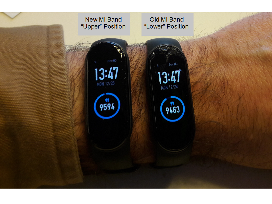
So, for 16 days in December of 2020 I wore both the old and the new bands simultaneously. Furthermore, as a small experiment, I switched the location of the devices every morning. Half of the time, the new (old) Mi Band was closer to (further from) the wrist, and vice versa. In the discussion that follows, I will refer to the position closest to the wrist as the “lower” position, and the position further from the wrist as the “upper” position. The picture below illustrates how I wore both fitness trackers, along with the positions.
You can find the data and all the code from this blog post on Github here.
The Data
I extracted the data from both devices using the method outlined in a previous post, keeping a final level of granularity of day/hour, e.g. one line of data per each hour of the day from 6 AM to midnight (I’m not including measurements from the middle of the night because there’s basically no movement then). I merged the data from both devices and created a dummy variable indicating the position of the bands on my arm.
In total, the dataset contains information on from 16 days, with one observation per device from the hours of 6 AM to midnight on each day, for a total of 288 rows of data.
The head of the dataset (named merged_data) looks like this:
| date | daily_total_new | hour | hourly_steps_new | cumulative_daily_steps_new | dow | week_weekend | daily_total_old | hourly_steps_old | cumulative_daily_steps_old | hour_diff_new_old | cumulative_diff_new_old | wrist_location_new |
|---|---|---|---|---|---|---|---|---|---|---|---|---|
| 2020-12-16 | 12143 | 6 | 0 | 0 | Wed | Weekday | 12012 | 0 | 0 | 0 | 0 | Upper |
| 2020-12-16 | 12143 | 7 | 157 | 157 | Wed | Weekday | 12012 | 163 | 163 | -6 | -6 | Upper |
| 2020-12-16 | 12143 | 8 | 2482 | 2639 | Wed | Weekday | 12012 | 2799 | 2962 | -317 | -323 | Upper |
| 2020-12-16 | 12143 | 9 | 230 | 2869 | Wed | Weekday | 12012 | 182 | 3144 | 48 | -275 | Upper |
| 2020-12-16 | 12143 | 10 | 292 | 3161 | Wed | Weekday | 12012 | 253 | 3397 | 39 | -236 | Upper |
| 2020-12-16 | 12143 | 11 | 293 | 3454 | Wed | Weekday | 12012 | 283 | 3680 | 10 | -226 | Upper |
| 2020-12-16 | 12143 | 12 | 359 | 3813 | Wed | Weekday | 12012 | 315 | 3995 | 44 | -182 | Upper |
| 2020-12-16 | 12143 | 13 | 222 | 4035 | Wed | Weekday | 12012 | 145 | 4140 | 77 | -105 | Upper |
| 2020-12-16 | 12143 | 14 | 323 | 4358 | Wed | Weekday | 12012 | 235 | 4375 | 88 | -17 | Upper |
| 2020-12-16 | 12143 | 15 | 286 | 4644 | Wed | Weekday | 12012 | 265 | 4640 | 21 | 4 | Upper |
Correspondence Plots
Let’s first make a scatterplot showing the correspondence between the measurements for the old and new Mi Bands, while also calculating the pairwise correlation between the values. We will make one plot for the hourly steps, and one for the cumulative steps.
On each plot, I draw a red dashed line as the identity line. If the measurements were exactly the same, all points should lie on this line. I’m also drawing regression lines separately for both tracker locations on my arm.
The colors in all the plots in this blog post are from the Economist palette in the excellent ggthemes package.
Hourly Step Counts
We can produce the hourly plot and calculate the correlation between the measurements with the following code:
# hourly step scatterplot
ggplot(data = merged_data, aes(x = hourly_steps_new,
                               y = hourly_steps_old,
                               color = wrist_location_new)) +
  # each data point represented with a plot
  geom_point() +
  # draw the identity line
  geom_abline(intercept = 0, slope = 1, color = 'darkred',
              linetype = 2, size = 2, show.legend = TRUE) +
  # draw the regression line
  geom_smooth(method="lm", fill=NA) +
  # economist theme: part 1
  theme_economist_white() +
  # economist theme: part 2
  scale_color_economist() +
  # set the plot labels and title
  labs(color='Wrist Location: New Mi Band',
       x = "New Mi Band",
       y = "Old Mi Band",
       title = 'Correspondence Plot: Hourly Steps')

# what's the correlation between the two columns?
cor.test(merged_data$hourly_steps_new, merged_data$hourly_steps_old)
Which returns the following plot:
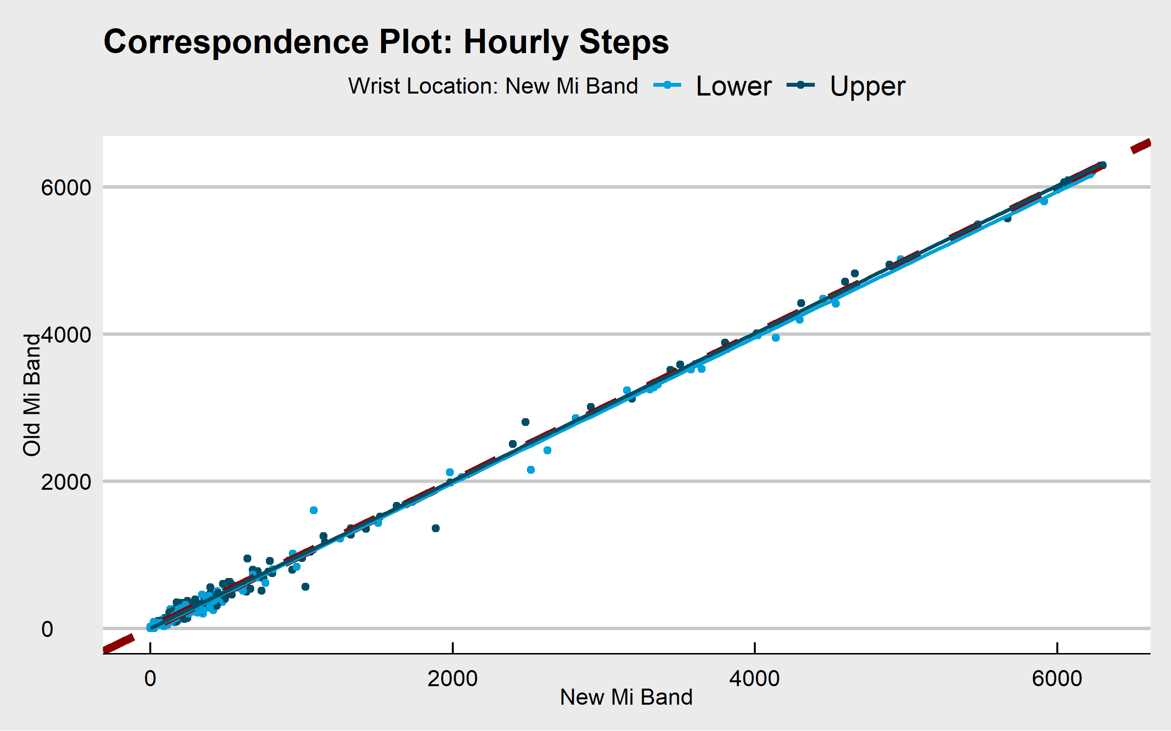
The hourly step count measurements are essentially identical. The separate regression lines indicating device position lie nearly directly on the identity line, and the correlation between the two measurements is .998 - incredibly high. In comparison, when I examined the correlation between hourly steps as measured by Fitbit vs. Accupedo, the correlation was only .52. We’re at a whole different level of agreement here.
Cumulative Step Counts
We can produce the cumulative step count plot and compute the correlation between the measurements with the following code:
# cumulative step scatterplot
ggplot(data = merged_data, aes(x = cumulative_daily_steps_new,
                               y = cumulative_daily_steps_old ,
                               color = wrist_location_new)) +
  # each data point represented with a plot
  geom_point() +
  # draw the identity line
  geom_abline(intercept = 0, slope = 1, color = 'darkred',
              linetype = 2, size = 2, show.legend = TRUE) +
  # draw the regression line
  geom_smooth(method="lm", fill=NA) +
  # economist theme: part 1
  theme_economist_white() +
  # economist theme: part 2
  scale_color_economist() +
  # set the plot labels and title
  labs(color='Wrist Location: New Mi Band',
       x = "New Mi Band",
       y = "Old Mi Band",
       title = 'Correspondence Plot: Cumulative Daily Steps')

# what's the correlation between the two columns?
cor.test(merged_data$cumulative_daily_steps_new, merged_data$cumulative_daily_steps_old) 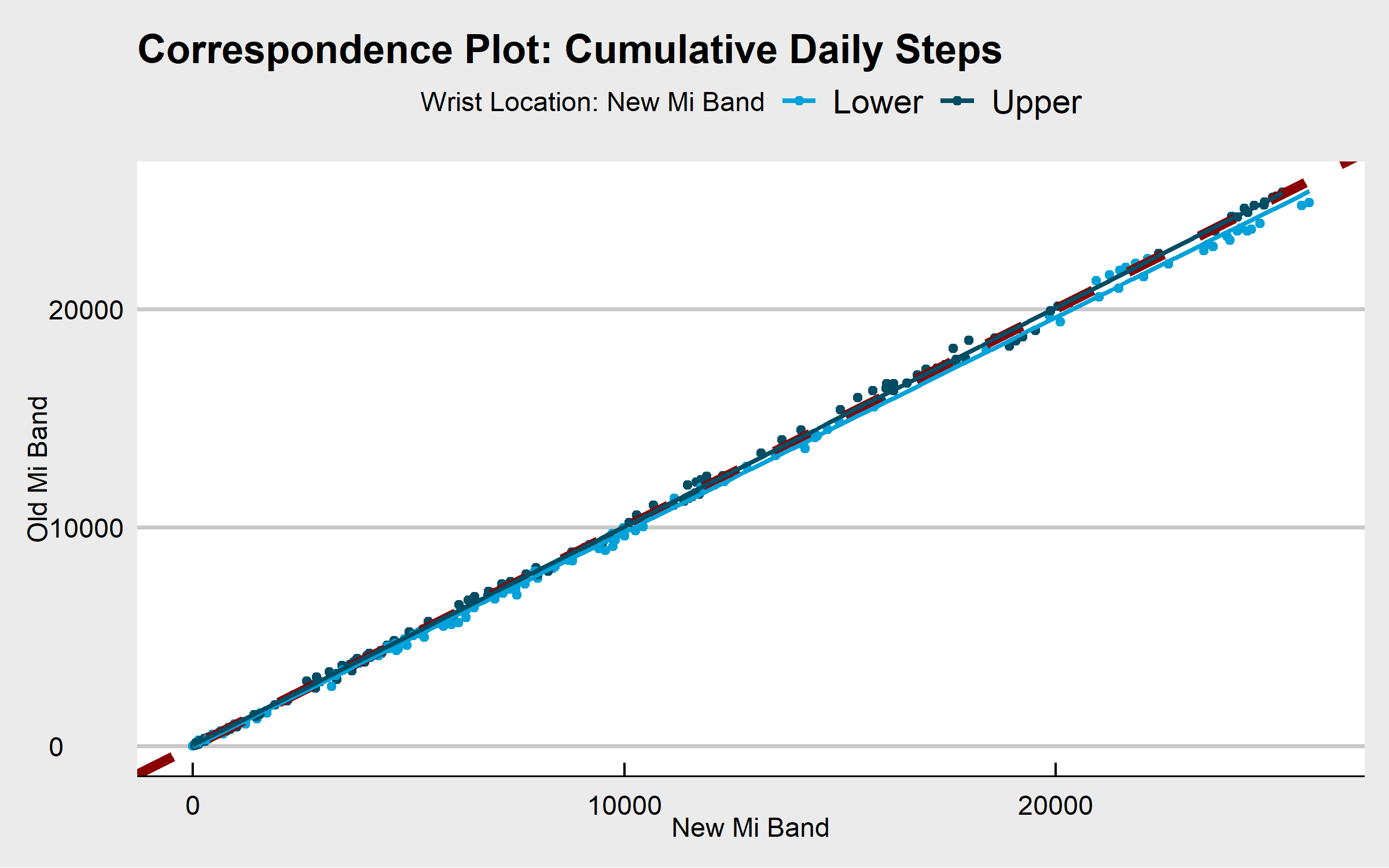
Once again, there is a near-perfect relationship between the measurements from the two devices. The regression lines basically lie on the identity line, and the correlation between the two measurements is .999. In comparison, when I examined the correlation of cumulative steps for Fitbit vs. Accupedo, the correlation was .97.
There is a small deviation in the correspondence of the measurements at the highest levels of cumulative step counts. Specifically, it looks like there’s a slight tendency for new Mi Band to register higher step counts when it is in the lower position (closer to the wrist).
Bland Altman Plots
Hourly Step Counts
Another way of examining the correspondence between two measurements is the Bland-Altman plot. The Bland-Altman plot displays the mean of the measurements on the x-axis, and the difference between the measurements on the y-axis. A horizontal line (in red in the plot blow) is drawn on the plot to indicate the mean difference between the measurements. In addition, two lines (in blue in the plot below) are drawn at +/- 1.96 standard deviations above and below the mean difference, respectively.
We will use the excellent BlandAltmanLeh package in R to make the Bland-Altman plot. Note that it takes some additional work to get the plot to have the same color scheme as our above correspondence plots, with separate colors for device position.
# Bland Altman plot - hourly step counts
# color the points
# by wrist location
library(BlandAltmanLeh)
pal <- economist_pal()(2)
position_color <- ifelse(merged_data$wrist_location_new == 'Lower', pal[1], pal[2])
bland.altman.plot(merged_data$hourly_steps_new, merged_data$hourly_steps_old, conf.int=.95,
                  main="Bland Altman Plot: Hourly Step Counts",
                  xlab="Mean of Measurements", ylab="Differences",
                  pch = 19, col = position_color)
legend(x = "topright", legend = c("New Mi Band: Lower","New Mi Band: Upper"), fill = pal) 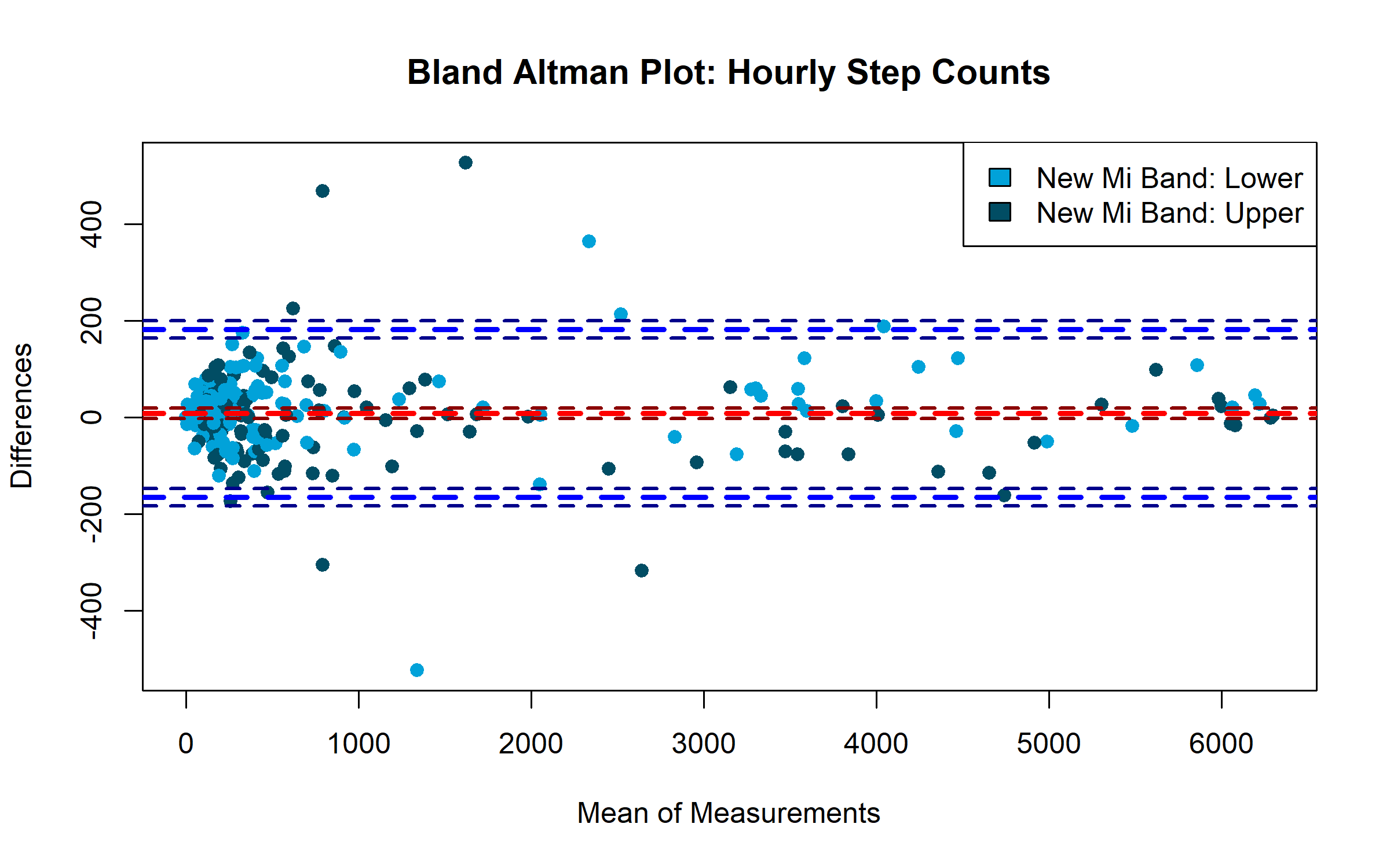
The mean difference between the counts (the red horizontal dashed line) is very close to zero (the exact value is 8.64, as we’ll see below). Because the difference score represents the new minus the old Mi Band, a positive average difference indicates that the new Mi Band gives directionally higher readings than the old Mi Band. The horizontal blue lines represent +/- 1.96 standard deviations above and below the mean difference, and therefore 95% of the difference scores fall within this range, which does not exceed 200 on the positive or negative side. There is a very slight tendency for there to be more positive difference scores (indicating the new Mi Band counts more steps than the old one) when the new Mi Band is in the lower position.
We can test the statistical significance of the mean difference of the hourly readings (M = 8.64, SD = 88.82), and we find that the difference is not statistically significant, t(287) = 1.65, p = .10. In any event, the difference is easy to interpret in practical terms, and 8.6 steps an hour is not a large difference. Given that the average hourly step count for both devices exceeds 950, a difference of 8.6 steps represents a difference of less than 1%.
# calculate the mean, standard deviation
# and the one-sample t-test against zero
mean(merged_data$hour_diff_new_old)
sd(merged_data$hour_diff_new_old)
t.test(merged_data$hour_diff_new_old, mu=0,
       alternative="two.sided", conf.level=0.95)
Cumulative Step Counts
Let’s make the Bland Altman plot for the cumulative step counts:
# Bland Altman plot - cumulative step counts
# color the points
# by wrist location
bland.altman.plot(merged_data$cumulative_daily_steps_new, merged_data$cumulative_daily_steps_old, conf.int=.95,
                  main="Bland Altman Plot: Cumulative Step Counts",
                  xlab="Mean of Measurements", ylab="Differences",
                  pch = 19, col = position_color)
legend(x = "topleft", legend = c("New Mi Band: Lower","New Mi Band: Upper"), fill = pal) 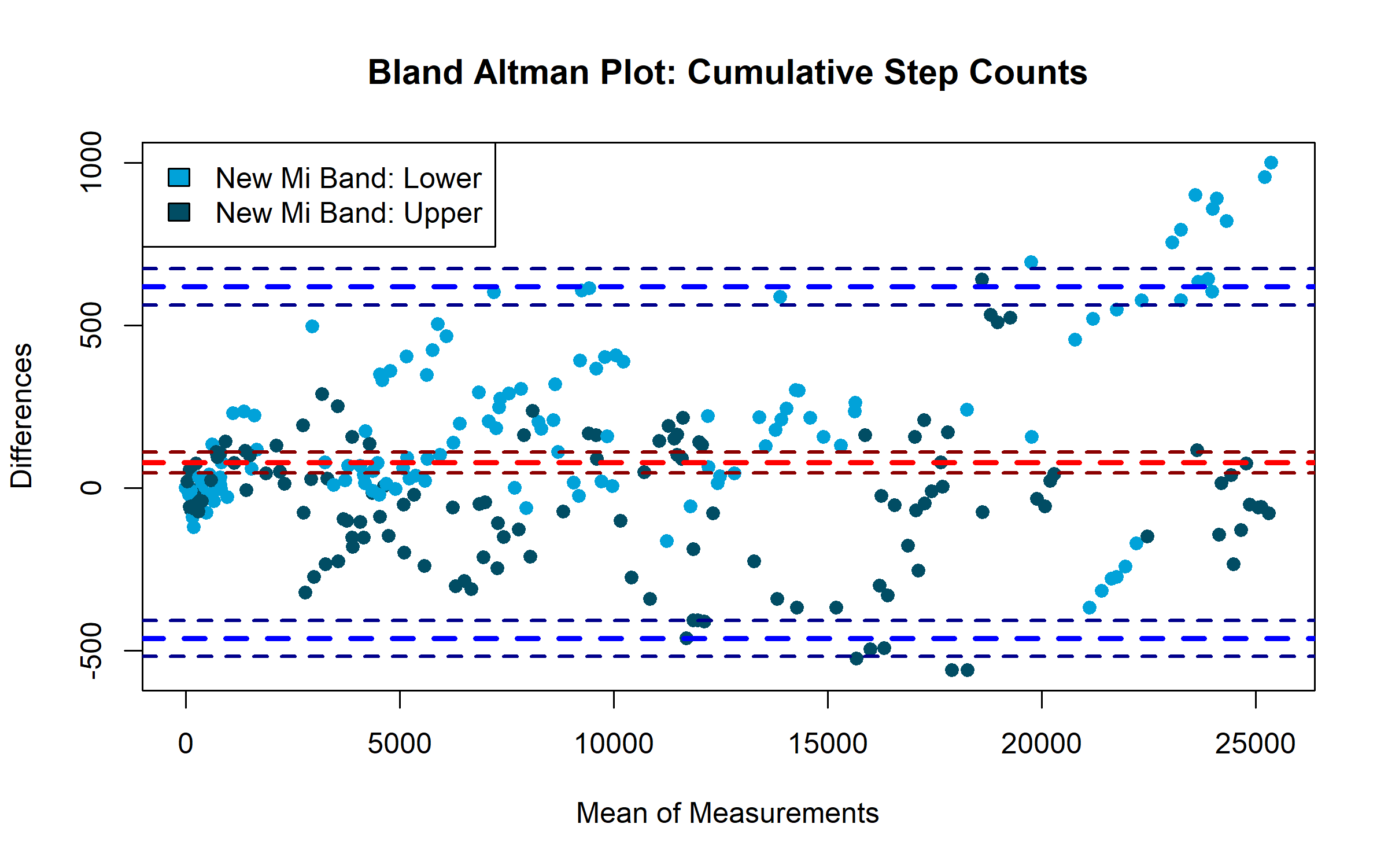
This plot looks very similar to that from the hourly step counts, though the mean difference between the measurements is larger for the cumulative step counts. Once again, the mean difference score sits above zero, indicating that the new Mi Band gives higher cumulative step count readings than the old Mi Band.
We can test the statistical significance of the mean difference of the cumulative readings (M = 77.04, SD = 275.92), and we find that the difference is statistically significant, t(287) = 4.74, p <.001. Despite the low p-value, the effect size is small in practical terms: 77 steps is not a large difference, especially given the average cumulative step counts for both devices is around 9,900. Our difference of 77 steps represents a difference of less than 1%!
# calculate the mean, standard deviation
# and the one-sample t-test against zero
mean(merged_data$cumulative_diff_new_old)
sd(merged_data$cumulative_diff_new_old)
t.test(merged_data$cumulative_diff_new_old, mu=0,
       alternative="two.sided", conf.level=0.95)
Differences Across the Day
Finally, we’ll take a look at the differences between the device readings across the course of the day. In the previous posts on convergent validity, I used the ggridges package to show the densities of the distribution of step differences. However, that technique works less well in the current case, where the number of observations at each hour is only equal to the number of days in our data, e.g. 16.
Therefore, we will use bar charts to examine the average differences between the device readings across the hours of the day. We will use separate panels to display the results for the different positions of the devices on my wrist.
In order to give some sense of the uncertainty surrouding the averages displayed in the bar chart, I’m including 95% confidence intervals in the plots. Confidence intervals have an intuitive-sounding name, but the definition is somewhat convoluted. I won’t get into the details here (see the Wikipedia link above if you’re interested), but in essence the logic goes like this: if we were to repeat the data collection 100 times, our 95% confidence interval would contain the population parameter estimates 95% of the time. Not so intuitive, but if we simply think of the confidence intervals as giving us a sense of the uncertainty surrounding our estimates (with wider bars indicating more uncertainty), then we’ll be OK!
Hourly Step Counts
We can make the plot for hourly steps like so:
# hourly step count differences across the day
merged_data %>%
  # group the data by hour and device position
  group_by(hour, wrist_location_new) %>%
  # calculate the mean, sd and se (for confidence intervals)
  summarize(mean_hour_diff_new_old = mean(hour_diff_new_old),
            sd_hour_diff_new_old = sd(hour_diff_new_old),
            n = n(),
            se = sd_hour_diff_new_old/sqrt(n)) %>%
  # pass the data to ggplot
  ggplot(., aes(x = as.factor(hour),
                y = mean_hour_diff_new_old,
                fill = wrist_location_new)) +
  # we want a barplot
  geom_bar(stat='identity') +
  # add the confidence intervals to the plot
  # (it's the standard error * 1.96 above/below the mean)
  geom_errorbar(aes(ymin=mean_hour_diff_new_old-1.96*se,
                    ymax=mean_hour_diff_new_old+1.96*se), width=.2,
                position=position_dodge(.9))  +
  # use the economist color palette for the bars
  scale_fill_manual(values = pal) +
  # white economist theme background
  theme_economist_white() +
  # set the plot labels and title
  labs(fill='Wrist Location: New Mi Band',
       x = "Hour of Day",
       y = "Difference Hourly Steps (New - Old)",
       title = 'Difference of Hourly Steps Across Hour of Day by Wrist Location') +
  # facet the plot by device location
  facet_wrap(~ wrist_location_new)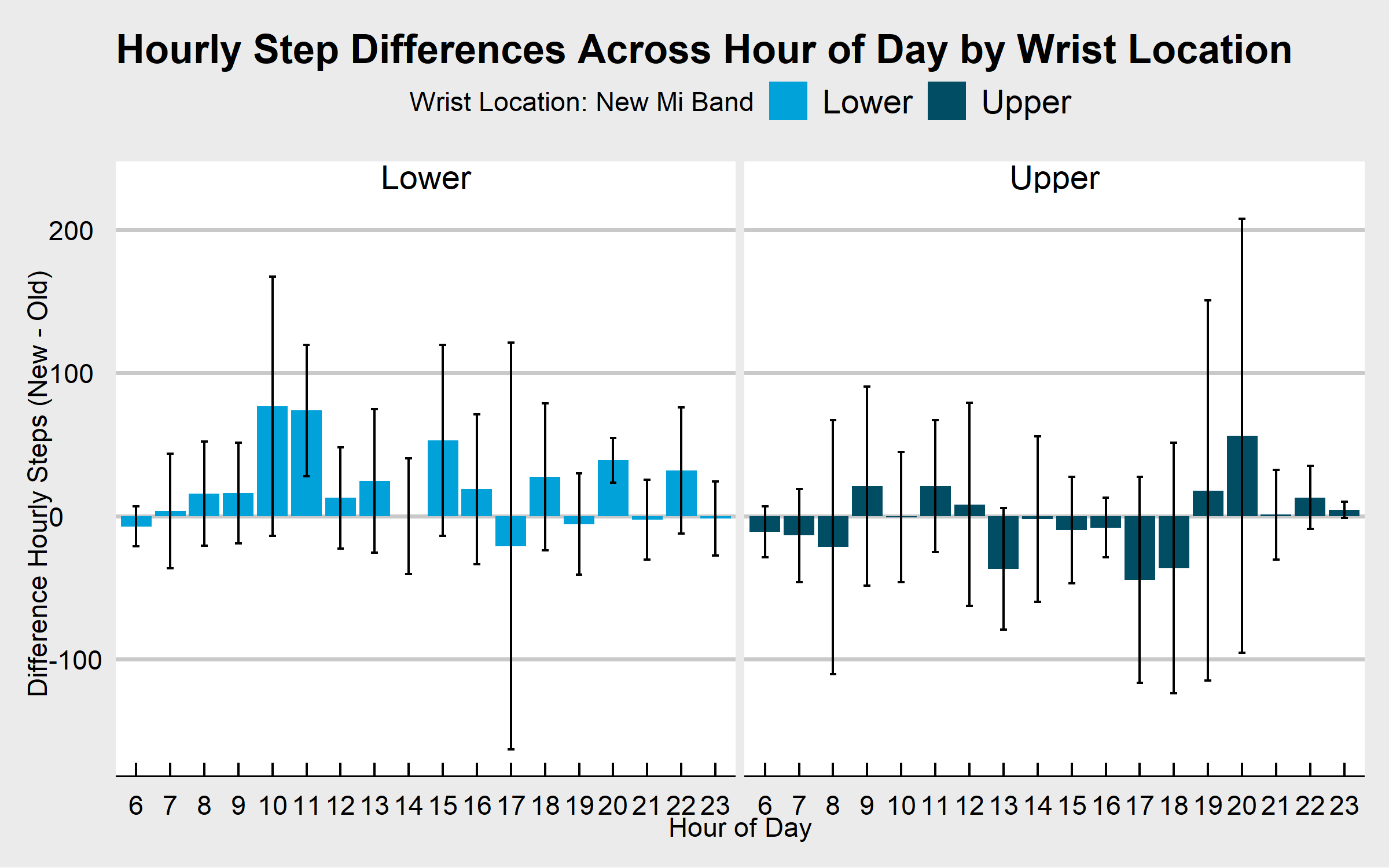
The average differences per hour between the devices are all small and the 95% confidence intervals are wide, indicating large uncertainty about the average size of our differences. When looking at the direction of the differences, however, there does seem to be a slight trend. On the left-hand side of the plot we see the differences between the devices when the new Mi Band is in the lower position. In this graph, nearly all of the differences are positive, indicating that the new Mi Band records more steps than the old one when it is in the lower position. There does not seem to be any systematic difference between the devices when the new Mi Band is in the upper position (the chart on the right-hand side of the figure). In all cases, however, the differences in hourly step counts are small compared to the variation in the measurements.
Cumulative Step Counts
We can make the plot for cumulative steps like so:
# cumulative step count differences across the day
merged_data %>%
  # group the data by hour and device position
  group_by(hour, wrist_location_new) %>%
  # calculate the mean, sd and se (for confidence intervals)
  summarize(mean_cumul_diff_new_old = mean(cumulative_diff_new_old),
            sd_cumul_diff_new_old = sd(cumulative_diff_new_old),
            n = n(),
            se = sd_cumul_diff_new_old/sqrt(n)) %>%
  # pass the data to ggplot
  ggplot(., aes(x = as.factor(hour),
                y = mean_cumul_diff_new_old,
                fill = wrist_location_new)) +
  # we want a barplot
  geom_bar(stat='identity') +
  # add the confidence intervals to the plot
  # (it's the standard error * 1.96 above/below the mean)
  geom_errorbar(aes(ymin=mean_cumul_diff_new_old-1.96*se,
                    ymax=mean_cumul_diff_new_old+1.96*se), width=.2,
                position=position_dodge(.9)) +
  # use the economist color palette for the bars
  scale_fill_manual(values = pal) +
  # white economist theme background
  theme_economist_white() +
  # set the plot labels and title
  labs(fill='Wrist Location: New Mi Band',
       x = "Hour of Day",
       y = "Difference Cumulative Steps (New - Old)",
       title = 'Difference of Cumulative Steps Across Hour of Day by Wrist Location') +
  # facet the plot by device location
  facet_wrap(~ wrist_location_new)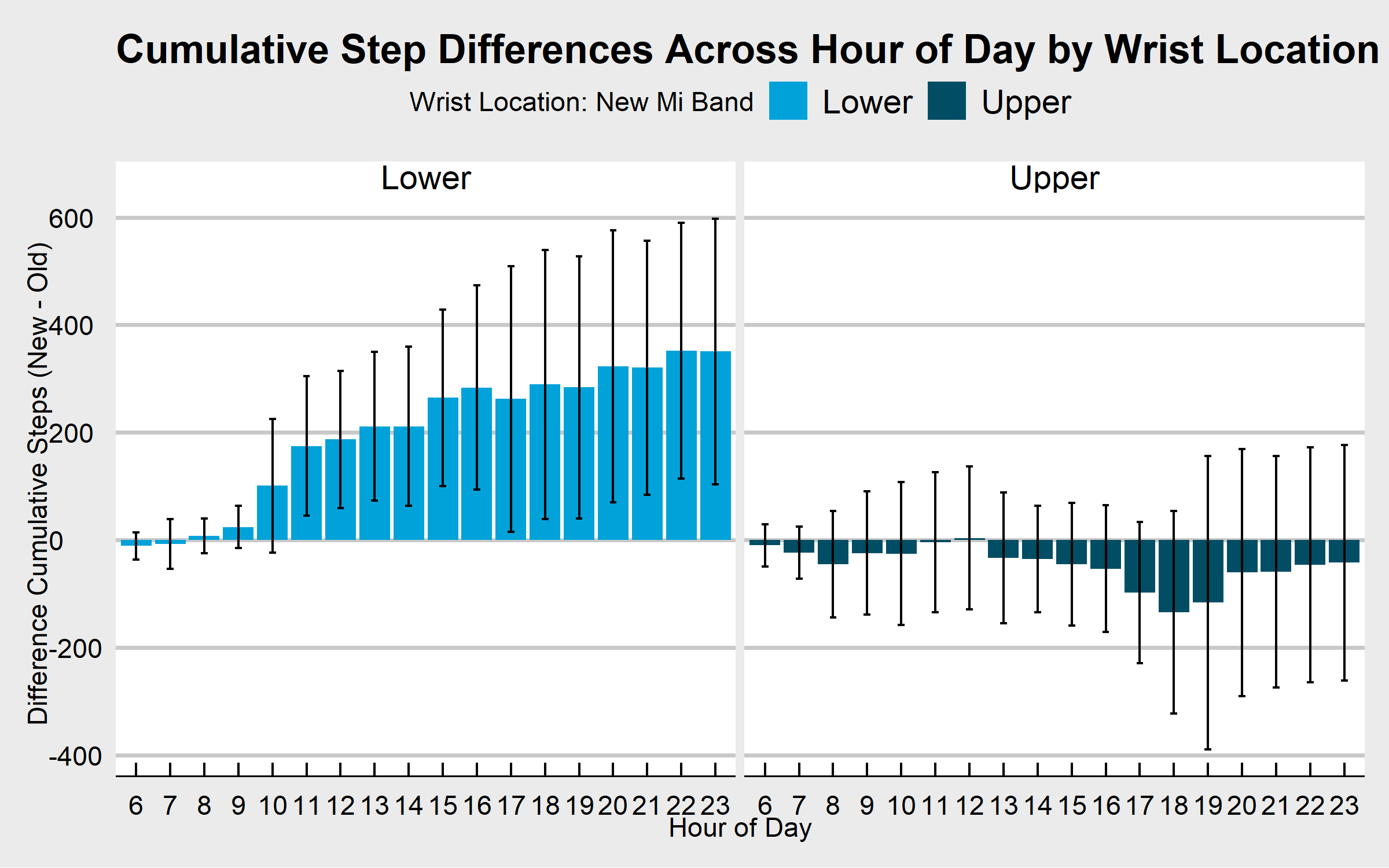
The plot looks quite different than the one for the hourly step counts! The directional pattern we saw on the left-hand side of the graph for the hourly steps is much more pronounced here. Specifically, from around 10 AM, when the new Mi Band is in the lower position, it counts slightly more steps than the old Mi Band every hour. Across the hours of the day, these small differences accumulate such that by the end of the day the new Mi Band has a step count of around 400 more steps than the old Mi Band. The 95% confidence intervals exclude zero from 11 AM onwards, indicating a systematic difference that is distinguishable from zero. However, the size of these differences is small (fewer than 400 steps by 11 PM, where the average step count at 11 PM exceeds 17,000, for a difference of around 2%).
When the old Mi Band is in the lower position (the right-hand side of the graph), the pattern is reversed, indicating that the old Mi Band counts more steps than the new Mi Band. However, the 95% confidence intervals all include zero, indicating that the variation in the differences overwhelms the average size of the differences.
Summary and Conclusion
In this post, we examined data from two Mi Band 5 fitness trackers, comparing the step counts between both devices across 16 days.
In comparison to my previous examinations of convergent validity among step count trackers, the convergence between both Mi Band devices was nearly perfect. Specifically, the scatterplot of the hourly and cumulative step count measurements indicated nearly perfect correspondence between the two, and the correlations for both sets of measurements was greater than .99.
However, the Bland Altman analysis suggested small directional differences between the devices, with the new Mi Band giving slightly higher readings than the old Mi Band. The analysis of the difference scores across the day revealed why. While both devices seemed to register more steps when they sat lower on my arm, this pattern was more systematic for the new Mi Band, resulting in slightly higher step counts for the new Mi Band across the days of data collection. However, in all cases the size of the differences was very small, never exceeding 2% of the total number of steps recorded.
Coming Up Next
In the next post, we will explore Bayesian regression analysis with the rstanarm package.
Stay tuned!