Anscombe's Quartet: 1980's Edition
In this post, I’ll describe a fun visualization of Anscombe’s quartet I whipped up recently.
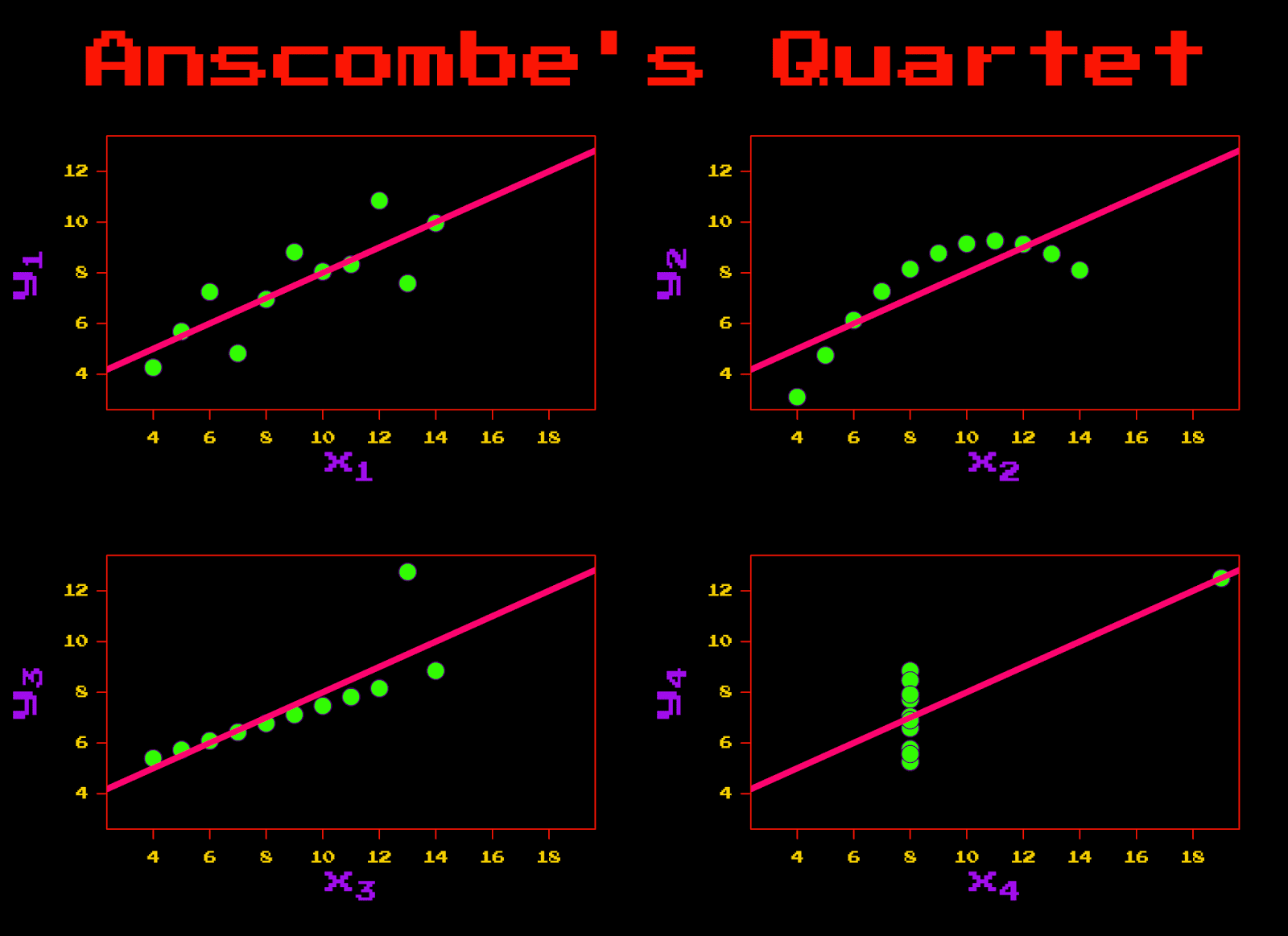
If you aren’t familiar with Anscombe’s quartet, here’s a brief description from its Wikipedia entry: “Anscombe’s quartet comprises four datasets that have nearly identical simple descriptive statistics, yet appear very different when graphed. Each dataset consists of eleven (x,y) points. They were constructed in 1973 by the statistician Francis Anscombe to demonstrate both the importance of graphing data before analyzing it and the effect of outliers on statistical properties. He described the article as being intended to counter the impression among statisticians that ‘numerical calculations are exact, but graphs are rough.’ “
In essence, there are 4 different datasets with quite different patterns in the data. Fitting a linear regression model through each dataset yields (nearly) identical regression coefficients, while graphing the data makes it clear that the underlying patterns are very different. What’s amazing to me is how these simple data sets (and accompanying graphs) make immediately intuitive the importance of data visualization, and drive home the point of how well-constructed graphs can help the analyst understand the data he or she is working with.
The Anscombe data are included in base R, and these data (and R, of course!) are used to produce the plot that accompanies the Wikipedia entry on Anscombe’s quartet.
Because the 1980’s are back, I decided to make a visualization of Anscombe’s quartet using the like-most-totally-rad 1980’s graphing elements I could come up with. I was aided with the colors by a number of graphic design palettes with accompanying hex codes. I used the excellent showtext package for the 1980’s font, which comes from the Google font “Press Start 2P.” (Note, if you’re reproducing the graph at home, the fonts won’t show properly in RStudio. Run the code in the standalone R program and everything works like a charm). I had to tweak a number of graphical parameters in order to get the layout right, but in the end I’m quite pleased with the result.
The Code
# showtext library to get 1980's font
# "Press Start 2P"
library(showtext)
# add the font from Google fonts
font.add.google("Press Start 2P", "start2p")


png("C:\\Directory\\Anscombe\_80s.png",
 width=11,height=8, units='in', res=600)

showtext.begin()
op <- par(las=1, mfrow=c(2,2), mar=1.5+c(4,4,.5,1), oma=c(0,0,5,0),
	lab=c(6,6,7), cex.lab=12.0, cex.axis=5, mgp=c(3,1,0), bg = 'black',
	col.axis = '#F2CC00', col.lab = '#A10EEC', family = 'start2p')
ff <- y ~ x
for(i in 1:4) {
	ff[[2]] <- as.name(paste("y", i, sep=""))
	ff[[3]] <- as.name(paste("x", i, sep=""))
	lmi <- lm(ff, data= anscombe)
	xl <- substitute(expression(x[i]), list(i=i))
	yl <- substitute(expression(y[i]), list(i=i))
	plot(ff, data=anscombe, col="#490E61", pch=21, cex=2.4, bg = "#32FA05",
	xlim=c(3,19), ylim=c(3,13)
	, xlab=eval(xl), ylab=yl,
	family = 'start2p'
	)
	abline(lmi, col="#FA056F", lwd = 5)
	axis(1, col = '#FA1505')
	axis(2, col = '#FA1505')
	box(col="#FA1505")
}
mtext("Anscombe's Quartet", outer = TRUE,
	cex = 20, family = 'start2p', col="#FA1505")
showtext.end()

dev.off()
The Plot
Conclusion
In this post, I used data available in R to make a 1980’s-themed version of the Anscombe quartet graphs. The main visual elements I manipulated were the colors and the fonts. R’s wonderful and flexible plotting capabilities (here using base R!) made it very straightforward to edit every detail of the graph to achieve the desired retro-kitsch aesthetic.
OK, so maybe this isn’t the most serious use of R for data analysis and visualization. There are doubtless more important business cases and analytical problems to solve. Nevertheless, this was super fun to do. Data analysis (or data science, or whatever you’d like to call it) is a field in which there are countless ways to be creative with data. It’s not always easy to bring this type of creativity to every applied project, but this blog is a place where I can do any crazy thing I set my mind to and just have fun. Judging by that standard, I think this project was a success.
Coming Up Next
In the next post, I’ll do something a little bit different with data. Rather than doing data analysis, I’ll describe a project in which I used Python to manage and edit meta-data (ID3 tags) in mp3 files. Stay tuned!