Analyzing Accupedo step count data in R
Accupedo is a great (and free!) step counting app that I’ve been using for a while now to keep track of how much I walk every day. The app measures the number of steps you make, and has some nice visualizations that allow you to see how many steps you’ve walked in the past days, weeks, months and years. Because I’m interested in data and data analysis, I was curious to see if I could access the raw data recorded by the app.
It’s possible to export a .csv file from the app directly, but the data contained in this file are aggregated to a daily total, and it seemed obvious that the app was keeping track of my steps at a much more granular level.
I checked out the “Accupedo” folder on my phone, and was in fact able to find the raw data. In the Accupedo folder, I found a file called “Accupedo.db” which contains the raw data recorded by the app. It’s an SQL-type database, and I was pleased to discover that it was relatively easy to import the data into R.
I used the DBI package to connect to the .db file, and found that the step data are recorded in the table called “diaries.”
library(DBI)

# connect to the sqlite file
con = dbConnect(RSQLite::SQLite(), dbname="D:\\Directory\\Accupedo.db")

# list all the tables in the sqlite database
alltables = dbListTables(con)
alltables

# load the table with the walking info (diaries)
# the others contain other information not relevant
# for this exercise
raw_data = dbGetQuery(con,'select * from diaries' )
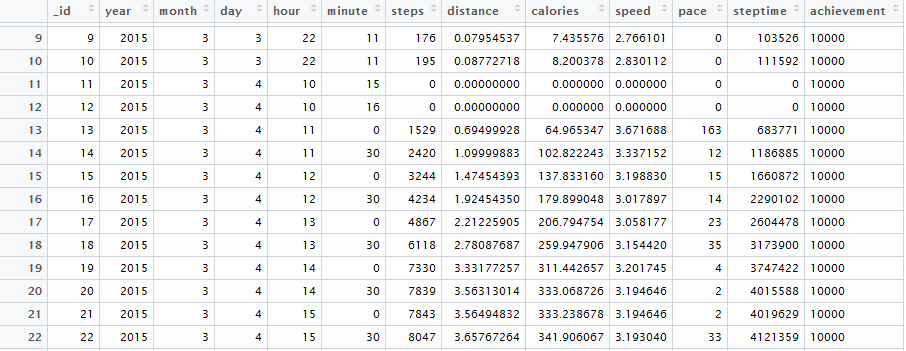
The raw data look like this:
For the sake of this exercise, I’ll be focusing on the “steps” variable, e.g. the step count recorded at a given moment in time. Note that the step counts are cumulative. For example, if by 11 AM I had walked 3,000 steps, the recorded value for 11 AM would be (of course) 3,000. Then, if I walked an additional 500 steps in the following half-hour, the recorded value at 11:30 AM would be 3,500, which includes the previously recorded total, plus the additional steps added within the given time frame.
Based on a visual examination of the data, it seems that step counts are saved every 30 minutes, with occasional updates in between. I decided to remove the updates that occurred in between the 0 and 30 minutes of each hour. I was hoping to reduce the size of the dataframe by eliminating some redundant information, but it didn’t end up changing that much in the end, other than making visual inspection of the data easier.
I kept all observations recorded at 0 and 30 minutes of each hour, as well as the last observation recorded on a given day. In order to do this, I first created an R date object from the raw data. The lubridate package is absolutely wonderful for this sort of operation, and made this exercise very straightforward. Below is the code I used to create the date object, and to select and merge together the observations I wanted to keep:
library(lubridate)

# first create a text vector with the dates
datez <- paste(raw_data$year, raw_data$month,raw_data$day, sep = "-" )

# then create a vector with the hour and minutes
hour_min <- paste( raw_data$hour, raw_data$minute,sep = ":" )

# make one variable with all information
# and turn it into a date object with lubridate
raw_data$date_time <- ymd_hm(paste(datez,hour_min, sep = " "))

# get the last observation per day
# this line is what the csv spits out
last_obs_day <- raw_data[!duplicated(raw_data[,c('year','month','day')], fromLast=T),]

# get the observations that are recorded every half-hour
# this appears to be the standard- every day at peak hours
# data are written out on the half-hour
data_0_30 <- raw_data[raw_data$minute == 0 | raw_data$minute == 30 , ]

# put the two dataframes together
walking <- rbind(data_0_30,last_obs_day)

# drop duplicates on the date_time variable
# because some of the last observations might also just have
# been written at minutes 0 or 30
walking_omnibus <- walking[!duplicated(walking$date_time, fromLast=T),]

# order by the date object created with lubridate above
# dataset should now contain observations written out
# on the half-hour, along with the last observation for the day
# if it was not on the half-hour
library(plyr); library(dplyr)
walking_omnibus <-arrange(walking_omnibus, date_time)
I have used the app since March of 2015 (655 days of recorded steps, to be precise) which leaves us with 25,586 observations after the cleaning described above. Very interesting to see how much data the app is recording, and it leaves us with a lot of information to work with.
There is lots to look at, but I’ll stick with a couple of small visualizations here, which make use of the granular data we can extract from the SQL database (rather than the daily step counts available in the .csv export). The basic question I’m looking at here is- how does my step count evolve over the course of the day, and is this evolution different for the different days of the week?
I first add some additional information to the dataset: a variable that is an identifier for each day, as well as the day of the week (e.g. Monday, Tuesday, etc.) for each day. We then use these variables to aggregate the data for plotting, getting the maximum step count for each hour of the day, for each day in the dataset. The dplyr package allows us to chain the aggregation operations in one step.
# add a day break variable and extract the date of the week (using lubridate package)
walking_omnibus$oneday <- cut(walking_omnibus$date_time, breaks = "1 day")
walking_omnibus$dow <- wday(walking_omnibus$date_time, label = TRUE)

# aggregate by hour
# because the step count is cumulative,
# we need to take the maximum value within
# a given day/hour time frame
aggregate_day_hour <- walking_omnibus %>% group_by(oneday, dow, hour) %>%
	summarise(steps = max(steps))
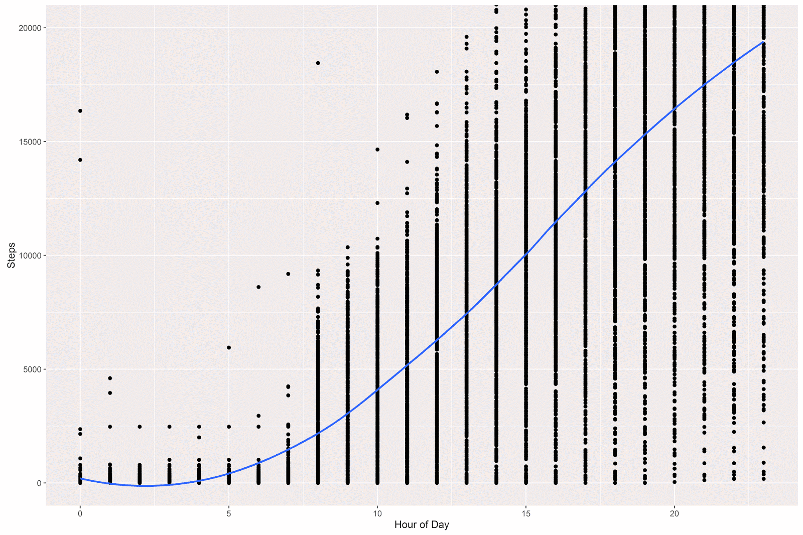
I then plotted the data (which reduces to 12,958 observations- quite a lot still) using ggplot2. Because the trend is difficult to see from the points, I’ve added a loess smoother, which gives the expected step count at any given hour of the day. For example, it looks like on average I reach the 10,000 step mark at around 3 PM.
# load the ggplot2 package
library(ggplot2)

# plot out the max counts per hour
# loess gives expected average at a given hour
p = ggplot(data = aggregate_day_hour, aes(x = hour, y = steps)) +
	geom_point() +
	coord_cartesian(ylim = c(0, 20000)) +
	geom_smooth(method="loess", fill=NA) +
	theme(legend.title=element_blank()) +
	labs(x = "Hour of Day", y = "Steps" )
p 
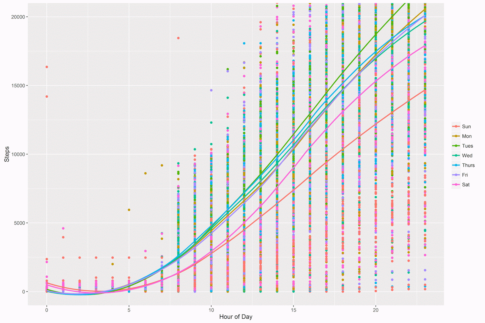
I then plotted out the trend lines for each day separately, to see if the evolution of step count is different on the different days of the week:
# different lines per day of week
# Sunday is the day that has the lowest step count
# Tuesday appears to be the highest
p = ggplot(data = aggregate_day_hour, aes(x = hour, y = steps, color = dow)) +
	geom_point() +
	coord_cartesian(ylim = c(0, 20000)) +
	geom_smooth(method="loess", fill=NA) +
	theme(legend.title=element_blank()) +
	labs(x = "Hour of Day", y = "Steps" )
p 
Indeed it is! The weekdays (Monday through Friday) are similar to each other, and I appear to walk more on these days. Saturday and especially Sunday are lower in terms of the step counts for basically the entire day- also Saturday and Sunday start to diverge from each other around 11 AM or so and the difference between them grows over the course of the day.
This makes sense to me- I walk to work during the weekday, and it’s no surprise that the step counts for those days are pretty much the same. I have an evening activity on Tuesday nights, and so it doesn’t surprise me that on Tuesday evenings I walk more. I do try to be active during the weekend, but it also doesn’t surprise me that (especially on Sundays) I walk less during the other days of the week.
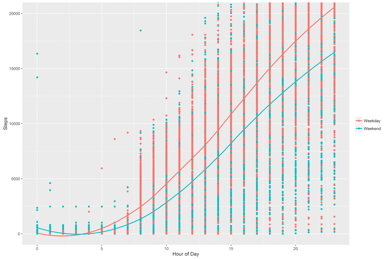
There are 7 different lines plotted on the above graph, which is nice but is perhaps a bit too much information for a single plot. Below, I add a “weekday vs. weekend” variable to the aggregated dataset and plot out the trends based on this variable. It preserves the essential insight provided in the above plot, but is easier to read and interpret.
# add a weekday/weekend variable to the aggregated dataset
aggregate_day_hour$week_weekend[aggregate_day_hour$dow == 'Sun'] <- 'Weekend'
aggregate_day_hour$week_weekend[aggregate_day_hour$dow == 'Sat'] <- 'Weekend'
aggregate_day_hour$week_weekend[aggregate_day_hour$dow == 'Mon'] <- 'Weekday'
aggregate_day_hour$week_weekend[aggregate_day_hour$dow == 'Tues'] <- 'Weekday'
aggregate_day_hour$week_weekend[aggregate_day_hour$dow == 'Wed'] <- 'Weekday'
aggregate_day_hour$week_weekend[aggregate_day_hour$dow == 'Thurs'] <- 'Weekday'
aggregate_day_hour$week_weekend[aggregate_day_hour$dow == 'Fri'] <- 'Weekday'

# plot out steps per hour by week/weekend
# even by 8 AM on a weekend I'm behind my weekday step count
# the difference continues to grow throughout the day
p = ggplot(data = aggregate_day_hour, aes(x = hour, y = steps, color = week_weekend)) +
	geom_point() +
	coord_cartesian(ylim = c(0, 20000)) +
	geom_smooth(method="loess", fill=NA) +
	theme(legend.title=element_blank()) +
	labs(x = "Hour of Day", y = "Steps" )
p 
The pattern between weekday and weekend is quite clear. On the weekend, even by 8 AM I’m below my weekday average, and the difference between the weekday vs. weekend continues to grow throughout the day. On a weekday, I hit 10,000 steps around 2:30 PM, but on the weekend I don’t hit 10,000 steps until around 4:30 PM (on average). By midnight, it looks like there’s more than a 3,000 step difference between the weekdays and the weekend.
That’s all for this post. I have been doing some other analyses of these data, and will present that here when I have the time!
