Accupedo vs. Fitbit Part 1: Convergent Validity of Hourly Step Counts with R
In this post, we will investigate the relationship between hourly step count data from two different sources: the Accupedo app on my phone, the Fitbit I wear on my wrist. We will use several visualization and analytical techniques to understand the correspondence (or lack thereof) between the two measurements. Do these devices give similar readings of hourly step counts? When are the two measurements more likely to agree or disagree with one another?
The Data
The data come from two sources: the Accupedo app on my phone and from the Fibit (model Alta HR) that I wear on my wrist. Both data sources are accessible (with a little work) via R: you can see my write up of how to access data from Accupedo here and my post on how to access data from Fitbit here.
I got the Fitbit in March 2018, and the data from both devices were extracted in mid-December 2018. I was able to match 273 days for which I had step counts for both Accupedo and Fitbit. The data contain the hourly steps for the hours from 6 AM to 11 PM. For each hour, I also record the cumulative daily steps (e.g. the number of steps I’ve taken so far during the day). In total, the dataset contains 4,914 observations of hourly step counts for the 273 days for which we have data (e.g. 18 observations per day).
You can find the data and all the code from this blog post on Github here.
The head of the dataset (named merged_data) looks like this:
| date | daily_total_apedo | hour | hourly_steps_apedo | cumulative_daily_steps_apedo | daily_total_fbit | hourly_steps_fbit | cumulative_daily_steps_fbit | dow | week_weekend | hour_diff_apedo_fbit |
|---|---|---|---|---|---|---|---|---|---|---|
| 2018-03-20 | 16740 | 6 | 0 | 0 | 15562 | 281 | 281 | Tue | Weekday | -281 |
| 2018-03-20 | 16740 | 7 | 977 | 977 | 15562 | 1034 | 1315 | Tue | Weekday | -57 |
| 2018-03-20 | 16740 | 8 | 341 | 1318 | 15562 | 1605 | 2920 | Tue | Weekday | -1264 |
| 2018-03-20 | 16740 | 9 | 1741 | 3059 | 15562 | 223 | 3143 | Tue | Weekday | 1518 |
| 2018-03-20 | 16740 | 10 | 223 | 3282 | 15562 | 287 | 3430 | Tue | Weekday | -64 |
| 2018-03-20 | 16740 | 11 | 226 | 3508 | 15562 | 188 | 3618 | Tue | Weekday | 38 |
| 2018-03-20 | 16740 | 12 | 283 | 3791 | 15562 | 1124 | 4742 | Tue | Weekday | -841 |
| 2018-03-20 | 16740 | 13 | 1587 | 5378 | 15562 | 525 | 5267 | Tue | Weekday | 1062 |
| 2018-03-20 | 16740 | 14 | 431 | 5809 | 15562 | 372 | 5639 | Tue | Weekday | 59 |
| 2018-03-20 | 16740 | 15 | 624 | 6433 | 15562 | 392 | 6031 | Tue | Weekday | 232 |
Hourly Step Counts
Correspondence Plot
In this post, we will explore the hourly step counts. We can make a scatterplot showing the correspondence between the hourly step counts (coloring the points by type of day - week vs. weekend), and compute their correlation, using the following code:
# plot hourly steps against one another
# regression lines show that
# Accupedo over-counts
# this over-counting is less strong on weekends
library(ggplot2)
ggplot(data = merged_data, aes(x = hourly_steps_apedo,
	y = hourly_steps_fbit , color = week_weekend)) +
	geom_point(alpha = .5) +
	geom_abline(intercept = 0, slope = 1, color = 'blue',
	linetype = 2, size = 2, show.legend = TRUE) +
	geom_smooth(method="lm", fill=NA) +
	labs(x = "Accupedo", y = "Fitbit" ) +
	scale_color_manual(values=c("black", "red")) +
	labs(color='Week/Weekend')

# what's the correlation between the two columns?
cor.test(merged_data$hourly_steps_apedo, merged_data$hourly_steps_fbit)
Which returns the following plot:

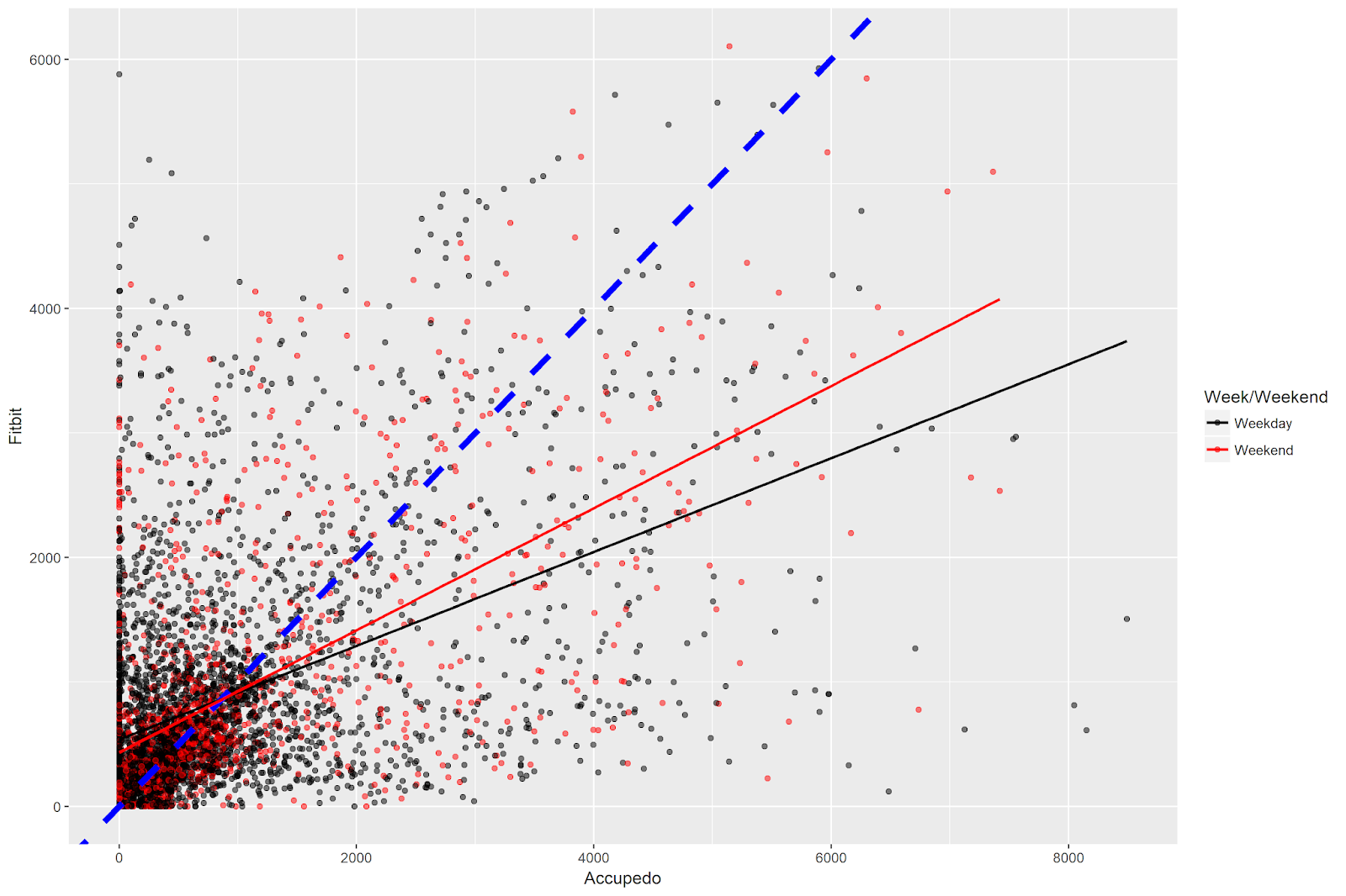
There are a number of things to note in this figure. The dashed blue line is the identity line - if both Accupedo and Fitbit recorded the same number of steps every hour, all of the points would lie on this line. Clearly they do not - it seems like there is some substantial disagreement between the devices on the hourly step counts!
I have colored the points separately for weekdays and weekend days, and drawn separate regression lines for each type of day. Both regression lines lie below the identity line, indicating that Accupedo has higher step counts on both types of days. Because the red line is closer to the identity line, the analysis indicates that correspondence between the hourly device measurements is higher (e.g. the values are closer together) on weekends vs. weekdays.
We can also note a number of points with positive values on the y access and a value of zero on the x axis - e.g. a fairly solid line extending upwards at the left-most side of the plot. These indicate hours that Fitbit recorded steps, but Accupedo recorded none. There are very few points with the opposite pattern - e.g. hours when Accupedo counted steps but Fibit did not.
Finally, the code returns a correlation value of .52, which is highly statistically significant but not the strength of a relationship you’d expect if you had two measurements of exactly the same thing.
Bland Altman Plot
Another way of examining the correspondence between two measurements is the Bland-Altman plot. The Bland-Altman plot displays the mean of the measurements on the x-axis, and the difference between the measurements on the y-axis. A horizontal line (in red in the plot blow) is drawn on the plot to indicate the mean difference between the measurements. In addition, two lines (in blue in the plot below) are drawn at +/- 1.96 standard deviations above and below the mean difference, respectively.
We will use the excellent BlandAltmanLeh package in R to make the Bland-Altman plot. Note that it takes some additional work to get the plot to have the same color scheme as our above correlation plot, with separate colors for weekdays and weekends, and transparency in the points.
# Bland Altman plot - color the points
# by weekday/weekend and make points
# semi-transparent
library(BlandAltmanLeh)
trans_red <- rgb(1,0,0,alpha=0.5)
trans_blk <- rgb(0,0,0,alpha=0.5)
week_weekday_color <- ifelse(merged_data$week_weekend == 'Weekday', trans_blk, trans_red)
bland.altman.plot(merged_data$hourly_steps_apedo, merged_data$hourly_steps_fbit, conf.int=.95,
	main="Bland Altman Plot: Hourly Step Counts",
	xlab="Mean of Measurements", ylab="Differences",
	pch = 19, col = week_weekday_color)
legend(x = "topright", legend = c("Weekday","Weekend"), fill = 1:2)
Which gives us the following plot:

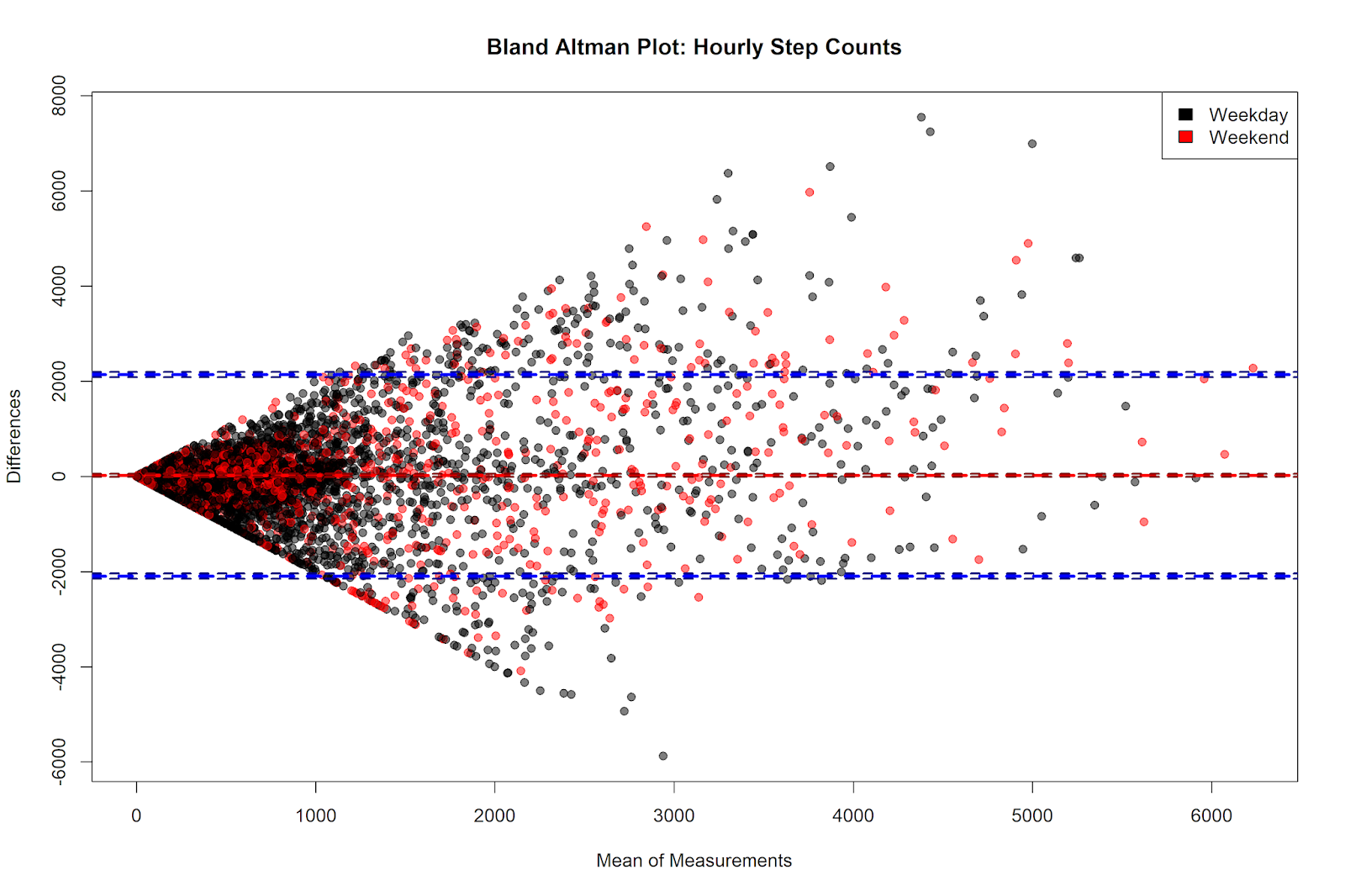
There are a couple of things to notice here. The first is that the mean of the difference of the hourly step counts - shown on the y axis - is close to zero (the exact value is 19.82, as we’ll see below). The y axis shows the value of the Accupdeo steps minus the Fitbit steps, and so the positive average difference indicates that Accupedo gives higher step counts than Fitbit. However, the size of this hourly difference is small.
We can also see that the smaller the average of the step counts, the closer the correspondence between the two measurements. As the mean of the step counts gets higher (e.g. in hours where I walk a greater number of steps), the disagreement between the measurements is greater. This disagreement is fairly symmetrical at average step counts of less than 3,000 - in this range, neither device systematically records higher or lower numbers. Indeed, the differences in this range seem to be somewhat random - at times the Accupedo step counts are higher and at times the Fitbit step counts are higher.
At high levels of mean step counts, however, there seems to be a slight trend for Accupedo to give higher values. Indeed, past values of 3,000 on the x-axis, virtually all of the points outside of the 1.96 standard deviation lines are on the upper part of the plot, which indicates hours that the Accupedo measurement is greater than that given by Fitbit. However, of our 4,914 hourly observations, only a handful have step counts above 3,000, and so the influence of these observations on the overall mean difference is small.
We can again notice the observations for which the Fitbit records steps, but Accupdeo doesn’t. These steps appear to be on the diagonal line sloping downwards to the right at the bottom half of the plot. Finally, there is not much visual evidence here for enormous differences between weekdays and weekend days.
Testing the Statistical Significance of the Hourly Differences
A corresponding statistical analysis that often accompanies the Bland-Altman plot is a one-sided t-test, comparing the mean difference of the measurements against zero (null hypothesis: the mean difference between the measurements is equal to zero). Although I’m not super-convinced of the utility of p-values, let’s go ahead and conduct this test. The difference score is contained in our dataset (shown above) in the column hour_diff_apedo_fbit. The mean of the differences is 19.82 and the standard deviation is 1080.42.
# calculate the mean, standard deviation
# and the one-sample t-test against zero
mean(merged_data$hour_diff_apedo_fbit)
sd(merged_data$hour_diff_apedo_fbit)
t.test(merged_data$hour_diff_apedo_fbit, mu=0,
	alternative="two.sided", conf.level=0.95)
This test indicates that the difference between the hourly step counts between Accupedo and Fitbit is not statistically significant, t(4913) = 1.29, p = .20.
More interesting is the effect size of this comparison. Effect sizes give a measure of the magnitude of an observed difference. There are many such measures, but we can compute Cohen’s D from the values we have above. Cohen’s D gives the size of a difference scaled to the standard deviation of that difference. Here, we simply take the mean difference score (19.82) and divide it by the standard deviation of that score (1080.42), which gives us a Cohen’s D value of .02. The average value of the hourly differences is dwarfed by the size of the variation in the hourly differences; this indicates that the magnitude of the average hourly step count differences is extremely small, and by all indications not meaningfully different from zero.
Differences in Hourly Step Counts Across the Day
The above plots mix data across all hours of the day in order to examine the global correspondence between hourly step counts. I was curious to visualize the difference in the step count measurements across the hours of the day, to see if there were any systematic differences within certain times of the day.
To make this plot, we’ll use the excellent ggridges package, visualizing the density distributions of step count differences separately for each hour of the day, with separate panels for weekdays and weekends.
library(ggridges)
# plot distributions for each hour
# separate week/weekend with facet
ggplot(data = merged_data, aes(x = hour_diff_apedo_fbit,
	y = as.factor(hour), fill = week_weekend)) +
	geom_density_ridges() +
	geom_vline(xintercept = 0, color = 'darkblue',
	linetype = 3, size = 1) +
	coord_flip() +
	facet_wrap(~week_weekend) +
	labs(y = "Hour of Day", x = "Difference Hourly Steps (Accupedo - Fitbit)" ) +
	scale_fill_manual(values=c("black", "red")) +
	labs(fill='Week/Weekend')
Which gives us the following plot:

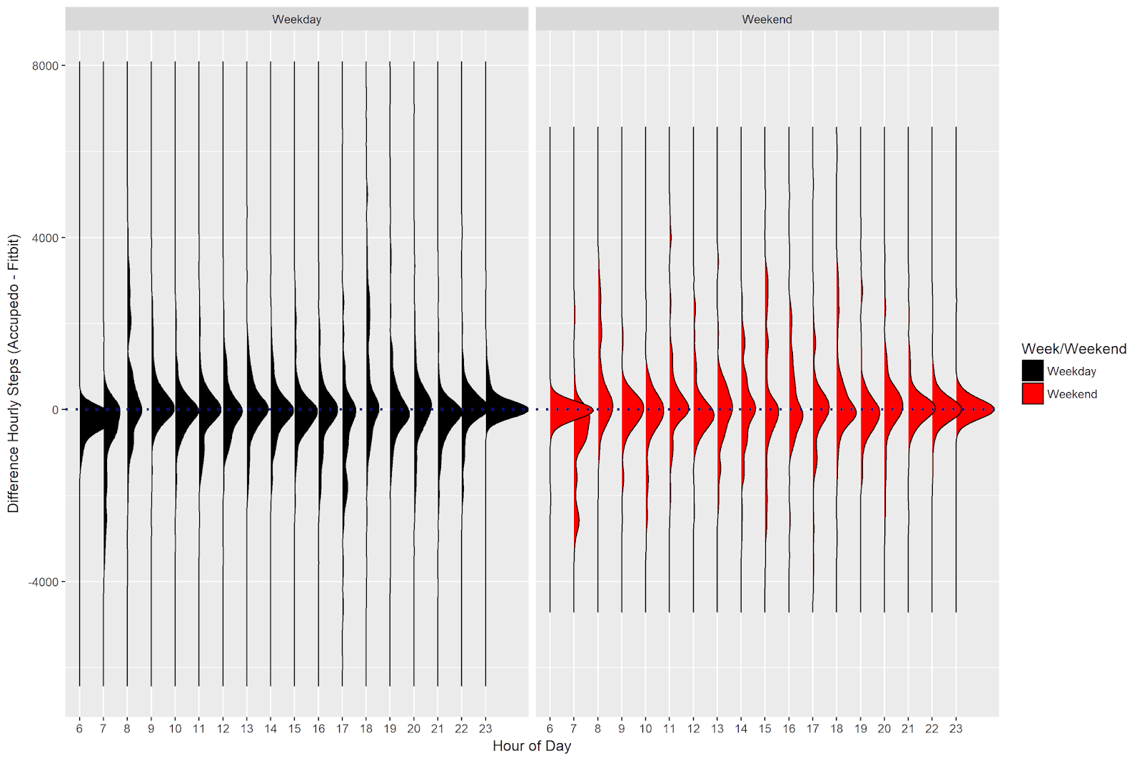
The distributions are for the most part neatly centered around zero, indicating few systematic differences across the hours of the day. There are some exceptions for the earliest hours of the day. Between 6 and 8 AM during the week and on weekends, the Fitbit counts more steps per hour (I guess I carry my phone around less just after waking up).
Summary and Conclusion
In this post, we examined the convergent validity of hourly step counts from the Accupedo app on my phone and the Fitbit I wear on my wrist. The correlation between these two devices’ records was .52, which is a rather weak relationship for two measurements of the same thing. The correspondence between the two measurements was higher on weekends than on weekdays, but regardless of the type of day, Accupedo gives numerically higher estimates of my hourly step count than does Fitbit.
We then constructed a Bland-Altman plot to compare the two measurements. This plot revealed that the average difference between the Accupedo and Fitbit hourly step counts was 19.82 steps; in other words, on average Accupedo counted 19.82 more steps each hour than did Fitbit. This difference was not statistically significantly different from zero, and the effect size analysis revealed that the magnitude of the difference between the devices was very small compared to the variation in the observed differences. The Bland-Altman plot also revealed that the disagreement between Accupedo and Fitbit was smaller when I walked fewer steps per hour. At very high step counts, the disagreement between the two devices’ readings was much larger.
Finally, the analysis of the density distributions of the differences in hourly step counts revealed few systematic differences between the Accupedo and Fitbit measurements across hours of the day.
In sum, this analysis offers some bad news and some good news, when considering the convergent validity of hourly step counts between Accupedo and Fitbit. On the one hand, the correlation between the hourly readings was only .52, which is a rather modest correlation. On the other hand, the average difference was small and not meaningfully different from zero. The differences in the measurements appear somewhat random - some hours Accupedo records higher step counts, and some hours Fitbit records higher step counts (although at higher step counts, Accupedo seems to give increasingly larger step counts than Fitbit).
It’s hard to say which device is more accurate, because we don’t have an objective gold standard to compare our measurements against. However, it’s safe to say that Accupedo and Fitbit give fairly similar readings, and that the differences in recorded hourly step counts are small on average.
Coming Up Next
In the next post, we’ll continue with our exploration of the step count measurements in this dataset. We will examine the cumulative daily step counts recorded by Accupedo and Fitbit, to see how they compare. This analysis focuses on the data that the user typically sees when interacting with the apps: the number of steps walked so far during a day. The results have both similarities and dissimilarities in comparison to what we’ve seen here.
Stay tuned!
P.S.
Welcome to the new home of this blog! It took a while to transfer everything from Blogger to Github, but I’m very pleased with the results. I hope to write a blog post at some point describing the process of transferring everything over.